background-position百分比原理
今天帮别人调代码时,看到一个样式:
background-position: 50% 0;
background-size: 100% auto;
对background-size:100% auto,意思是背景图片宽度为元素宽度*100%,高度等比缩放。详情可见css3 background。
对background-position很自然的以为百分比是根据父元素宽度计算的,但background-position真的不是,它有一套自己的原理。下面详细介绍。
一、等价写法
在看各类教程时有以下等价写法:
- top left, left top 等价于 0% 0%.
- top, top center, center top 等价于 50% 0%.
- right top, top right 等价于 100% 0%.
- left, left center, center left 等价于 0% 50%.
- center, center center 等价于 50% 50%.
- right, right center, center right 等价于 100% 50%.
- bottom left, left bottom 等价于 0% 100%.
- bottom, bottom center, center bottom 等价于 50% 100%.
- bottom right, right bottom 等价于 100% 100%.
那么为什么left,top就等价于0% 0%,right bottom等价于100% 100%呢?
二、background-position百分比计算公式
background-postion:x y;
x:{容器(container)的宽度—背景图片的宽度}*x百分比,超出的部分隐藏。
y:{容器(container)的高度—背景图片的高度}*y百分比,超出的部分隐藏。
有了这个公式,就很容易理解百分百写法了,推算一下也就很容易理解上面各类等价写法了。
三、举例
1、background-position:center center等价于background-position:50% 50%等价于background-position:?px ?px
例子中用到背景图如下【尺寸:200px*200px】:
背景图在容器中居中。

<style type="text/css">
.wrap{
    width: 300px;
    height: 300px;
    border:1px solid green;
    background-image: url(img/image.png);
    background-repeat: no-repeat;
/*    background-position: 50% 50%;*/
    background-position: center center;
}
</style>
<div class="wrap">
</div>
效果都是让背景图片居中

如上通过设置百分比和关键字能实现背景图居中,如果要实现通过具体值来设置图片居中该设置多少?
根据上面公式:
x=(容器的宽度-背景图宽度)*x百分比=(300px-200px)*50%=50px;
y=(容器的高度-背景图高度)*y百分比=(300px-200px)*50%=50px;
即设置background-postion:50px 50px;
测试一下:
<style type="text/css">
.wrap{
    width: 300px;
    height: 300px;
    border:1px solid green;
    background-image: url(img/image.png);
    background-repeat: no-repeat;
/*    background-position: 50% 50%;*/
/*    background-position: center center;*/
    background-position: 50px 50px;
}
</style>
<div class="wrap">
</div>
转:http://www.cnblogs.com/starof/p/4610984.html
语法:
background-position : length || length
background-position : position || position
取值:
length : 百分数 | 由浮点数字和单位标识符组成的长度值。请参阅 长度单位
position : top | center | bottom | left | center | right
说明:
设置或检索对象的背景图像位置。必须先指定 background-image 属性。
该属性定位不受对象的补丁属性( padding )设置影响。
默认值为: 0% 0% 。此时背景图片将被定位于对象不包括补丁( padding )的内容区域的左上角。
如果只指定了一个值,该值将用于横坐标。纵坐标将默认为 50% 。如果指定了两个值,第二个值将用于纵坐标。
如果设置值为 right center ,因为 right 作为横坐标值将会覆盖 center 值,所以背景图片将被居右定位。
对应的脚本特性为 backgroundPosition。
注: 本文中使用的图片大小为 300px*120px,为了能很清晰的表达图形的哪部分被隐藏了,按照图片的大小平均分成了9等份。同时背景图片容器区域绘制出绿色边框清晰显示容器的范围。
1、background-position:0 0;
背景图片的左上角将与容器元素的左上角对齐。该设置与background-position:left top;或者background-position:0% 0%;设置的效果是一致的。例如:
.container{
width:300px;
height:150px;
background:transparent url(bg.jpg) no-repeat scroll 0 0;
border:5px solid green;
}
效果如下图1:
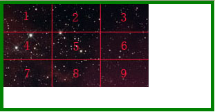
图 1
2、该属性定位不受对象的补丁属性( padding )设置影响。
例如,我们给容器元素增加padding值,背景图片的左上角还是与容器元素的左上角对齐。在此处只是影响到了容器元素的高度和宽度。
.container{
width:300px;
height:150px;
background:transparent url(bg.jpg) no-repeat scroll 0 0;
border:5px solid green;
padding:50px;
}
效果如图2:

图 2
3、background-position:-70px -40px;
图片以容器左上角为参考向左偏移70px,向上偏移 40px,示例:
.container{
width:300px;
height:150px;
background:transparent url(bg.jpg) no-repeat scroll -70px -40px;
border:5px solid green;
}
效果如图3:
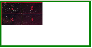
图 3
4、background-position:70px 40px;
图片以容器左上角为参考向右偏移70px,向下偏移 40px,示例:
.container{
width:300px;
height:150px;
background:transparent url(bg.jpg) no-repeat scroll 70px 40px;
border:5px solid green;
}
效果如图4:
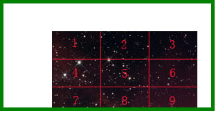
图 4
5、background-position:50% 50%;
图片水平和垂直居中。与 background-position:center center;效果等同。
等同于x:{容器(container)的宽度—背景图片的宽度}*x百分比,超出的部分隐藏。
等同于y:{容器(container)的高度—背景图片的高度}*y百分比,超出的部分隐藏。
例如: .container{
width:300px;
height:150px;
background:transparent url(bg.jpg) no-repeat scroll 50% 50%;
border:5px solid green;
}
其x=(300-210)*50%=45px;
y=(150-120)*50%=15px;
效果如图5:

图 5
由于超出部分别往两端延伸,所以我们可以先制作一张宽度足够宽图片设置水平值为50%,这样可以用来适应不同的浏览器,使得图片水平充满浏览器窗口并且居中。替代margin:50 auto的功能。
6、background-position:-50% -50%;
等同于x:-{容器(container)的宽度—背景图片的宽度}*x百分比,超出的部分隐藏。
等同于y:-{容器(container)的高度—背景图片的高度}*y百分比,超出的部分隐藏。
.container{
width:300px;
height:150px;
background:transparent url(bg.jpg) no-repeat scroll -50% -50%;
border:5px solid green;
}
效果如图6:
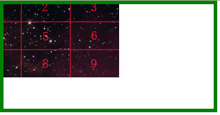
图 6
7、background-position:100% 100%;
图片处于容器元素的右下角,与 background-position:right bottom;效果等同。
示例:
.container{
width:300px;
height:150px;
background:transparent url(bg.jpg) no-repeat scroll 100% 100%;
border:5px solid green;
}
效果如图7:
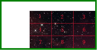
图 7

 浙公网安备 33010602011771号