Matplotlib数据可视化(4):折线图与散点图
from matplotlib import pyplot as plt
import numpy as np
import matplotlib as mpl
mpl.rcParams['font.sans-serif'] = ['SimHei']  # 中文字体支持
对于折线图的绘制,在之前博客的示例中都有使用,在面向对象绘图方法中,一般是创建axes实例后调用plot()方法实现折线图绘制,并通过传递各种参数实现对图像的设置。 散点图的绘制通过axes实例的scatter()方法来实现。scatter()方法的参数和参数取值与绘制折线图的plot()方法基本一致,所以本文将两种图放在一起进行介绍。
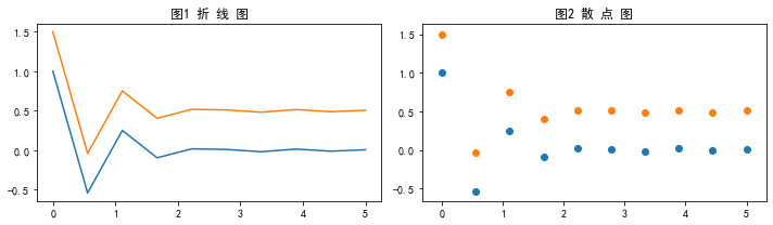
1 多图像绘制
在一个axes中,可以绘制多条折线图,秩序多次调用plot()或者scatter()方法即可。
x1 = np.linspace(0.0, 5.0, 10)
y1 = np.cos(2 * np.pi * x1) * np.exp(-x1)
fig, axes = plt.subplots(1, 2, figsize=(10, 3), tight_layout=True)

# 折线图
axes[0].set_title('图1 折 线 图')
axes[0].plot(x1, y1)
axes[0].plot(x1, y1+0.5)

# 散点图
axes[1].set_title('图2 散 点 图')
axes[1].scatter(x1, y1)
axes[1].scatter(x1, y1+0.5)
plt.show()
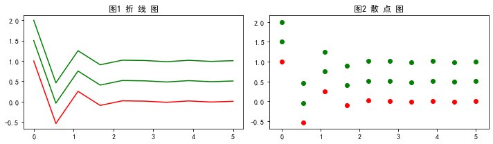
2 颜色
颜色通过color参数来设置,color参数的值可以使颜色的英文全称,例如'green'、'red',也可以是简写,例如'g'表示'green'、'r表示'red',一些常见颜色全称和简写如下所示。
'b', blue'g', green'r', red'c', cyan'm', magenta'y', yellow'k', black'w', white
如果觉得这些常见的颜色不够用,设置可以用16进制字符来表示颜色。
x1 = np.linspace(0.0, 5.0, 10)
y1 = np.cos(2 * np.pi * x1) * np.exp(-x1)
fig, axes = plt.subplots(1, 2, figsize=(10, 3), tight_layout=True)

# 折线图
axes[0].set_title('图1 折 线 图')
axes[0].plot(x1, y1, color='red')  # 红色
axes[0].plot(x1, y1+0.5, color='g')  # 绿色
axes[0].plot(x1, y1+1, color='#008000')  # 也是绿色

# 散点图
axes[1].set_title('图2 散 点 图')
axes[1].scatter(x1, y1, color='red')  # 红色
axes[1].scatter(x1, y1+0.5, color='g')  # 绿色
axes[1].scatter(x1, y1+1, color='#008000')  # 也是绿色
plt.show()
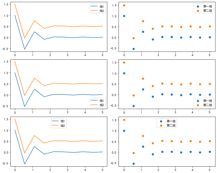
3 图例
axes实例中提供了legend()方法用于添加图例,legend()方法会将元素的label字符串设置为图例,如下面的示例所示,有两种参数传递方式来设置label。除了label外,还可以传递loc参数来设置图例的位置,loc参数值可以使代表位置的字符串,也可以是对应的整数,其对应关系如下所示:
    ===============   =============
    Location String   Location Code
    ===============   =============
    'best'            0
    'upper right'     1
    'upper left'      2
    'lower left'      3
    'lower right'     4
    'right'           5
    'center left'     6
    'center right'    7
    'lower center'    8
    'upper center'    9
    'center'          10
=============== =============x1 = np.linspace(0.0, 5.0, 10)
y1 = np.cos(2 * np.pi * x1) * np.exp(-x1)
fig, axes = plt.subplots(3, 2, figsize=(10, 8), tight_layout=True)
axes[0, 0].plot(x1, y1, label='线1') # 传递label参数
axes[0, 0].plot(x1, y1+0.5, label='线2') # 传递label参数
axes[0, 0].legend(loc='best') # 默认就是best
axes[1, 0].plot(x1, y1, label='线1') # 传递label参数
axes[1, 0].plot(x1, y1+0.5, label='线2') # 传递label参数
axes[1, 0].legend(loc='lower right')
line1, = axes[2, 0].plot(x1, y1) # 注意,等号前面有逗号
line2, = axes[2, 0].plot(x1, y1+0.5)
axes[2, 0].legend(handles=(line1, line2), labels=('线1', '线2'), loc='upper center')
axes[0, 1].scatter(x1, y1, label='第一组') # 传递label参数
axes[0, 1].scatter(x1, y1+0.5, label='第二组') # 传递label参数
axes[0, 1].legend(loc='best') # 默认就是best
axes[1, 1].scatter(x1, y1, label='第一组') # 传递label参数
axes[1, 1].scatter(x1, y1+0.5, label='第二组') # 传递label参数
axes[1, 1].legend(loc='lower right')
group1 = axes[2, 1].scatter(x1, y1) # 注意,等号前面没有逗号,这是与plot()方法不同的
group2 = axes[2, 1].scatter(x1, y1+0.5)
axes[2, 1].legend(handles=(group1, group2), labels=('第一组', '第二组'), loc='upper center')
plt.show()
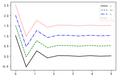
4 线型
通过传递linestyle或ls参数可以设置线型,参数包含一下几种取值:
    =============    ===============================
    character        description
    =============    ===============================
    ``'-'``          实线(默认)
    ``'--'``         长虚线
    ``'-.'``         点划线
    ``':'``          虚线
============= ===============================x1 = np.linspace(0.0, 5.0, 10)
y1 = np.cos(2 * np.pi * x1) * np.exp(-x1)
fig = plt.figure()
axes = fig.add_subplot(1, 1, 1)
axes.plot(x1, y1, color='black', label='-', ls='-') # 默认线性就是'-'
axes.plot(x1, y1+0.5, color='green', label='--',ls='--')
axes.plot(x1, y1+1, color='blue', label='-.', linestyle='-.')
axes.plot(x1, y1+1.5, color='red', label=':', ls=':')
axes.legend()
plt.show()
5 标记(形状)
参数marker可以在图形中添加标记,标记参数值和对应的标记类型如下所示:
    =============    ===============================
    character        description
    =============    ===============================
    ``'.'``          点
    ``','``          像素点
    ``'o'``          圆
    ``'v'``          向下三角形
    ``'^'``          向上三角形
    ``'<'``          向左三角形
    ``'>'``          向右三角形
    ``'1'``          向下T形
    ``'2'``          向上T形
    ``'3'``          向左T形
    ``'4'``          向右T形
    ``'s'``          正方形
    ``'p'``          五边形
    ``'*'``          星型
    ``'h'``          六边形1
    ``'H'``          六边形2
    ``'+'``          十字形
    ``'x'``          x 形
    ``'D'``          大菱形
    ``'d'``          小菱形
    ``'|'``          竖线
    ``'_'``          横线
============= ===============================x1 = np.linspace(0.0, 5.0, 10)
y1 = np.cos(2 * np.pi * x1) * np.exp(-x1)
fig, axes = plt.subplots(1, 2, figsize=(10, 3), tight_layout=True)
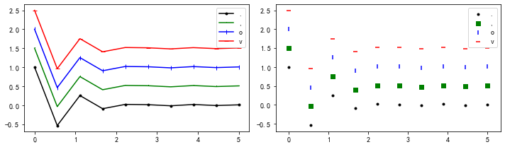
axes[0].plot(x1, y1, color='black', label='.', marker='.')
axes[0].plot(x1, y1+0.5, color='green', label=',', marker=',')
axes[0].plot(x1, y1+1, color='blue', label='o', marker='|')
axes[0].plot(x1, y1+1.5, color='red', label='v', marker='_')
axes[0].legend()
axes[1].scatter(x1, y1, color='black', label='.', marker='.')
axes[1].scatter(x1, y1+0.5, color='green', label=',', marker=',')
axes[1].scatter(x1, y1+1, color='blue', label='o', marker='|')
axes[1].scatter(x1, y1+1.5, color='red', label='v', marker='_')
axes[1].legend()
plt.show()
绘制折线图时,在传递了marker参数后,也可以通过以下参数进一步设置标记的样式:
- markeredgecolor 或 mec : 边框颜色
- markeredgewidth 或 mew : 边框粗细
- markerfacecolor 或 mfc :填充色
- markersize 或 ms :大小
x1 = np.linspace(0.0, 5.0, 10)
y1 = np.cos(2 * np.pi * x1) * np.exp(-x1)
fig = plt.figure()
axes = fig.add_subplot(1, 1, 1)
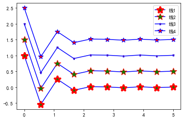
axes.plot(x1, y1, color='blue', label='线1', marker='*',markersize=15, markerfacecolor='green',markeredgecolor='red', markeredgewidth=3) # 线1
axes.plot(x1, y1+0.5, color='blue', label='线2', marker='*',markersize=15, markerfacecolor='green',markeredgecolor='red') # 线2
axes.plot(x1, y1+1, color='blue', label='线3', marker='*',markersize=5, markerfacecolor='red') # 线3
axes.plot(x1, y1+1.5, color='blue', label='线4',marker='*',markersize=10, markerfacecolor='red') # 线4
axes.legend()
plt.show()
散点图修改点的样式时,参数与折线图有些许不同:
- s : 大小
- color 或 c : 填充色
- alpha:透明度
- linewidths:边框粗细
- edgecolors:边框颜色
x1 = np.linspace(0.0, 5.0, 10)
y1 = np.cos(2 * np.pi * x1) * np.exp(-x1)
fig = plt.figure()
axes = fig.add_subplot(1, 1, 1)
axes.scatter(x1, y1, color='green', label='第一组', marker='*',s=105,edgecolors='red', linewidths=5)
axes.scatter(x1, y1+0.5, color='green', label='第二组', marker='*',s=15)
axes.scatter(x1, y1+1, color='blue', label='第三组', marker='*',s=5)
axes.scatter(x1, y1+1.5, color='blue', label='第四组',marker='*',s=10)
axes.legend()
plt.show()

6 显示坐标
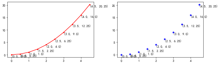
显示坐标可以用添加text的方法实现:
x1 = [i*0.1 for i in range(0, 50, 5)]
y1 = [i*i for i in x1]
fig, axes = plt.subplots(1, 2, figsize=(10, 3), tight_layout=True)

axes[0].plot(x1, y1, color='red', label='.', marker='.')  # 默认线性就是'-'
axes[1].scatter(x1, y1, color='blue', label='.', marker='*')  # 默认线性就是'-'
for a, b in zip(x1, y1):
    axes[0].text(a, b, (a,b),ha='left', va='top', fontsize=10)
    axes[1].text(a, b, (a,b),ha='left', va='top', fontsize=10)
plt.show()

作者:奥辰
微信号:chb1137796095
Github:https://github.com/ChenHuabin321
欢迎加V交流,共同学习,共同进步!
本文版权归作者和博客园共有,欢迎转载,但未经作者同意必须保留此段声明,且在文章页面明显位置给出原文链接,否则保留追究法律责任的权利。

 浙公网安备 33010602011771号