display:-webkit-flex(flex等分)、display: table(table等分)、justify-content: center(flex居中)、transform: translate(translate居中)、justify-content(横轴两端对齐)、align-content(垂直对齐方式)
justify-content-----定义伸缩项目沿主轴线的对齐方式
取值:
flex-start :默认值,向一行的其实位置靠齐
flex-end :伸缩项目向一行的结束位置靠齐
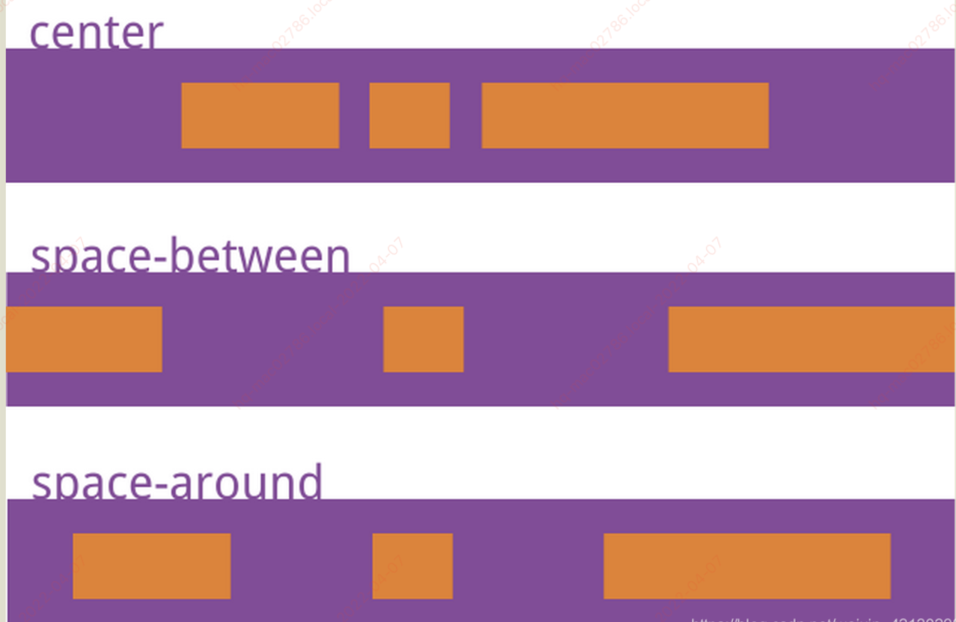
center :伸缩项目向一行的中间位置靠齐
space-between :两端对齐,项目之间的间隔都相等。
space-around:每个项目两侧的间隔相等。所以,项目之间的间隔比项目与边框的间隔大一倍。
每个项目两侧的间隔相等。所以,项目之间的间隔比项目与边框的间隔大一倍。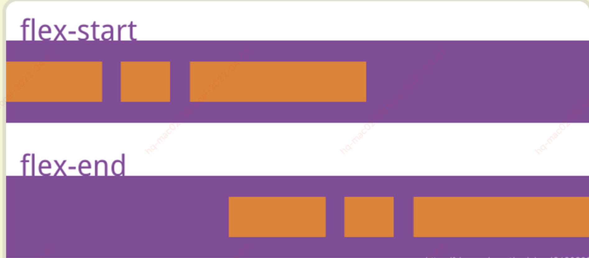
div.parant{
  display: flex;
  justify-content: space-between;
}
首页公共样式可以运用:http://www.w3cplus.com/mcommon/reset.css
HTML结构:
<!DOCTYPE html>
<html>
<head>
    <meta charset="UTF-8">
    <title>Document</title>
    <meta name="viewport" content="width=device-width, initial-scale=1.0, maximum-scale=1.0, user-scalable=0;" />
    <meta name="apple-mobile-web-app-capable" content="yes" />
    <meta name="apple-mobile-web-app-status-bar-style" content="black" />
    <meta name="format-detection"content="telephone=no, email=no" />
    <link rel="stylesheet" href="http://www.w3cplus.com/mcommon/reset.css" />
</head>
<body>
      <!--flex等分 start-->
      <h2>flex等分</h2>
      <ul class="flex-equal demo">
            <li>手机</li>
            <li>联系人</li>
            <li>信息</li>
            <li>主屏</li>
      </ul>
      <ul class="flex-equal demo">
            <li>手机</li>
            <li>联系人</li>
            <li>信息</li>
      </ul>
      <!--flex等分 end-->
      <!--table等分 start-->
      <h2>table等分</h2>
      <ul class="table-equal demo">
            <li>手机</li>
            <li>联系人</li>
            <li>信息</li>
            <li>主屏</li>
      </ul>
      <ul class="table-equal demo">
            <li>手机</li>
            <li>联系人</li>
            <li>信息</li>
      </ul>
      <!--table等分 end-->
      <!--flex居中 start-->
      <h2>flex居中</h2>
      <div class="flex-center demo-center">
           <div class="children">子元素水平垂直居中</div>
      </div>
      <!--flex居中 end-->
      <!--translate居中 start-->
      <h2>translate居中</h2>
      <div class="translate-center demo-center">
           <div class="children">子元素水平垂直居中</div>
      </div>
      <!--trnaslate居中 end-->
      <!--两端对齐 start-->
      <h2>两端对齐</h2>
      <div class="justify"><h2>左边对齐</h2><span>右边对齐</span></div>
      <!--两端对齐 end-->
</body>
</html>
第一:flex等分(Flex布局新旧混合写法详解(兼容微信)https://segmentfault.com/a/1190000003978624
CSS3代码为:
.demo{ line-height:44px; margin-bottom:20px; text-align:center; background-color:#0078e7; color:#fff;}
.flex-equal{
    display: -webkit-box; /* 老版本语法: Safari, iOS, Android browser, older WebKit browsers. */
    display: -moz-box; /* 老版本语法: Firefox (buggy) */
    display: -ms-flexbox; /* 混合版本语法: IE 10 */
    display: -webkit-flex; /* 新版本语法: Chrome 21+ */
    display: flex; /* 新版本语法: Opera 12.1, Firefox 22+ */
}
.flex-equal li{-webkit-box-flex:1;-ms-flex:1;-webkit-flex:1;flex:1;}
效果为:

第二种:table等分
CSS3代码为:
.demo{ line-height:44px; margin-bottom:20px; text-align:center; background-color:#0078e7; color:#fff;}
      .table-equal{ display:table; table-layout:fixed; width:100%;}
      .table-equal li{ display:table-cell;}
效果为:

注:在移动端display: table;同样也是个有利的神器,flex技术是个好技术,两者都可以合着用非常好!!!
第三种:flex居中
CSS3代码为:
.demo-center{ border:1px solid #ccc; margin:20px; height:200px;}
    .flex-center{
        display:-webkit-box;
        display:-ms-flexbox;
        display:-webkit-flex;
        display:flex;
        -webkit-box-pack:center;
        -ms-flex-pack:center;
        -webkit-justify-content:center;
        justify-content:center;
        -webkit-box-align:center;
        -ms-flex-align:center;
        -webkit-align-items:center;
        align-items:center;
    }
    .flex-center .children{ background:#0078e7; color:#fff; width:150px; line-height:5; text-align:center;}
效果为:

第四种:translate居中
CSS3代码为:
.demo-center{ border:1px solid #ccc; margin:20px; height:200px;}
      .translate-center{ position:relative;}
      .translate-center .children{ background:#0078e7; color:#fff; width:150px; line-height:5; text-align:center; position:absolute; left:50%; top:50%; -webkit-transform:translate(-50%,-50%);transform:translate(-50%,-50%);}
效果为:

第五种:两端对齐
CSS3代码为:
.justify{ display:-webkit-box; display:-ms-flexbox; display:-webkit-flex; display:flex;}
      .justify{-webkit-box-pack:justify;-ms-flex-pack:justify;-webkit-justify-content:space-between;justify-content:space-between; padding:0 10px; background:#0087e7; color:#fff; line-height:32px;}
效果为:

第六种:display:-webkit-box等分

HTML代码为:
<section class="nav-bottom">
         <a href="">新闻</a>
         <a href="">独家</a>
         <a href="">体育</a>
         <a href="">娱乐</a>
         <a href="">财经</a>
</section>
CSS3代码为:
.nav-bottom{
    display:-webkit-box;
    display:box;
    width: 100%;
    height: 45px;
}
.nav-bottom a{
    display:-webkit-box;
    display:box;
    -webkit-box-flex:1;
    box-flex:1;
    -webkit-box-pack:center;
    -ms-flex-pack:center;
    -webkit-justify-content:center;
    justify-content:center;
    -webkit-box-align:center;
    -ms-flex-align:center;
    -webkit-align-items:center;
    align-items:center;
    background: #eb6100;
    color: 16px;
    color: #fff;
    font-weight: bold;
    letter-spacing: 2px;
}
第七种:display:-webkit-box等分

HTML代码为:
<div class="label-act">
     <a href="//h5.m.taobao.com/mlapp/olist.html">
        <div class="ico"><p class="ico-cont"><span class="icon-form"></span></p> </div>
        <div class="title"> <h1>全部订单</h1></div>
        <div class="sub">查看全部订单</div>
        <div class="arrow"><span class="icon-right"></span></div>
     </a>
</div>
CSS代码为:
.label-act{ border-top:1px solid #e7e7e7;border-bottom:1px solid #e7e7e7; height: 40px; display:-webkit-box; display:-moz-box; display:-ms-box; display:-o-box; display:box;}
.label-act a{ width: 100%; display: -webkit-box; display:-moz-box; display:-ms-box; display:-o-box; display:box; font-size: 14px;}/*box-pack:横向排列子元素居中对齐*/
.label-act>a>div{display:-webkit-box; display:box;-webkit-box-pack:center;box-pack:center;-webkit-box-align:center;box-align:center;}
.ico{ width: 40px; margin-right: 5px; display:-webkit-box; display:-moz-box; display:-ms-box; display:-o-box; display:box;-webkit-box-pack:center;box-pack:center;-webkit-box-align:center;box-align:center;}
.ico p{ background:#5090cd; width: 20px; height: 20px; display: -webkit-box; display:box;-webkit-box-pack:center;box-pack:center;-webkit-box-align:center;box-align:center;}
.label-act .title{-webkit-box-flex:1;box-flex:1;}
.label-act .title h1{ font-size: 14px; width: 100%;}
.arrow{ padding-right:5px;}
.arrow .icon-right:before{ content: ''; display:inline-block;border: 2px solid #a4aab3;border-width: 2px 0 0 2px; width: 8px;height: 8px;-webkit-transform: rotate(135deg);}
第七种:-webkit-box-orient、-webkit-line-clamp:2、text-overflow:ellipsis用法等分

HTML代码为:
<div class="module 557871825497875951_1 item" id="item9">
     <div class="item-list o-t-item">
          <div class="item-img">
               <p><img class="" src="//img.alicdn.com/bao/uploaded/i4/1705000231/TB2R0dcbuIPyuJjSspcXXXiApXa_!!1705000231.jpg_200x200.jpg"> </p>
          </div>
          <div class="item-info">
               <h3 class="title">e代驾工作服订制代驾公司服装定制翻领广告文化衫印字刺绣logo</h3>
               <p class="sku">颜色分类:纯色橙色;尺码:M;袖长:短袖</p>
          </div>
          <div class="item-pay">
               <div class="item-pay-data">
                    <p class="price">¥28.00</p>
                    <p class="price"><del class="">¥46.00</del></p>
                    <p class="nums">x1</p>
               </div>
          </div>
     </div>
</div>
CSS代码为:
.o-t-item{ display:-webkit-box; display:box; padding:5px 10px; box-sizing:border-box; background:#f5f5f5;}
.o-t-item .item-img{ width: 80px; height:80px; margin-right: 5px; background:#fff; overflow: hidden; display:-webkit-box; display:box;-webkit-box-pack:center;box-pack:center;-webkit-box-align:center;box-align:center;}
.o-t-item .item-img img{ max-width:100%; transform:translateZ(0);}
.o-t-item .item-info{ -webkit-box-flex:1; box-flex:1;}
.o-t-item .item-info .title{ overflow: hidden;-webkit-line-clamp:2;line-clamp:2;word-break:break-all; display:-webkit-box; display:box;-webkit-box-orient:vertical;box-orient:vertical; font-size: 12px; line-height:1.5;}
.o-t-item .item-info p{ margin-top:5px; overflow: hidden; -webkit-line-clamp:2;line-clamp:2;word-break:break-all;display:-webkit-box; display:box;-webkit-box-orient:vertical;box-orient:vertical; color: #999; font-size: 12px;}
.o-t-item .item-pay{ width: 70px; text-align: right; display: -webkit-box; display:box;-webkit-box-orient:vertical; font-size:12px;}
.o-t-item .item-pay .item-pay-data{-webkit-box-flex:1;box-flex:1;}
.o-t-item .item-pay .item-pay-data .price{ text-overflow:ellipsis; white-space:nowrap; overflow: hidden;}
第七种:display:-webkit-box等分

HTML代码为:
<div class="module logisticsholder">
     <div class="o-t-contmsg">
          <div class="ico"><span class="icon-deliver"></span></div>
          <div class="cont">
               <h5>【广州市】广东省广州市白云区公司 已签收 签收人:已收,感谢使用圆通速递,期待再次为您服务 </h5>
               <div class="subtime">2016-05-04 11:38:41</div>
          </div>
          <div class="arrow"><span class="icon-jr"></span></div>
     </div>
</div>
CSS代码为:注:以前处理垂直居中用的方法是设置div的height和line-height是一样的值,限制CSS3只要设置元素的box-pack和box-align即可,这个前提是使用css3的盒布局,即将外层元素的display设置为box (链接)
.logisticsholder{ background: #fbf9f7;}
.o-t-contmsg {padding: 10px;color: #7e6f67; margin-bottom: 15px;}
.o-t-contmsg{
    display: -webkit-box;
    display: -moz-box;
    display: -ms-box;
    display: -o-box;
    display: box;
    width: 100%;
}
.o-t-contmsg .ico{
    font-size: 20px;
    margin-right: 15px;
    -webkit-box-pack: center;
    -moz-box-pack: center;
    -ms-box-pack: center;
    -o-box-pack: center;
    box-pack: center;
    -webkit-box-align: center;
    -moz-box-align: center;
    -ms-box-align: center;
    -o-box-align: center;
    box-align: center;
    display: -webkit-box;
    display: -moz-box;
    display: -ms-box;
    display: -o-box;
    display: box;
    width: 30px;
}
.icon-deliver:before{ content: '\e613'; display: block; font-size: 24px;}
.o-t-contmsg .cont {
    -webkit-box-flex: 1;
    -moz-box-flex: 1;
    -ms-box-flex: 1;
    -o-box-flex: 1;
    box-flex: 1;
}
.o-t-contmsg .cont h5{ font-weight: normal;}
.o-t-contmsg .arrow{
    width: 25px;
    text-align: right;
    -webkit-box-align: center;
    -moz-box-align: center;
    -ms-box-align: center;
    -o-box-align: center;
    box-align: center;
    display: -webkit-box;
    display: -moz-box;
    display: -ms-box;
    display: -o-box;
    display: box;
}
.o-t-contmsg .icon-jr:before{ content: '\e603'; font-size: 20px;}
第八种: display:table-cell (ie6、ie7不支持) 几种display:table-cell的应用(链接)

第九种:flex:1规划

HTML代码为:
<div class="shopCart">
     <div class="content">
          <div class="content-left">
               <div class="logo-wrapper">
                    <div class="logo highlight"><i class="iconfont icon-gouwuche highlight"></i></div>
                    <div class="num">3</div>
               </div>
               <div class="price highlight">¥30</div>
               <div class="desc">另需配送费¥4元</div>
          </div>
          <div class="content-right">
               <div class="pay enough">去结算</div>
          </div>
     </div>
</div>
CSS代码为:
.shopCart{ position: fixed; left: 0; bottom: 0; z-index: 50; width: 100%; height: 48px;}
.shopCart .content{ display:flex; background: #141d27;}
.shopCart .content .content-left{-webkit-box-flex: 1;-ms-flex: 1; flex:1;}
.shopCart .content .content-right{-webkit-box-flex: 0;-ms-flex: 0 0 105px; flex:0 0 105px; width: 105px;background: #00b43c}

 浙公网安备 33010602011771号