
react实现设置答题器选项个数
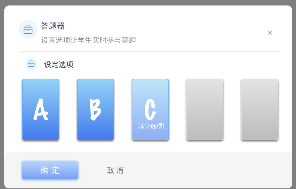
一,设置答题器选项
import React, { useState, useEffect } from 'react'
import PropTypes from 'prop-types'
import _ from 'lodash'

import CloseButtonSmall from '../CloseButtonSmall'
import LargeButton from '../LargeButton'
import CancelButton from '../CancelButton'
import OptionSettings from '../OptionSettings'

import './index.less'

/**
 * 答题设置组件
 *
 * @param {*} props
 * @returns
 */
function AnswererSettings(props) {
  const { style, onConfirm, onClose } = props
  const wrapperStyle = _.assign({}, style)

  const [selectedCount, setSelectedCount] = useState(2)
  const [isShowLimitTip, setIsShowLimitTip] = useState(false)
  const minOptionCount = 2

  useEffect(() => {
    const tipTimeout = setTimeout(() => {
      setIsShowLimitTip(false)
    }, 3000)
    return () => {
      clearTimeout(tipTimeout)
    }
  }, [isShowLimitTip])

  const handleSelectOption = (optionCount) => {
    setSelectedCount(optionCount)
  }

  const handleSelectMinOption = (optionCount) => {
    setIsShowLimitTip(true)
    setSelectedCount(optionCount)
  }

  const handleConfirm = () => {
    onConfirm(selectedCount)
    onClose()
  }

  const handleCancel = () => {
    onClose()
  }

  return (
    <div className="answerer-settings-component-wrap" style={wrapperStyle}>
      <div className="header">
        <div className="title-wrap">
          <div className="title-tip">
            <span className="title-icon" />
            <div className="title-contents">
              <p className="title">答题器</p>
              <p className="sub-title">设置选项让学生实时参与答题</p>
            </div>
          </div>
          <CloseButtonSmall onClick={handleCancel} />
        </div>
      </div>
      <div className="body">
        <div className="title-wrap">
          <span className="options-icon" />
          <div className="title-contents">
            <p className="title">设定选项</p>
          </div>
          { isShowLimitTip
            ? (
              <div className="title-tip">
                <span className="tip-icon" />
                <span className="tip-contents">请至少保留两个选择选项</span>
                <CloseButtonSmall
                  style={{
                    marginLeft: '20px',
                  }}
                  onClick={() => {
                    setIsShowLimitTip(false)
                  }}
                />
              </div>
            )
            : ''}
        </div>
        <OptionSettings
          style={{
            marginTop: '6px',
            marginRight: '23px',
          }}
          onSelectOption={handleSelectOption}
          onSelectMinOption={handleSelectMinOption}
          minOptionCount={minOptionCount}
        />
      </div>
      <div className="footer">
        <div className="answerer-btns-wrap">
          <LargeButton
            text="确 定"
            className="btn-confirm"
            onClick={handleConfirm}
            style={{
              marginLeft: '29px',
            }}
          />
          <CancelButton
            text="取 消"
            className="btn-cancel"
            onClick={handleCancel}
            style={{
              marginLeft: '37px',
            }}
          />
        </div>
      </div>
    </div>
  )
}

AnswererSettings.propTypes = {
  style: PropTypes.object,
  onConfirm: PropTypes.func.isRequired,
  onClose: PropTypes.func,
}

AnswererSettings.defaultProps = {
  style: {},
  onClose: _.noop,
}

export default AnswererSettings
import React, { useState, useRef } from 'react'
import PropTypes from 'prop-types'
import CX from 'classnames'
import _ from 'lodash'

import './index.less'

const optionItemImgs = [
  require('~/shared/assets/image/answerer-option-letter-a.svg'),
  require('~/shared/assets/image/answerer-option-letter-b.svg'),
  require('~/shared/assets/image/answerer-option-letter-c.svg'),
  require('~/shared/assets/image/answerer-option-letter-d.svg'),
  require('~/shared/assets/image/answerer-option-letter-e.svg'),
//   require('~/shared/assets/image/answerer-option-letter-f.svg'),
]

/**
 * 选项设置组件
 *
 * @param {*} props
 * @returns
 */
function OptionSettings(props) {
  const {
    style, onSelectOption, onSelectMinOption, minOptionCount,
  } = props
  const wrapperStyle = _.assign({}, style)

  const [selectedCount, setSelectedCount] = useState(2)
  const options = useRef(null)

  const handleClickItem = (e) => {
    const { target } = e
    if (target.classList.contains('last-selected')) {
      if (selectedCount !== minOptionCount) {
        setSelectedCount(selectedCount - 1)
        onSelectOption(selectedCount - 1)
      } else {
        onSelectMinOption(selectedCount)
      }
    } else if (target.classList.contains('first-non-selected')) {
      setSelectedCount(selectedCount + 1)
      onSelectOption(selectedCount + 1)
    }
  }

  const renderOptionItems = () => {
    return optionItemImgs.map((img, index) => {
      return (
        <div
          className={CX({
            item: true,
            selected: index < selectedCount,
            'last-selected': index === selectedCount - 1,
            'first-non-selected': index === selectedCount,
          })}
          key={img}
        >
          <img className="letter" alt="" src={img} />
          <img className="add" alt="" />
          <span className="tip" />
        </div>
      )
    })
  }

  return (
    <div className="option-settings-component-wrap" style={wrapperStyle}>
      <div className="option-items" onClick={handleClickItem} role="button" tabIndex={0} ref={options}>
        {renderOptionItems()}
      </div>
    </div>
  )
}

OptionSettings.propTypes = {
  style: PropTypes.object,
  onSelectOption: PropTypes.func,
  onSelectMinOption: PropTypes.func,
  minOptionCount: PropTypes.number,
}

OptionSettings.defaultProps = {
  style: {},
  onSelectOption: _.noop,
  onSelectMinOption: _.noop,
  minOptionCount: 2,
}

export default OptionSettings
效果如下:
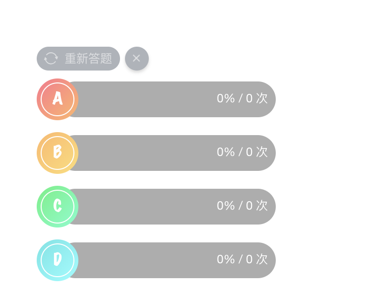
二,展示答题器状态
import React, { useState } from 'react'
import PropTypes from 'prop-types'
import _ from 'lodash'
import CX from 'classnames'

import CloseButtonSmall from '../CloseButtonSmall'
import AnswererStatItem from '../AnswererStatItem'

import './index.less'

// 默认支持5个选项,名称、背景样式和进度条样式
const itemsOption = [
  {
    itemName: 'A',
    iconStyle: { backgroundImage: 'linear-gradient(135deg, #ff758c, #ffb867)' },
    processStyle: { backgroundImage: 'linear-gradient(273deg, #ff758c, #ffb867)' },
  },
  {
    itemName: 'B',
    iconStyle: { backgroundImage: 'linear-gradient(135deg, #ffb867, #fdde74)' },
    processStyle: { backgroundImage: 'linear-gradient(273deg, #ffb867, #fdde74)' },
  },
  {
    itemName: 'C',
    iconStyle: { backgroundImage: 'linear-gradient(135deg, #4cf27d, #6affcc)' },
    processStyle: { backgroundImage: 'linear-gradient(273deg, #4cf27d, #6affcc)' },
  },
  {
    itemName: 'D',
    iconStyle: { backgroundImage: 'linear-gradient(135deg, #63e4e4, #8affff)' },
    processStyle: { backgroundImage: 'linear-gradient(273deg, #63e4e4, #8affff)' },
  },
  {
    itemName: 'E',
    iconStyle: { backgroundImage: 'linear-gradient(135deg, #3977f6, #81d5fa)' },
    processStyle: { backgroundImage: 'linear-gradient(273deg, #3977f6, #81d5fa)' },
  },
]

/**
 * 答题结果展示组件
 * @param {onRestart} 重新开始
 * @param {onClose} 关闭
 * @param {itemNum} 选项的个数
 * @param {statData} 对象,{选项:次数}
 * @param {userCount} 投票人数
 */
function AnswererStat(props) {
  const {
    style, onRestart, onClose, itemNum, statData, userCount,
  } = props
  const wrapperStyle = _.assign({}, style)

  const [isRestarting, setIsRestarting] = useState(false)

  const renderItems = () => {
    return itemsOption.slice(0, itemNum).map((option, index) => {
      return (
        <AnswererStatItem
          style={{
            marginBottom: '12px',
          }}
          key={option.itemName}
          maxValue={userCount}
          value={statData[index]}
          {...option}
        />
      )
    })
  }
  return (
    <div className="answerer-stat-wrap" style={wrapperStyle}>
      <div className="operation">
        <div
          className="restart"
          role="button"
          onClick={() => {
            setIsRestarting(!isRestarting)
            onRestart()
          }}
          tabIndex={0}
        >
          <img
            className={CX({
              'restart-icon': true,
              active: isRestarting,
            })}
            src={require('~/shared/assets/image/loading-icon-circle-50-50.svg')}
            alt=""
          />
          <span className="restart-name">重新答题</span>
        </div>
        <CloseButtonSmall
          theme="dark"
          style={{
            backgroundColor: 'rgba(54, 65, 82, 0.4)',
            boxShadow: '0 2px 4px 0 rgba(51, 51, 51, 0.2)',
          }}
          onClick={onClose}
        />
      </div>
      <div className="item-area">
        {renderItems()}
      </div>
    </div>
  )
}

AnswererStat.propTypes = {
  style: PropTypes.object,
  itemNum: PropTypes.number.isRequired,
  userCount: PropTypes.number,
  statData: PropTypes.object.isRequired,
  onRestart: PropTypes.func,
  onClose: PropTypes.func,
}

AnswererStat.defaultProps = {
  style: {},
  onClose: _.noop,
  onRestart: _.noop,
  userCount: 1,
}

export default AnswererStat
import React from 'react'
import PropTypes from 'prop-types'
import _ from 'lodash'

import './index.less'
/**
 * 答题选项组件
 *
 * @param {选项的名称} itemName
 * @param {名称所在区域的样式} iconStyle
 * @param {进度条的样式} processStyle
 * @param {当前值} value
 * @param {最大值} maxValue
 * @returns
 */
function AnswererStatItem(props) {
  const {
    style, itemName, iconStyle, processStyle, value, maxValue,
  } = props
  const wrapperStyle = _.assign({}, style)
  const wrapperIconStyle = _.assign({}, iconStyle)

  let dataPercentage // 数据计算出来的百分比
  if (maxValue === 0) {
    dataPercentage = 0
  } else {
    dataPercentage = value / maxValue
  }

  const textPercentage = Math.round(dataPercentage * 100) // 在进度条展示的百分比文本

  // 计算进度条样式相关的百分比
  // 根据可见长度的百分比换算符合可见长度比例的全部长度
  // 例,10%的区域被遮挡,此时若数据是50%,则需要填充整体宽度为 10%+50%*90%=55%
  const computeProcessBarOffset = () => {
    if (dataPercentage === 0) {
      return 0
    }
    const visibleLength = 0.9
    return ((dataPercentage * visibleLength + 1 - visibleLength) * 100).toFixed()
  }

  const wrapProcessStyle = _.assign({}, processStyle, { right: `${100 - computeProcessBarOffset()}%` })

  return (
    <div className="answerer-stat-item-wrap" style={wrapperStyle}>
      <div className="answerer-stat-item">
        <div className="stat-item-icon" style={wrapperIconStyle}>
          <div className="item-name-wrap">
            {itemName}
          </div>
        </div>
        <div className="stat-item-present">
          <div className="stat-item-percentage">
            <div className="filler" style={wrapProcessStyle} />
            <div className="stat-item-data">
              <span className="percentage">
                {`${textPercentage}%`}
              </span>
              { ' / ' }
              <span className="numbers">
                {`${value} 次`}
              </span>
            </div>
          </div>
        </div>
      </div>
    </div>
  )
}

AnswererStatItem.propTypes = {
  style: PropTypes.object,
  iconStyle: PropTypes.object,
  processStyle: PropTypes.object,
  itemName: PropTypes.string.isRequired,
  value: PropTypes.number,
  maxValue: PropTypes.number,
}

AnswererStatItem.defaultProps = {
  style: {},
  iconStyle: {},
  processStyle: {},
  value: 0,
  maxValue: 0,
}

export default AnswererStatItem
效果如下:

 浙公网安备 33010602011771号