提示框样式tips
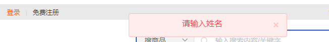
上图
上代码
<!DOCTYPE html>
<html lang="en">
<head>
<script src="/plugins/jquery.min.js"></script>
<meta charset="UTF-8">
<meta name="viewport" content="width=device-width, initial-scale=1.0">
<title>提示框</title>
</head>
<style>
.btn,
.errorButton {
width: 100px;
height: 40px;
background-color: #2e5ec0;
color: #ffffff;
}
.layui-m-layer {
z-index: 9999 !important;
}
.loading {
display: none;
position: fixed;
top: 0px;
bottom: 0;
right: 0;
left: 0;
background-color: #424040;
opacity: 0.4;
z-index: 99000;
}
.ts-alert {
position: fixed;
top: 17px;
left: 50%;
z-index: 9999;
white-space: normal;
min-width: 314px;
text-align: center;
padding: 10px;
padding-right: 15px;
margin-bottom: 20px;
border-radius: 4px;
}
.fadeInDown {
animation-name: fadeInDown;
-webkit-animation: fadeInDown;
}
@keyframes fadeInDown {
from {
opacity: 0;
transition: 2s;
-webkit-transform: translate(0, -1000px);
transform: translate(0, -1000px);
}
to {
opacity: 1;
-webkit-transform: translate(0, 10px);
transform: translate(0, 10px);
}
}
@-webkit-keyframes fadeInDown {
from {
opacity: 0;
-webkit-transform: translate(0, -1000px);
transform: translate(0, -1000px);
}
to {
opacity: 1;
-webkit-transform: translate(0, 10px);
transform: translate(0, 10px);
}
}
.ts-alert-text {
text-align: center;
white-space: normal;
line-height: 20px;
font-size: 16px;
}
button.close {
-webkit-appearance: none;
padding: 0;
cursor: pointer;
background: 0 0;
border: 0;
float: right;
font-size: 21px;
font-weight: 700;
line-height: 1;
text-shadow: 0 1px 0 #fff;
margin-left: 5px;
line-height: 26px;
}
button.close:active,
button.close:focus {
outline-width: 0px;
}
.alert-success {
background-color: #f1f6f2;
border: 1px solid #e3eee5;
color: #339645;
}
.alert-success .close {
color: #339645;
}
.alert-danger {
background-color: #fdeeed !important;
border: 1px solid #fdbbbd !important;
color: #ff343a !important;
}
.alert-danger .close {
color: #ff343a;
}
.pswp__preloader__icn {
opacity: 0.75;
width: 35px;
height: 35px;
-webkit-animation: clockwise 500ms linear infinite;
animation: clockwise 500ms linear infinite;
position: fixed;
left: 50%;
top: 50%;
margin-left: -26px;
}
.pswp__preloader__cut {
position: relative;
width: 12px;
height: 24px;
overflow: hidden;
position: absolute;
top: 0;
left: 0;
}
.pswp__preloader__donut {
box-sizing: border-box;
width: 35px;
height: 35px;
border: 2px solid #b5b2b2;
border-radius: 50%;
border-left-color: transparent;
border-bottom-color: transparent;
position: absolute;
top: 0;
left: 0;
background: none;
margin: 0;
-webkit-animation: donut-rotate 1000ms cubic-bezier(.4, 0, .22, 1) infinite;
animation: donut-rotate 1000ms cubic-bezier(.4, 0, .22, 1) infinite;
}
@-webkit-keyframes clockwise {
0% {
-webkit-transform: rotate(0deg)
}
100% {
-webkit-transform: rotate(360deg)
}
}
@keyframes clockwise {
0% {
transform: rotate(0deg)
}
100% {
transform: rotate(360deg)
}
}
@-webkit-keyframes donut-rotate {
0% {
-webkit-transform: rotate(0)
}
50% {
-webkit-transform: rotate(-140deg)
}
100% {
-webkit-transform: rotate(0)
}
}
@keyframes donut-rotate {
0% {
transform: rotate(0)
}
50% {
transform: rotate(-140deg)
}
100% {
transform: rotate(0)
}
}
</style>
<body>
<button type="button" class="btn">成功提示框</button>
<button type="button" class="errorButton">失败提示框</button>
</body>
<script>
$('.btn').bind('click', function () {
console.log(111)
successAlert('Hello World SUCCESS!');
})
$('.errorButton').bind('click', function () {
errorAlert('Hello World ERROR!');
})
function errorAlert(str) { //调用操作失败的方法
var html = '<div class="alert alert-danger ts-alert" >'
+ '<span class="ts-alert-text">' + str + '</span>'
+ '<button type="button" class="close"><span>×</span></button></div>';
var obj = $(html);
obj.appendTo(document.body);
var w = obj.width();
if (w > 1) w = w / 2;
obj.css("margin-left", "-" + w + "px");
setTimeout(function () {
obj.remove();
}, 3000);
}
function successAlert(str) {//调用操作成功的方法
var html = '<div class="alert alert-success ts-alert fadeInDown" >'
+ '<span class="ts-alert-text">' + str + '</span>'
+ '<button type="button" class="close"><span>×</span></button></div>';
var obj = $(html);
obj.appendTo(document.body);
var w = obj.width();
if (w > 1) w = w / 2;
obj.css("margin-left", "-" + w + "px");
//延时自动关闭
setTimeout(function () {
obj.remove();
}, 3000);
}
</script>
</html>

 浙公网安备 33010602011771号