基于css3的新特性transition 动画hover玩法使用
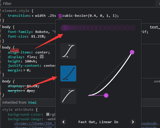
1.transition用法动画效果调试
transition:color .25s linear;

/*调试时候直接在浏览器点击linear  去调试动画效果 */
/* 动画效果是在点击移动选中时出现的样式 */
transition :all .25s ...;
直接在浏览器去调试几个按钮就可以看出动画
2.左边菜单布局样式代码
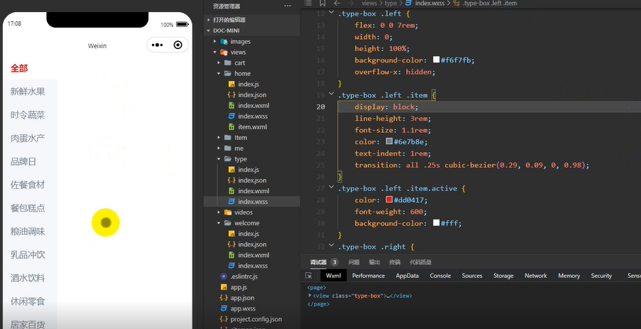
3.类型菜单页面布局样式代码
page {
    display: block;
    position: relative;
    height: 100%;
}
.type-box {
    display: flex;
    height: 100%;
    width: 100%;
    overflow: hidden;
}
/* 左边菜单样式 */
.type-box .left {
    flex: 0 0 7rem;
    width: 0;
    height: 100%;
    background-color: #f6f7fb;
    overflow-x: hidden;
}
.type-box .left .item {
    display: block;
    line-height: 3rem;
    font-size: 1.1rem;
    color: #6e7b8e;
    text-indent: 1rem;
    transition: all .25s cubic-bezier(0.29, 0.09, 0, 0.98);
}
.type-box .left .item.active {
    color: #dd0417;
    font-weight: 600;
    background-color: #fff;
}
.type-box .right {
    flex: 1;
    width: 0;
    height: 100%;
    overflow-x: hidden;
}

.right {
    display: block;
    padding: 0 12px;
}
/* 右边样式*/

.right .item {
    display: block;
    width: calc(100% - 26px);
    background-color: #fff;
    padding: 12px;
    border: solid 1px #ddd;
    margin-bottom: 12px;
    border-radius: 4px;
    box-shadow: 5px 5px 12px rgba(0, 0, 0, .1);
}

.right .item image {
    display: block;
    width: 100%;
    height: 10rem;
}

.more {
    display: block;
    text-align: center;
    font-size: .9rem;
    color: #999;
    line-height: 2rem;
}
2.transform阴影 效果
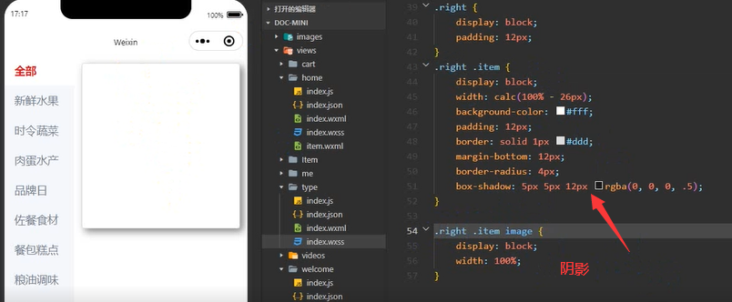

box-shadow:5px 5px 12px rgba(0,0,0,.1)

/*  阴影效果边框加黑 */

 浙公网安备 33010602011771号