
Android自定义组合控件详细示例 (附完整源码)
在我们平时的Android开发中,有时候原生的控件无法满足我们的需求,或者经常用到几个控件组合在一起来使用.这个时候,我们就可以根据自己的需求创建自定义的控件了,一般通过继承View或其子类来实现.
实现一个自定义控件一般需要下面三个步骤:
1. 设计控件中需要的属性 (xml)
2. 实现自定义的View (java)
3. 引用自定义的View (xml)
下面我们通过实例来实现一个完整的自定义组合控件--TopBar,左右两边各一个Button,中间是一个TextView.
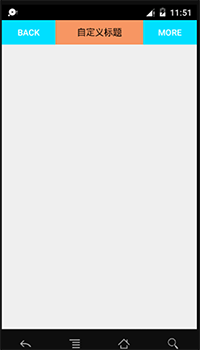
先看下最终效果:
下面通过代码来完成自定义控件的完整过程.
.设计控件中需要的属性
我们可以先把要实现的自定义控件画一个草图,来分析需要设计哪些属性.我们需要在values资源文件夹下创建一个定义控件的xml文件.
atts.xml
<?xml version="1.0" encoding="utf-8"?>
<resources>
    <!--
         使用declare-styleable标签定义控件,name为控件名
         使用attr标签定义控件的属性,name为属性名,format为属性的类型
     -->
    <declare-styleable name="topBar">
        <attr name="tbTitle" format="string" />
        <attr name="titleTextSize" format="dimension" />
        <attr name="titleTextColor" format="color" />

        <attr name="leftText" format="string" />
        <attr name="leftBackground" format="reference|color" />
        <attr name="leftTextColor" format="color" />

        <attr name="rightText" format="string" />
        <attr name="rightBackground" format="reference|color" />
        <attr name="rightTextColor" format="color" />
    </declare-styleable>
</resources>
.实现自定义的View
TopBar.java
package scratchcard.cbt.com.learnuserdefinedview;

import android.content.Context;
import android.content.res.TypedArray;
import android.graphics.drawable.Drawable;
import android.util.AttributeSet;
import android.view.Gravity;
import android.view.View;
import android.view.ViewGroup;
import android.widget.Button;
import android.widget.RelativeLayout;
import android.widget.TextView;

/**
 * Created by caobotao on 15/12/9.
 */
public class TopBar extends RelativeLayout{
    /**
     * 声明控件
     */
    private Button leftBtn;//左按钮
    private TextView textView;//中间文本框
    private Button rightBtn;//右按钮

    /**
     * 声明三个控件的属性
     */
    //声明左按钮的属性
    private String leftText;//按钮文本
    private Drawable leftBackground;//按钮背景
    private int leftTextColor;//按钮文本颜色
    //声明中间文本框的属性
    private String tbTitle;//文本框文本
    private float titleTextSize;//文本框字体大小
    private int titleTextColor;//文本框字体颜色
    //声明右按钮的属性
    private String rightText;//按钮文本
    private Drawable rightBackground;//按钮背景
    private int rightTextColor;//按钮文本颜色

    /**
     * 声明三个控件的布局属性
     */
    private LayoutParams leftBtnLayoutParams;
    private LayoutParams textViewLayoutParams;
    private LayoutParams rightBtnLayoutParams;

    //声明左右按钮点击监听
    private TopBarBtnsOnClickListener listener;

    //创建一个监听左右按钮点击的接口
    public interface TopBarBtnsOnClickListener{
        public void leftBtnOnClick();//左按钮被点击的事件
        public void rightBtnOnClick();//右按钮被点击的事件
    }

    //向外提供一个设置监听的方法
    public void setOnTopBarBtnsClick(TopBarBtnsOnClickListener listener){
        this.listener = listener;
    }

    //重写构造方法
    public TopBar(Context context, AttributeSet attrs) {
        super(context, attrs);
        /**
         * 用TypedArray可以获取用户在xml中声明的此控件的所有属性,以键值对存储,
         * K:资源文件(例 R.styleable.topBar_leftText)
         * V:属性值
         */
        TypedArray ta = context.obtainStyledAttributes(attrs,R.styleable.topBar);

        //为左按钮的属性赋值
        leftText = ta.getString(R.styleable.topBar_leftText);
        leftBackground = ta.getDrawable(R.styleable.topBar_leftBackground);
        leftTextColor = ta.getInt(R.styleable.topBar_leftTextColor,0);

        //为中间的文本框的属性赋值
        tbTitle = ta.getString(R.styleable.topBar_tbTitle);
        titleTextSize = ta.getDimension(R.styleable.topBar_titleTextSize,0);
        titleTextColor = ta.getInt(R.styleable.topBar_titleTextColor,0);

        //为右按钮的属性赋值
        rightText = ta.getString(R.styleable.topBar_rightText);
        rightBackground = ta.getDrawable(R.styleable.topBar_rightBackground);
        rightTextColor = ta.getInt(R.styleable.topBar_rightTextColor,0);

        //使用完TypedArray之后需要调用其recycle()方法,以便重用
        ta.recycle();

        //实例化三个控件
        leftBtn = new Button(context);
        textView = new TextView(context);
        rightBtn = new Button(context);

        //设置左按钮的属性
        leftBtn.setText(leftText);
        leftBtn.setBackground(leftBackground);
        leftBtn.setTextColor(leftTextColor);
        //设置文本框的属性
        textView.setText(tbTitle);
        textView.setTextSize(titleTextSize);
        textView.setTextColor(titleTextColor);
        textView.setGravity(Gravity.CENTER);
        //设置右按钮的属性
        rightBtn.setText(rightText);
        rightBtn.setBackground(rightBackground);
        rightBtn.setTextColor(rightTextColor);

        //设置此自定义控件的背景颜色
        setBackgroundColor(0xFFF59563);

        //实例化左按钮的布局属性
        leftBtnLayoutParams = new LayoutParams(ViewGroup.LayoutParams.WRAP_CONTENT, ViewGroup.LayoutParams.WRAP_CONTENT);
        //设置左按钮靠左显示
        leftBtnLayoutParams.addRule(RelativeLayout.ALIGN_PARENT_LEFT,TRUE);
        //将左按钮添加到本自定义控件中
        addView(leftBtn,leftBtnLayoutParams);

        //同上
        rightBtnLayoutParams = new LayoutParams(ViewGroup.LayoutParams.WRAP_CONTENT, ViewGroup.LayoutParams.WRAP_CONTENT);
        rightBtnLayoutParams.addRule(RelativeLayout.ALIGN_PARENT_RIGHT,TRUE);
        addView(rightBtn,rightBtnLayoutParams);

        //同上
        textViewLayoutParams = new LayoutParams(ViewGroup.LayoutParams.WRAP_CONTENT, ViewGroup.LayoutParams.MATCH_PARENT);
        textViewLayoutParams.addRule(RelativeLayout.CENTER_IN_PARENT,TRUE);
        addView(textView,textViewLayoutParams);

        //回调左按钮的监听事件
        leftBtn.setOnClickListener(new OnClickListener() {
            @Override
            public void onClick(View v) {
                listener.leftBtnOnClick();
            }
        });

        //回调右按钮的监听事件
        rightBtn.setOnClickListener(new OnClickListener() {
            @Override
            public void onClick(View v) {
                listener.rightBtnOnClick();
            }
        });

    }

    //当然,我们还可以添加其他控制此控件的方法,如设置左按钮是否可见等等,大家可根据自己的需求进行扩展
    public void setLeftBtnVisible(boolean isVisible){
        leftBtn.setVisibility(isVisible ? VISIBLE : INVISIBLE);
    }
}
.引用自定义的View
activity_main.xml
<?xml version="1.0" encoding="utf-8"?>

<!--
     使用自定义的控件的属性需要先添加命名空间
     xmlns:cbt="http://schemas.android.com/apk/res-auto"
     其中"cbt"可以任意指定,但是不能与系统的命名空间相同
     在Android Studio中如上用res-auto,
     在Eclipse需要在res后指定完整包名,如:
     xmlns:cbt="http://schemas.android.com/apk/res/scratchcard.cbt.com.learnuserdefinedview.TopBar"
 -->

<LinearLayout
    xmlns:android="http://schemas.android.com/apk/res/android"
    xmlns:cbt="http://schemas.android.com/apk/res-auto"
    xmlns:tools="http://schemas.android.com/tools"
    android:layout_width="match_parent"
    android:layout_height="match_parent"
    android:orientation="vertical"
    tools:context="scratchcard.cbt.com.learnuserdefinedview.MainActivity">
    <!-- 添加自定义控件及属性 -->
    <scratchcard.cbt.com.learnuserdefinedview.TopBar
        android:id="@+id/topbar"
        android:layout_width="wrap_content"
        android:layout_height="40dp"
        cbt:leftText = "BACK"
        cbt:leftBackground = "@android:color/holo_blue_bright"
        cbt:leftTextColor = "#FFFFFF"

        cbt:tbTitle = "自定义标题"
        cbt:titleTextSize = "10sp"
        cbt:titleTextColor = "#000000"

        cbt:rightText = "MORE"
        cbt:rightBackground = "@android:color/holo_blue_bright"
        cbt:rightTextColor = "#FFFFFF"/>

</LinearLayout>
MainActivity.java
package scratchcard.cbt.com.learnuserdefinedview;

import android.app.Activity;
import android.support.annotation.Nullable;
import android.support.v7.app.AppCompatActivity;
import android.os.Bundle;
import android.util.Log;
import android.view.ViewTreeObserver;
import android.widget.Button;
import android.widget.Toast;
import scratchcard.cbt.com.learnuserdefinedview.TopBar.TopBarBtnsOnClickListener;

public class MainActivity extends Activity {
    //创建自定义控件
    private TopBar topBar;
    @Override
    protected void onCreate(@Nullable Bundle savedInstanceState) {
        super.onCreate(savedInstanceState);
        setContentView(R.layout.activity_main);
        //初始化自定义控件
        topBar = (TopBar) findViewById(R.id.topbar);

        //为自定义控件添加按钮的监听事件
        topBar.setOnTopBarBtnsClick(new TopBarBtnsOnClickListener() {
            @Override
            public void leftBtnOnClick() {
                Toast.makeText(MainActivity.this,"LEFT",Toast.LENGTH_SHORT).show();
            }
            @Override
            public void rightBtnOnClick() {
                Toast.makeText(MainActivity.this,"RIGHT",Toast.LENGTH_SHORT).show();
            }
        });

    }
}
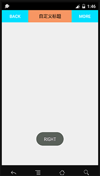
运行项目后点击左边按钮: 点击右边按钮:

至此,整个自定义控件就已经完成了.虽然效果有些寒碜,但是麻雀虽小,五脏俱全.主要是通过这个实例使大家掌握自定义组合控件的过程与方法.学会了创建自定义控件的方法之后可以举一反三完成自己的漂亮的作品.
完整源码 : 点击下载
作者:caobotao
本文版权归作者和博客园共有,欢迎转载,但未经作者同意必须保留此段声明,且在文章页面明显位 置给出原文连接,否则保留追究法律责任的权利。
作者:caobotao
本文版权归作者和博客园共有,欢迎转载,但未经作者同意必须保留此段声明,且在文章页面明显位置给出原文链接,否则保留追究法律责任的权利。
作者:caobotao
本文版权归作者和博客园共有,欢迎转载,但未经作者同意必须保留此段声明,且在文章页面明显位置给出原文连接,否则保留追究法律责任的权利。

