#!/usr/bin/python
# -*- coding: <encoding name> -*-
import matplotlib.pyplot as plt
import numpy as np
import pandas as pd # data processing, CSV file I/O (e.g. pd.read_csv)
import pymssql # 引入pymssql模块
import seaborn as sns # Provides a high level interface for drawing attractive and informative statistical graphics
from matplotlib import ticker
from matplotlib.font_manager import FontProperties
from pylab import *
import cx_Oracle
plt.rcParams['font.sans-serif']=['SimHei']#用来正常显示中文标签
plt.rcParams['axes.unicode_minus']=False#用来正常显示负号
conn = cx_Oracle.connect('system/manager@172.16.199.195/ivfhis')
sql2 = "select to_number(to_char(pm.CREATE_DATE,'yyyymm')) AS months,"\
"count(distinct pm.PATIENT_ID) patientcount,"\
"count(distinct pm.ID_NO) as idnumber,"\
"COUNT(distinct su.PATIENT_ID) as sunumber,"\
"round(COUNT(distinct su.PATIENT_ID)/count(distinct pm.PATIENT_ID),2) as supercent "\
"from PAT_MASTER_INDEX pm "\
"left join INSURANCE_ACCOUNTS su on "\
"pm.PATIENT_ID=su.PATIENT_ID where to_number(to_char(pm.CREATE_DATE,'yyyy'))='2018' "\
"group by to_number(to_char(pm.CREATE_DATE,'yyyymm')) ORDER BY months desc"\
# -- order by years;'
df0 = pd.read_sql(sql2, conn)
df = pd.DataFrame(df0)
# vm=df['months'].astype(str)
# vm=df['months'].astype(str)
# print(vm)
print(df)
# df.rename(index={0: "years", 1: "patientcount", 2: "idnumber", 3: "sunumber", 3: "supercent"})
fig, ax1 = plt.subplots()
plt.xticks(df.iloc[:, 0],fontsize='6',color='blue',rotation=45)
plt.tick_params(axis='x',width=2,labelsize=8)
# 柱形图
# df01=df.iloc[:, 0]
#
# print(df01)
# 按照列索引获取指定列的值,然后画图
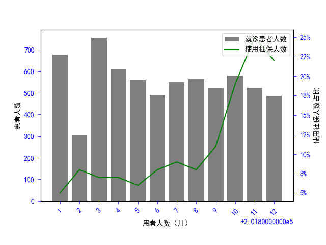
ax1.bar(df.iloc[:, 0],df.iloc[:, 1], color="black", alpha=0.5, label="就诊患者人数")
ax1.set_xlabel("患者人数(月)")
ax1.set_ylabel("患者人数")
# label下边界
ax2 = ax1.twinx()
# 折线图
ax2.plot(df.iloc[:, 0],df.iloc[:, 4], color="green", label="使用社保人数")
ax2.yaxis.set_major_formatter(ticker.PercentFormatter(xmax=1,decimals=0))
ax2.set_ylabel("使用社保人数占比")
ax1.tick_params(pad=5,which='both',length=4,width=0.5,colors='blue',labelsize='medium')
ax2.tick_params(pad=5,which='both',length=4,width=0.5,colors='blue',labelsize='medium')
# 参数x空值X轴的间隔,第二个参数控制每个间隔显示的文本,后面两个参数控制标签的颜色和旋转角度
plt.xticks(rotation=45)
fig.legend(loc="upper right", bbox_to_anchor=(1, 1), bbox_transform=ax1.transAxes)
plt.subplots_adjust(bottom=0.18)
plt.show();
conn.close()


 浙公网安备 33010602011771号