

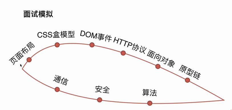
通信:跨域通信;前后端通信
安全:xss;
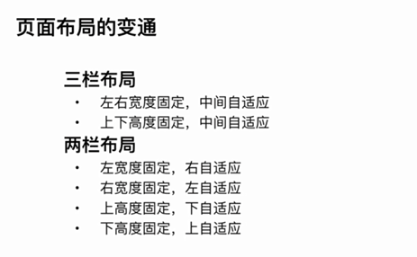
页面布局:
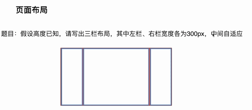
写出3种及格,目的是写出更多的解决方法
出题意图:
考察css
方案:
1.浮动
2.绝对定位
3.flexbox
4.table cell
5.网格布局 grid
提高及延伸:
1.这几种方案的优缺点
浮动:
优点:兼容性好
缺点:脱离文档流,需要处理好和周边元素的关系
绝对定位:
优点:快捷
缺点:布局脱离文档流,导致可使用性太差
flex布局:
优点:比较完美,为解决上述两种方案的缺点出现的css3特性
表格布局:
优点:很多场景很方便;兼容性好
缺点:IE8不支持;当单元格高度超出时两边会自动增加高度,根据使用场景决定
grid布局:
优点:新技术;
2.把“假设高度已知”条件去掉,需要左右高度也和中间的一致的解决方案及原因
flex和表格布局会自动撑高
3.这几种方案的兼容性
解决方案完整代码:
<!DOCTYPE html>
<html lang="en">

<head>
    <meta charset="UTF-8">
    <meta name="viewport" content="width=device-width, initial-scale=1.0">
    <meta http-equiv="X-UA-Compatible" content="ie=edge">
    <title>页面布局浮动解决方案</title>
    <style media="screen">
        html * {
            padding: 0;
            margin: 0;
        }

        .layout article div {
            min-height: 100px;
        }

        section+section {
            margin-top: 20px;
        }

        h1 {
            text-align: center;
        }
    </style>
</head>

<body>
    <!-- 浮动解决方案 -->
    <section class="layout float">
        <style media="screen">
            .layout.float .left {
                float: left;
                width: 300px;
                background-color: yellow;
            }

            .layout.float .center {
                background-color: #dcdcdc;
            }

            .layout.float .right {
                float: right;
                width: 300px;
                background-color: yellow;
            }
        </style>
        <article class="left-center-right">
            <div class="left"></div>
            <div class="right"></div>
            <div class="center">
                <h1>浮动解决方案</h1>
            </div>

        </article>
    </section>

    <!-- 绝对定位解决方案 -->
    <section class="layout absolute">
        <style media="screen">
            .layout.absolute .left-center-right>div {
                position: absolute;
            }

            .layout.absolute .left {
                left: 0;
                width: 300px;
                background-color: red;
            }

            .layout.absolute .center {
                left: 300px;
                right: 300px;
                background-color: #dcdcdc;
            }

            .layout.absolute .right {
                right: 0;
                width: 300px;
                background-color: red;
            }
        </style>
        <article class="left-center-right">
            <div class="left"></div>
            <div class="center">
                <h1>绝对定位解决方案</h1>
            </div>
            <div class="right"></div>
        </article>
    </section>

    <!-- flexbox解决方案 -->
    <section class="layout flexbox">
        <style>
            .layout.flexbox {
                margin-top: 140px;
            }

            .layout.flexbox .left-center-right {
                display: flex;
            }

            .layout.flexbox .left {
                width: 300px;
                background-color: blue;
            }

            .layout.flexbox .center {
                flex: 1;
                background-color: #dcdcdc;
            }

            .layout.flexbox .right {
                width: 300px;
                background-color: blue;
            }
        </style>
        <article class="left-center-right">
            <div class="left"></div>
            <div class="center">
                <h1>flexbox解决方案</h1>
            </div>
            <div class="right"></div>
        </article>
    </section>

    <!-- 表格布局解决方案 -->
    <section class="layout table">
        <style>
            .layout.table .left-center-right {
                width: 100%;
                display: table;
                height: 100px;
            }

            .layout.table .left-center-right>div {
                display: table-cell;
            }

            .layout.table .left {
                width: 300px;
                background-color: orange;
            }

            .layout.table .center {
                background-color: #dcdcdc;
            }

            .layout.table .right {
                width: 300px;
                background-color: orange;
            }
        </style>
        <article class="left-center-right">
            <div class="left"></div>
            <div class="center">
                <h1>表格布局解决方案</h1>
            </div>
            <div class="right"></div>
        </article>
    </section>

    <!-- 网格布局解决方案 -->
    <section class="layout grid">
        <style media="screen">
            .layout.grid .left-center-right {
                width: 100%;
                display: grid;
                grid-template-rows: 100px;
                grid-template-columns: 300px auto 300px;
            }

            .layout.grid .left {
                background-color: green;
            }

            .layout.grid .center {
                background-color: #dcdcdc;
            }

            .layout.grid .right {
                background-color: green;
            }
        </style>
        <article class="left-center-right">
            <div class="left"></div>
            <div class="center">
                <h1>网格布局解决方案</h1>
            </div>
            <div class="right"></div>
        </article>
    </section>
</body>

</html>
变通:
本文首发于Calamus的博客。


 浙公网安备 33010602011771号