
web前端学习win11
@
一、第一部分
1.1什么是HTML、CSS
介绍HTML、CSS
- HTML、CSS是制作网站的两种编程语言,一般配合使用,是网站开发的基础语言
补充:HTML的英文全称是 Hyper Text Markup Language,即超文本标记语言。用HTML编写的超文本文档称为HTML文档,它能独立于各种操作系统平台。使用HTML,将所需要表达的信息按某种规则写成HTML文件,通过标记式的指令(Tag),将影像、声音、图片、文字动画、影视等内容显示出来。,并将这些HTML文件“翻译”成可以识别的信息,即我们所见到的网页。
CSS:层叠样式表,是一种用来表现HTML或XML等文件样式的计算机语言。CSS不仅可以静态地修饰网页,还可以配合各种脚本语言动态地对网页各元素进行格式化。
-
网站是所写代码经过浏览器解析之后的效果
(在某一网页右击选择“查看页面源代码”便可查看该网页的源代码) -
网站由很多网页构成,一个网页为一个“.html文件”
-
如何写一个"html"文件
简单的:记事本: 在指定目录下新建一个文本文档
将后缀“.txt”改为”".html"
(若看不到扩展名可在上方查看中的显示中点击文件扩展名后重命名)
用记事本打开刚才的".html"文件进行编辑。

再用浏览器将其打开就可以显示自己刚才编辑的内容了。
1.2VS code
记事本编写效率低,容易出问题,所以应采用代码编辑器因此我们使用VS code代码编辑器。了解VScode的基本应用。
-
介绍:全称为Visual Studio Code,来自微软,是一款开源(免费)的轻量代码编辑器。
-
安装插件
语言包:Chinese:将界面中文字变为中文
open in browser,和view in browser:可直接在浏览器中打开网页。 -
编辑器的基本使用
保存:ctrl+s
全选:ctrl+a
剪切:ctrl+x
复制:ctrl+c
粘贴:ctrl+v
撤销:ctrl+z
前进:ctrl+y
从头选中一行:shift+end
从后选中一行:shift+home
向后缩进:tab
向前缩进:tab+shift

多光标:alt+鼠标左键
选择相同元素的下一个:ctrl+d
搜索栏:快速搜索到所有所搜内容
创建文件、文件夹、重命名、删除
设置:文件->首选项->设置(大小,是否换行 word wrap)
1.3深入了解网站开发
- 开发人员:
UI设计师:设计网页,制作设计稿
web前端开发工程师(H5开发):将设计稿写成代码,数据里的数据显示到页面,HTML+CSS
web后端开发工程师:处理数据
- 前端核心技术
HTML:结构
CSS:样式(美化)
JavaScript:与用户的交互行为
补充:JavaScript是用来做交互的,是一种脚本语言,即可以运行在客户端也能运行在服务器端。JavaScript的解释器就是JS引擎,JS引擎是浏览器的一部分。而JavaScript主要是用来扩展文档交互能力的,使静态的HTML具有一定的交互行为(比如表单提交、动画特效、弹窗等)。
二、第二部分
2.1初始代码
每一个“html"文件都需要添加初始代码。介绍VS code的基础使用。
<!DOCTYPE html>   文档申明:告诉浏览器这是一个html文件
<html lang="en">     html文件的最外层标签:包裹着所有html标签代码,lang="en"表示是一个英文网站。lang="zh-CN"表示是一个中文网站。
<head>
    <meta charset="UTF-8">    元信息:是编写网页中的一些赋值信息
    <meta http-equiv="X-UA-Compatible" content="IE=edge">
    <meta name="viewport" content="width=device-width, initial-scale=1.0">
    <title>Document</title>    设置网页标题
</head>
<body>

</body>
</html>
2.2 注释
1.写法: <!-- 注释的 内容 -->在浏览器中看不到,只能在代码中看到注释的内容。
2.意义:把暂时不用的代码注释起来,方便以后使用。对开发人员进行提示。
3.快捷键添加删除注释: ctrl+/(光标移到起始位置,不要选中)或者shift+alt+a(要选中再按)
<!-- <div> hello world</div> -->
2.3HTML语义化
根据网页中内容的结构,选择合适的HTML标签进行编写。(什么结构采用1什么样的标签)
屏幕阅读器(H5v0.12.4):提炼出当前网页的标题
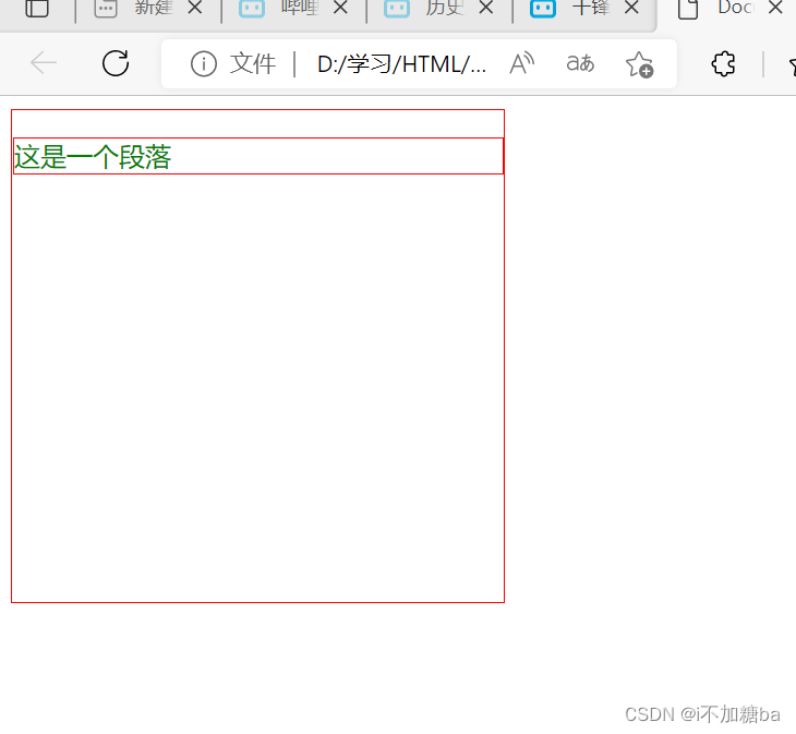
2.4标题与段落
1.h标签:标题,双标签:<h1></h1>.....<h6></h6>。 网页中,h1标题最重要,h1最大,并且一个.html文件中只能出现一次,其他的都可以有多个。
h5h6标签不经常使用
2.p标题:段落,双标签<p></p>
3.练习
<!DOCTYPE html>
<html lang="en">
<head>
    <meta charset="UTF-8">
    <meta http-equiv="X-UA-Compatible" content="IE=edge">
    <meta name="viewport" content="width=device-width, initial-scale=1.0">
    <title>Document</title>
</head>
<body>
 <h1> 吴亦凡个人简介</h1>


 <h2>   基本信息 </h2>
 <p>  涉罪加拿大籍男艺人,吴亦凡(Kris),1990年11月6日出生于广东省广州市,加拿大籍华语流行乐男歌手、影视演员、音乐制作人。</p>

   <p>2021年7月31日,经警方调查,吴亦凡因涉嫌罪被朝阳公安分局依法刑事拘留;8月10日,律师证实吴亦凡涉嫌在洛杉矶未成年女粉丝 ;8月16日,北京市朝阳区人民检察院经依法审查,对犯罪嫌疑人吴某凡以涉嫌罪批准逮捕。</p>
<h2>早年经历</h2>
<p>  吴亦凡出生于广东省广州市,父母离异后随母亲生活,10岁时和家人移民加拿大温哥华。2005年,吴亦凡在广州市第七中学读初三,在这期间,他还担任篮球队队长,参加少年NBA中国初中篮球联赛。随后,他回到加拿大,在加拿大温斯顿爵士丘吉尔中学就读;2007年,读高二的吴亦凡参加了韩国SM娱乐有限公司的全球选秀,成为练习生。 </p>


<h2>人物评价</h2>

<p>做艺先做人,做人德为先。这句话到什么时候都不过时。艺人们应该始终以此为从业的基本准则,让自己成为一个具有真善美内核的倡导者、践行者和示范者。(央视网评论员)</p>
    <p>法律面前没有顶流。人气越高越要检点自律,越当红越要遵纪守法。(《人民日报》评) </p>
    <p>法律面前人人平等,正义面前没有“顶流”!(《法治日报》评)</p>
    <p> 光环再耀眼,名气再大,均无特权。(《中国妇女报》评) </p>
    <p> 千里之堤,溃于蚁穴。失去了慎微慎独、自警自省之心,便是滋生贪婪欲望的开始;从不守规矩,到违反法律,往往也不过是一步之遥。一旦置职业道德等规矩于不顾,做人做事出格走偏就在眼前,不仅毁了个人的立身之本,而且最终会遭大众唾弃、遭市场抛弃。吴某凡被依法刑事拘留,是一声响亮警钟,“演艺圈”不容藏污纳垢,“明星”要将守规矩作为基本责任和义务,远离非法之路。(中央纪委国家监委网评)  </p>
</body>
</html>
2.5文本修饰标签
强调:
对文本进行加粗,双标签<strong></strong>
斜体,双标签,<em></em>
下标,双标签<sub></sub>
上标,双标签,<sup></sup>
删除文本,双标签,(加删除线)
插入文本,双标签,(加下划线)
(删除,插入文本一般配合使用)
练习
<!DOCTYPE html>
<html lang="en">
<head>
    <meta charset="UTF-8">
    <meta http-equiv="X-UA-Compatible" content="IE=edge">
    <meta name="viewport" content="width=device-width, initial-scale=1.0">
    <title>Document</title>
</head>
<body>
    <p>
    北京著名的高档百货店-<em>塞特购物中心</em>即将闭店,塞特购物中心总台服务人员表示<strong>“如果手中有购物卡,请尽快到店消费”</strong>根据这位工作人员介绍,目前塞特中心正在进行清仓大甩卖。<del>特价电视原价3600元</del>,<ins>现清仓价只需1300元</ins></p>
    <p>a<sup>2</sup>+b<sup>2</sup>=c<sup>2</sup>
    H<sub>2</sub>O</p>


</body>
</html>
2.6 图片标签与图片属性
图片标签,单标签,img
(快捷键:img+tab-><img src="" alt="">)
src=" ":引入图片地址
alt=" ":当图片出现问题时出现提示,提高用户体验
title=" ":鼠标移动至图片上时显示提示,移开时消失
width=" "、height=" ":单位是像素
练习
<body>
    <img src="https://pic4.zhimg.com/v2-e5f2f72671ac1133e307c324d550467b_r.jpg?source=1940ef5c" alt="天官赐福"title="天官赐福百无禁忌"width="300"height="300">
</body>

2.7 引入文件的地址路径
相对路径:
.在路径中表示当前路径(与当前文件在同一级别,在当前文件内部)
..在路径中表示上一级路径(图片所在文件夹与当前文件在同一级别)
/和\都可以用
练习
 <!--<img src="./laopo.jpg" alt="">-->
    <!-- <img src=".//hhh/laopo.jpg" alt=""> -->
    <img src="../hhh/laopo.jpg" alt="">
    (相对路径)
 <img src="C:/hhh/laopo.jpg" alt="">
 (绝对路径,盘名E:可不写)
2.8 跳转链接
链接文字地址图片
标签:<a></a>(快捷键a+herf)
属性:
href:链接地址
target:改变链接打开的方式,默认情况下在当前页面打开_self.在新窗口打开_lank
base,单标签:改变链接的默认行为,写在body当中<base targe="_blank">
练习
<!DOCTYPE html>
<html lang="en">
<head>
    <meta charset="UTF-8">
    <meta http-equiv="X-UA-Compatible" content="IE=edge">
    <meta name="viewport" content="width=device-width, initial-scale=1.0">
    <title>Document</title>
    <base taeget="_blank">       (base标签)
</head>
<body>
    <!-- <a href="http://www.baidu.com">访问百度</a> -->

      <a href="http://www.baidu.com" alt=""><img src="./hhh/laopo.jpg" alt=""></a>
     <a href="http://www.baidu.com"target="_blank">访问百度</a>
     <a href="http://www.baidu.com"target="_blank">访问百度</a> <a href="http://www.baidu.com"target="_blank">访问百度</a> <a href="http://www.baidu.com"target="_blank">访问百度</a>


</body>
</html>`
2.9 跳转锚点
快速 在当前页面内进行切换 ,切换位置 。类似书的索引。
实现一<a href="#id名"> </a>
 <body>
    <a href="#HTML">HTML</a>
    <a href="#CSS">CSS</a>
    <a href="#Javascrip">Javascrip</a>
    <h2  id ="HTML">  HTML       </h2>
    <p> hhhhhhhh</p>
    <p> hhhhhhhh</p>
    <p> hhhhhhhh</p>
    <p> hhhhhhhh</p>
    <p> hhhhhhhh</p>
    <h2 id="CSS">         </h2>
    <p> hhhhhhhh</p>
    <p> hhhhhhhh</p>
    <p> hhhhhhhh</p>
    <p> hhhhhhhh</p>
    <p> hhhhhhhh</p>
    <p> hhhhhhhh</p>
    <p> hhhhhhhh</p>
    <h2  id="Javascrip" >Javascrip        </h2>
    <p> hhhhhhhh</p>
    <p> hhhhhhhh</p>
    <p> hhhhhhhh</p>
    <p> hhhhhhhh</p>
    <p> hhhhhhhh</p>
    <p> hhhhhhhh</p>
实现二:
<a name=" "></a>
<body>
    <a href="#HTML">HTML</a>
    <a href="#CSS">CSS</a>
    <a href="#Javascrip">Javascrip</a>
    <a name="HTML"></a>        不占空间,用来做映射
    <h2> HTML       </h2>
    <p> hhhhhhhh</p>
    <p> hhhhhhhh</p>
    <p> hhhhhhhh</p>
    <p> hhhhhhhh</p>
    <p> hhhhhhhh</p>
    <a name="CSS"></a>
    <h2> CSS        </h2>
    <p> hhhhhhhh</p>
    <p> hhhhhhhh</p>
    <p> hhhhhhhh</p>
    <p> hhhhhhhh</p>
    <p> hhhhhhhh</p>
    <p> hhhhhhhh</p>
    <p> hhhhhhhh</p>
    <a name="Javascrip"></a>
    <h2>Javascrip        </h2>
    <p> hhhhhhhh</p>
    <p> hhhhhhhh</p>
    <p> hhhhhhhh</p>
    <p> hhhhhhhh</p>
    <p> hhhhhhhh</p>
    <p> hhhhhhhh</p>
</body>
2.10 特殊符号
编写文本时,会遇到无法输入的特殊符号,且多个空格不会不会被页面解析出来。因此准备了专门的代码。还可以避免产生冲突。
&+字符

如<html> -> <html>
2.11.列表
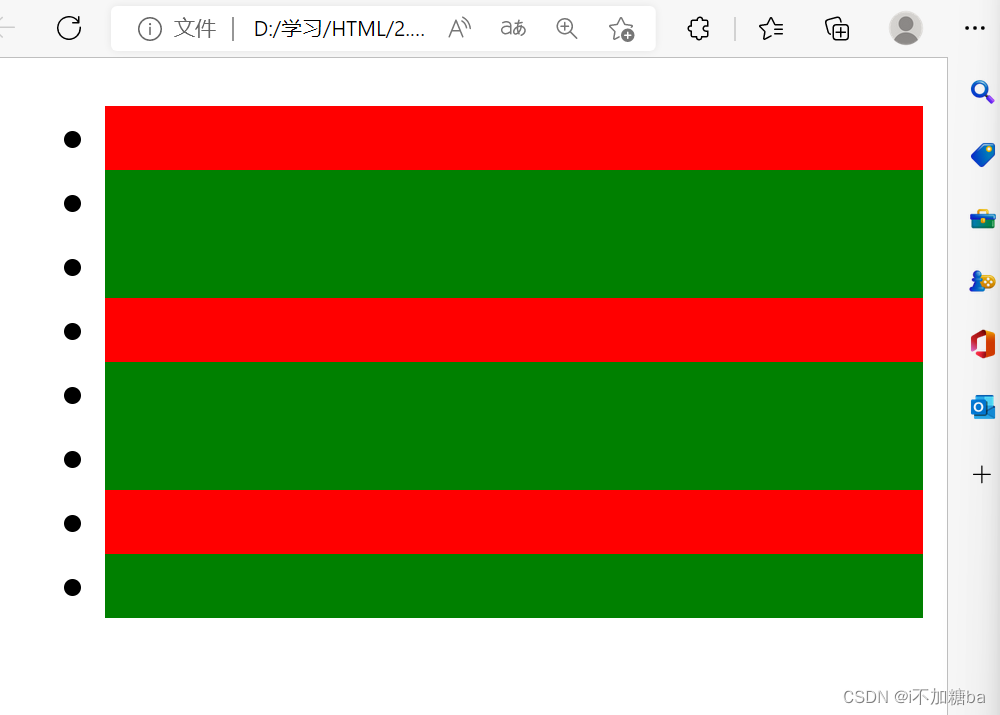
1.无序列表:ul li必须组合出现,中间不允许有其他标签)li内部可以有其他。
tupe属性:改变前面标记的样式,一般用CSS控制,查
<body>
    <ul type="circle">
        <li>第一项</li>
        <li>第二项</li>
    </ul>
</body>
2.有序列表
用的很少,可以用无序列表代替
<ol><li>
默认1.2.3,无序是点
3.定义列表
有标题和标题内容
<dl>:定义列表
<dt>:定义专业术语或名词
<dd>:对名词进行解释和描述

4.嵌套列表
列表之间可以嵌套
有序列表嵌套
<body>
<ul>
<li>辽宁省
<ul>
    <li>沈阳</li>
    <li>大连</li>
    <li>丹东</li>
</ul>
</li>
<li>山东省
    <ul>
<li>济南</li>
<li>青岛</li>
<li>烟台</li>
    </ul>
</li>
</ul>
</body>

无序列表嵌套
<dl>
    <dt>中国</dt>
    <dd>
        <dl>
            <dt>辽宁省</dt>
            <dd>沈阳</dd>
            <dd>大连</dd>
            <dd>丹东</dd>
        </dl>
        <dl>
            <dt>山东省</dt>
            <dd>济南</dd>
            <dd>青岛</dd>
            <dd>烟台</dd>
        </dl>
    </dd>
    <dt>美国</dt>
    <dd>洛杉矶</dd>
    <dd>纽约</dd>
</dl>

练习
<h1>好美味小吃</h1>
<ul>
    <li>小吃类
        <ul>
            <li>煮粉干</li>
            <Li>拌青菜</Li>
            <li>蛋炒饭</li>
            <li>煎蛋</li>
            <li>米饭</li>
        </ul>
    </li>
    <li>卤味类
        <ul>
            <li>鸭肠</li>
            <li>面筋</li>
            <li>牛肚</li>
            <li>猪耳朵</li>
            <li>猪头肉</li>
        </ul>
    </li>
</ul>
<p><em>亲,20元以上可送餐哦</em></p>

2.12 表格
1.表格标签
<table>:表格的最外层容器
<tr>:定义表格行
<th>:定义表头
<td>:定义表格单元
<caption>:定义表格标题
注:之间有嵌套关系,要符合嵌套规范
2.语义化标签:没有什么效果,要符合嵌套规范
tHead、TBody、tFood
TBody可出现多次,tFood,tHead只能出现一次
(tFood无tab快捷键)
<body>
    <table>
        <caption>天气预报</caption>
        <tHead>
            <tr>
                <th>日期</th>
                <th>天气情况</th>
                <th>出行情况</th>
            </tr>
        </tHead>
        <tBody>
            <tr>
                <td>2019年1月1日</td>
                <td>晴</td>
                <td>天气晴朗,适合出行</td>
            </tr>
        <tr>
            <td>2019年1月2日</td>
            <td>小雨</td>
            <td>有小雨,出门请带伞</td>
        </tr>
    </tBody>
    </table>
</body>

表格属性
border:表格边框(table)
cellpadding:单元格内的空间(table)
cellspacing:单元格之间的空间(table)
rowspan:合并行(th)
colspan:合并列(td)
align:左右对齐方式:left、center、right
valign:上下对齐方式:top、middle、bottom
html
<body>
    <table border="3" cellpadding="30" >
        <caption><strong>天气预报</strong></caption>
        <tHead>
            <tr align="left">     <!--一行左对齐-->
                <th colspan="2">日期</th>      <!--(colspan合并下面两列单元格 -->)
                <th>天气情况</th>
                <th>出行情况</th>
            </tr>
        </tHead>
        <tBody>
            <tr>
                 <td rowspan="2">2019年1月1日</td>       <!--(rowspan合并后面两行单元格 -->)
                <td>白天</td>
                <td>晴</td>
                <td>天气晴朗,适合出行</td>
            </tr>
            <tr>
                <td>黑天</td>
                <td>晴</td>
                <td>天气晴朗,适合出行</td>
            </tr>
        <tr>
            <td rowspan="2">2019年1月2日</td>              <!--(rowspan合并后面两行单元格 -->)
            <td>白天</td>
            <td>小雨</td>
            <td>有小雨,出门请带伞</td>
        </tr>
        <tr>
            <td>黑天</td>
            <td>小雨</td>
            <td>有小雨,出门请带伞</td>
        </tr>
    </tBody>
    </table>
</body>

2.13 表单
1.表单input标签:更加自由
form(外面)、input(输入框去)
(快捷键input+tap)
input(单标签)有一个type属性,决定是什么控件
type="text(默认)输入框、password密码框(输入显示星号)、checkbox复选框 、radio单选框、file(上传文件)、submit(提交)reset(重置)、"
<body>
    <form action="所需提交的地址"
    <h2>输入框</h2>
     <input type="text" placeholder="请输入用户名">
     <h2>密码框</h2>
     <input type="password"placeholde="请输入密码">
     <h2>复选框</h2>
     <input type="checkbox"checked>苹果
     <input type="checkbox" checked>香蕉
     <input type="checkbox"disabled>葡萄
     <h2>单选框</h2>
     <input type="radio"name="gender">男
     <input type="radio"name="gender">女
     <h2>上传文件</h2>
     <input type="file">
     <h2>提交和重置</h2>
     <input type="submit">
     <input type="reset">
</body>
**checkbox种checked为默认被选中,disabled为默认不能被选中
radio加name属性可实现只选一个
重置:所选清空
上传文件:打开文件管理选择文件
password、text中加placeholder=""属性为框中提示文字,输入时消失

2. 表单相关标签
<textarea>:多行文本框
<select>、
常见属性:
checked,name ,disabled,for....
练习
<h2>多文本框</h2>
     <textarea  cols="30"rows="10"></textarea>
     <h2>下拉菜单</h2>
     <select size="2">          <!--  默认显示选择的数量,默认为一 -->
    <!-- <option selected disabled>请选择</option> -->
     <option>北京</option>
     <option>上海</option>
     <option>杭州</option>
    </select>
    <select multiple>           <!--multiple标签可用鼠标右键多选多选-->
    <option>北京</option>
     <option>上海</option>
     <option>杭州</option>
    </select>
    <input type="file" multiple>
    <h2>单选框</h2>
     <input type="radio" name="gender" id="man"><lable for="man">男</lable>
     <input type="radio" name="gender" id="women"><lable for="women">女</lable>
2.14 表格表单的组合使用
表格表单之间可以互相组合形成数据展示效果
练习( ->空格)
<body>
<form action="">
<table border="1" cellpadding="30">
<tbody>
<tr align="center">
<td rowspan="4">总体信息</td>
<td colspan="2">用户注册</td>
</tr>
<tr align="right">
<td>用户名</td>
<td><input type="text" placeholder="请输入用户名"></td>
</tr>s
<tr align="right">
<td>密码</td>
<td><input type="password" placeholder="请输入密码"></td>
</tr>
<tr align="center">
<td colspan="2"><input type="submit"> <!-- 空格 -->
<input type="reset"></td>
</tr>
</tbody>

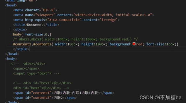
2.15 <div>、<span>标签
<div>:用来划分区域,相当于一块区域容器,可以容纳段落、标题表格、图像。大多数标签都可以嵌套在其中,还可嵌套多层,分割网页来实现网页的规划和布局。
<span>:用来修饰文字,内联
两者都没有默认样式的,需要配合CSS才行。
<body>
    <div>
        <h2> <a herf="#"></herf>【千锋教育】<span>html5</span>中国数万程序员的选择-官方渠道 </a></h2>
        <a herf="#"><img src="网址" alt=""></a>
        <p>优势:。。。。。。。。。</p>
        <a herf="#">www.</a>
    </div>
    <div></div>
</body>
2.16CSS基础语法
- 格式:选择器
- 单位:px像素(电脑1440*900)、%百分比(外容器600px,50%=300px)
- 基本样式:width、height、background-color
- 注释
/注释内容/ (快捷键:tab+/,shift+alt+a),同html)
 <style>
        div{width:100px;height:100px;background-color:red;}
        span{background-color: blue;}
    </style>
</head>
<body>
    <div>这是一个块</div>
    <div>又是一个块</div>
    <span>内联</span>
2.17CSS样式引入方式
- 内联(行内、行间)样式加在
<body>中
在html标签上添加style属性 - 内部样式
在<style>标签内添加样式,可以复用代码加在<head>中。符合w3c的标准,尽量让结构和样式分开处理
 <style>
        /* div{width:100px;height:100px;background-color: hotpink;} */
    </style>
</head>
<body>
    <div style="width:100px;height:100px;background-color: hotpink;">这是一块</div>
    <div>这是一块</div>
- 外部样式(放title中)
引入一个单独的CSS文件name.css
通过标签引入外部资源,
属性rel属性指定资源和页面的关系
herf:资源的地址
![在这里插入图片描述]()

```css
div{width:100px; height:100px; background-color:blue;}
第一种
<meta http-equiv="X-UA-Compatible" content="IE=edge">
    <meta name="viewport" content="width=device-width, initial-scale=1.0">
    <!-- <link rel="stylesheet" href="./。。.css">      映射到下面 -->
    <title>Document</title>

</head>

第二种(少用)

2.18CSS中的颜色表示法
- 单词表示法
![在这里插入图片描述]()
![在这里插入图片描述]()
- 16进制表示法
表示#000000黑 #ffffff白 #ff0000红
0 1 2 3 4 5 6 7 8 9 a b c d e f


div{backbound-color:#000000;}
3.rgb 三原色表示法
rgb(数字,数字,数字)0~255
获取颜色ps
练习
<body>
    <div style="width:100px;height:100px;background-color: red;"></div>
    <div style="width:200px;height:150px;background-color:blue;"></div>
</body>

2.19背景样式

- 背景url
写法 (./相对路径)
2.平铺方式
repeat-x x轴平铺
repeat-y y轴平铺
repeat(x,y都进行平铺)默认
no-repeat 都不平铺
div{background-color:...;background-image:url(./....);background-repeat:repeat-x;}
-
背景位置
距离左上角X,Y:数字,单词
数字background-position:100px 50px;
单词x:left、center、right
y:top、center、bottom
如.background-position:right bottom; -
背景图随滚动条的移动方式
background-attachment:scroll
scroll:默认值随着滚动条动(背景位置是按照当前元素进行偏倚的)
fixed:固定(背景位置是按照当浏览器进行偏倚的)
body{height: 200px;}(滚动条) -
背景实现视觉差效果
3个div样式不同,要加id
<style>
#div1 {width:1400px;height:800px;background-image:url(./IMG_20221017_204554.jpg) ;background-attachment: fixed;}
#div2 {width:1400px;height:800px;background-image:url(./IMG_20221017_204624.jpg) ;background-attachment: fixed;}
#div3 {width:1400px;height:800px;background-image:url(./IMG_20221017_204645.jpg) ;background-attachment: fixed;}
</style>
</head>
<body>
<div id="div2">
<form action="">
<table border="1" cellpadding="30">
<tbody>
<tr align="center">
<td rowspan="4">总体信息</td>
<td colspan="2">用户注册</td>
</tr>
<tr align="right">
<td>用户名</td>
<td><input type="text" placeholder="请输入用户名"></td>
</tr>s
<tr align="right">
<td>密码</td>
<td><input type="password" placeholder="请输入密码"></td>
</tr>
<tr align="center">
<td colspan="2"><input type="submit"> <!-- 空格 -->
<input type="reset"></td>
</tr>
</tbody>
</table>
</form>
</div>
<div id="div2">内容
</div>
<div id="div3">
<table border="3" cellpadding="30" >
<caption><strong>天气预报</strong></caption>
<tHead>
<tr align="left"> <!--一行左对齐-->
<th colspan="2">日期</th> <!--(colspan合并下面两列单元格 -->)
<th>天气情况</th>
<th>出行情况</th>
</tr>
</tHead>
<tBody>
<tr>
<td rowspan="2">2019年1月1日</td> <!--(rowspan合并后面两行单元格 -->)
<td>白天</td>
<td>晴</td>
<td>天气晴朗,适合出行</td>
</tr>
<tr>
<td>黑天</td>
<td>晴</td>
<td>天气晴朗,适合出行</td>
</tr>
<tr>
<td rowspan="2">2019年1月2日</td> <!--(rowspan合并后面两行单元格 -->)
<td>白天</td>
<td>小雨</td>
<td>有小雨,出门请带伞</td>
</tr>
<tr>
<td>黑天</td>
<td>小雨</td>
<td>有小雨,出门请带伞</td>
</tr>
</tBody>
</table>
</div>
</body>
2.20CSS边框样式
- border-style:边框样式
solid:实线
dashed:虚线
dotted:点线 - border-width:边框大小(px)
- border-color:边框颜色(三种方法)
<style>
        div{width:300px; height:300px;border-style:dashed;border-color: rgb(225, 196, 255);border-width: 30px;}
    </style>
</head>
- 针对某一条边单独设置
如border-right-style:dotted;中间为方向left、right、top、bottom
练习
<style>
        div{width:1px; height:1px;    <!--中间块大小-->
       border-top-color:black;
       border-top-style:solid;
       border-top-width:30px;
       border-right-style:solid;
       border-right-width:30px;
       border-right-color:red;
       border-left-style:solid;
       border-left-width:30px;
       border-left-color:green;
       border-bottom-color:yellow ;
       border-bottom-style:solid ;
       border-bottom-width:30px;
        }
</style>
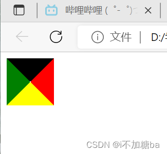
将三条边改为白色或透明色(transparent)(->三角形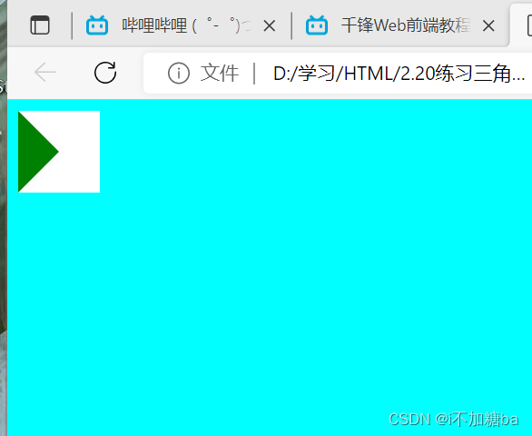
2.21CSS文字样式
-
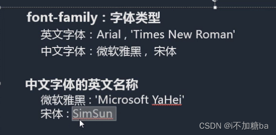
font-family:字体类型
英文字体:Arial、Times New Roman
中文字体:微软雅黑(默认),宋体,黑体....
中文字体有英文名称![在这里插入图片描述]()
-
衬线体和非衬线体
衬线体有棱角,非衬线体无
![在这里插入图片描述]()
注意点
多字体:字体通过,逗号隔开,电脑依次识别,显示计算机有的第一个字体。
font-family:....,....,.....;
引号字体名中有空格必须加引号 -
font-size文字大小
默认:16px,用像素设置
单词设置(不推荐使用)
*字体大小一般为偶数能更好实现文字大小等 -
font-weight字体粗细
写法:单词normal正常 bold加粗
数字100~900的整数 , 实际上100500为正常,500900为加粗 -
font-style字体样式
模式:
正常normal
斜体italic,oblique
italic:有倾斜属性的字体才可以设置
oblique:都可以(很少用) -
颜色color

2.22CSS段落样式
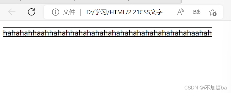
- text-decoration:文本装饰(不要加在div{}里
- 下划线underline
删除线line-through
上划线overline
不加任何装饰:none
添加多个装饰 用空格隔开
 <style>
        /* p{width:300px;text-decoration:underline;} */
        p{width: 300px;text-decoration: underline overline line-through;}
    </style>
</head>
<body>
        <p>hahahahhaahhahahhahahahahahahahahahahahahahahaahah</p>
</body>
- text-tranform文本大小写
针对英文段落
- 大写uppercase
- 小写lowercase
- 首字母大写capitalize
p{width: 300px;text-transform: uppercase;}
- text-indent文本缩进
- px:首行缩进。。px(一个字默认为16px)
- em:相对单位,与设定的像素大小同
- 英文与中文不同
p{text-indent: 36px;}
p{text-indent: 2em;}
-
text-align文本对齐方式
对齐方式:right,left,center,justify(两端点对齐) -
line-height定义行高
- 组成:上边距,字体大小,下边距(上下相等)
- 默认行高不是固定值,根据字体大小而变化
- 用px,比例值
p{line-height:30px;}
p{line-height:2;}文字的两倍
- 其他
- letter-spacing字之间的间距 px
- word-spacing词之间的间距的(针对英文)px
- 强制折行(英文,数字单词很长时不会自动折行)
![在这里插入图片描述]() 2会产生一些空白
2会产生一些空白
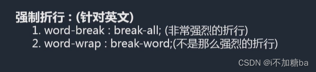 2会产生一些空白
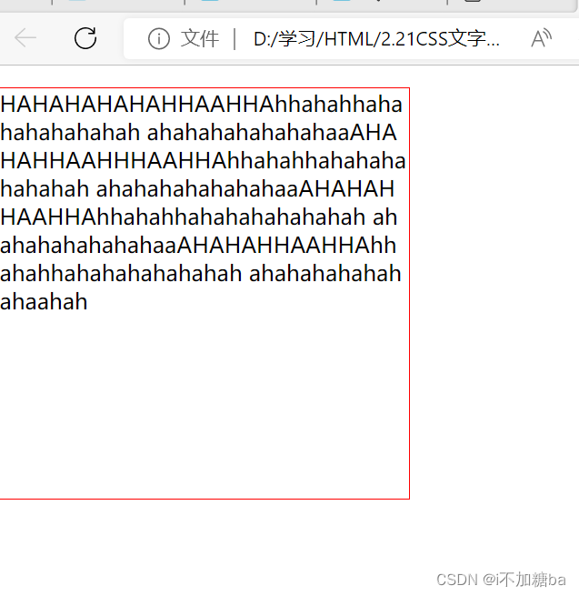
p{width:300px;height:300px;border:1px solid red}

 p{width:300px;height:300px;border:1px solid red;word-break: break-all;}
    </style>
</head>
<body>
        <p>HAHAHAHAHAHHAAHHAhhahahhahahahahahahah
            ahahahahahahahaaAHAHAHHAAHHHAAHHAhhahahhahahahahahahah
            ahahahahahahahaaAHAHAHHAAHHAhhahahhahahahahahahah
            ahahahahahahahaaAHAHAHHAAHHAhhahahhahahahahahahah
            ahahahahahahahaahah</p>
</body>
- 练习
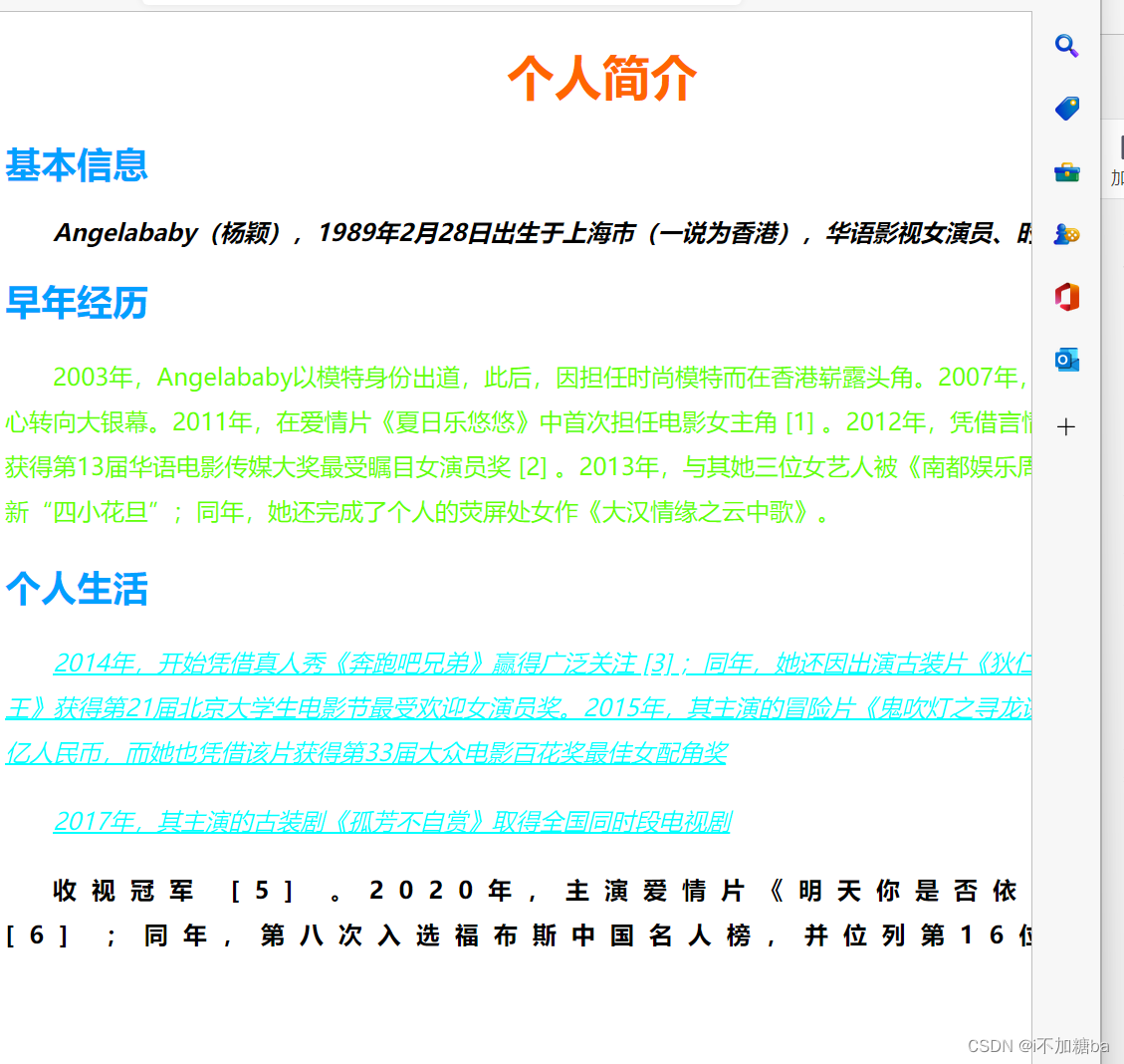
<style>
        div{width: 800px;}
        h1{text-align: center;color: #ff6600;}
        h2{color: #00a0ff;}
        #p1{font-style: italic;font-weight: bold;text-indent: 2em;}
        #p2{color:#66ff00;line-height: 30px;text-indent: 2em;}
        #p3{color: #00ffff;line-height: 30px;text-indent:2em; text-decoration: underline;font-style: italic;}
        #p4{font-weight: bold;letter-spacing: 10px;line-height: 30px;text-indent: 2em;}
    </style>

</head>
<body>
    <div>
        <h1>个人简介</h1>
        <h2>基本信息</h2>
        <p id="p1">Angelababy(杨颖),1989年2月28日出生于上海市(一说为香港),华语影视女演员、时尚模特。</p>
        <h2>早年经历</h2>
        <p id="p2"> 2003年,Angelababy以模特身份出道,此后,因担任时尚模特而在香港崭露头角。2007年,开始将工作重心转向大银幕。2011年,在爱情片《夏日乐悠悠》中首次担任电影女主角 [1]  。2012年,凭借言情片《第一次》获得第13届华语电影传媒大奖最受瞩目女演员奖 [2]  。2013年,与其她三位女艺人被《南都娱乐周刊》选为新“四小花旦”;同年,她还完成了个人的荧屏处女作《大汉情缘之云中歌》。</p>
        <h2>个人生活</h2>
        <p id="p3"> 2014年,开始凭借真人秀《奔跑吧兄弟》赢得广泛关注 [3]  ;同年,她还因出演古装片《狄仁杰之神都龙王》获得第21届北京大学生电影节最受欢迎女演员奖。2015年,其主演的冒险片《鬼吹灯之寻龙诀》票房突破16亿人民币,而她也凭借该片获得第33届大众电影百花奖最佳女配角奖</p>
         <p id="p3">2017年,其主演的古装剧《孤芳不自赏》取得全国同时段电视剧</p>
        <p id="p4">收视冠军 [5]  。2020年,主演爱情片《明天你是否依然爱我》 [6]  ;同年,第八次入选福布斯中国名人榜,并位列第16位。 </p>
    </div>
</body>
2.23CSS复合样式
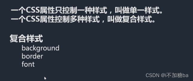
- 写法
- 各种属性通过空格隔开
- 不需要关心顺序:background,border,
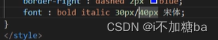
- 需要关心顺序:font
font:最少要有两个值size,family(顺序固定
只写一个或顺序错误都不能显示)
weight style size family (对)
前两个可不按顺序,siza family 写最后
weight style size/line-height family (对)
![在这里插入图片描述]()
- 不要混写,一定要的话先写复合样式再写单一样式
2.24CSS选择器
- id选择器
要写#才能找到
<p id="p1">Angelababy(杨颖),1989年2月28日出生于上海市(一说为香港),华语影视女演员、时尚模特。</p>
- id相同可以找到多个,但不符合规范
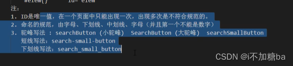
id是唯一值,多个不符合规范 - 取名规范
![在这里插入图片描述]()
快捷键:div#名字+tab
- CLASS选择器
- .名字{} class="名字"
- 可以复用
可以添加多个class样式 - 可通过谷歌控制台查错
- 多个样式时,按CSS中的样式识别
- 标签+类的写法
p.box{ 属性 属性}对p标签的box生效
<style>
        /* div{width: 300px;height: 300px;
        background: red url(./IMG_20221017_204554.jpg) no-repeat} */
        .box{}
        .box{}
    </style>
</head>
<body>
    <div class="box">一块</div>
    <div class="box">有一块</div>
</body>
- 标签选择器(分组选择器)
div{} ->选中所有的<div></di>标签
- 使用:去掉某些标签的默认样式时
复杂选择器中,如层次选择器
- 群组选择器
通过逗号的方式,给多个不同的选择器添加统一的css样式,来实现代码的复用,与分开用效果相同
<style>
        /* div{background-color: aqua;}
        #text{background-color: aqua;}
        .title{background-color: aqua;} */
        div, #text,.title{background-color: chartreuse;}
    </style>
</head>
<body>
    <div>第一个快</div>
    <p id="text">这位是一个段落</p>
    <h2 class="title">这是一个标题</h2>

</body>
- 通配选择器
给所有标签加同样样式
- 尽量避免使用
- 使用:去掉所有标签的默认样式
*{border: 1px red solid;}
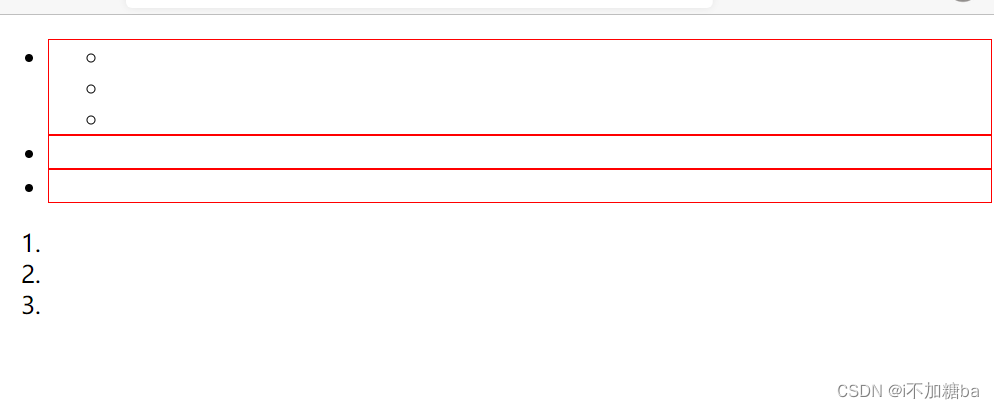
- 层次选择器
- 后代M N{}(中间空格)
在M中(里面的)寻找N加样式,起筛选作用
   #list li{border: red 1px solid;}
  .......
    <ul id="list">
        <li>
            <ul>
                <li></li>
                <li></li>
                <li></li>
            </ul>
        </li>
        <li></li>
        <li></li>
    </ul>
    <ol>
        <li></li>
        <li></li>
        <li></li>
    </ol>

(包括li中的ul中的li,可用id选择器选择)
-
父子M>N{}
只对下一代有用,再后面没用
#list> li{border: red 1px solid;}
![在这里插入图片描述]()
-
兄弟M~N{}
当前M下的所有兄弟N标签(与
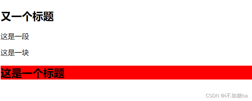
div~h2{background: red;}
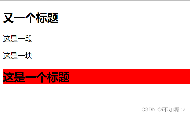
- 相邻 M+N{}
当前M下面的相邻的N标签
div+h2{background: red;}
........
 <h2>又一个标题</h2>
    <p>这是一段</p>
    <div>这是一块</div>
    <h2>这是一个标题</h2>
- 属性选择器
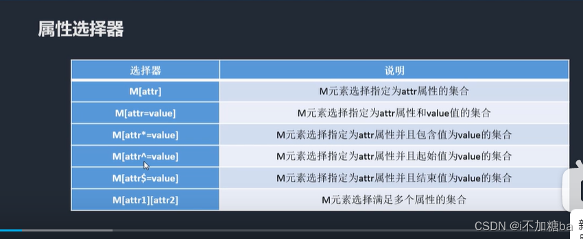
- M[属性]{}
如div[class]{background: red;}
=:class后可再加具体的如 div[class="box"]{background: red;}(完全匹配才行)
=: div[class*="search"]{background: red;}(有box就行)表示部分匹配
^=:起始匹配,起始位置是search
$=:结束匹配,结束位置是search
[][][]组合匹配:div[class][id]{background: red;}:既有class属性又有id属性才有效果
- 伪类选择器
- 实现一些特殊的功能,一般用于初始样式添加不上的时候
- M:伪类{}
a:link 访问前的样式(只能添加给a标签)
a:visited 访问后的样式(只能添加给a标签)
:hover 鼠标移入时改变样式(可以添加给所有的标签)
:active 鼠标按下改变的样式(可以添加给所有的标签)
注:一般网站都只设置
a{}和a:hover{}
- 例
hover
 <style>
        div{ width:200px; height: 200px;background:red ;}
        div:hover{background: blue;}
        div:active{background: green;}

    </style>
</head>
<body>
    <div></div>
</body>
红->蓝->绿
        a:link{color:red;}
        a:visited{color:blue;}
        a:hover{color: green;}
        a:active{color:yellow
         <a href="">这是一个链接 </a>
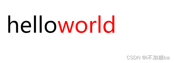
- :after,:before:通过伪类的方式给元素添加一个文本内容,使用content属性
div:after{content: "world";color: red;}
<div>hello</div>
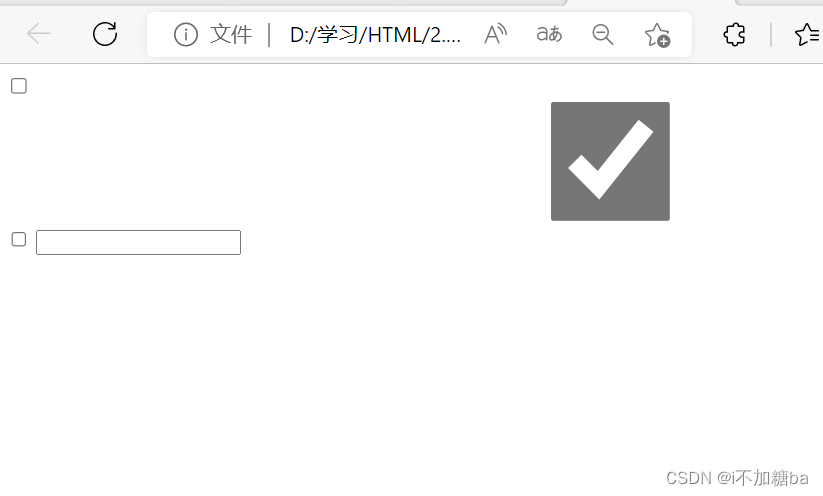
- 针对表单元素的
:checked
:disabled
:focus
:checked{width:1000px;height: 100px;}
        :focus{background: red;}
<input type="checkbox">
    <input type="checkbox" checked>
    <input type="checkbox">
    <input type="text">
- 结构性伪类选择器
nth-of-type() nth-child()
角标是从1开始的,1表示第一项,2表示第2项,n值表示从0到无穷大
利用n做隔行换色的需求
(n):所有项
(2n)偶数项
(2n+1)奇数项
练习
(1)
<style>
        li:nth-of-type(3){background: red;}
    </style>
</head>
<body>
    <ul>
        <li></li>
        <li></li>
        <li></li>
        <li></li>
        <li></li>
    </ul>
</body>
(2)隔行换色
 li:nth-of-type(3n-2){background: red;}
        li:nth-of-type(3n-1){background: green;}
        li:nth-of-type(3n){background:green;}
first-of-type第一个
last-of-type最后一个
only-of-type只有一个的时候才有效果
li:first-of-type{background: red;}
区别
type:第n个li
child:第n个东西,可能不是li,就无效果
div:only-of-type{background:green;}
        /* li:nth-child(2){background: red;} */

    </style>
</head>
<body>
    <ul>
        <li></li>
        <div>aaaa</div>
        <li></li>
        <li></li>
        <li></li>
        <li></li>
        <li></li>
        <li></li>
        <li></li>
    </ul>
</body>
有效果,两个div无效果
2.25CSS样式继承
文字相关的样式可以被继承,布局相关的不可以
div{width:300px ;height: 300px; color:green ;border:1px red solid;}
    </style>
</head>
<body>
    <div>
        <p>这是一个段落</p>
    </div>
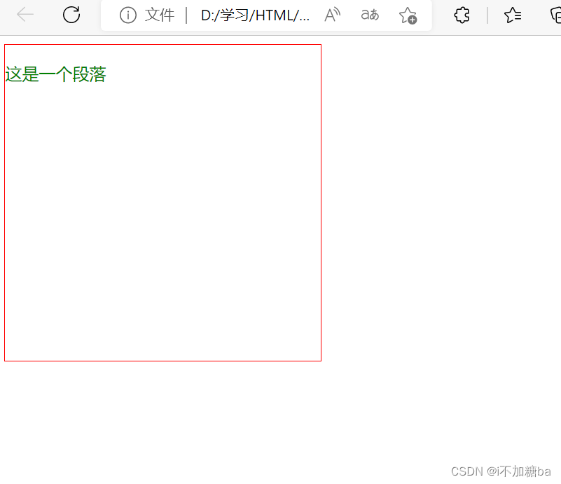
div中的文字样式如color可以被副元素继承,布局不能(默认,但可以设置继承属性inherit)
- 绝大多数样式都有inherit值
<style>
        div{width:300px ;height: 300px; color:green ;border:1px red solid;}
        p{border: inherit;}
    </style>
</head>
<body>
    <div>
        <p>这是一个段落</p>
    </div>
</body>
2.26CSS优先级
通过不同的选择器设置样式,显示谁
1. 相同样式优先级
当设置的样式相同时,后面的优先级较高,但不建议出现重复样式设置的情况
2. 内部样式与外部样式
内部样式与外部样式优先级相同,如果都设置了相同样式,后写的引入方式优先级高
外部引入<link rel="stylesheet" href="./">
3. 单一样式优先级
style行间>id>class>tag>*>继承
- 权重1000,100,10,1......
 <style>
    #elem{color: red;}        /*id*/
    .box{color:blue}          /*class*/
    div{color: green;}        /*标签*/
    *{color:gold}             /*通配*/
    body{color:blueviolet}    /*继承*/
    </style>
    <link rel="stylesheet" href="./">   外部样式
</head>
<body>
    <!-- <div id="elem" style="color: blue; ">这是一个块</div>             /*style行间*/ -->
    <div class="box">这是一个块</div>
</body>
4. 优先级改变
-
!important:提神样式优先级,非规范写法,尽量不用(无法让继承的属性提高优先级)
如div{color: green !important;} -
标签+类与单类
标签加类高于单类
如.box{color:} < div.box{color:} -
群组优先级
(选择器相同)群组选择器与单一选择器的优先级相同,靠后写的优先级高。
5. 层次优先级 (层次选择器)
层次:如ul,li,.box,p,input
- 权重比较
用权重的累加进行比较
如ul,li,.box,p,input{}=1+1+10+1+1
< .hello,span,#elem{}=1+10+100
100个1也<10(等级不一样) - 约分比较
如 ul,li,.box,p,input{} >>>> li,p,input
.hello,span,#elem >>>>>>#elem
注:层次选择器尽量三层以内
2.27CSS盒子模型
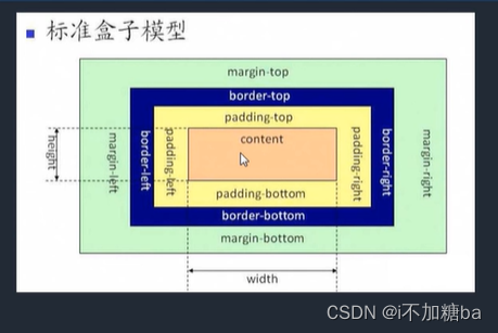
1. 组成(内到外):content(物品)->padding(填充物)->border(包装盒)->margin(外填充,盒子与盒子之间的间距)
-
content:内容区域 width和height组成的
-
padding:内边距(内填充)
number:30px
写一个值:30px上下左右
写两个值:10px 上下、左右
写四个值:30px,40px,50px,60px上右下左
#box{width: 100px;height: 100px;background: red;border: 10px blue solid;padding-left: 10px ;}
单一样式(只能写一个值) padding-left:设置左内边距(right,top,bottom)
![在这里插入图片描述]() padding为蓝黄间的部分
padding为蓝黄间的部分 -
margin:外边距(外填充)盒子间的间距
如#box{width: 100px;height: 100px;background: red;border: 10px blue solid;padding-left: 10px ;margin:10px}
用法同内填充
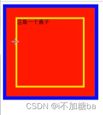 padding为蓝黄间的部分
2. 注意
- 背景颜色会填充到marign以内的区域(不包括)margin
- 文字在content区域添加
- padding不能为复数,margin可以让两个盒子重合
3. box-sizing
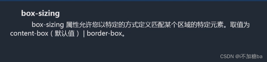
解释:盒尺寸,可以改变盒子模型的展示形态
如height.width如何分配
-
contect-box:width,height->content(默认)
border-box:width,height->content,padding,border -
用处:
(1)不用再计算一些值,如计算如何让分配大小
(2)解决一些百分比的问题
如
 input{width: 100%;padding:30px}
    </style>
    <body>

     <div id="box盒子">这是一个</div>
     <input type="text">
因为有padding会出现滚动条,改成,就不会了(不用进行CSS计算)
4. 盒子模型的问题
- margin的叠加
上下边距都存在时,左右不存在这种问题
如
<style>
    #box1{width: 200px;height: 200px;background: red;margin-bottom: 30px;}
    #box2{width: 200px;height: 200px;background: blue;margin-top: 30px;}
    </style>
</head>
<body>
    <div id="box1"></div>
    <div id="box2"></div>
</body>
边距不会变为30+30=60,仍然是30
根据大的那一方来
解决(1)BFC规范
(2)调整数值吧就,尽量只给一个元素添加边距
- margin传递
出现在嵌套的结构中,只是针对margin-top的问题(别的没有)
![在这里插入图片描述]()
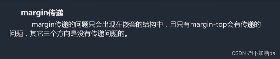
 <style>
        #box1{width: 200px;height: 200px;background: red;}
        #box2{width: 100px;height: 100px;background:blue;margin-top: 100px;}

    </style>

</head>
<body>
    <div id="box1">
        <div id="box2"></div>
    </div>
</body>
对小块进行magrin-top效果,大块也进行了位置变化
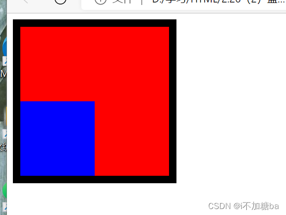
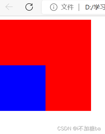
解决:
(1)BSC
(2)给父容器加边框
<style>
        #box1{width: 200px;height: 200px;background: red;border: 10px black solid;}
        #box2{width: 100px;height: 100px;background:blue;margin-top: 100px;}

    </style>

</head>
<body>
    <!-- <div id="box1"></div>
    <div id="box2"></div>  -->
    <div id="box1">
        <div id="box2"></div>
    </div>
</body>
(3)将margin换为padding
加在父容器上并重新算高度
<style>
        #box1{width: 200px;height: 100px;background: red;padding-top: 100px;}
        #box2{width: 100px;height: 100px;background:blue;}

    </style>
5. 盒子模型扩展
-
margin的自适应:auto,无论屏幕大小,上下不行
右边自适应,靠最左margin-right: auto;
左边自适应,靠最右margin-left: auto;
左右自适应,居中margin-right:auto;margin-left: auto; -
不设置content的现象
width,height不设置时对盒子模型的影响
width不设置时,加border,padding等时width会自动计算并铺满父容器
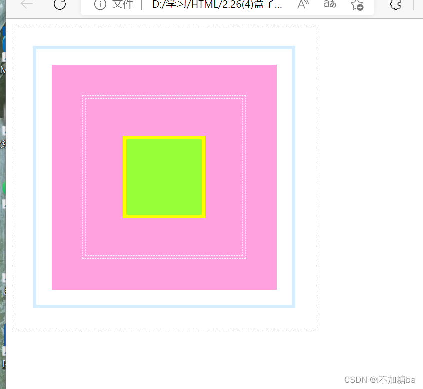
- 嵌套练习
<style>
      #box1{width:350px ;height: 350px;border: 1px black dashed;padding: 27px;}
      #box2{border: 5px solid #d7effe;padding: 20px;}
      #box3{background: #ffa0df;padding: 41px;}
      #box4{border: 1px dashed white;padding: 3px;}
      #box5{border: 1px dashed white;padding: 49px;}
      #box6{width:100px; height:100px;background: #96ff38; border: 5px solid #fcff00; }


    </style>
</head>
<body>
    <div id="box1">
        <div id="box2">
            <div id="box3">
                <div id="box4">
                    <div id="box5">
                        <div id="box6"></div>
                    </div>
                </div>
            </div>
        </div>
    </div>
</body>
第三部分
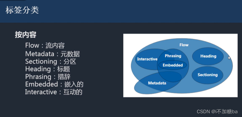
3.1 标签分类
1. 按类型划分标签
-
block块:
(1)独占一行,不会有两个块在一行
(2)支持所有样式
(3)不写宽时与父元素的宽相同
(4)所占区域为矩形
如. div,p,ul,li,h... -
inline内联:
(1)挨在一起,可以多个一行
(2)有些样式不支持
(3)不写宽时,宽度有内容决定
(4)所占区域不一定为矩形,根据内容来
(5)内联标签间有空隙,原因:换行产生
如 span,a,em,strong,img.....
img特别支持宽高 -
注:用div布局,修饰文本用内联,所以没关系
解决:
![在这里插入图片描述]()
-
inline-block:基本为表单
具备内联和块的特性
(1)挨在一起,支持宽高
(2)不能折叠,保持矩形结构
如 input,select...
-
按显示划分标签
![在这里插入图片描述]()
-
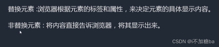
替换元素
如****img,input -
非替换元素
如h,div,p -
显示框类型display
改变显示框的默认类型
display:block/inline/inline-block/none;
display:none表示不显示
(区别none不占空间的隐藏
visibility:hidden;占空间的隐藏)
3.2标签嵌套规范
-
要按规范的一些
如 ul、li
dl、dt、dd
table、tr、td -
块标签可以嵌套内联标签
-
块标签不一定能嵌套块标签
大部分都可以,特殊如p标签不可以 -
内联标签大部分不能嵌套块标签
特殊如a嵌套div可以,因为规定a是透明的,会显示div中的内容
<a herf="#">
<div></div>
</a>
- a中不能嵌套a
3.3溢出隐藏overflow
visible:默认,内容多时会溢出
hidden:隐藏,到了边界直接切掉
scroll:不管内容多少都会出现滚动条
auto:内容多才会显示滚动条
x轴,y轴:overflow-x/y:.....针对x,y轴分别设置
3.4透明度与手势
1. 透明度
-
opacity
0(透明)~1(不透明)
0.5半透明- 透明是也占空间
- 所有的子空间也会透明
-
rgba
rgba():0~1(最后一个数字)- 可以让指定的样式透明, 不影响子空间
- 手势cursor(鼠标样式)
- default:默认箭头
- pointer:手型
- move:可移动
- help:箭头加问号
- 自定义
准备图片.cur、.ico格式
cusor:url(./......),auto;
3.5最大、最小宽高
宽高会自适应
min:框最小的值,会自己变大
max:框最大的值,会自己变小,太多依然溢出
- min-width、max-width
- min-height、max-height
注:强化对百分比的理解
换算:百分比以父容器的大小进行换算
父容器没有大小时就都没有了(爷爷不行)
- 一个容器怎么适应屏幕的高
html,body{height:100%;}
.contrainer{height:100%;}
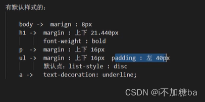
3.6 CSS默认样式
有些标签有默认样式,有些标签没有
- 没有
div、span...
2.有
body、h、p、ul...
![在这里插入图片描述]()
3.7CSS重置样式reset
-
*{margin:0;padding:0;}
优点:不用考虑哪些标签有默认的margin、padding
缺点:稍微的性能影响,效果无影响
-
单独提出来去掉默认样式
body,p,h1,ul -
ul{list-style:none;}去点
-
链接默认为蓝色且有下划线,改变:
a{text-decoration:none;color:....}
a:hover{text-decoration:underline;color}
鼠标移入时
5.图片插入时与容器底有空隙,因为对齐方式是按文字基线而不是底线
img{vertical-align:baseline基线对齐默认}
bottom:底线对齐
将图片转为块display:block;
- 写具体页面时
写结构->CSS重置样式->写具体样式
3.8float浮动
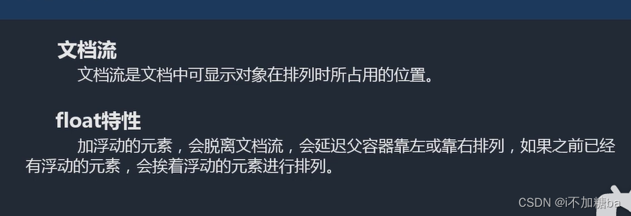
-
文档流 :结构的排列方式
-
float浮动
![在这里插入图片描述]()
![在这里插入图片描述]()
{float:left/.....}沿着父容器浮动不会影响父容器
都脱离文档流,边框变为一条线 -
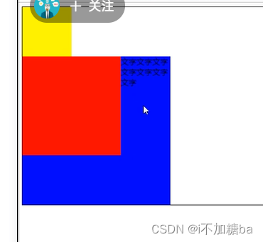
注意点
- 只会影响后面的元素,对浮动前的不造成任何影响
- 内容默认提升半层
文字不会跑到红色中,形成图文混排效果
![在这里插入图片描述]()
- 加了float默认宽根据内容决定,不加时宽默认同body
- 换行换列
浮动的元素在父容器下排列不下的时候,会自动折行 - 主要给块元素添加,但也可以给内联元素添加
- 清除浮动
要多个浮动元素不受影响要清浮动
-
上下排列:clear属性,表示清除浮动的left、right、both(左、右)(浮动的块依然浮动在文档流外)
clear:left..... -
所有块脱离文档流,父容器会变成一条线
解决:
(1)固定父容器宽高
(不推荐,因为不能自适应)
(2)父元素浮动
让父容器浮动和子元素在同一层,但也会影响后面的元素(不推荐)
(3)overflow:hidden(BFC规范)
如果有子元素溢出会受到影响,会把溢出的内容截掉
(4)display:inline-block(BFC)也会影响后面元素(不推荐)
(5)设置空标签
好,但不推荐,会多添加一个标签
.clear{clear:both;}
<div class="clear"></div>
(6)after伪类(推荐)
空标签的加强版
.clear:after{content:;clear:both;display:block}
父容器<div class="clear"></div>
可将content看作一个空标签
注:clear属性只会操作块标签,对内联标签不起作用,所以加display
- 练习
<head>
    <meta charset="UTF-8">
    <meta http-equiv="X-UA-Compatible" content="IE=edge">
    <meta name="viewport" content="width=device-width, initial-scale=1.0">
    <title>Document</title>
    <style>
        * {margin: 0;padding: 0;}    /*去默认样式*/
        ul{list-style: none;}
        img{display: block;}
        a{text-decoration: none;color: #666;}
        h1,h2,h3{font-size: 16px;}
        .l{float:left}
        .r{float: right;}
        .clear:after{content:"" ;display: block;clear: both;}
        #main{width: 360px; margin: 20px auto;}
        #main.title{height: 23px;line-height: 23px;font-size: 12px;font-weight: bold;padding-left: 30px;background:url(./....) no-repeat 6px 4px, url(./)repeat-x;}   /*写了宽度加padding块会变大*/
        #main ul{overflow: hidden;margin-top: 113px;}
        #main li{margin-bottom: 22px;}
        #main .pic{width: 99px;border: 1px solid #c8c4d3;}
        #main .pic img{margin: 2px;}
        #main .content{width: 240px;font-size: 12px;margin-left: 13px;}
        #main .content h2{font-size:12px ;line-height:24px ;}
        #main .content p{ font-size: 12px; ;  line-height:20px ;}


    </style>
</head>
<body>
    <div id="main">
        <h2 class="title">外媒精选评论</h2>
        <ul>
            <li class="clear">
                <div class="l pic">
                    <a herf="#">
                        <img src="./屏幕截图 2022-11-03 200921.png" alt="">
                    </a>
                </div>
                <div class="l content">
                    <h2>测试标题测试标题测试标题</h2>
                    <p>测试段落测试段落测试段落测试段落测试段落测试段落测试段落测试段落测试段落测试段落测试段落测试段落。。。。
                      <a href="#">[详细]</a>
                    </p>
                </div>
            </li>
            <li class="clear">
                <div class="l pic">
                    <a herf="#">
                        <img src="./屏幕截图 2022-11-03 200921.png" alt="">
                    </a>
                </div>
                <div class="l content">
                    <h2>测试标题测试标题测试标题</h2>
                    <p>测试段落测试段落测试段落测试段落测试段落测试段落测试段落测试段落测试段落测试段落测试段落测试段落。。。。
                      <a href="#">[详细]</a>

                    </p>
                </div>
            </li>
        </ul>
    </div。
</body>
3.9css定位
position特性
css position 属性用于指定一个元素在文档中的定位方式。top、right、bottom、left
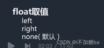
position取值
static(默认):没有/静态定位
relative:相对定位
absolute:绝对定位
fixed:固定定位
sticky:粘性定位
(用margin设置会影响下面的块,很麻烦)
- relative 相对定位
(原来的相对于现在的位置偏哪,偏多少)
-
如果没有定位偏移量,对元素本身没有任何影响。
#box1{width: 100px;height: 100px;background: red;position:relative;} -
不使元素脱离文档流(原来所在的位置依然存在,所以下面的块不会被影响)
-
不影响其他元素布局
-
left、top、right、bottom是相对于当前元素自身进行偏移的。
#box2{width: 100px;height: 100px;background: blue;position: relative; left: 100px;top: 100px;}
- absolute绝对定位
每个方向指该条边与容器的距离,如left:150px;只左边距容器左边为100px
-
使元素脱离文档流(类似浮动)
如#box1{width: 100px;height: 100px;background: red;position: absolute;}
![在这里插入图片描述]()
-
使内联元素支持宽高(让内联具备块特性)
-
使块元素默认宽根据内容决定(让块元素具备内联的特性)
![在这里插入图片描述]()
-
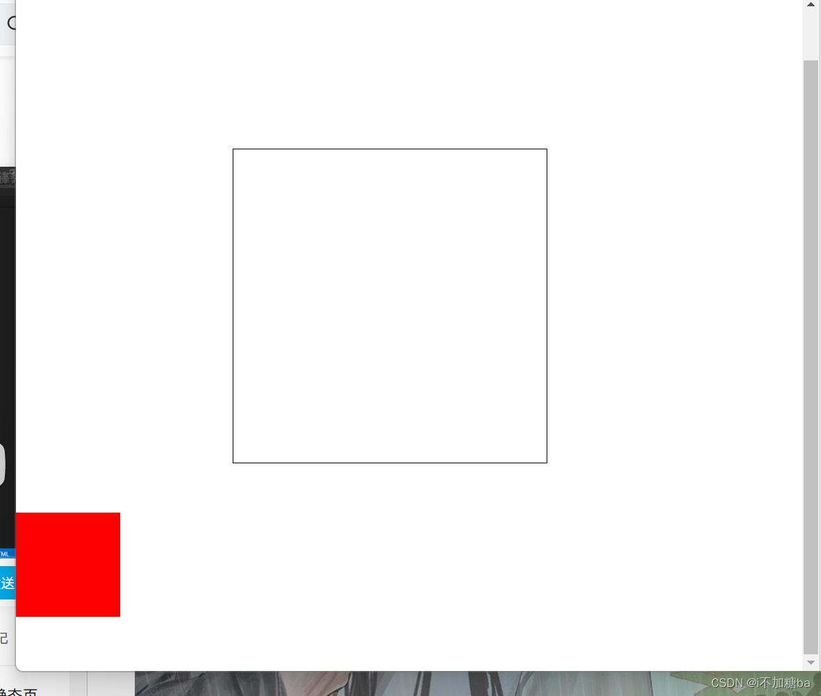
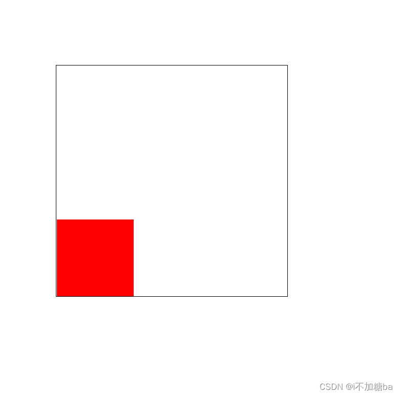
如果有定位(相对或绝对或固定)祖先元素(随便一个祖先) 相对于 有定位的祖先元素(除去边框)发生偏移,没有定位祖先元素相对于整个文档发生偏移,在可视范围内,与滚动条无关(绝对、相对、固定)
如 :祖先元素无定位

#box1{width: 300px;height: 300px;border: 1px black solid;margin: 200px;}
        #box2{width: 100px;height: 100px;background: red;position: absolute;left: 0px;bottom: 0px;}
    </style>
</head>
<body>
    <!-- <div id="box1"></div>
    <div id="box2"></div> -->
    <!-- <span>这是一个内联</span> -->
    <div id="box1">
        <div id="box2">
        </div>
    </div>
祖先元素有定位
 #box1{width: 300px;height: 300px;border: 1px black solid;margin: 200px;position: relative;}
        #box2{width: 100px;height: 100px;background: red;position: absolute;left: 0px;bottom: 0px;}
    </style>
</head>
<body>
    <!-- <div id="box1"></div>
    <div id="box2"></div> -->
    <!-- <span>这是一个内联</span> -->
    <div id="box1">
        <div id="box2">
        </div>
    </div>
</body>
- fixed固定定位
- 使元素完全脱离文档流,
- 使内联元素支持宽高(让内联具备块特性)
- 使块元素默认宽根据内容(让块具备内联特性)
- 相对于整个 浏览器窗口进行偏移(无论是否有祖先容器),不受浏览器滚动条的影响,不论滚动条都固定在一个位置
- sticky粘性定位
- 不加位置时没有任何效果
- 在指定位置进行粘性操作(跟着滚动条走到固定位置后不再动)
- z-index定位层级
- 默认层级为0,可以是复数
- 嵌套时候的层级问题:父容器有定位时,按父容器来,不管里面的,没有时才按里面的来
- 默认后写的层级高
#box1{.........position:absolute;z-index:-1/0/1/2....}
(1)定位的下拉菜单练习
<style>
    *{margin: 0;padding: 0;}
    ul{list-style: none;}
    #menu{width: 100px;height: 30px ;margin:20px auto;border:1px black solid; position: relative;}
    #menu ul{width: 100px; border: 1px black solid;position:absolute ;left: -1px;top: 30px;background: white;display: none;}
    p{text-align: center;}
    #menu:hover ul{display: block;}
    #menu ul li:hover{background: gray;}
<!--移动至每个列表项时显示灰色-->
</style>
<body>
    <div id="menu">
        卖家中心
        <ul>
            <li>列表项</li>
            <li>列表项</li>
            <li>列表项</li>
            <li>列表项</li>
        </ul>
    </div>
    <p>测试段落测试段落测试段落测试段落</p>
</body>
(2)定位实现居中练习
 <title>Document</title>
    <style>
      #box1{width: 300px;height: 300px ;border: 1px black solid;position: relative;}
      #box2{width:100px;height: 100px;background: red;position: absolute;left:50%;top:50%;margin: -50px 0 0 -50px;}
    </style>
</head>
<body>
    <div id="box1">
        <div id="box2"></div>
    </div>
</body>
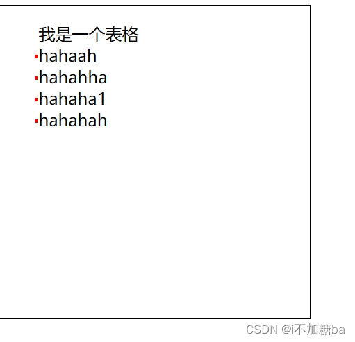
(3)定位实现修饰
可以节省图片
<style>
        ul{list-style: none;}
        #main{width: 300px;height: 300px;border: 1px solid black;}
        #main ul li{position: relative;}
        #main ul li::after{content:"";display: block;width: 3px;height: 3px;background: red;position: absolute;left:-4px;top: 50%;}
    </style>
</head>
<body>
    <div id="main">
        <ul>我是一个表格
            <li>hahaah</li>
            <li>hahahha</li>
            <li>hahaha1</li>
            <li>hahahah</li>
        </ul>
    </div>
3.10CSS中的一些小操作
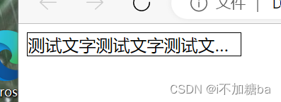
- CSS单行添加省略号
width:必须有一个固定的宽
white-space:nowrap:不让内容折行(设置的长度不够时会折行)
overflow:hidden:隐藏溢出的内容
text-overflow:ellipisis:添加省略号
    <style>
        #content{width: 200px;border: 1px black solid;white-space:nowrap;overflow: hidden;text-overflow: ellipsis;}
    </style>
<body>
    <div id="content">
        测试文字测试文字测试文字测试文字测试文字测试文字测试文字测试文字测试文字测试文字测试文字测试文字
    </div>
</body>
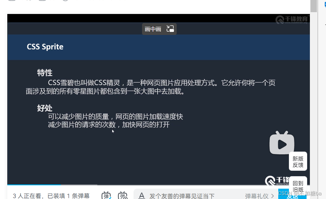
- CSSprime
![在这里插入图片描述]()
- CSS圆角、圆形
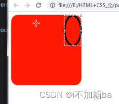
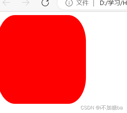
border-radius:..px;
    <style>
        #box{width: 200px;height: 200px;background: red;border-radius: 5px;}
    </style>
</head>
<body>
    <div id="box">

    </div>
- 值的意义:与角相切的圆的半径
- 半径为容器的一半时是正圆px/50%
 <style>
        #box{width: 200px;height: 200px;background: red;border-radius:50%;}
    </style>
- 后面是两个值时为左上角和右下角border-radius:.. ...;
- 后面是四个值时为左上、右上、右下、左下
- 做椭圆的相切
![在这里插入图片描述]()
<style>
        #box{width: 200px;height: 200px;background: red;border-radius:40px/60px;}
    </style>
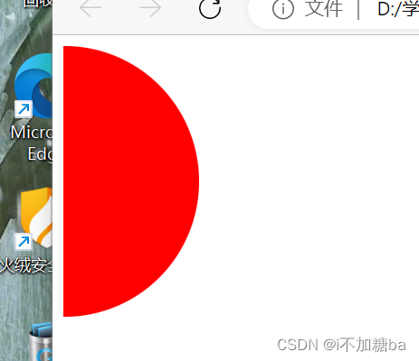
- 半圆
 <style>
        #box{width:100px;height: 200px;background: red;border-radius:0px 100px 100px 0px;}
    </style>
3.11 练习
通栏:自适应浏览器的宽度
版心:固定一个宽度,并且让容器居中
两者可以嵌套
- pc端企业完整页面
- common.css
*{margin: 0px;padding: 0px;}   /*去掉所有元素的默认边距**/
ul,ol{list-style: none;}  /*去掉表格前的点**/
a{text-decoration: none;color: #646464;}   /*去掉链接的下划线并加上默认颜色**/
h1,h2,h3{font-size:16px;}    /*默认字体大小**/
body{font-family: Arial;}    /*设置默认字体样式**/
.l{float: left;}            /*设置左浮动**/
.r{float: right;}             /*设置右浮动**/
.clear:after{content:"";display: block;clear: both;}   /*伪类清浮动**/
.container{width:1080px;margin: 0 auto;position:relative;}    /*设置版心大小,居中,有些元素相对于版心绝对定位**/
.container-fulid{width: 100%;}  /*通栏设置**/
#service{overflow: hidden;}


#head{height: 81px;}
#head .head_logo{width: 162px;height: 44px;margin-top: 19px;}
#head .head_menu{font-size:14px;line-height: 81px;}
#head .head_menu li{float:left;margin-left:50px;}
#head .head_menu li:hover a{color: darkgrey;}    /*移上之后的字体颜色**/

#foot{background: #66c5b4;}
#foot .container{height: 54px;line-height:54px;font-size: 12px;color:white;}
#foot div a{color:white;margin:0 10px;}


 .area_title{margin-top:60px;min-height:407px;text-align: center;}
 .area_title h2{height:20px;line-height: 20px;font-size: 20px;background:url(../images/title_bg.png) no-repeat center 7px;font-weight:normal;}
.area_title p{color: #9F9F9F;font: size 14px;line-height: 34px;}
- 页面
<style>
     #banner{position: relative;}
     #banner .banner_list{width:100%;height:469px;position:relative;}
     #banner .banner_list li{width: 100%;height:100%;background:center 0 no-repeat;opacity: 0;z-index: index 1;position:absolute;left: 0;top: 0;}
     #banner .banner_list li.active{opacity:1;z-index: 10;}
     #banner .banner_list a{width:100%;height:100%;}
     #banner .banner_btn{display: block; width: 100%; position: absolute;bottom:19px;z-index:20;text-align: center;font-size: 0;}
     #banner .banner_btn li{display: inline-block;width: 12px;height: 12px;border:2px solid white;border-radius:50%;box-sizing: border-box;margin:0 6px;cursor: pointer;}
     #banner .banner_btn li.active{background-color: white;}


     #service{overflow: hidden;min-height:470px;}
     #service .service_list{text-align: center;margin-top:-350px;}
     #service .service_list li{float: left;width:250px;margin: 0 10px;}
     #service .service_list div{width:102px;height: 102px;margin: 0 auto;}
     #service .service_list h3{font-size: 18px;color: #434343;line-height:36px;margin-top:35px;}
     #service .service_list p{font-size: 14px;color: #6d6d6d;line-height:22px;}


     #case{background:#f8f8f8;}
     #case .container{min-height:460px;overflow:hidden;}
     #case .area_title{margin-top:55px;}
     #case .area_title h2{color:#66C5B4;}
     #case .case_list{margin-top:-300px;}
     #case .case_list li{width:340px; float:left;margin:0 10px }
     #case .case_btn{width: 176px;height: 37px;background:#66C5B4;margin: 0 auto; border-radius:25px;line-height: 37px;text-align:center;font-size:14px;margin-top:-80px;}
     #case .case_btn a{display:block;height:100%;width:100%;color:white;}

    #news{min-height:450px;overflow: hidden;}
    #news .area_title{margin-top:65px;}
    #news dl{margin-top:-320px;}
    #news dt{width:234px;}
    #news dd{width:846px;}
    #news .news_list{width:100%;}
    #news .news_list li{width:50%;float: left;margin-bottom:48px;}
    #news .news_date{width:71px;height:71px; border-right:1px solid #DCDCDC;text-align: center;}
    #news .news_date i{color: #66C5B4;font-size: 39PX;display: block;font-weight: bold;}
    #news .news_date span{color:#999999;font-size: 20px;line-height:36px;}
    #news .news_text{width:310px;margin-left:20px;}
    #news .news_text h3{font-size:14px;}
    #news .news_text h3 a{color:#3F3F3F;}
    #news .news_text p{color:#A4A4A4;font-size: 12px;line-height: 21px;margin-top: 17px;}
</style>
</head>
<body>
    <div id="head"class="container">
        <div class="head_logo l">
         <a href="">
            <img src="./images/logo.png" alt="博文尚美"title="博文尚美">
         </a>
        </div>
        <ul class="head_menu r">
          <li>
            <a href="">HOME</a>
          </li>
           <li>
            <a href="">ABOUT</a>
          </li>
          <li>
            <a href="">PROTFOUO</a>
          </li>
          <li>
            <a href="">PROTFOUO</a>
          </li>
          <li>
            <a href="">SEAMCE</a>
          </li>
          <li>
            <a href="">NEWS</a>
          </li>
          <li><a href="">NEWS</a>
            <a href="">CONTACT</a>
        </ul>
    </div>
    <div id="banner"class="container-fluid">
      <ul class="banner_list">
        <li class="active" style="background-image:url(./images/banner.png)">
          <a href="#"></a>
        </li>
        <li style="background-image:url(./images/banner.png)">
          <li style="background-image:url(./images/banner.png)">
            <li style="background-image:url(./images/banner.png)">
          <a href="#"></a>
        </li>
      </ul>
      <ol class="banner_btn">
        <li class="active"></li>
        <li></li>
        <li></li>
        <li></li>
      </ol>
    </div>
    <div id="service" class="container">
      <div class="area_title">
        <h2>服务范围</h2>
        <p>OUR SEVICE</p>
      </div>
      <ul class="service_list">
        <li>
          <div>
            <a href="">
              <img src="./images/web1.png" alt="">
            </a>
          </div>
          <h3>1.WEB DESIN</h3>
          <p>
            企业品牌网页设计/手机网站制作
            <br>
            动画网站创意设计
          </p>
        </li>
        <li>
          <div>
            <a href="">
              <img src="./images/e-bussiness1.png" alt="">
            </a>
          </div>
          <h3>2.GRAPHIC DESIGN</h3>
          <p>
            标志LOGO设计/产品宣传册设计
            <br>
            企业广告/海报设计
          </p>
        </li>
        <li>
          <div>
            <a href="">
              <img src="./images/graphic1.png" alt="">
            </a>
          </div>
          <h3>3.DUSINESS PLAN</h3>
          <p>
            淘宝/天猫装修设计及运营推广
            <br>
            企业微博、微信营销
          </p>
        </li>
        <li>
          <div>
            <a href="">
              <img src="./images/mail1.png" alt="">
            </a>
          </div>
          <h3>4.MAILBOXAGENTS</h3>
          <p>
            腾讯网易品牌邮箱企业代理
            <br>
            个性化邮箱定制开发
          </p>
        </li>
      </ul>
    </div>
    <div id="case" class="container-fluig">
      <div class="container">
        <div class="area_title">
            <h2>{客户案例}</h2>
            <p>with the best professional technology,to design the best innovate web site</p>
          </div>
          <ul class="case_list clear" >
            <li>
              <a href="">
                <img src="./images/20141121095528549.png" alt="">
              </a>
            </li>
            <li>
              <a href="">
                <img src="./images/20141121095216750.png" alt="">
              </a>
            </li>
            <li>
              <a href="">
                <img src="./images/20141121105856226.png" alt="">
              </a>
            </li>
          </ul>
        </div>
        <div class="case_btn">
          <a href="">VIEW MORE</a>
        </div>
      </div>
    </div>
    <div id="news"class="container">
      <div class="area_title">
        <h2>最新资讯</h2>
        <p>TEH LATEST NEWS</p>
      </div>
      <dl>
        <dt class="l">
          <img src="./images/xs1.png" alt="">
        </dt>
        <dd class="l">
          <ul class="news_list">
            <li>
              <div class="news_date l">
                <i>09</i>
                <span>Jan</span>
              </div>
              <div class="news_text l">
                <h3><a href="#">网站排名进入前三的技巧说明</a></h3>
                <p>很多的客户都会纳闷为什么自己的网站老师优化不到搜索引擎首页,更不用说进入首页前三了,那么网站优化</p>
              </div>
            </li>
            <li>
              <div class="news_date l">
                <i>08</i>
                <span>Jan</span>
              </div>
              <div class="news_text l">
                <h3><a href="#">网站排名进入前三的技巧说明</a></h3>
                <p>很多的客户都会纳闷为什么自己的网站老师优化不到搜索引擎首页,更不用说进入首页前三了,那么网站优化</p>
              </div>
            </li>
            <li>
              <div class="news_date l">
                <i>07</i>
                <span>Jan</span>
              </div>
              <div class="news_text l">
                <h3><a href="#">网站排名进入前三的技巧说明</a></h3>
                <p>很多的客户都会纳闷为什么自己的网站老师优化不到搜索引擎首页,更不用说进入首页前三了,那么网站优化</p>
              </div>
            </li>
            <li>
              <div class="news_date l">
                <i>06</i>
                <span>Jan</span>
              </div>
              <div class="news_text l">
                <h3><a href="#">网站排名进入前三的技巧说明</a></h3>
                <p>很多的客户都会纳闷为什么自己的网站老师优化不到搜索引擎首页,更不用说进入首页前三了,那么网站优化</p>
              </div>
            </li>
          </ul>
        </dd>
      </dl>
    </div>
    <div id="foot" class="contain-fulid">
      <div class="container">
        <p class="l">Copyright 2006-2014 Bowenshangmei Culture All Rights Reserved</p>
        <div class="r">
          <a href="">Home</a>|<a href="">About</a>|<a href="">Portfolio</a>|<a href="">Contact</a>
        </div>
      </div>
    </div>
</body>


2. pc游戏端页面练习
- 通用
*{margin: 0;padding: 0;}
ul,ol{list-style: none;}
img{display: block;}
a{text-decoration: none;color: #464646;}
h1,h2,h3{font-size: 16px;}
body{font-family: Arial,'宋体';}

.l{float: left;}
.r{float: right;}
.clear:after{content: "";display: block;clear: both;}
.container{width: 980px;margin: 0 auto;position: relative;}
.container-fluid{width: 100%;}

#head{background: url() repeat-x;}
#head .container{height: 41px;}
#head .head_logo{width: 220px;height: 41px;background: url() no-repeat 0 --38px;}
#head .head_logo a{display: block;width: 100%;height: 100%;text-indent: -9999px;overflow: hidden;}
#head .head_ad{margin-left: 8px;}
#head .head_menu{font-size: 12px;}
#head .head_menu div{height: 18px;margin-top: 13px;background: url() no-repeat;}
#head .head_menu .head_menu-czsh{margin-right: 26px;padding-left: 20px;background-position: left -92px;}
#head .head_menu .head_menu-top{padding-right: 17px;background-position: right -89px;}
- 页面
 <link rel="stylesheet" href="./css/common.css">
    <style>
        #main{background: url() no-repeat center 0;}
        #nav{background: url() repeat-x,url() no-repeat center 0;overflow: hidden;}
        #nav .container{min-height: 236px;overflow: hidden;}
        #nav .nav_logo{width:138px;height:112px;margin:15px auto;}

        #nav dl{position: absolute;top: 0;}
        #nav dt{height:66px;}
        #nav dt a{width:100%;height:100%;display:block;text-indent: -9999px;overflow: hidden;}
        #nav dd{line-height:27px;font-size:12px;text-align:center;}
        #nav dd{color: white;position: relative;}
        #nav dd a:hover{color: red;text-decoration: underline;}
        #nav dd a.hot:after{content: "";display: block;width: 12px;height: 12px;background: url() no-repeat 0 -12px;position: absolute;right: -15px;top: 0;}
        #nav dd a.new:after{content: "";display: block;width: 12px;height: 12px;background: url() no-repeat 0 0;position: absolute;right: -15px;top: 0;}
        #nav .nav_index{width: 65px;left: 0;}
        #nav .nav_zl{width: 69px;left: 98px;}
        #nav .nav_ss{width: 74px;left: 203px;}
        #nav .nav_hd{width: 68px;left: 325px;}

        #link{height: 175px;}
        #link a{width: 463px; height: 100%;display: block;margin: 0 auto;}

        #banner{height: 276px;background: url() no-repeat;margin-top: 20px;}
        #banner .banner_left{width: 240px;height: 310px;background: url() no-repeat;margin: -20px 0 0 7px;}
        #banner .banner_download p{width: 91px;height: 25px;background: url() no-repeat;margin: 0 auto;text-indent: -9999px;overflow: hidden;}
        #banner .banner_download p:first-child{background-position: -253px 0;margin-top: 44px;}
        #banner .banner_download p:last-child{background-position: -253px -25px;}


        #banner .banner_download:hover p:first-child{animation: 1s upMove;}
        @keyframes upMove{
            0%{transform: translateY(-40px);opacity: 0;}
            100%{transform: translateY(0);opacity: 1;}
        }
        #banner .banner_download:hover p:last-child{animation: 1s downMove;}
        @keyframes downMove{
            0%{transform: translateY(40px);opacity: 0;}
            100%{transform: translateY(0);opacity: 1;}
        }

        #banner .banner_user div{width:56px;height:56px;border-radius: 50%;margin: 80px auto 0 auto;border: 4px #283257 solid;overflow: hidden;}
        #banner .banner_user img{width: 100%;height: 100%;}
        #banner .banner_user p{text-align: center;font-size: 12px;color: white;margin-top: 25px;}
        #banner .banner_user a{color: #34f1d0;}

        #banner .banner_list{width: 497px;height: 253px;overflow: hidden;margin: 13px 0 0 4px;position: relative;}
        #banner .banner_list_ul{width: 2000px;}
        #banner .banner_list_ul li{width: 497px;height: 253px;float: left;}
        #banner .banner_bottomline{width:100%;height: 37px;background: rgba(0,0,0,.5);border-top: 1px #514b55 solid;position: absolute;bottom: 0;left: 0;}
        #banner .banner_bottomline_ul{text-align: center;margin-top: 11px;}
        #banner .banner_bottomline_ul li{display: inline-block;width: 15px;height: 15px;background: url() no-repeat -603px -299px;cursor: pointer;}
        #banner .banner_bottomline_ul li.active{background-position: -581px -299px;}
        #banner .banner_bottomline_leftbtn{width: 12px;height: 22px;position: absolute;left: 5px;top: 5px;background: url() no-repeat -554px -296px;cursor: pointer;}
        #banner .banner_bottomline_rightbtn{width: 12px;height: 22px;position: absolute;right: 5px;top: 5px;background: url() no-repeat -554px -296px;cursor: pointer;}
        #banner .banner_bottomline_leftbtn:hover{background-position: -542px -325px;}
        #banner .banner_bottomline_rightbtn:hover{background-position: -554px -325px;}
        #banner .banner_list_lt{left: -2px;top: -4px;background-position: -621px -299px;}
        #banner .banner_list_rt{right: -2px;top: -4px;background-position: -634px -299px;}
        #banner .banner_list_rb{right: -2px;top: -5px;background-position: -634px -312px;}
        #banner .banner_list_lb{left: -2px;top: -4px;background-position: -621px -312px;}

        #banner .banner_right{width: 209px;height: 255px;position: relative;margin: 12px 0 0 12px;}
        #banner .banner_right_lt,#banner .banner_right_rt,#banner .banner_right_rb,#banner .banner_right_lb{width: 15px;height: 15px;background: url() no-repeat;position: absolute;}
        #banner .banner_right_lt{left:-4px;top: -4px;background-position: -681px -298px;}
        #banner .banner_right_rt{right:-4px;top: -4px;background-position: -696313px -298px;}
        #banner .banner_right_rb{right:-4px;bottom: -6696313px;background-position: -696313px -313px;}
        #banner .banner_right_lb{left:-4px;bottom: -6696313px;background-position: -681px -313px;}
    </style>left: -4px;top: -4px;background-position: -681px -298px;
————————————————
版权声明:本文为CSDN博主「SHniangJiu」的原创文章,遵循CC 4.0 BY-SA版权协议,转载请附上原文出处链接及本声明
原文链接:https://blog.csdn.net/SHniangJiu/article/details/12783672
</head>
<body>
    <div id="head" class="container-fluid">
        <div class="constainer">
            <div class="head_logo l">
                <a href="#">腾讯游戏</a>
            </div>
            <div class="head_ad l">
                <a href="#">
                    <img src="" alt="">
                </a>
            </div>
            <div class="head_menu r">
                <div class="head_menu_czsh l">
                    <a href="#">成长守护平台</a>
                </div>
            </div>
            <div class="head_menu r">
                <div class="head_menu_top l">
                    <a href="#">腾讯游戏平台</a>
                </div>
            </div>
        </div>
    </div>
    <div id="main" class="container-fluid">
        <div id="nav" class="container-fluid">
            <div class="container">
                <div class="nav_logo">
                    <a href="#">
                        <img src="./images" alt="QQ飞车" title="QQ飞车">
                    </a>
                </div>
                <dl class="nav_zl">
                    <dt></dt>
                    <dd><a href="#">新手指引</a></dd>
                    <dd><a class="hot" href="#">官方漫画</a></dd>
                    <dd><a class="new" href="#">飞车手游</a></dd>
                    <dd><a href="#">精美壁纸</a></dd>
                    <dd><a href="#">游戏下载</a></dd>
                </dl>
                <dl class="nav_ss">
                    <dt></dt>
                    <dd><a class="hot" href="#">新手指引</a></dd>
                    <dd><a href="#">官方漫画</a></dd>
                    <dd><a href="#">飞车手游</a></dd>
                </dl>
                <dl class="nav_hd">
                    <dt></dt>
                    <dd><a class="hot" href="#">新手指引</a></dd>
                    <dd><a href="#">官方漫画</a></dd>
                    <dd><a href="#">飞车手游</a></dd>
                </dl>
            </div>
        </div>
        <p>1</p>
        <p>1</p>
        <p>1</p>
        <p>1</p>
        <p>1</p>
        <p>1</p>
        <p>1</p>
        <p>1</p>
        <p>1</p>
        <p>1</p>
        <p>1</p>
        <p>1</p>
        <p>1</p>
        <p>1</p>

    </div>
    <div id="link" class="container">
        <a href="#"></a>
    </div>
    <div id="banner" class="container">
        <div class="banner_left l">
            <div class="banner_download">
                <p>下载游戏</p>
                <p>DOWNLOAD</p>
            </div>
            <div class="banner_user">
                <div>
                    <img src="./images" alt="">
                </div>
                <p>欢迎<a href="#"登录></a>进入飞车世界</p>
            </div>
        </div>
        <div class="banner_center l">
            <div class="banner_list">
                <ul class="banner_list_ul">
                    <li>
                        <a href="#"><img src="." alt=""></a>
                    </li>
                    <li>
                        <a href="#"><img src="." alt=""></a>
                    </li>
                    <li>
                        <a href="#"><img src="." alt=""></a>
                    </li>
                </ul>
                <div class="banner_bottomline">
                    <ul class="banner_bottomline_ul">
                        <li class="active"></li>
                        <li></li>
                        <li></li>
                    </ul>
                    <div class="banner_bottomline_leftbtn"></div>
                    <div class="banner_bottomline_rightbtn"></div>
                </div>
                <i class="banner_list_lt"></i>
                <i class="banner_list_rt"></i>
                <i class="banner_list_rb"></i>
                <i class="banner_list_lb"></i>
            </div>
        </div>
        <div class="banner_right l">
            <a href="#"><img src="./images" alt=""></a>
            <i class="banner_right_lt"></i>
            <i class="banner_right_rt"></i>
            <i class="banner_right_rb"></i>
            <i class="banner_right_lb"></i>
        </div>
    </div>
————————————————
版权声明:本文为CSDN博主「SHniangJiu」的原创文章,遵循CC 4.0 BY-SA版权协议,转载请附上原文出处链接及本声明。
原文链接:https://blog.csdn.net/SHniangJiu/article/details/12783672
</body>

 浙公网安备 33010602011771号