一、选择器类型
先看下下面的例子
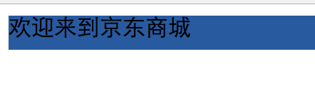
<!DOCTYPE html>
<html lang="en">
<head>
    <meta charset="UTF-8">
    <title>Title</title>
</head>
<body>
<div style="background-color:#2459a2;height:24px;">
    欢迎来到京东商城
</div>

</body>
</html>
在标签上设置style属性:
background-color:#2459a2
height:24px
color可以参照RGB颜色对照表,一种码对应一种颜色
当然我们也可以不在body里面写,因为方便模板重用,我们可以把style模板放到head里面
页面效果如下:
(1)id选择器


<!DOCTYPE html>
<html lang="en">
<head>
    <meta charset="UTF-8">
    <title>Title</title>
    <style>
        #i1{
        background-color:#2459a2;
        height:24px;
        }
        #i2{
        background-color:#2459a2;
        height:24px;
        }
    </style>
</head>
<body>
<div id="i1">
    欢迎来到京东商城
</div>
<div id="i2">
    欢迎来到淘宝
</div>

</body>
</html>
id选择器了解一下,虽然我们可以通过id把模板和内容联系起来,但是id原则上需要唯一值,这就给代码的重复利用带来了困难。
(2) 类选择器
<!DOCTYPE html>
<html lang="en">
<head>
    <meta charset="UTF-8">
    <title>Title</title>
    <style>
        .c1{
        background-color:#2459a2;
        height:24px;
    </style>
</head>
<body>
<div class="c1">
    欢迎来到京东商城
</div>
<div class="c1">
    欢迎来到淘宝
</div>

</body>
</html>
相对于id选择器,类选择器就很好的解决了模块需要重复利用的问题,既然id不可以重复,那class是可以重复的。这种选择器也最常用
(3)标签选择器
<!DOCTYPE html>
<html lang="en">
<head>
    <meta charset="UTF-8">
    <title>Title</title>
    <style>
        div{
        background-color:#2459a2;
        height:24px;
    </style>
</head>
<body>
<div>
    欢迎来到京东商城
</div>
<span>欢迎来到好乐买</span>>
<div>
    欢迎来到淘宝
</div>


</body>
</html>
你也可以自定义div 模块格式,那后面所有用div标签的内容都会生效,而span不生效
(4)层级选择器(空格)
通过两个标签关联:
<!DOCTYPE html>
<html lang="en">
<head>
    <meta charset="UTF-8">
    <title>Title</title>
    <style>
       span div{
        background-color:#2459a2;
        height:24px;

    </style>
</head>
<body>
<div>
    欢迎来到京东商城
</div>
<span>欢迎来到好乐买
    <div>要啥自行车</div>
</span>
<div>
    欢迎来到淘宝
</div>


</body>
</html>
通过class和标签关联:
<!DOCTYPE html>
<html lang="en">
<head>
    <meta charset="UTF-8">
    <title>Title</title>
    <style>
        .c1 div{
        background-color:#2459a2;
        height:24px;

    </style>
</head>
<body>
<div class="c1">
    欢迎来到京东商城
</div>
<span class="c1">欢迎来到好乐买
    <div class="c1">要啥自行车</div>
</span>
<div class="c1">
    欢迎来到淘宝
</div>

</body>
</html>
我们甚至可以关联多层,但不建议
(5)组合选择器(逗号)
<!DOCTYPE html>
<html lang="en">
<head>
    <meta charset="UTF-8">
    <title>Title</title>
    <style>
        #i1,#i2{
        background-color:#2459a2;
        height:24px;
        }
    </style>
</head>
<body>
<div id="i1">
    欢迎来到京东商城
</div>
<div id="i2">
    欢迎来到淘宝
</div>

</body>
</html>
还记得第(1)中id选择器的代码重复利用率低吗,我们可以通过逗号来把模板赋值给多个id,这样也可以降低代码重复的问题.
当然类选择器也是可以使用组合选择器的:
<!DOCTYPE html>
<html lang="en">
<head>
    <meta charset="UTF-8">
    <title>Title</title>
    <style>
        .i1,.i2{
        background-color:#2459a2;
        height:24px;
        }
    </style>
</head>
<body>
<div class="i1">
    欢迎来到京东商城
</div>
<div class="i2">
    欢迎来到淘宝
</div>

</body>
</html>
(6)属性选择器
<!DOCTYPE html>
<html lang="en">
<head>
    <meta charset="UTF-8">
    <title>Title</title>
    <style>
        input[type='text']{width:100px;height:200px;}
    </style>
</head>
<body>
<input type="text" />
<input type="password" />

</body>
</html>
可以根据type字段来让我的模板生效,我们可以看到text生效了,但是password没有生效。
当然我们甚至可以自定义属性:
<!DOCTYPE html>
<html lang="en">
<head>
    <meta charset="UTF-8">
    <title>Title</title>
    <style>
        input[n='xiaohong']{width:100px;height:200px;}

    </style>
</head>
<body>
<input type="text" n="xiaoming"/>
<input type="text" n="xiaohong"/>
<input type="password"/>

</body>
</html>
n是我自定义的。
当然也可以结合类标签,把input变成.c1(类名)
<!DOCTYPE html>
<html lang="en">
<head>
    <meta charset="UTF-8">
    <title>Title</title>
    <style>
        .c1[n='xiaohong']{width:100px;height:200px;}
    </style>
</head>
<body>
<input class="c1"  type="text" n="xiaoming" />
<input class="c1"  type="text" n="xiaohong" />
<input class="c1" type="password"/>

</body>
</html>
可以看到生效的就只有xiaohong
二、选择器优先级
<!DOCTYPE html>
<html lang="en">
<head>
    <meta charset="UTF-8">
    <title>Title</title>
    <style>
        .c1{
            font-size:58px;
            color:black;
        }
        .c2{
            background-color:red;
            color:white;
        }
    </style>
</head>
<body>
<div class="c1 c2" style="color:pink">这里是京东商城</div>
</body>
</html>
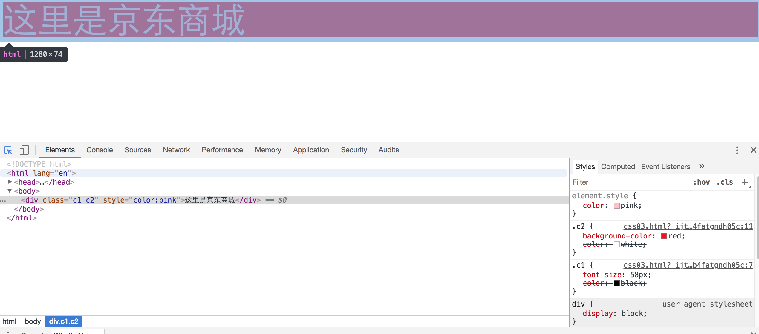
看右下角
标签上面的style优先,其它按照编写顺序,越下面越优先(c2优于c1)
当然css样式也能单独写在一个文件里,先在同级目录下新建一个文件commons.css,内容如下:
.c1{
       font-size:58px;
       color:black;
   }
.c2{
       background-color:red;
       color:white;
   }
然后把上面html修改下:
<!DOCTYPE html>
<html lang="en">
<head>
    <meta charset="UTF-8">
    <title>Title</title>
    <link rel="stylesheet" href="commons.css" />
</head>
<body>
<div class="c1 c2">这里是京东商城</div>
</body>
</html>
link标签通常放置在一个网页的头部标签head标签内的用于链接外部css文件、链接收藏夹图标(favicon.ico),<link> 标签最常见的用途是链接外部样式表,外部资源。
href 值为外部资源地址,这里是css的地址
rel 定义当前文档与被链接文档之间的关系,这里是外部css样式表即stylesheet
type 规定被链接文档的 MIME 类,这里是值为text/css,这里没有写这个标签
三、CSS边框
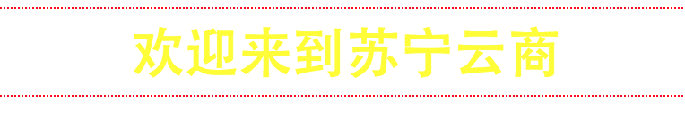
<!DOCTYPE html>
<html lang="en">
<head>
    <meta charset="UTF-8">
    <title>Title</title>
</head>
<body>
<div style="border:1px solid red;">
    欢迎来到苏宁云商
</div>

</body>
</html>
border就是指边框,1px指边框宽窄,solid指实线(当然也有虚线dotted等等),red是边框颜色,效果如下:

当然border是指上下左右都加,如果我只想加左边呢,用border-left,等等。
element.style {
    border: 1px dotted red;
    border-top-color: red;
    border-top-style: dotted;
    border-top-width: 1px;
    border-right-color: red;
    border-right-style: dotted;
    border-right-width: 1px;
    border-bottom-color: red;
    border-bottom-style: dotted;
    border-bottom-width: 1px;
    border-left-color: red;
    border-left-style: dotted;
    border-left-width: 1px;
    border-image-source: initial;
    border-image-slice: initial;
    border-image-width: initial;
    border-image-outset: initial;
    border-image-repeat: initial;
}
四、字体参数
标签高度
height:48px;
宽度,可以用200px,也可以用百分比
width:80%;
最小宽度:
min-width:100px;
解释下,这个min-width通常和width一起使用,比如
. css1 {
width: 20%
min-width: 100px
}
当整个页面宽度有1000px时,1000*0.2=200px,class css1会随着整个页面的减小而减小。当减小到20%都要比100px小时,min-width生效。
边框
border
字体大小
font-size:16px;
内容水平居中
text-align:center;
把内容居中,水平垂直方向都居中
line-height:48px;
字体加粗
font-weight:bold;
字体颜色
color
内容超出屏幕自动滚动条
overflow:auto;
<!DOCTYPE html>
<html lang="en">
<head>
    <meta charset="UTF-8">
    <title>Title</title>
</head>
<body>
<div style="border:1px dotted red;
font-size:30px;
text-align:center;
line-height:48px;
color:yellow;
">
    欢迎来到苏宁云商
</div>

</body>
</html>
页面展示如下:
float参数:定义标签向那个方向浮动
<!DOCTYPE html>
<html lang="en">
<head>
    <meta charset="UTF-8">
    <title>Title</title>
</head>
<body>
<div style="width:20%;background-color:red">上午好</div>
<div style="width:80%;background-color:blue">下午好</div>

</body>
</html>
结果:
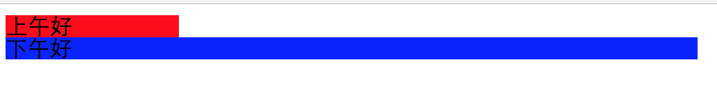
因为div是块标签,所以有多个div会另起一行,那怎么可以把他们做一个拼接呢,用float
<!DOCTYPE html>
<html lang="en">
<head>
    <meta charset="UTF-8">
    <title>Title</title>
</head>
<body>
<div style="width:20%;background-color:red;float:left">上午好</div>
<div style="width:80%;background-color:blue;float:left">下午好</div>

</body>
</html>
页面展示就变成了下面:
有时候用float参数会导致css浮动,类似下面这样:

解决办法,在div之间加:
<div style="clear:both"></div>
display标签:块标签和行内标签切换,可以把div变成行内标签(display:inline),把span变成块标签(display:block)
<!DOCTYPE html>
<html lang="en">
<head>
    <meta charset="UTF-8">
    <title>Title</title>
</head>
<body>
<div style="background-color:red;display:inline;">早上好</div>
<span style="background-color:yellow;display:block;">晚上好</span>

</body>
</html>
行内标签无法设置高度和宽度,padding,margin
块级标签可以设置高度和宽度,padding,margin
<!DOCTYPE html>
<html lang="en">
<head>
    <meta charset="UTF-8">
    <title>Title</title>
</head>
<body>
<div style="background-color:red;height:80px;display:inline;">早上好</div>
<span style="background-color:yellow;height:80px;display:block;">晚上好</span>

</body>
</html>
设置高度后,发现黄颜色的可以生效,红颜色不生效。
display还有一个参数inline-block,这样即有了行内标签自己用多少占多少,也有了块级标签可以设置高度和宽度,padding,margin
display:none 让标签消失 ,标签内的内容也就消失了
padding 内边距,自身发生变化
margin 外边距,让div居中:
margin:0 auto
四、position
页面通常有一个功能,有个悬浮窗在右下角:返回顶部;还有当我们下拉菜单的时候头部一部分始终在顶部。这就用到了position。
下面这个demo就是如何使最上面菜单栏顶格
<!DOCTYPE html>
<html lang="en">
<head>
    <meta charset="UTF-8">
    <title>Title</title>
    <style>
      .ly-header{
        height:48px;
        background-color:black;
        color:#dddddd;
        position:fixed;
        top:0;
        right:0;
        left:0;
        }
      .ly-body{
        background-color:yellow;
        height:5000px;
        margin-top:50px;
        }
    </style>
</head>
<body>
<div class="ly-header">欢迎来到苏宁易购</div>
<div class="ly-body">内容丰富</div>

</body>
</html>
下面的demo如何在右下角生成一个返回顶部的浮动按钮:
<!DOCTYPE html>
<html lang="en">
<head>
    <meta charset="UTF-8">
    <title>Title</title>
    <style>
        .c1{
        width:50px;
        height:50px;
        background-color:black;
        color:white;
        position:fixed;
        bottom:20px;
        right:20px;
        }
    </style>
</head>
<body>
<div class="c1">返回顶部</div>
<div style="height:5000px;background-color:#dddddd;"></div>

</body>
</html>
position标签,检索对象的定位方式,当值是fixed时,内容会动态固定在页面的一个位置,偏移定位以窗口为参考,出现滚动条也不会随着滚动;
当值是position:absolute时,跟fixed功能类似,但是是绝对固定在一个地方,会随着滚动条移动
bottom:20px 距离底部20像素
top:0距离顶部0像素
right:20距离右侧20像素
left
当然后期要实现你点击返回顶部,真的实现这个功能还需要后面js的知识。
position取值:
static:对象遵循常规流。此时4个定位偏移属性不会被应用。
relative:对象遵循常规流,并且参照自身在常规流中的位置通过top,right,bottom,left这4个定位偏移属性进行偏移时不会影响常规流中的任何元素。
absolute:对象脱离常规流,此时偏移属性参照的是离自身最近的定位祖先元素,如果没有定位的祖先元素,则一直回溯到body元素。盒子的偏移位置不影响常规流中的任何元素,其margin不与其他任何margin折叠。
fixed:与absolute一致,但偏移定位是以窗口为参考。当出现滚动条时,对象不会随着滚动。
center:与absolute一致,但偏移定位是以定位祖先元素的中心点为参考。盒子在其包含容器垂直水平居中。(CSS3)
page:与absolute一致。元素在分页媒体或者区域块内,元素的包含块始终是初始包含块,否则取决于每个absolute模式。(CSS3)
sticky:对象在常态时遵循常规流。它就像是relative和fixed的合体,当在屏幕中时按常规流排版,当卷动到屏幕外时则表现如fixed。该属性的表现是现实中你见到的吸附效果。(CSS3)
写个position 的 absolute+relative结合实现相对定位的demo
relative --单独写没有意义
absolute --第一次定位可以在指定位置,滚轮滚动时就不在了。
<!DOCTYPE html>
<html lang="en">
<head>
    <meta charset="UTF-8">
    <title>Title</title>
    <style>
        .c1{
            width:50px;
            height:50px;
            background-color:black;
            color:white;
            position:absolute;
            bottom:20px;
            right:20px;
            }
        .c2{
        position:relative;
        width:500px;
        height:200px;
        border:1px solid red;
        margin:0 auto;
        }

    </style>
</head>
<body>
<div class="c1">返回顶部</div>
<div class="c2">
    <div style="position:absolute;left:0;bottom:0;width:50px;height:50px;background-color:black;"></div>
</div>
<div class="c2">
    <div style="position:absolute;right:0;bottom:0;width:50px;height:50px;background-color:black;"></div>
</div>
<div class="c2">
    <div style="position:absolute;right:0;top:0;width:50px;height:50px;background-color:black;"></div>
</div>

</body>
</html>
页面展示如下:
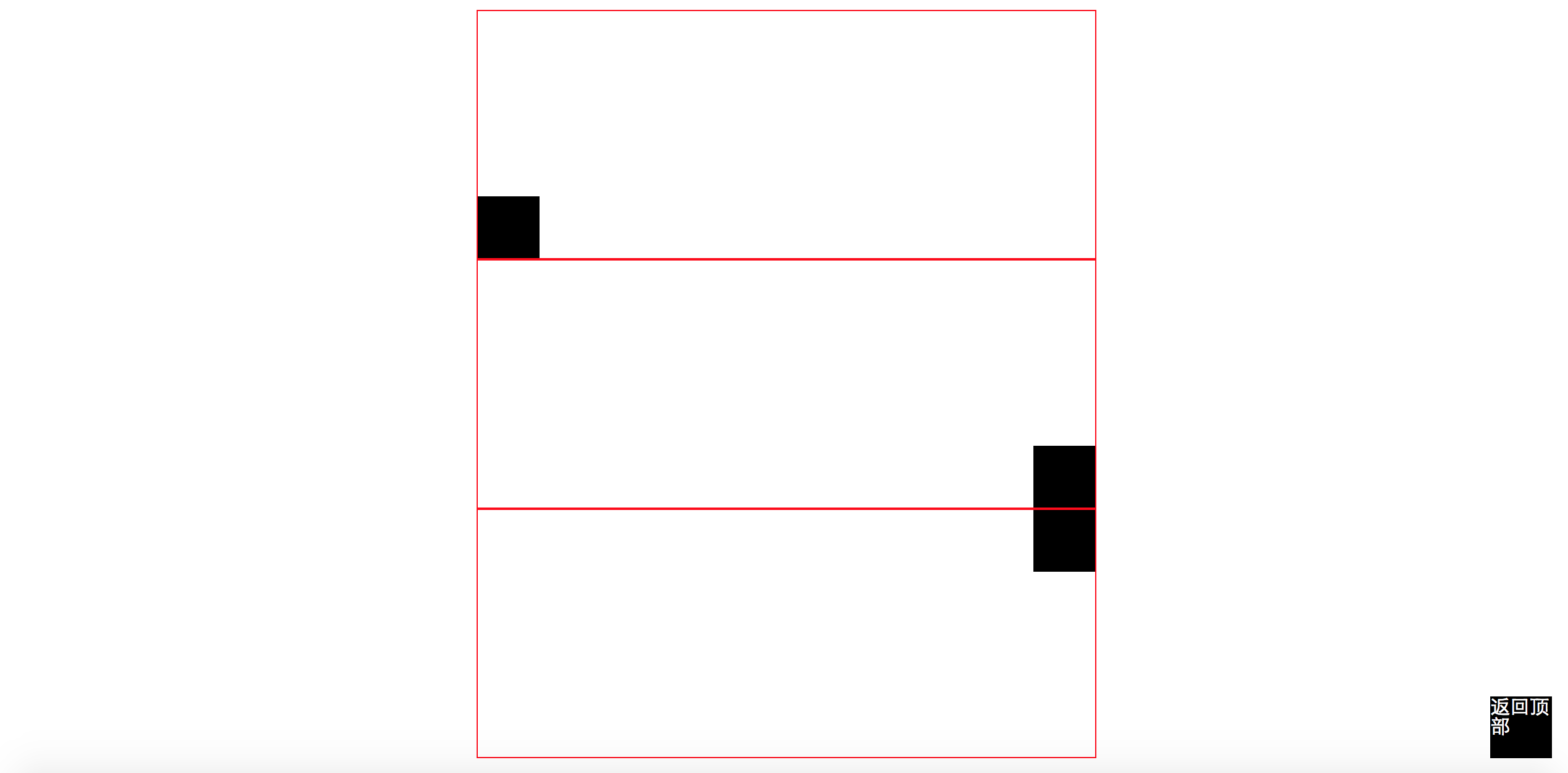
margin:0 auto,意思就是上下边距为0,左右边距为auto,就是自动适应。
注意absolute的right,left可以是负数,这样就可以跑到窗口外面了。
实现三层覆盖:
<!DOCTYPE html>
<html lang="en">
<head>
    <meta charset="UTF-8">
    <title>Title</title>
    <style>
        .c1{
            z-index:9;
            position:fixed;
            background-color:black;
            top:0;
            bottom:0;
            right:0;
            left:0;
            opacity:0.5;
           }
        .c2{
            z-index:10;
            position:fixed;
            background-color:white;
            top:50px;
            left:100px;
            height:400px;
            width:500px;
           }
    </style>
</head>
<body>
<div class="c2"></div>
<div class="c1"></div>
<div style="z-index:8;height:5000px;background-color:green;">
    aksdfaf;nanfaasmdf;a
</div>

</body>
</html>
z-index 表示优先级,值越高展示在最外层
opacity表示透明度,1表示不透明,0表示透明
五、overflow hover background-image
overflow
当我定义好div的高度和宽度的时候,如果这个时候插入一张照片比较大,name默认就会覆盖掉我定义的高度和宽度。
overflow标签可以处理内容超过div定义的高度和宽度的时候如何处理。
overflow属性有四个值:visible (默认), hidden, scroll, 和auto。
<!DOCTYPE html>
<html lang="en">
<head>
    <meta charset="UTF-8">
    <title>Title</title>
</head>
<body>
<div style="height:100px;width=100px;overflow:hidden" >
    <img src="timg.jpeg" />
</div>

</body>
</html>
hidden表示超出部分隐藏,页面展示如下:

如果是auto,会生成一个滚动条,隐藏的可以使用滚动条来查看
<!DOCTYPE html>
<html lang="en">
<head>
    <meta charset="UTF-8">
    <title>Title</title>
</head>
<body>
<div style="height:200px;width:200px;overflow:auto;">
    <img src="timg.jpeg" />
</div>

</body>
</html>
页面展示效果如下:

hover
当我们鼠标放到一个页面板块(体育,娱乐,财经)上面的时候,背景色就会变化,原理是当鼠标移到对应板块执行对应css
<!DOCTYPE html>
<html lang="en">
<head>
    <meta charset="UTF-8">
    <title>Title</title>
    <style>
        .ly-header{
            position:fixed;
            right:0;
            left:0;
            top:0;
            height:48px;
            background-color:#2459a2;
            line-height:48px;
            }
        .ly-body{
            margin-top:50px;
            }
        .w{
            width:980px;
            margin:0 auto
            }
        .ly-header .menu{
            display:inline-block;
            padding:0 10px;
            color:white;
         }
         .menu:hover{
            background-color:blue;
         }
    </style>
</head>
<body>
<div class="ly-header">
    <div class="w">
        <a class="menu">LOGO</a>
        <a class="menu">全部</a>
        <a class="menu">42区</a>
        <a class="menu">段子</a>
        <a class="menu">游戏</a>

    </div>
</div>
<div class="ly-body">
    <div class="w">内容</div>
</div>

</body>
</html>
.menu:hover .b{
background-color:blue;
}
##在b标签作用
background-image
图片背景参数,会在div内自动填充。
background-repeat:no-repeat 不需要重复
background-repeat:repeat-x 图片横着重复加
background-repeat:repeat-y 图片竖着重复加
background-position-x 移动背景图片,默认0,以图片左上角为参考点,正数图片向右移动,负数图片向左移动
background-position-y 移动背景图片,默认0,以图片左上角为参考点,正数图片向下移动,负数图片向上移动
<!DOCTYPE html>
<html lang="en">
<head>
    <meta charset="UTF-8">
    <title>Title</title>
    <style>
        .c1{
        background-image:url(icon_18_118.png);
        background-repeat:no-repeat;
        height:20px;
        width:20px;
        border:1px solid red;
        background-position-y:0px;
        }
    </style>
</head>
<body>
<div style="height:100px;"></div>
<div class="c1"></div>

</body>
</html>

 浙公网安备 33010602011771号