

echarts 角度渐变环形图心得
今天做了一个图,把自己的遇到的问题和体会记录一下,以防忘记
echarts地址
https://gallery.echartsjs.com/editor.html?c=xEPtLLmG4G
参考官网地址: http://echarts.baidu.com/examples/index.html
思路:
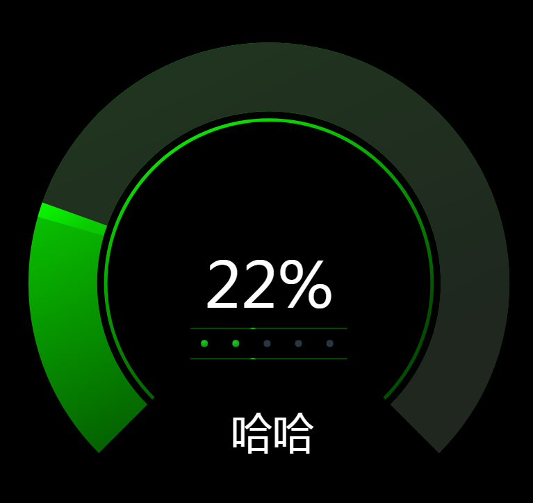
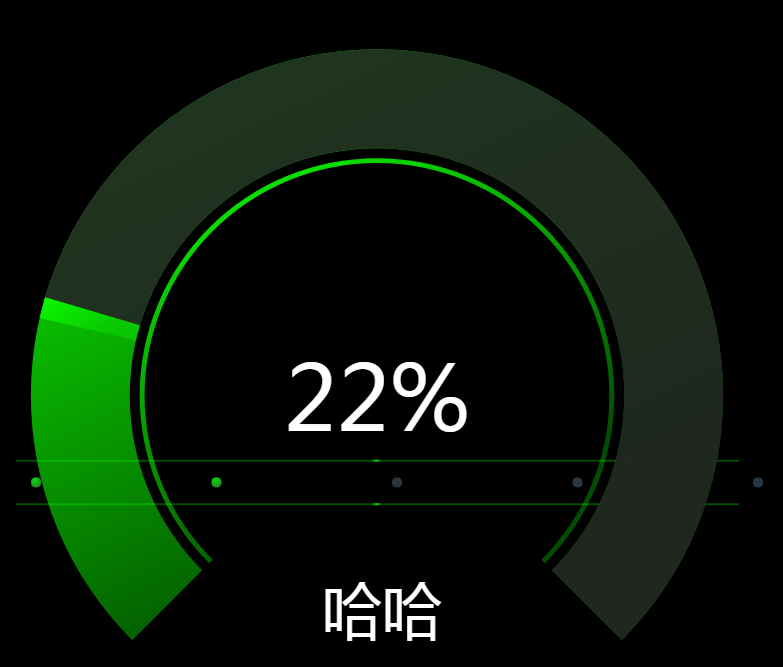
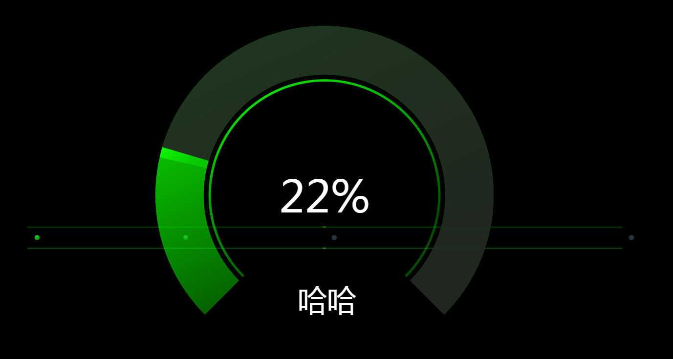
首先需要1/4个圆形
在数据对象里面设置75和25 分别表示一个占1份,另一个占4份
 series: [{
            "name": '',
            "type": 'pie',
            "radius": ['50%', '70%'],
            "avoidLabelOverlap": false,
            "startAngle": 225,
            "color": [{
                type: 'linear',
                x: 0,
                y: 0,
                x2: 0.4,
                y2: 1,
                colorStops: [{
                    offset: 0,
                    color: color_percent0 // 0% 处的颜色
                }, {
                    offset: 1,
                    color: color_percent100 // 100% 处的颜色
                }],
                globalCoord: false // 缺省为 false
            }, 'none'],
            "hoverAnimation": false,
            "legendHoverLink": false,
            "label": {
                "normal": {
                    "show": false,
                    "position": 'center'
                },
                "emphasis": {
                    "show": true,
                    "textStyle": {
                        "fontSize": '30',
                        "fontWeight": 'bold'
                    }
                }
            },
            "labelLine": {
                "normal": {
                    "show": false
                }
            },
            "data": [{
                "value": 75,
                "name": '1'
            }, {
                "value": 25,
                "name": '2'
            }]
        }]
还有一部分就是真实数据环形
 1 series:[{
 2             "name": '',
 3             "type": 'pie',
 4             "radius": ['50%', '70%'],
 5             "avoidLabelOverlap": false,
 6             "startAngle": 315,
 7             "color": ['rgba(34,34,34,.9)', "#ff7a00", "transparent"],
 8             "hoverAnimation": false,
 9             "legendHoverLink": false,
10             "clockwise": false,
11             "itemStyle": {
12                 "normal": {
13                     "borderColor": "transparent",
14                     "borderWidth": "20"
15                 },
16                 "emphasis": {
17                     "borderColor": "transparent",
18                     "borderWidth": "20"
19                 }
20             },
21             "z": 10,
22             "label": {
23                 "normal": {
24                     "show": false,
25                     "position": 'center'
26                 },
27
28             },
29             "labelLine": {
30                 "normal": {
31                     "show": false
32                 }
33             },
34             "data": [{
35                 "value": (100 - 50) * 270/ 360,
36
37                 "label": {
38                     normal: {
39                         formatter: percent + '%',
40                         position: 'center',
41                         show: true,
42                         textStyle: {
43                             fontSize: '90',
44                             fontWeight: 'normal',
45                             color: '#fff'
46                         }
47                     }
48                 },
49                 "name": ''
50             }, {
51                 "value": 1,
52                 "name": ''
53             }, {
54                 "value": 100 - (100 - 50) * 270/ 360,
55                 "name": ''
56             }]
57         }]
这个里面需要注意的是一个算法
(100 - 50) * 270/ 360
100 - (100 - 50) * 270/ 360
我们先算出这个公式里面的270 怎么得的
75/100*360 =270
也就是在270的这个圆上进行百分比的配置
如果后台传来的是50%
(100 - 50) * 270/ 360 这样算出来的就是在3/4圆中的一半位置
还有一个地方需要注意,图中有一个颜色很亮的部分,我把这个部分设置占比为1
分为3个部分来显示
分解开是这样的
其他部分用渐变来解决
说到渐变,
 1 "color": [{
 2                 type: 'linear',
 3                 x: 0,
 4                 y: 0,
 5                 x2: 0.4,
 6                 y2: 1,
 7                 colorStops: [{
 8                     offset: 0,
 9                     color: 'rgba(12,255,0,1)' // 0% 处的颜色
10                 }, {
11                     offset: 1,
12                     color: 'rgba(12,255,0,.3)'// 100% 处的颜色
13                 }],
14                 globalCoord: false // 缺省为 false
15             }, 'none'],
我遇到一个问题,就是横轴的坐标,如果不进行设置,坐标上的宽度是页面大小和数据的值变化的,如果页面放大,横轴的坐标就会跟着自适应变大
如果页面放大就会更大,效果就不好了
所以在xAxis对象里设置,根据自己的需要设置值
min: function(value) {
return value.min - 7;
},
max: function(value) {
return value.max + 7;
},
startAngle:230
起始角度,支持范围[0, 360]。

 浙公网安备 33010602011771号