
EXT JS 4.3 在线学习
官网地址:http://docs.sencha.com/extjs/4.1.3/
相关示例:http://docs.sencha.com/extjs/4.1.3/#!/example
Examples
-

Kitchen Sink (Webkit only)
Showcase of Ext JS components using a preview release of the new Neptune theme
-
Feed Viewer
RSS feed reader example application that features a swappable reader panel layout.
-
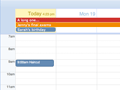
Ext JS Calendar
Example Calendar application. Demonstrates the new Day, Week and Month views and how to combine them.
-
Web Desktop
Demonstrates how one could build a desktop in the browser using Ext components including a module plugin system.
-
Portal Demo
A page layout using several custom extensions to provide a web portal interface.
-

Ext JS 3 & 4 on one page
This example demonstrates Ext JS 4's sandboxing behavior which allows you to run Ext JS 3 & 4 on the same page.
-
Image Viewer
DataView and TreePanel example that demonstrates dragging data items from a DataView into a TreePanel.
-
Theme Viewer
View and test every Ext component against bundled Ext themes.
-
Simple Tasks
Complete personal task management application example
-

SOAP Grid
Grid loaded from SOAP data
-
AMF Grid
Grid loaded from binary AMF (Action Message Format) data
-

Keyboard Feed Viewer
Shows Ext JS 4's comprehensive keyboard support for users who have difficulty using a pointing device
-
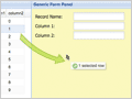
Binding a Grid to a Form
A grid embedded within a FormPanel that uses the Accessibility theme.
-
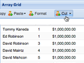
Basic Array Grid
A basic read-only grid loaded from local array data that demonstrates the use of custom column renderer functions.
-

XML Grid
A simple read-only grid loaded from XML data.
-

Paging
A grid with paging, cross-domain data loading and custom- rendered expandable row bodies.
-

Sliding Pager
A demonstration on the integration of the Slider with the Paging Toolbar using a custom plugin.
-
Grouping
A basic grouping grid showing collapsible data groups that can be customized via the 'Group By' header menu option.
-

Grid Plugins
Multiple grids customized via plugins: expander rows, checkbox selection and row numbering.
-
Grid Filtering
Grid feature providing custom data filtering menus that support various data types.
-

Grid Data Binding (basic)
Data binding a grid to a detail preview panel via the grid"s RowSelectionModel.
-
Grid Data Binding (advanced)
Refactoring the basic data binding example to use a class-based application design model.
-

Multiple Sorting
An example that shows multi-level sorting in a Grid Panel.
-
Grid Cell Editing
An example that shows cell editing in a Grid Panel.
-
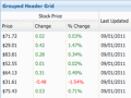
Grouped Header Grid
A basic grouping grid showing collapsible data groups that can be customized via the 'Group By' header menu option.
-
Grid Grouping with Summary
Advanced grouping grid that allows cell editing and includes custom dynamic summary calculations.
-

Infinite Grid (Updated)
Sample grid which scrolls through thousands of rows dynamically loaded from a server
-
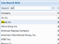
Grid with Live Search Capability
Grid with Live Search Capability.
-
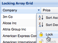
Grid with Locking Capability
An example extension that introduces the ability to add locking columns to the GridPanel.
-
Grouping with Remote Summary
Advanced grouping grid that allows cell editing and includes remotely loaded dynamic summary calculations.
-

Grid Row Editing
An editable grid which allows the user to make modifications to an entire record at once.
-
RESTful Store with GridPanel and RowEditor
A RESTful Store with JsonWriter which automatically generates CRUD requests to the server.
-
Editable Grid with Writable Store
This Store uses Data's writer to automatically generate CRUD requests to the server through a standard Ajax Proxy.
-
Editable Grid with Writable Store
This Store uses Data's writer to automatically generate CRUD requests to the server through a standard JsonP Proxy.
-
Buffered Scrolling(Updated)
The new grid uses a virtualized scrolling system to handle potentially infinite data sets without any impact on client side performance.
-
List View
Ext 4 replaces Ext.ListView with the default Ext.grid.Panel.
-
Progress Bar Pager
Progress Bar Pager Extension.
-

Property Grid
Create a property grid from an object.
-
Reconfigure Grid
Reconfigure the columns & data of a grid dynamically
-
Grid From Markup
Create a grid with from an existing, unformatted HTML table.
-
Locking Grouping Grid with Summary
Advanced grouping grid that allows cell editing and includes custom dynamic summary calculations. With column locking capability
-
Infinite Grid with remote filter (Updated)
Sample grid which scrolls through thousands of rows dynamically loaded from a server with a filtering UI
-
Locking Grouping Grid with Summary and grouped headers
Grouped grid with locked columns and grouped column headers
-

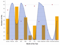
Area Charts
Display 7 sets of random data in an area series. Reload data will randomly generate a new set of data in the store.
-
Custom Area Charts
Display browser usage trends in an area series. This chart uses custom gradients for the colors and the legend is interactive.
-
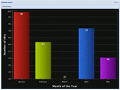
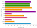
Bar Charts
Display a sets of random data in a bar series. Reload data will randomly generate a new set of data in the store.
-
Custom Bar Charts
Displaying a horizontal bar series with a bar renderer that modifies the color of each bar.
-
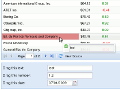
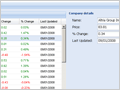
Complex Dashboard
Showing companies information in a complex dashboard. Edit the information for each record in the form to see live updates in the charts and grid.
-
Rich Tips
Showing a line series with rich tips. Tips show dynamic information in Grid and Pie chart components.
-
Themed Line Charts
Using 3.x theme. Displaying multiple charts and mixed charts with mouse over and click interaction.
-
Column Charts
Display a set of random data in a column series. Reload data will randomly generate a new set of data in the store.
-
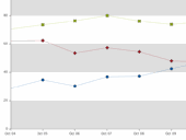
Line Charts
Display 2 sets of random data in a line series. Reload data will randomly generate a new set of data in the store.
-
Column Custom Background
A Column chart with customized theme and animation transitions
-
Mixed Series Chart
Display 3 sets of random data using a line, bar, and scatter series. Reload data will randomly generate a new set of data in the store.
-
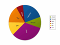
Pie Charts
Display 5 sets of random data using a pie chart. Reload data will randomly generate a new set of data in the store.
-
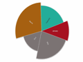
Custom Pie Charts
Display 5 sets of random data using a pie chart. A renderer has been set up on to dynamically change the length and color of each slice based on the data.
-

Radar Charts
Display 3 sets of random data in a radar series. Note this example uses a radial axis.
-
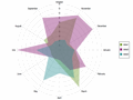
Filled Radar Charts
Display 3 sets of random data in a filled radar series. Click or hover on the legend items to highlight and remove them from the chart.
-
Scatter Charts
Display 2 sets of random data in a scatter series. A renderer has been set up on to dynamically change the size and color of the items based upon it's data.
-
Stacked Bar Charts
Showing movie taking by genre as a stacked bar chart sample. Filter the stacks by clicking on the legend items.
-
Live Updated Chart
Showing a line series with data updating at a regular interval.
-
Live Animated Chart
Showing a line series with smooth transitions on data updating at regular intervals.
-

Gauge Chart
Display three custom gauge charts bound to different data stores with different configuration options and easings.
-

Grouped Bar
Display 3 sets of random data in a grouped bar series.
-

Reload Chart
Display a Column Chart Sample that animates when refreshing the data set
-

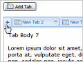
Basic Tabs
Basic tab functionality including autoHeight, tabs from markup, Ajax loading and tab events.
-
Advanced Tabs
Advanced tab features including tab scrolling, adding tabs programmatically and a context menu plugin.
-
Tab overflow menu
Demonstrates the TabPanel overflow menu extension, which makes management of large numbers of tabs easier
-

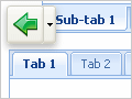
Group Tabs
A custom example on how to setup tab grouping using vertical tabs.
-
Window Variations
A collection of Windows in different configurations, showing headers attached to any side of the window.
-
Layout Window
A window containing a basic BorderLayout with nested TabPanel.
-
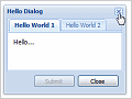
MessageBox
Different styles include confirm, alert, prompt, progress and wait and also support custom icons.
-
Drag and Drop Reordering
A TreePanel loaded asynchronously via a JSON TreeLoader that shows drag and drop with container scroll.
-

Multiple trees
Drag and drop between two different sorted TreePanels.
-

TreeGrid
The TreeGrid component
-

Check Tree
An example showing simple checkbox selection in a tree.
-

XML Tree
A custom TreeLoader implementation that demonstrates loading a tree from an XML document.
-

Custom Drop Logic
Apply custom logic to determine where nodes can be moved.
-
Layout Browser
Comprehensive showcase of the standard layout managers as well as several custom and combination layouts and combination examples.
-
Border Layout
A complex BorderLayout implementation that shows nesting multiple components and sub-layouts.
-
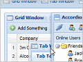
Accordion Layout
A basic accordion layout within a border layout.
-
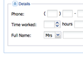
Anchor Layout (Form)
A simple example of form fields utilizing an anchor layout in a window for flexible form resizing.
-

Anchor Layout (Panel)
An example of Panels anchored in the browser window.
-
Column Layout
An example of Panels managed by a column layout.
-

Table Layout
An example of Panels managed by a table layout.
-
HBox Layout
Interactive layout illustrating the capabilities of the HBox Layout.
-
VBox Layout
Interactive layout illustrating the capabilities of the VBox Layout.
-
Complex Layout
A complex layout example.
-

Resizable Sencha Logo
Resolution independent Sencha logo in a resizable component.
-

Browser Logos
Resolution independent logos of all the popular browsers.
-

Tiger
The classic SVG Tiger in a floatable, draggable component. Scalable to any size, fully resolution independent.
-

Rotate Text
Create text in a Draw Component which can be rotated easily in any browser.
-

Grid to Grid DnD
Shows how rows can be easily dragged and dropped between two or more grids
-
Grid to Form DnD
Enables a user to drag a record from a grid and drop it into a form, where it can be edited
-
Field to Grid DnD
Demonstrates dragging a value from a field onto a grid cell
-
Custom Drag and Drop
A completely custom Drag and Drop example showing DnD between a DataView and a grid
-

Basic Toolbar
Toolbar and menus that contain various components like date pickers, color pickers, sub-menus and more.
-

Toolbar Button Groups
Group buttons together in the toolbar.
-
Vertical Toolbars
Vertical Toolbars on the left and right. Combined vertical and horizontal toolbars.
-
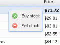
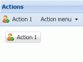
Ext Grid Actions
Bind the same behavior to multiple buttons, toolbar and menu items using the Ext.Action class.
-
Reorderable Toolbar
Items within a toolbar can be reordered using this plugin.
-
Overflow Toolbar
Items within a toolbar will be placed into an overflow menu if the toolbar is too narrow.
-
Status Bar
A simple StatusBar that can be dropped into the bottom of any panel to display status text and icons.
-
Status Bar (Advanced)
Customizing the StatusBar via a plugin to provide automatic form validation monitoring and error linking.
-
Ext Toolbar Actions
Bind the same behavior to multiple buttons, toolbar and menu items using the Ext.Action class.
-

Basic ComboBox
Basic combos, combos rendered from markup and customized list layout to provide item tooltips.
-
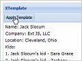
ComboBox Templates
Customized combo with template-based list rendering, remote loading and paging.
-

DataView
This example shows how to use an Ext.view.View
-
Animated DataView
Transition animation plugin applied to a standard DataView
-

Multi-sort DataView
Example demonstrating the ability to sort a DataView by multiple sorters.
-
Advanced DataView
DataView which allows you to filter and sort images.
-

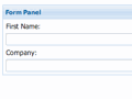
Dynamic Forms
Various example forms showing collapsible fieldsets, column layout, nested TabPanels and more.
-
Ajax with XML Forms
Ajax-loaded form fields from remote XML data and remote field validation on submit.
-
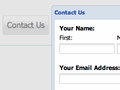
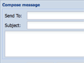
Contact Us Form
An example of a common popup Contact Us form.
-
Custom Search Fields
A TriggerField search extension combined with an XTemplate for custom results rendering.
-
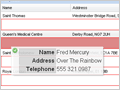
Binding a Grid to a Form
A grid embedded within a FormPanel that automatically loads records into the form on row selection.
-

Field Types
This example shows off all of the field types available in Ext JS in lots of different configurations.
-

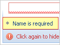
Advanced Validation
Relational form field validation using custom vtypes.
-
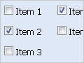
Checkbox/Radio Groups
Examples showing different checkbox and radio group configurations.
-

File Upload Field
A demo of how to give standard file upload fields a bit of Ext style using a custom class.
-
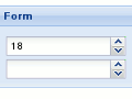
Number Field
An example of the Number field, with and without a spinner.
-

MultiSelect and ItemSelector
Example controls for selecting a list of items in forms.
-

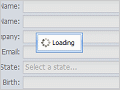
Registration Form
An account registration form, with custom global error message display.
-

Shopping Cart Checkout
An example of a common shopping cart checkout form.
-

Slider Field
Example usage of an Ext.Slider to select a number value in a form.
-
Forms with vBox layout
Example usage of the vBox layout with forms. An added bonus is the FieldReplicator plugin.
-
Forms with hBox layout
Example usage of the hBox layout with a form. Includes automatically adjusting validation messages.
-
Field Containers
Example usage of the FieldContainer to place several fields on a single form row.
-

Form with absolute layout
A simple example of form fields utilizing an absolute layout in a window for flexible form resizing.
-
Custom form Field
A simple example that demonstrate how to create a custom form field.
-

Direct
An example demonstrating Remoting and Polling the server
-
Direct Form
Ext.Direct Remoting with a Form
-
Direct Grid
Ext.Direct Remoting with a Grid
-
Direct TreeLoader
Ext.Direct Remoting with a Tree
-
Direct Named Arguments
Ext.Direct Named Arguments
-
Feed Viewer
An MVC application version of the Feed Viewer example. This shows best practice for a small app
-
Nested Loading
An MVC example that shows simple navigation and nested loading with the data package
-
History
A History manager that allows the user to navigate an Ext UI via browser back/forward.
-

Google Maps
A Google Maps wrapper class that enables easy display of dynamic maps in Ext panels and windows.
-

Editor
An example demonstrating the ease of use of the Ext.editor class to modify DOM elements
-

Slider
A slider component that supports vertical mode, snapping, tooltips, customized styles and multiple thumbs.
-
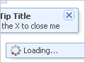
QuickTips
Various tooltip and quick tip configuration options including Ajax loading and mouse tracking.
-

Progress Bar
A basic progress bar component shown in various configurations and with custom styles.
-

Panels
A basic collapsible panel example.
-

Resizable
Examples of making any element resizable with various configuration options.
-

Buttons
Shows buttons in many of their possible configurations
-
Spotlight
A utility for masking everything except a single element on the page to visually highlight it.
-
Keyboard Navigation
Shows a custom keyboard navigation using the KeyNav class
-

Localization (static)
Demonstrates fully localizing a form by including a custom locale script.
-
Localization (dynamic)
Dynamically render various Ext components in different locales by selecting from a locale list.
-
Browser State Management
An example of storing your application's state.
-
Basic Templating
A basic templating example.
-
Bubble Panel
This is a custom panel UI to achieve a different look and feel while not changing the default appearance of an Ext.Panel.

 浙公网安备 33010602011771号