CSS实现一个牛奶加载动画
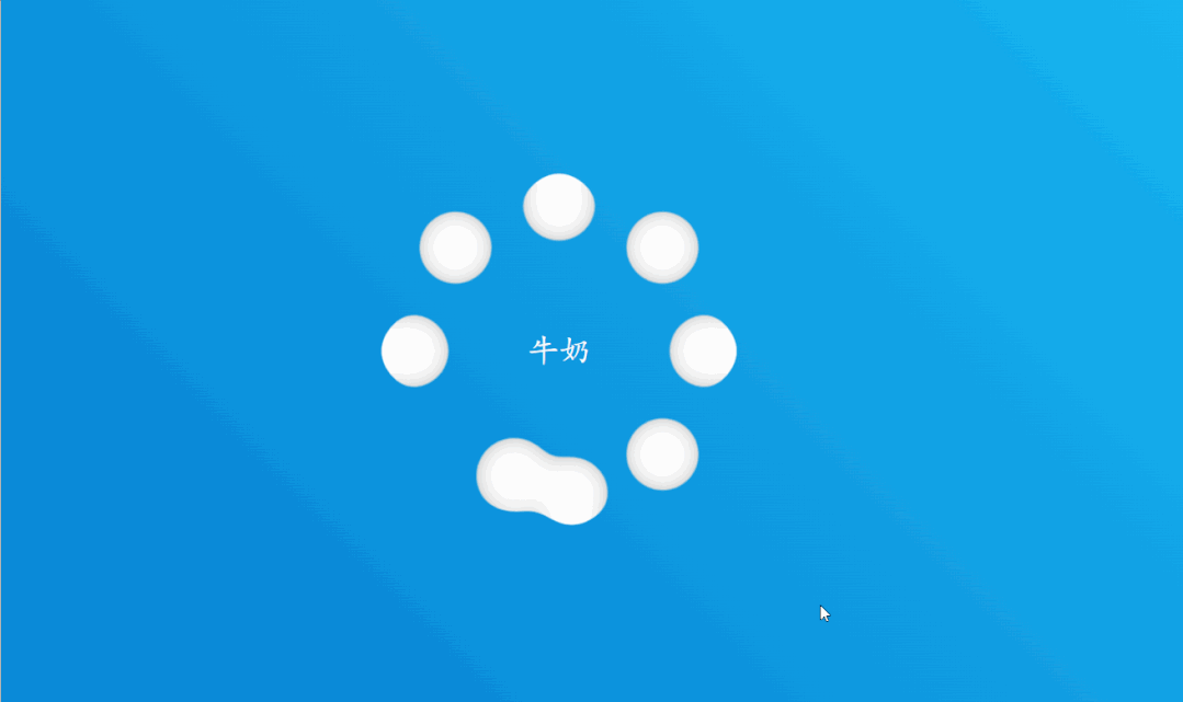
HTML代码:
<!doctype html>
<html>
<head>
  <meta charset="utf-8">
  <title>【每日一练】69—CSS实现一个牛奶加载动画</title>
</head>
<body>
  <div class="container">
    <h2>牛奶</h2>
    <div class="loader">
      <span style="--i:0;"></span>
      <span style="--i:1;"></span>
      <span style="--i:2;"></span>
      <span style="--i:3;"></span>
      <span style="--i:4;"></span>
      <span style="--i:5;"></span>
      <span style="--i:6;"></span>
      <span style="--i:7;"></span>
    </div>
  </div>
  <svg>
    <filter id="gooey">
      <feGaussianBlur in="SourceGraphic" stdDeviation="10" />
      <feColorMatrix values="
                            1 0 0 0 0
                            0 1 0 0 0
                            0 0 1 0 0
                            0 0 0 20 -10"
                      />
    </filter>
  </svg>
</body>
</html>
CSS代码:
*
{
  margin: 0;
  padding: 0;
  box-sizing: border-box;
  font-family: 'Oleo Script Swash Caps', cursive;
}
body
{
  display: flex;
  justify-content: center;
  align-items: center;
  min-height: 100vh;
  background: linear-gradient(45deg,#006bc6,#1ecafc);
}
.container
{
  position: relative;
  display: flex;
  justify-content: center;
  align-items: center;
}
.container h2
{
  position: absolute;
  color: #fff;
  font-size: 1.75em;
  font-weight: 500;
}
.loader
{
  position: relative;
  width: 300px;
  height: 300px;
  display: flex;
  justify-content: center;
  align-items: center;
  background: rgba(0,0,0,0.25);
  filter: url(#gooey);
}
.loader span
{
  position: absolute;
  left: 0px;
  transform-origin: 150px;
  width: 60px;
  height: 60px;
  background: #fff;
  border-radius: 50%;
  animation: animate 5s ease-in-out infinite;
  animation-delay: calc(0.15s * var(--i));
}
@keyframes animate
{
  0%,10%
  {
    width: 100px;
    height: 100px;
    transform: rotate(0deg) translateX(120px);
  }
  40%,70%
  {
    width: 40px;
    height: 40px;
    transform: rotate(calc(360deg / 8 * var(--i)));
    box-shadow: 0 0 0 10px #fff;
  }
  90%,100%
  {
    width: 100px;
    height: 100px;
    transform: rotate(0deg) translateX(120px);
  }
}
svg
{
    width: 0;
    height: 0;
}

 浙公网安备 33010602011771号