matplotlib模块之绘图设计
matplotlib模块
In [11]:
import matplotlib.pyplot as plt
import pandas as pd
import numpy as np
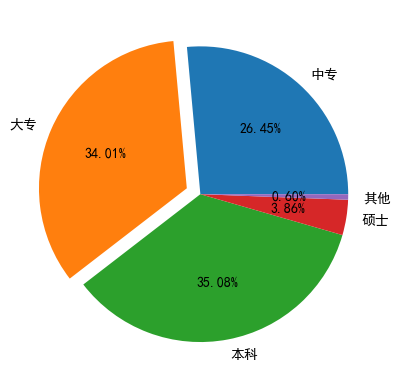
饼图绘制
In [4]:
# 解决中文乱码问题
plt.rcParams['font.sans-serif'] = ['SimHei']
# 构造数据
edu = [0.2515, 0.3234, 0.3336, 0.0367, 0.0057]
labels = ['中专', '大专', '本科', '硕士', '其他']
explode = [0,0.1,0,0,0]
plt.pie(x=edu,#绘图数据
       labels = labels,# 添加标签
        autopct = '%.2f%%',#设置百分比格式,这里保留两位小数
        explode = explode,#呈现爆炸式突出 离圆心点位置
       )
# %matplotlib
plt.show()
'''
默认情况下,使用matplotlib绘制图片是嵌入式展示的,可以设置弹窗式展示。
使用步骤:代码输入 %matplotlib,运行没反应再注释掉运行就有反应了。
'''
Out[4]:
'\n默认情况下,使用matplotlib绘制图片是嵌入式展示的,可以设置弹窗式展示。 \n使用步骤:代码输入 %matplotlib,运行没反应再注释掉运行就有反应了。\n'
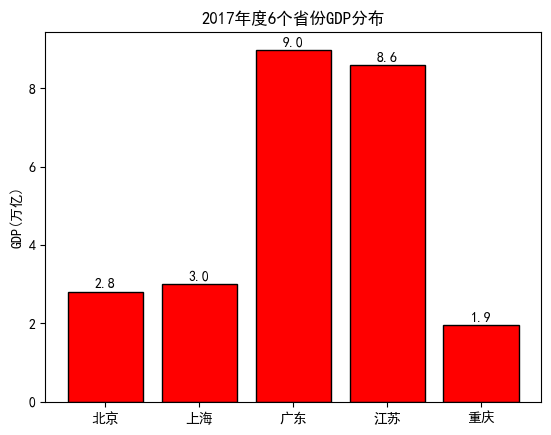
条形图
In [5]:
# 文件中读取数据
GDP = pd.read_excel(r'GDP1.xlsx')
GDP.head()
Out[5]:
| Province | GDP | |
|---|---|---|
| 0 | 北京 | 2.80 |
| 1 | 上海 | 3.01 |
| 2 | 广东 | 8.99 |
| 3 | 江苏 | 8.59 |
| 4 | 重庆 | 1.95 |
In [11]:
# 绘制条形图
plt.bar(x=range(GDP.shape[0]),# 指定条形图轴的刻度值
       height = GDP['GDP'], #指定条形图的y轴
       tick_label = GDP.Province, # 指定条形图x轴的刻度标签
        color = 'red',# 指定条形图的填充色
       edgecolor = 'black', # 指定条形图的边框色
       )
# 给y轴添加一个标签注释
plt.ylabel('GDP(万亿)')
# 添加条形图的标题
plt.title('2017年度6个省份GDP分布')
##########################################
# 为每个条形图添加数值标签
for x, y in enumerate(GDP.GDP):
    plt.text(x, y+0.1, '%s'%round(y,1), ha='center')
##########################################
plt.show()
In [12]:
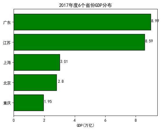
# 水平条形图
# 对读入数据做升序排序
GDP.sort_values(by = 'GDP', inplace = True)
"""
ascending 决定升序还是降序
"""
In [24]:
# 绘制水平条形图
plt.barh(y=range(GDP.shape[0]),# 指定条形图轴的刻度值
       width = GDP['GDP'], #指定条形图的y轴
       tick_label = GDP.Province, # 指定条形图x轴的刻度标签
       color = 'green',# 指定条形图的填充色
       edgecolor = 'black', # 指定条形图的边框色
       )
# 给x轴添加一个标签注释
plt.xlabel('GDP(万亿)')
# 添加条形图的标题
plt.title('2017年度6个省份GDP分布')
# 为每个条形图添加数值标签
for y, x in enumerate(GDP.GDP):
    plt.text(x+0.3, y, '%s'%round(x,2), ha='center')
plt.show()
In [45]:
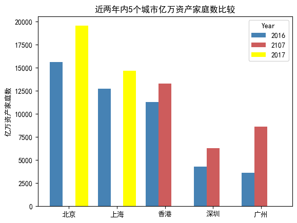
# 交叉条形图
HuaRen = pd.read_excel(r'Count1.xlsx')
HuaRen.head()
Out[45]:
| Year | Counts | City | |
|---|---|---|---|
| 0 | 2016 | 15600 | 北京 |
| 1 | 2016 | 12700 | 上海 |
| 2 | 2016 | 11300 | 香港 |
| 3 | 2016 | 4270 | 深圳 |
| 4 | 2016 | 3620 | 广州 |
In [46]:
# Pandas模块之水平交错条形图
# pivot_table 数据透视表
HuaRen_reshape = HuaRen.pivot_table(
            index = 'City',
            columns = 'Year',
            values = 'Counts').reset_index()
HuaRen_reshape
Out[46]:
| Year | City | 2016 | 2017 | 2107 |
|---|---|---|---|---|
| 0 | 上海 | 12700.0 | 14700.0 | NaN |
| 1 | 北京 | 15600.0 | 19600.0 | NaN |
| 2 | 广州 | 3620.0 | NaN | 8620.0 |
| 3 | 深圳 | 4270.0 | NaN | 6270.0 |
| 4 | 香港 | 11300.0 | NaN | 13300.0 |
In [50]:
#对数据集降序排序
HuaRen_reshape.sort_values(by = 2016, ascending = False, inplace = True)
HuaRen_reshape.plot(
    x='City',
    y = [2016,2107, 2017],
    kind = 'bar',
    color = ['steelblue', 'indianred', 'yellow'],
    # 用于旋转x轴刻度标签的角度,0表示水平显示刻度标签
    rot = 0,
    width = 0.8,
    title = '近两年内5个城市亿万资产家庭数比较',
)
# 添加y轴标签
plt.ylabel('亿万资产家庭数')
# 将x轴标签去除
plt.xlabel('')
plt.show()
直方图
折线图
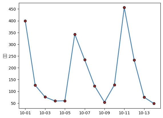
In [12]:
# 数据读取
wechat = pd.read_excel(r'Wechat.xlsx')
wechat.head()
Out[12]:
| Date | Counts | Times | |
|---|---|---|---|
| 0 | 2017-10-01 | 399 | 453 |
| 1 | 2017-10-02 | 126 | 234 |
| 2 | 2017-10-03 | 76 | 645 |
| 3 | 2017-10-04 | 59 | 235 |
| 4 | 2017-10-05 | 60 | 654 |
In [13]:
plt.plot(
    wechat.Date, # x轴数据
    wechat.Counts, # y轴数据
    linestyle = '-', # 折线的类型
    linewidth = 2, # 折线的宽度
    color = 'steelblue', # 折线的颜色
    marker = 'o', # 折线图中添加圆点
    markersize = 6, # 点的大少
    markeredgecolor = 'black', # 点的边框色
    markerfacecolor = 'brown', # 点的天从折
        )
# 获取图的坐标位置
ax = plt.gca()
# 设置日期的显示格式
import matplotlib as mpl
date_format = mpl.dates.DateFormatter("%m-%d")
ax.xaxis.set_major_formatter(date_format)
# # 设置x轴每个刻度的间隔天数
# xlocator = mpl.ticker.MultipleLocator(7)
# ax.xaxis.set_major_locator(xlocator)
# 添加y轴标签
plt.ylabel('人数')
# 显示图形
plt.show()
D:\Users\24579\anaconda3\Lib\site-packages\IPython\core\pylabtools.py:152: UserWarning: Glyph 20154 (\N{CJK UNIFIED IDEOGRAPH-4EBA}) missing from current font.
  fig.canvas.print_figure(bytes_io, **kw)
D:\Users\24579\anaconda3\Lib\site-packages\IPython\core\pylabtools.py:152: UserWarning: Glyph 25968 (\N{CJK UNIFIED IDEOGRAPH-6570}) missing from current font.
  fig.canvas.print_figure(bytes_io, **kw)
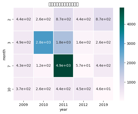
热力图
In [26]:
import numpy as np
import seaborn as sns
# 读取数据
Sales = pd.read_excel(r'Sales.xlsx')
Sales.head()
Out[26]:
| Date | Sales | |
|---|---|---|
| 0 | 2010-10-13 | 261.5400 |
| 1 | 2012-02-20 | 435.7500 |
| 2 | 2011-07-15 | 2808.0800 |
| 3 | 2011-07-15 | 1761.4000 |
| 4 | 2011-07-15 | 160.2335 |
In [27]:
# 根据交易日期,衍生出年份和月份字段
# 将date拆分出 year、month
Sales['year'] = Sales.Date.dt.year
Sales['month'] = Sales.Date.dt.month
Sales.head()
Out[27]:
| Date | Sales | year | month | |
|---|---|---|---|---|
| 0 | 2010-10-13 | 261.5400 | 2010 | 10 |
| 1 | 2012-02-20 | 435.7500 | 2012 | 2 |
| 2 | 2011-07-15 | 2808.0800 | 2011 | 7 |
| 3 | 2011-07-15 | 1761.4000 | 2011 | 7 |
| 4 | 2011-07-15 | 160.2335 | 2011 | 7 |
In [28]:
# 统计每年各月份的销售总额(绘制热力图之前,必须将数据转换为交叉表形式)
Summary = Sales.pivot_table(index = 'month', columns = 'year', values = 'Sales', aggfunc = np.sum)
Summary
Out[28]:
| year | 2009 | 2010 | 2011 | 2012 | 2019 |
|---|---|---|---|---|---|
| month | |||||
| 2 | 435.7500 | 261.5400 | 865.7040 | 435.7500 | 865.7040 |
| 3 | 489.3945 | 2808.0800 | 1761.4000 | 160.2335 | 261.5400 |
| 7 | 432.5300 | 123.9302 | 4853.6437 | 56.8645 | 435.7500 |
| 10 | 366.8887 | 261.5400 | 435.5640 | 445.7764 | 45.7855 |
In [30]:
# 绘制热力图
sns.heatmap(data = Summary, # 指定绘图数据
            cmap = 'PuBuGn', # 指定填充色
            linewidths = .1, # 设置每个单元格边框的宽度
            annot = True, # 显示数值
            fmt = '.1e' # 以科学计算法显示数据
            )
#添加标题
plt.title('每年各月份销售总额热力图')
# 显示图形
plt.show()
D:\Users\24579\anaconda3\Lib\site-packages\IPython\core\pylabtools.py:152: UserWarning: Glyph 27599 (\N{CJK UNIFIED IDEOGRAPH-6BCF}) missing from current font.
  fig.canvas.print_figure(bytes_io, **kw)
D:\Users\24579\anaconda3\Lib\site-packages\IPython\core\pylabtools.py:152: UserWarning: Glyph 24180 (\N{CJK UNIFIED IDEOGRAPH-5E74}) missing from current font.
  fig.canvas.print_figure(bytes_io, **kw)
D:\Users\24579\anaconda3\Lib\site-packages\IPython\core\pylabtools.py:152: UserWarning: Glyph 21508 (\N{CJK UNIFIED IDEOGRAPH-5404}) missing from current font.
  fig.canvas.print_figure(bytes_io, **kw)
D:\Users\24579\anaconda3\Lib\site-packages\IPython\core\pylabtools.py:152: UserWarning: Glyph 26376 (\N{CJK UNIFIED IDEOGRAPH-6708}) missing from current font.
  fig.canvas.print_figure(bytes_io, **kw)
D:\Users\24579\anaconda3\Lib\site-packages\IPython\core\pylabtools.py:152: UserWarning: Glyph 20221 (\N{CJK UNIFIED IDEOGRAPH-4EFD}) missing from current font.
  fig.canvas.print_figure(bytes_io, **kw)
D:\Users\24579\anaconda3\Lib\site-packages\IPython\core\pylabtools.py:152: UserWarning: Glyph 38144 (\N{CJK UNIFIED IDEOGRAPH-9500}) missing from current font.
  fig.canvas.print_figure(bytes_io, **kw)
D:\Users\24579\anaconda3\Lib\site-packages\IPython\core\pylabtools.py:152: UserWarning: Glyph 21806 (\N{CJK UNIFIED IDEOGRAPH-552E}) missing from current font.
  fig.canvas.print_figure(bytes_io, **kw)
D:\Users\24579\anaconda3\Lib\site-packages\IPython\core\pylabtools.py:152: UserWarning: Glyph 24635 (\N{CJK UNIFIED IDEOGRAPH-603B}) missing from current font.
  fig.canvas.print_figure(bytes_io, **kw)
D:\Users\24579\anaconda3\Lib\site-packages\IPython\core\pylabtools.py:152: UserWarning: Glyph 39069 (\N{CJK UNIFIED IDEOGRAPH-989D}) missing from current font.
  fig.canvas.print_figure(bytes_io, **kw)
D:\Users\24579\anaconda3\Lib\site-packages\IPython\core\pylabtools.py:152: UserWarning: Glyph 28909 (\N{CJK UNIFIED IDEOGRAPH-70ED}) missing from current font.
  fig.canvas.print_figure(bytes_io, **kw)
D:\Users\24579\anaconda3\Lib\site-packages\IPython\core\pylabtools.py:152: UserWarning: Glyph 21147 (\N{CJK UNIFIED IDEOGRAPH-529B}) missing from current font.
  fig.canvas.print_figure(bytes_io, **kw)
D:\Users\24579\anaconda3\Lib\site-packages\IPython\core\pylabtools.py:152: UserWarning: Glyph 22270 (\N{CJK UNIFIED IDEOGRAPH-56FE}) missing from current font.
  fig.canvas.print_figure(bytes_io, **kw)
组合图
In [ ]:

 浙公网安备 33010602011771号