封装组件发布到npm上,项目中可以npm install,这里做一个简单的封装例子(第二步)
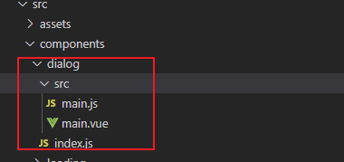
第一步就是我们平常的写的vue组件,比如dialog,我的目录如下,这里面目录自己随意写
main.vue组件,编写组件
1.根据传入的 type 确定弹窗的类型(成功提示,失败提示,警告,加载,纯文字)
2.设置弹窗消失的时间
<template>
  <div class="dialog-mask" v-if="showDialog" @click.self="cancelClick">
    <div class="dialog-box">
      <header class="header" v-html="title" v-if="title">
      </header>
      <article class="body tc" v-html="text" v-if="text">
      </article>
      <article class="edit-block" v-if="type === 'input'" :class="text ? '' : 'pt-15'">
        <textarea class="edit-el" rows="3" :placeholder="placeholder" v-model.trim="content" :maxlength="maxLength"></textarea>
      </article>
      <footer class="footer tc">
        <div class="my-cancel-btn dib" v-show="showCancelBtn" v-text="cancelText" @click="cancelClick">
        </div>
        <div class="confirm-btn" :style="{width: showCancelBtn ? '50%' : '100%'}" v-text="confirmText" @click="confirmClick" :class="showCancelBtn ? 'dib' : ''">
        </div>
      </footer>
    </div>
  </div>
</template>
<script>
export default {
  name: 'dialog-box',
  data () {
    return {
      showDialog: true,
      type: '',
      title: '',
      /* 文本 */
      text: '',
      /* 输入内容 */
      content: '',
      /* 默认输入最长20个字 */
      maxLength: 20,
      showCancelBtn: true,
      confirmText: '确定',
      cancelText: '取消',
      placeholder: '请输入...(最多20个字)',
      confirm: null
    }
  },
  methods: {
    cancelClick () {
      this.showDialog = false
    },
    confirmClick () {
      this.confirm(this.content)
      this.showDialog = false
    }
  },
  mounted () {
    this.maxLength = this.length ? this.length : 20
  }
}
/*  使用例子 只有type = input 时是有输入框的
  this.$dialog({
        title: '流程结束',
        text: '您未开启下节点处理,确定后审批流程结束,不需要下节点处理人操作!',
        // type: 'input',
        // placeholder: '请输入内容文本...',
        // length: 10,
        showCancelBtn: false,
        confirmText: '确认',
        confirm () {
        }
      })
  */
</script>

<style lang="less" scoped>
.dialog-mask {
  position: fixed;
  z-index: 999;
  top: 0;
  bottom: 0;
  left: 0;
  right: 0;
  background-color: rgba(0, 0, 0, 0.5);
}

.dialog-box {
  position: fixed;
  background-color: #ffffff;
  width: 270px;
  left: 50%;
  top: 50%;
  transform: translateX(-50%) translateY(-50%);
  font-size: 16px;
  border-radius: 4px;
  .header {
    color: #000000;
    padding: 15px 15px 0;
    font-size: 18px;
    line-height: 28px;
    text-align: center;
  }
  .body {
    padding: 0 15px 15px;
    color: #555555;
    font-size: 16px;
    line-height: 26px;
  }
  .pt-15 {
    padding-top: 15px !important;
  }
  .edit-block {
    padding: 0 15px 15px;
    .edit-el {
      border-radius: 0.1rem;
      padding: 8px 10px;
      width: 100%;
      color: #555555;
      font-size: 16px;
    }
    .edit-el::placeholder {
      color: #888888;
      font-size: 16px;
      line-height: 20px;
    }
  }
  .footer {
    border-top: 0.01rem solid #eeeeee;
    white-space: nowrap;
    font-size: 0;
    .my-cancel-btn {
      padding: 11px 0;
      font-size: 18px;
      line-height: 28px;
      width: 50%;
      color: #222222;
      border-radius: 0 0 0 4px;
      border-right: 0.01rem solid #eeeeee;
      background-color: white;
    }
    .confirm-btn {
      padding: 11px 0;
      font-size: 18px;
      line-height: 28px;
      width: 50%;
      color: #222222;
      border-radius: 0 0 0 4px;
      background-color: white;
      color: #597ef7;
    }
  }
}
textarea {
  background-color: #f5f5f5;
}
</style>
第二步注册 dialog组件
1.利用 Vue.extend 构造器把dialog组件挂载到 vue 实例下
import Vue from 'vue'
import Main from './main.vue'

let DialogConstructor = Vue.extend(Main)

let instance
const Dialog = function (options) {
  options = options || {}
  instance = new DialogConstructor({
    data: options
  })
  instance.vm = instance.$mount()
  document.body.appendChild(instance.vm.$el)
  return instance.vm
}
export default Dialog
第三步发布组件
1. 在 src 下新建 index.js 文件,引入需要上传的组件,这里主要用到 vue 两种注册组件和插件的方法
1.Vue.component(key, val)
2.Vue.use()

index.js
import toast from './components/toast'
import dialog from './components/dialog'
const YMUI = {
// 这里是后续补充的组件
}

const install = function (Vue, opts = {}) {
  if (install.installed) return
  Object.keys(YMUI).forEach(key => {
    Vue.component(key, YMUI[key])
  })

  Vue.prototype.$toast = toast
  Vue.prototype.$dialog = dialog
}

// auto install
if (typeof window !== 'undefined' && window.Vue) {
  install(window.Vue) // 通过use方式全部引入
}

const API = {
  install,
  ...YMUI
}

export default API // 通过插件单独引入
到这里我们组件封装,准备要发布到npm的工作做完,下面就是推送到npm上
记下点滴,等老了慢慢欣赏

 浙公网安备 33010602011771号