

Day29渐变及综合案例
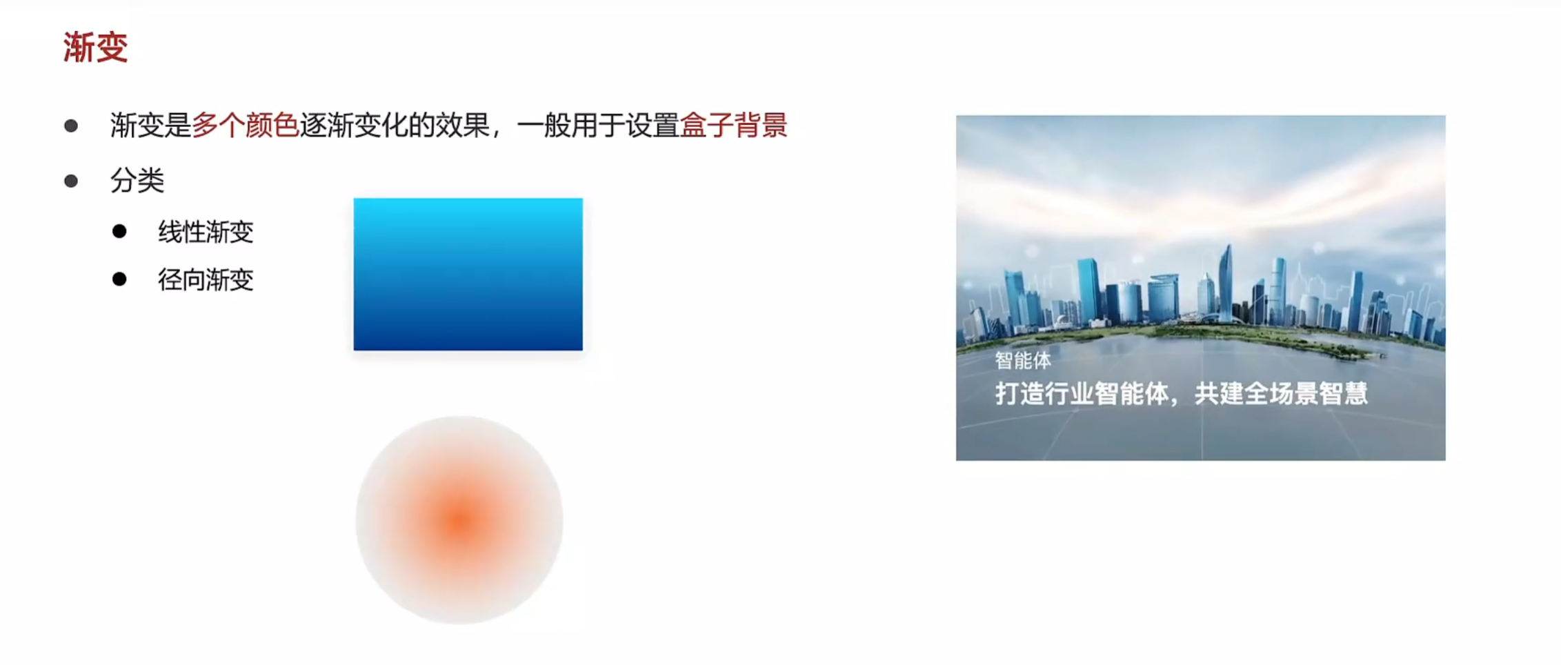
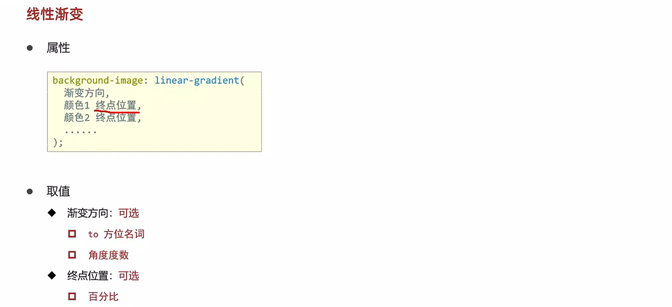
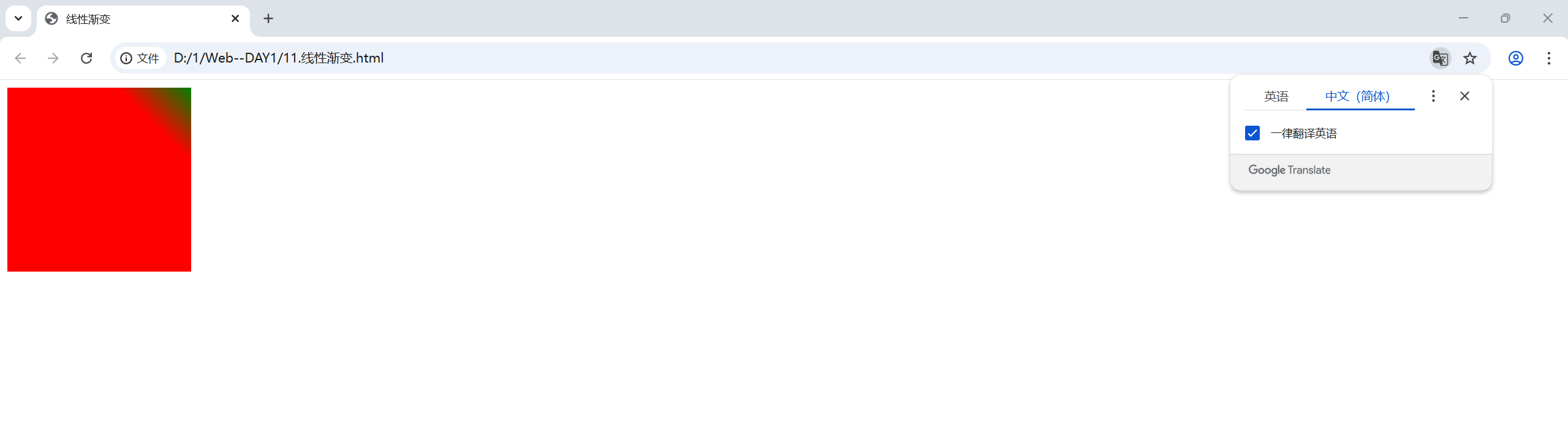
线性渐变
<!DOCTYPE html>
<html lang="en">
<head>
    <meta charset="UTF-8">
    <meta name="viewport" content="width=device-width, initial-scale=1.0">
    <title>线性渐变</title>
    <style>
        div{
            width: 200px;
            height: 200px;
            background-color: green;
            background-image: linear-gradient(
                /* to right, */
                45deg,
                red 80%,/* 后面添加百分比为其设置终点位置 */
                green
            );
        }
    </style>
</head>
<body>
    <div></div>
</body>
</html>
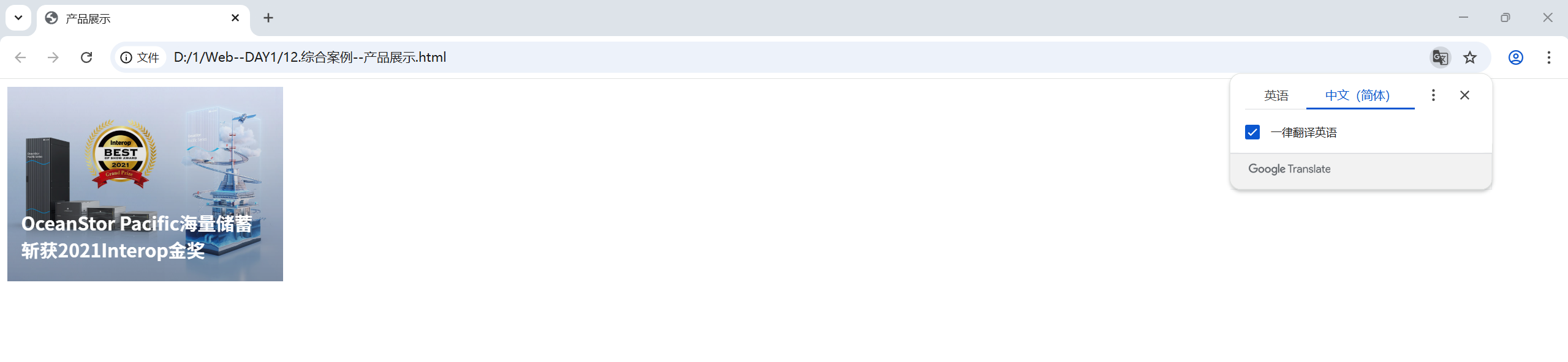
案例--产品展示
<!DOCTYPE html>
<html lang="en">
<head>
    <meta charset="UTF-8">
    <meta name="viewport" content="width=device-width, initial-scale=1.0">
    <title>产品展示</title>
    <style>
        .box{
            position: relative;
            width: 300px;
            height: 212px;
        }
        .box img{
            width: 300px;
        }
        .box .title{
            position: absolute;
            left: 15px;
            bottom: 20px;
            z-index: 2;
            width: 260px;
            color: #fff;
            font-size: 20px;
            font-weight: 700;
        }
        .mask{
            position: absolute;
            left: 0;
            top: 0;
            width: 100%;
            height: 100%;
                /* 表示完全透明的颜色 */
                transparent,
                rgba(0,0,0,0.5)
            );
            opacity: 0;
            transition: all 0.5s;
        }
        .box:hover .mask{
            opacity: 1;
        }
    </style>
</head>
<body>
    <div class="box">
        <img src="./product.jpeg" alt="">
        <div class="title">OceanStor Pacific海量储蓄斩获2021Interop金奖</div>
        <div class="mask"></div>
    </div>
</body>
</html>
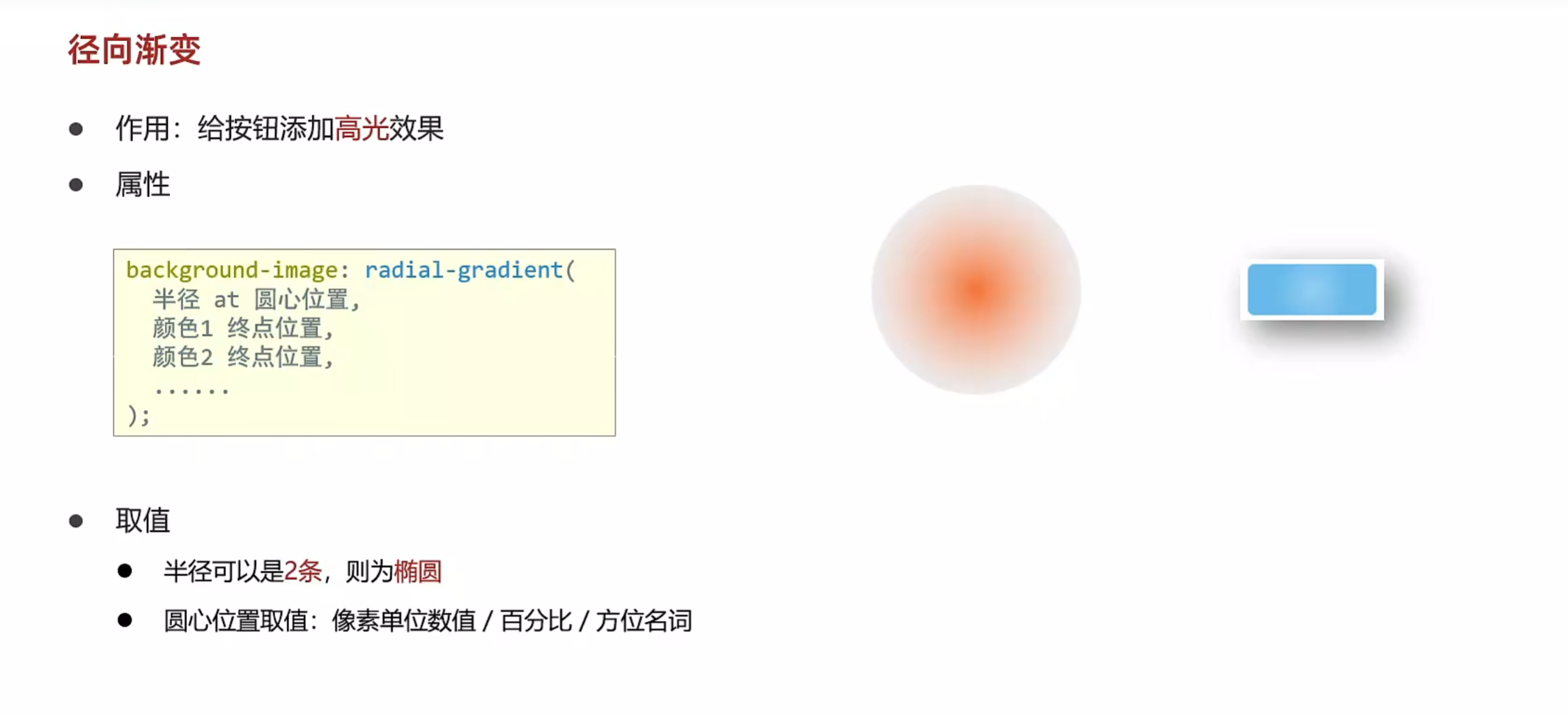
径向渐变
<!DOCTYPE html>
<html lang="en">
<head>
    <meta charset="UTF-8">
    <meta name="viewport" content="width=device-width, initial-scale=1.0">
    <title>径向渐变</title>
    <style>
        div{
            width: 100px;
            height: 100px;
            background-color: pink;
            border-radius: 50%;
            background-image: radial-gradient(
                50px at center center,
                red,
                pink
            );
            /* 两条半径,图片会由一个圆变成一个椭圆 */
            background-image: radial-gradient(
                50px 20px at center center,
                red,
                pink
            );
            background-image: radial-gradient(
                /* 用像素单位数值来确定圆心点数值 */
                50px at 50px 30px,
                red,
                pink
            );
        }
        button{
            width: 100px;
            height: 40px;
            background-color: green;
            border: 0;
            border-radius: 5px;
            color: #fff;
            background-image: radial-gradient(
                30px at 30px 20px,
                rgb(255,255,255,0.2)
                transparent
            );
        }
    </style>
</head>
<body>
    <div></div>
    <button>按钮</button>
</body>
</html>

 浙公网安备 33010602011771号