
Day28平面转换
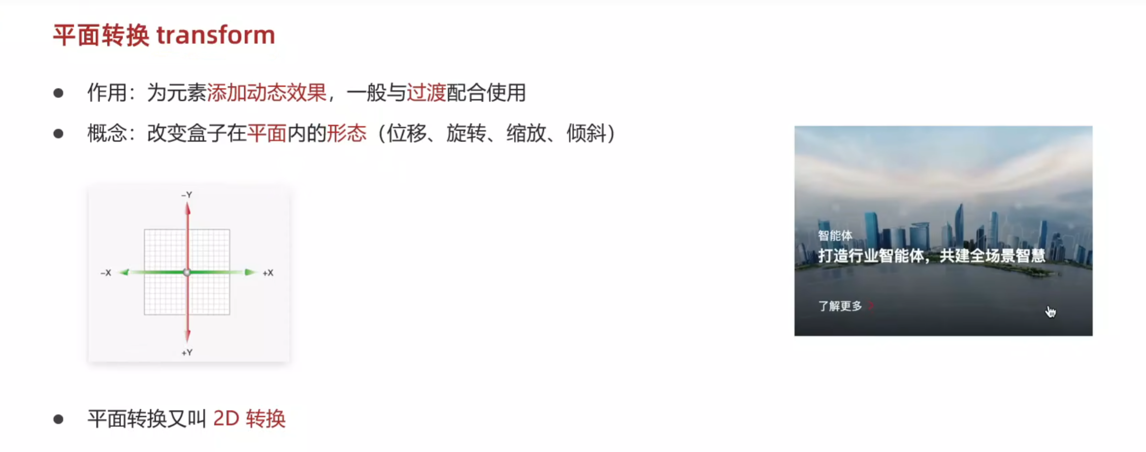
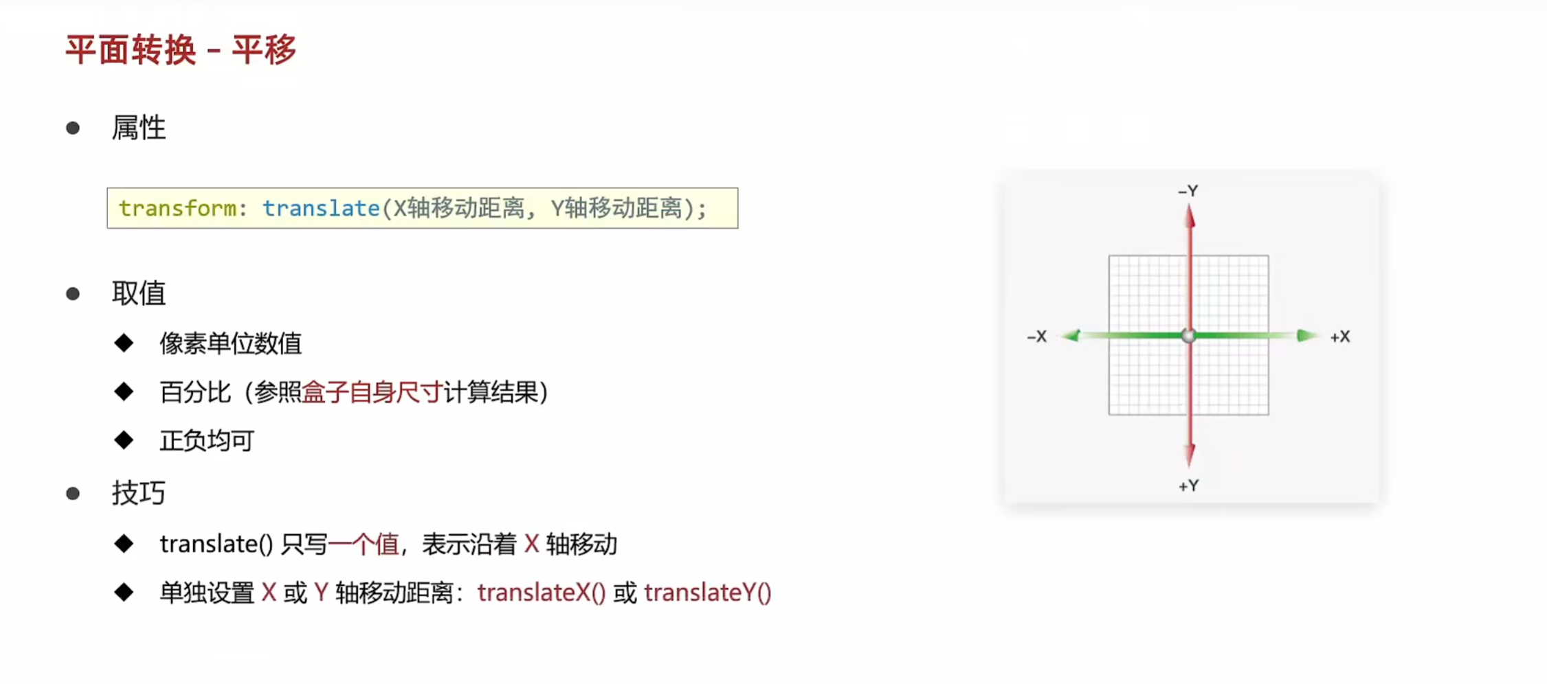
平移
<!DOCTYPE html>
<html lang="en">
<head>
    <meta charset="UTF-8">
    <meta name="viewport" content="width=device-width, initial-scale=1.0">
    <title>平移</title>
    <style>
        .father{
            margin: 100px auto;
            width: 500px;
            height: 300px;
            border: 1px solid #000;
        }
        .son{
            width: 200px;
            height: 100px;
            background-color: pink;
            transition: all 1s;
        }
        /* 鼠标移入父盒子,子盒子的位置改变 */
        .father:hover .son{
            transform: translate(200px,100px);
            /* 还有百分比的写法 */
            /* 参照盒子自身尺寸计算结果 */
            transform: translate(50%,100%);

            /* 只写一个值表示水平方向,也可以直接单独写出来 */
            transform: translate(50%);
            transform: translateX(100px) translateY(200px);
        }
    </style>
</head>
<body>
    <div class="father">
        <div class="son"></div>
    </div>
</body>
</html>
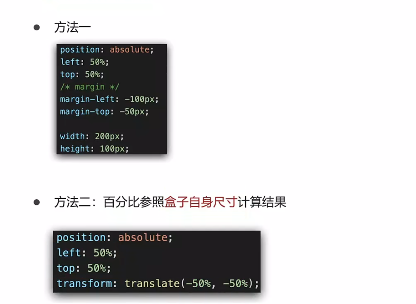
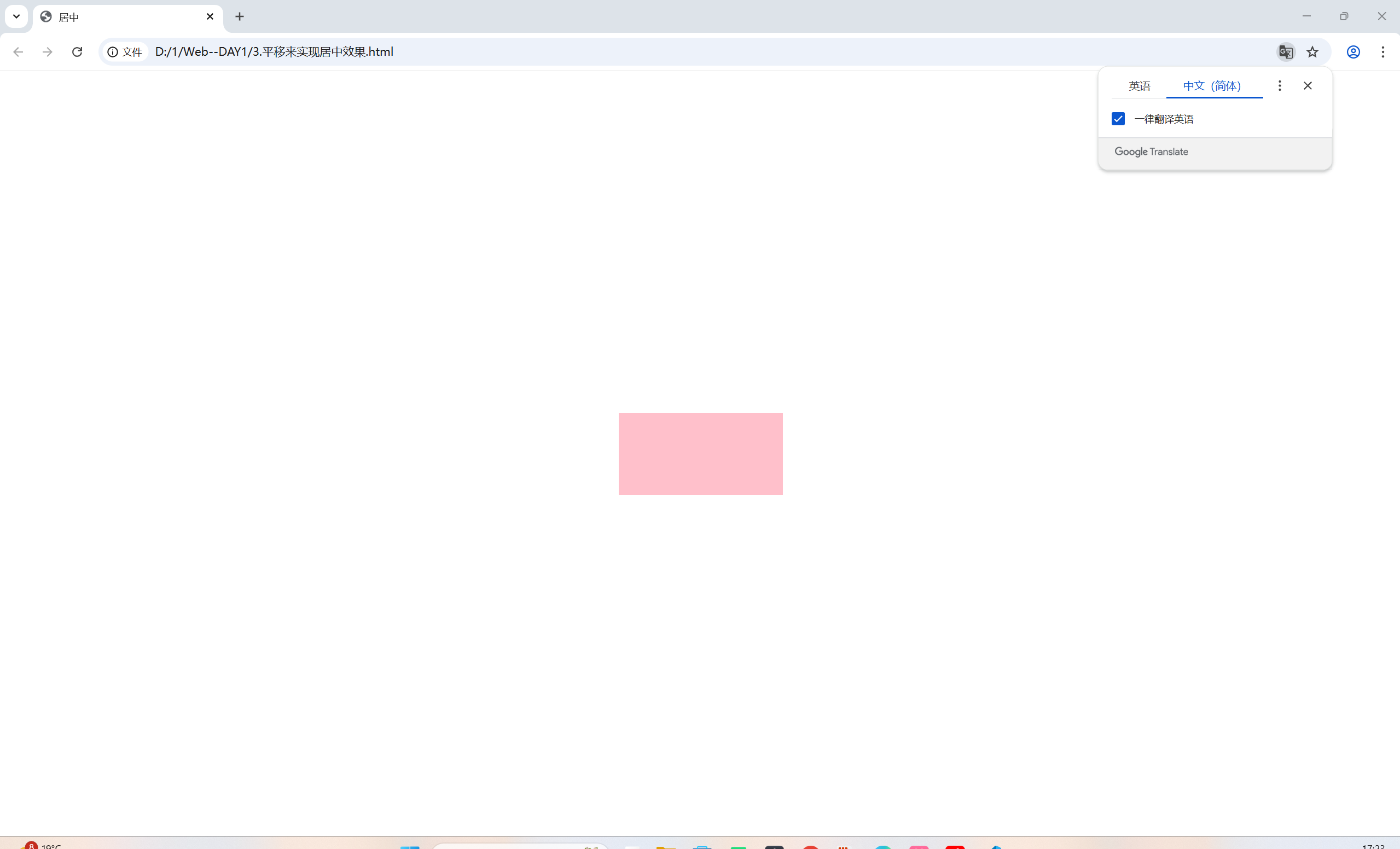
通过平移来实现居中效果
<!DOCTYPE html>
<html lang="en">
<head>
    <meta charset="UTF-8">
    <meta name="viewport" content="width=device-width, initial-scale=1.0">
    <title>居中</title>
    <style>
        .box{
            position: absolute;
            width: 200px;
            height: 100px;
            left: 50%;
            top: 50%;
            /* 可以不用再去计算自身宽高的一半然后添加外边距来调控了 */
            transform: translate(-50%,-50%);

            background-color: pink;
        }
    </style>
</head>
<body>
    <div class="box"></div>
</body>
</html>

 浙公网安备 33010602011771号