
Day22flex布局
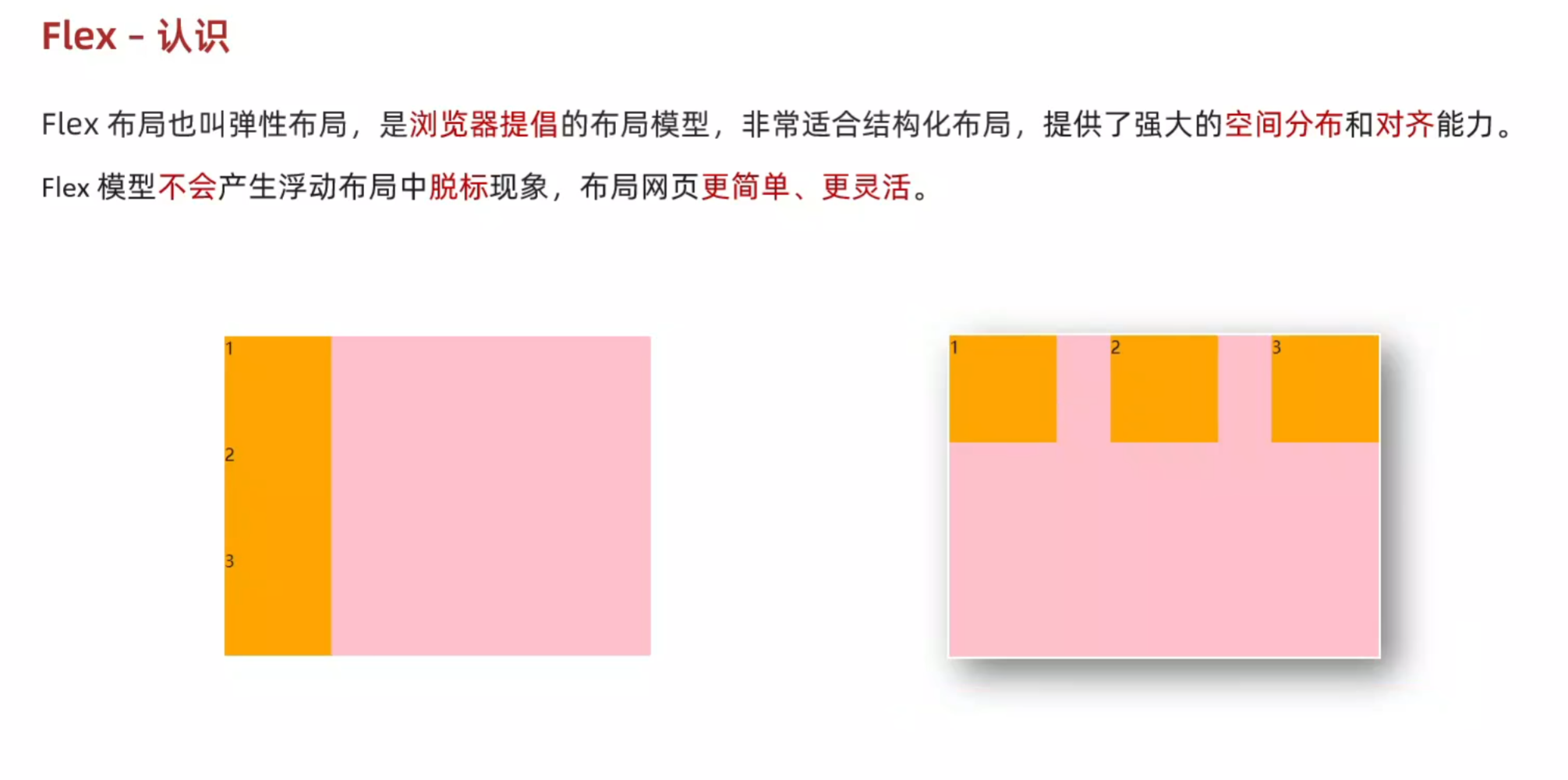
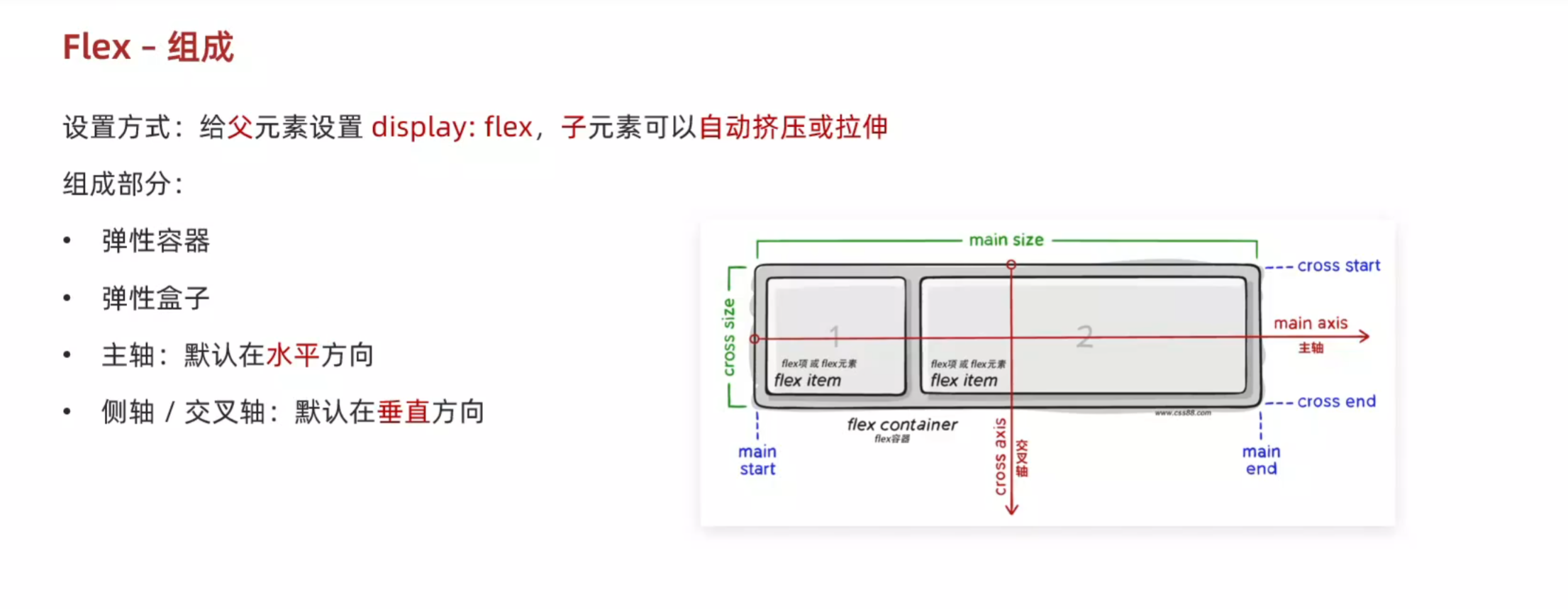
1.felx的组成
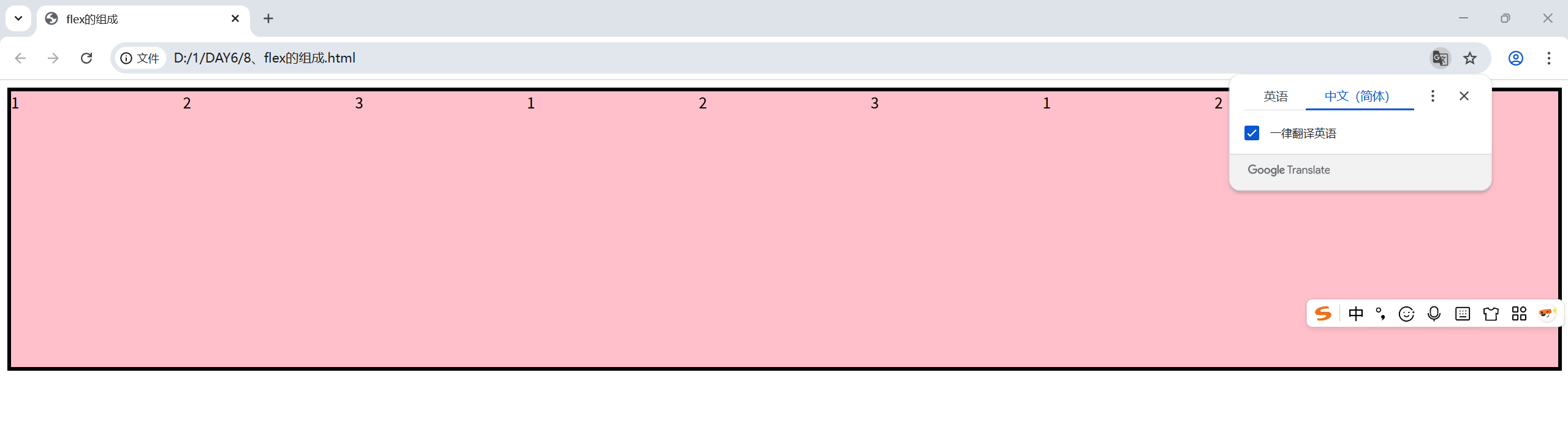
<!DOCTYPE html>
<html lang="en">
<head>
    <meta charset="UTF-8">
    <meta name="viewport" content="width=device-width, initial-scale=1.0">
    <title>flex的组成</title>
    <style>
        .box{
            display: flex;
            height: 300px;
            border: 4px solid #000;
        }
        .box div{
            width: 200px;
            /* 不设置高度子元素会自动被拉伸到父级的高度 */
            /* height: 100px; */
            background-color: pink;
        }
    </style>
</head>
<body><div class="box">
    <div>1</div>
    <div>2</div>
    <div>3</div>
    <div>1</div>
    <div>2</div>
    <div>3</div>
    <div>1</div>
    <div>2</div>
    <div>3</div>
    </div>
</body>
</html>
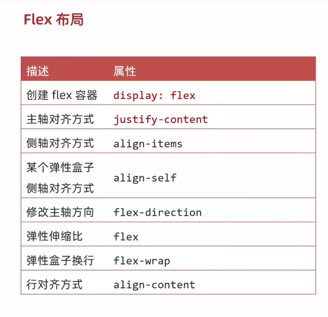
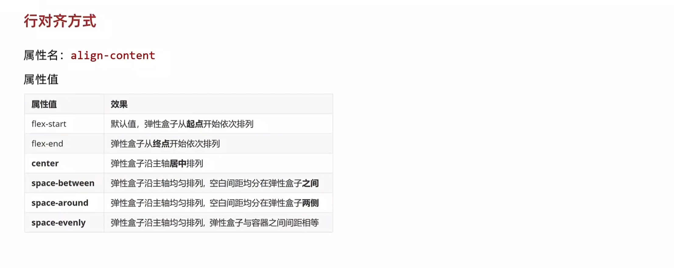
2.主轴和侧轴的对齐方式
主轴:
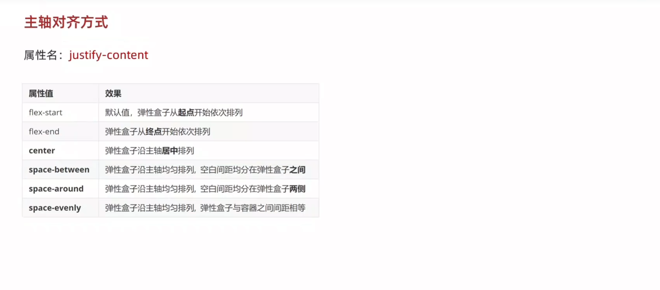
<!DOCTYPE html>
<html lang="en">
<head>
    <meta charset="UTF-8">
    <meta name="viewport" content="width=device-width, initial-scale=1.0">
    <title>主轴的对齐方式</title>
    <style>
        .box{
            display: flex;
            /* justify-content: flex-start; */
            /* justify-content: flex-end; */
            /* 居中 */
            /* justify-content: center; */
            /* 父级剩余尺寸平均分配成间距   盒子之间的间距相等*/
            /* justify-content: space-between; */
            /* 间距出现在盒子的两侧,且盒子之间的距离是盒子与边界的两倍 */
             /* justify-content: space-around;  */
             justify-content: space-evenly;


            height: 300px;
            border: 3px solid #000;
        }
        .box div{
            height: 100px;
            width: 200px;
            background-color: pink;
        }
    </style>
</head>
<body>
    <div class="box">
        <div>1</div>
        <div>2</div>
        <div>3</div>
    </div>
</body>
</html>
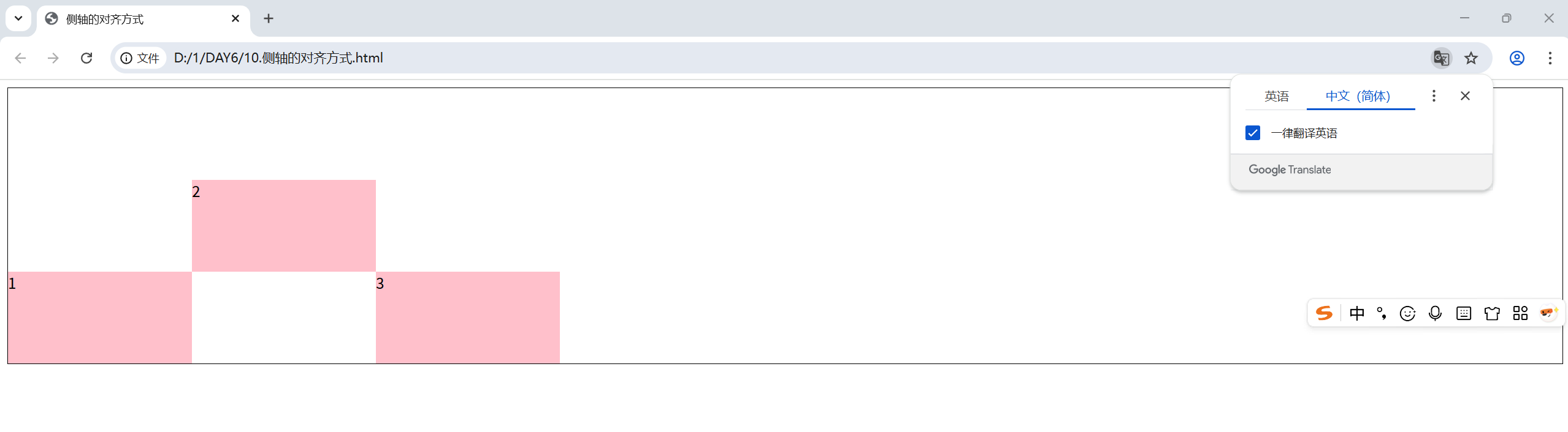
侧轴:
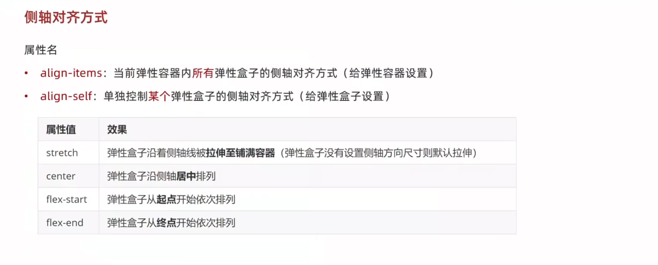
<!DOCTYPE html>
<html lang="en">
<head>
    <meta charset="UTF-8">
    <meta name="viewport" content="width=device-width, initial-scale=1.0">
    <title>侧轴的对齐方式</title>
    <style>
        .box{
            display: flex;
            /* 弹性盒子在侧轴方向上没有设置尺寸才能拉伸 */
            /* align-items: stretch; */
            /* align-items: center; */
            /* align-items: self-start; */
            align-items: self-end;
            height: 300px;
            border: 1px solid #000;
        }
        .box div{
            width: 200px;
             height: 100px;
            background-color: pink;
        }
        /* 令第二个div的侧轴水平居中 */
        .box div:nth-child(2){
            align-self: center;
        }
    </style>
</head>
<body>
    <div class="box">
        <div>1</div>
        <div>2</div>
        <div>3</div>
    </div>
</body>
</html>
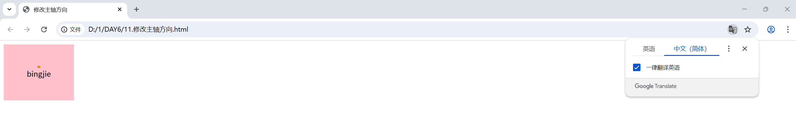
3.修改主轴方向
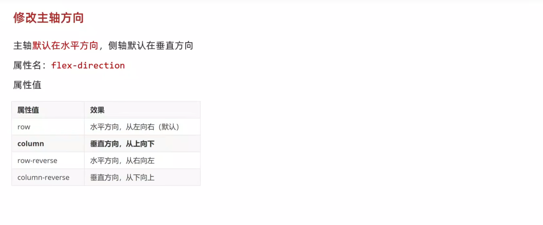
<!DOCTYPE html>
<html lang="en">
<head>
    <meta charset="UTF-8">
    <meta name="viewport" content="width=device-width, initial-scale=1.0">
    <title>修改主轴方向</title>
    <style>
        .box{
            display: flex;
            /* 修改主轴方向 变为垂直方向,则侧轴会自动变为水平方向 */
            flex-direction: column;
            /* 主轴此时在垂直,使其垂直居中 */
            justify-content: center;
            /* 侧轴在水平,使其水平居中 */
            align-items: center;
            width: 150px;
            height: 120px;
            background-color: pink;
        }
    </style>
</head>
<body>
    <div class="box">
        <img src="../JAVA前端/images/黄色正方块.png">
        <span>bingjie</span>
    </div>
</body>
</html>
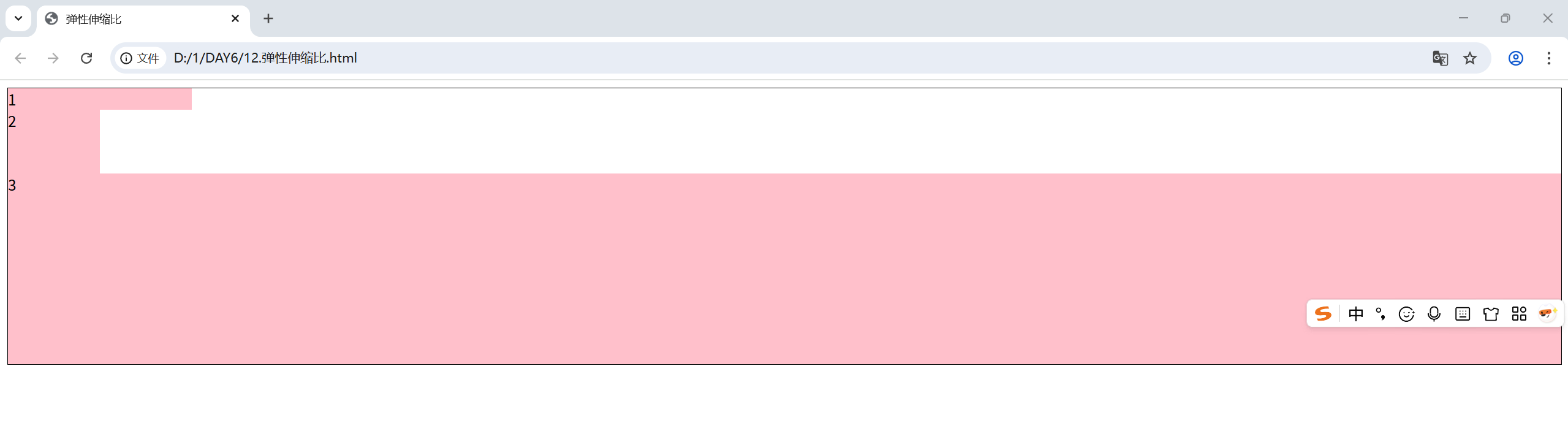
4.弹性伸缩比
<!DOCTYPE html>
<html lang="en">
<head>
    <meta charset="UTF-8">
    <meta name="viewport" content="width=device-width, initial-scale=1.0">
    <title>弹性伸缩比</title>
    <style>
        .box{
            display: flex;
            flex-direction: column;
            height: 300px;
            border: 1px solid #000;
        }
        .box div{
            background-color: pink;
        }
        .box div:nth-child(1){
            width: 200px;
        }
        .box div:nth-child(2){
            width: 100px;
            flex: 1;
        }
        .box div:nth-child(3){
            flex: 3;
        }
    </style>
</head>
<body>
    <div class="box">
        <div>1</div>
        <div>2</div>
        <div>3</div>
    </div>
</body>
</html>
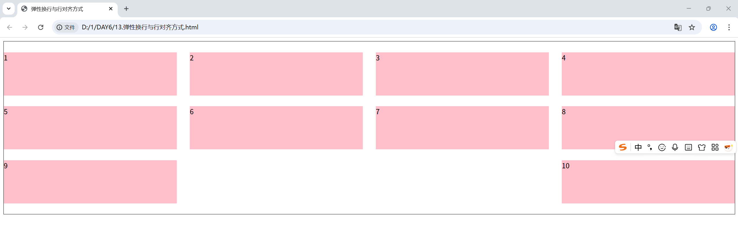
5.弹性换行与行对齐方式
<!DOCTYPE html>
<html lang="en">
<head>
    <meta charset="UTF-8">
    <meta name="viewport" content="width=device-width, initial-scale=1.0">
    <title>弹性换行与行对齐方式</title>
    <style>
        .box{
            display: flex;
            flex-wrap: wrap;
            justify-content: space-between;
            align-content: center;
            /* 调整行对齐方式 */
            /* align-content: flex-start; */
            /* align-content: flex-end; */
            /* align-items: center; */
            /* align-content: space-between; */
            /* align-content: space-around; */
            align-content: space-evenly;
            height: 400px;
            border: 1px solid #000;

        }
        .box div{
            width: 400px;
            height: 100px;
            background-color: pink;
        }
    </style>
</head>
<body>
    <div class="box">
        <div>1</div>
        <div>2</div>
        <div>3</div>
        <div>4</div>
        <div>5</div>
        <div>6</div>
        <div>7</div>
        <div>8</div>
        <div>9</div>
        <div>10</div>
    </div>
</body>
</html>

 浙公网安备 33010602011771号