
Day21浮动
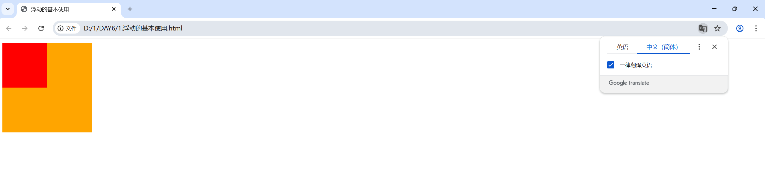
1.浮动的基本使用
<!DOCTYPE html>
<html lang="en">
<head>
    <meta charset="UTF-8">
    <meta name="viewport" content="width=device-width, initial-scale=1.0">
    <title>浮动的基本使用</title>
    <style>
        /* 特点:顶对齐,具备行内块显示模式,即可以在同一行一起显示 */
        .one{
            width: 100px;
            height: 100px;
            background-color: red;
            float: left;
        }
        .two{
            width: 200px;
            height: 200px;
            background-color: orange;
            /* float: left; */

            /* float: right; */
            /* 此时由于只有.one进行了浮动,而浮动会导致该标签脱标 */
            /* 即浏览器不在会识别他为标签,后面的标签可能会抢占原本浮动标签的位置 */
            /* 导致标签重叠错乱 */
        }
    </style>
</head>
<body>
    <div class="one"></div>
    <div class="two"></div>
</body>
</html>
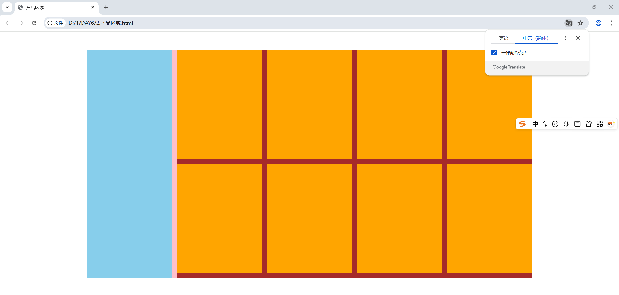
2.产品区域布局
<!DOCTYPE html>
<html lang="en">
<head>
    <meta charset="UTF-8">
    <meta name="viewport" content="width=device-width, initial-scale=1.0">
    <title>产品区域</title>
    <style>
        *{
            margin: 0;
            padding: 0;
        }
        li{
            list-style: none;
        }
        .product{
            margin: 50px auto;
            width: 1226px;
            height: 628px;
            background-color: pink;
        }
        .left{
            float: left;
            width: 234px;
            height: 628px;
            background-color: skyblue;
        }
        .right{
            float: right;
            width: 978px;
            height: 628px;
            background-color: brown;
        }
        .right li{
            float: left;
            margin-right: 14px;
            margin-bottom: 14px;
            width: 234px;
            height: 300px;
            background-color: orange;
        }
        /* 第四个和第八个li去掉右边的margin */
        .right li:nth-child(4n){
            margin-right: 0;
        }
        /* 如果父级的宽度不够,即使加上了浮动,浮动的标签也可能因为位置不够而被挤到下一行 */
    </style>
</head>
<body>
    <div class="product">
        <div class="left"></div>
        <div class="right">
            <ul>
                <li></li>
                <li></li>
                <li></li>
                <li></li>
                <li></li>
                <li></li>
                <li></li>
                <li></li>
            </ul>
        </div>
    </div>
</body>
</html>
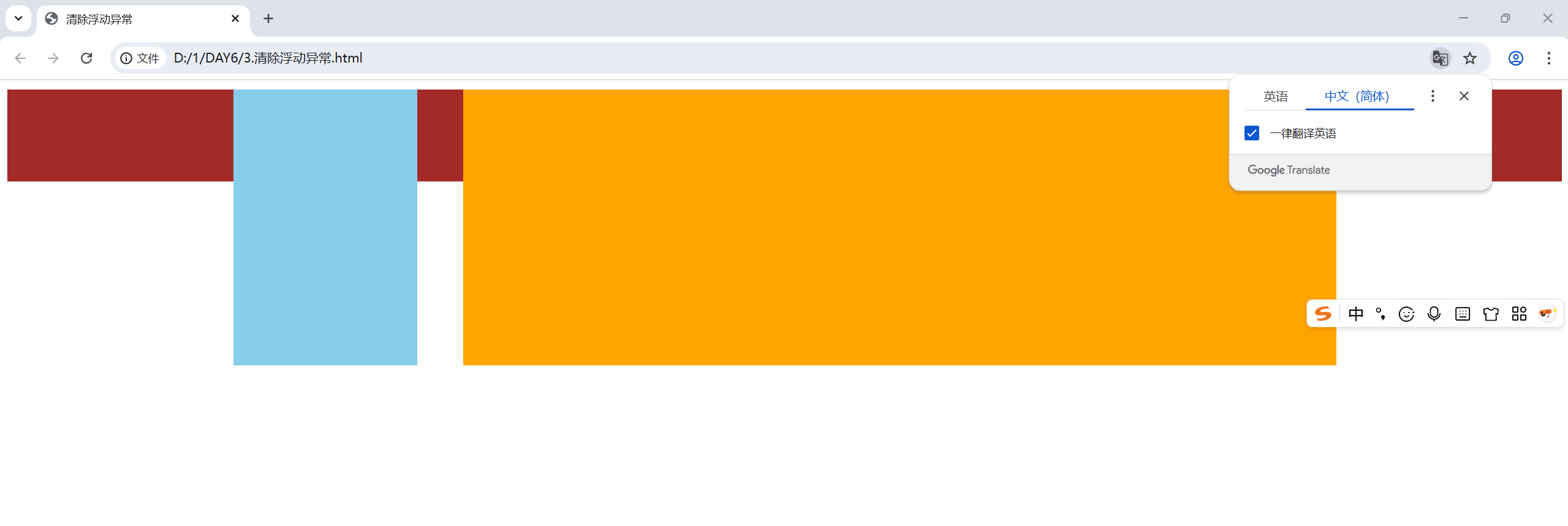
3.清除浮动异常
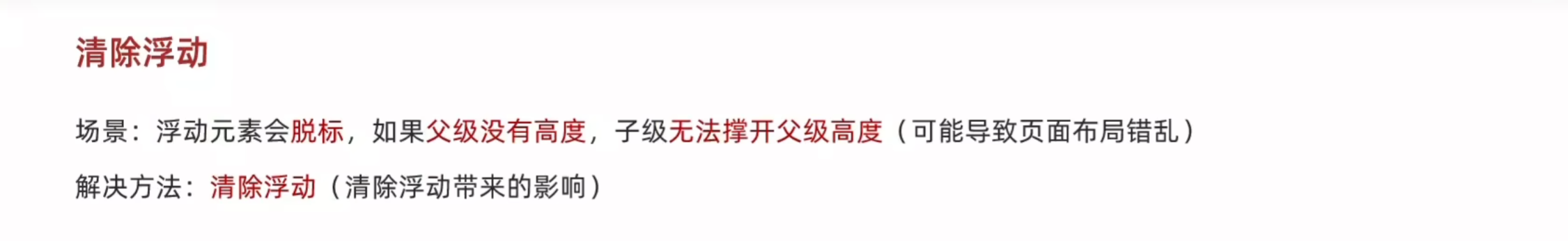
原理就是标签添加浮动属性之后会导致脱标,即浏览器不在为该标签安排位置,所以下一个标签会挤占浮动标签的位置,造成页面异常
例如:
<!DOCTYPE html>
<html lang="en">
<head>
    <meta charset="UTF-8">
    <meta name="viewport" content="width=device-width, initial-scale=1.0">
    <title>清除浮动异常</title>
    <style>
        .top{
            margin: 10px auto;
            width: 1200px;
            /* 注释掉父级的高度,子集无法撑开父级高度,会导致页面错乱 */
            /* height: 300px; */
            background-color: pink;
        }
        .right{
            float: left;
            width: 200px;
            height: 300px;
            background-color: skyblue;
        }
        .left{
            float: right;
            width: 950px;
            height: 300px;
            background-color: orange;
        }
        .bottom{
            height: 100px;
            background-color: brown;
        }
    </style>
</head>
<body>
    <div class="top">
        <div class="left"></div>
        <div class="right"></div>
    </div>
    <div class="bottom"></div>
</body>
</html>
解决浮动异常的四种方法
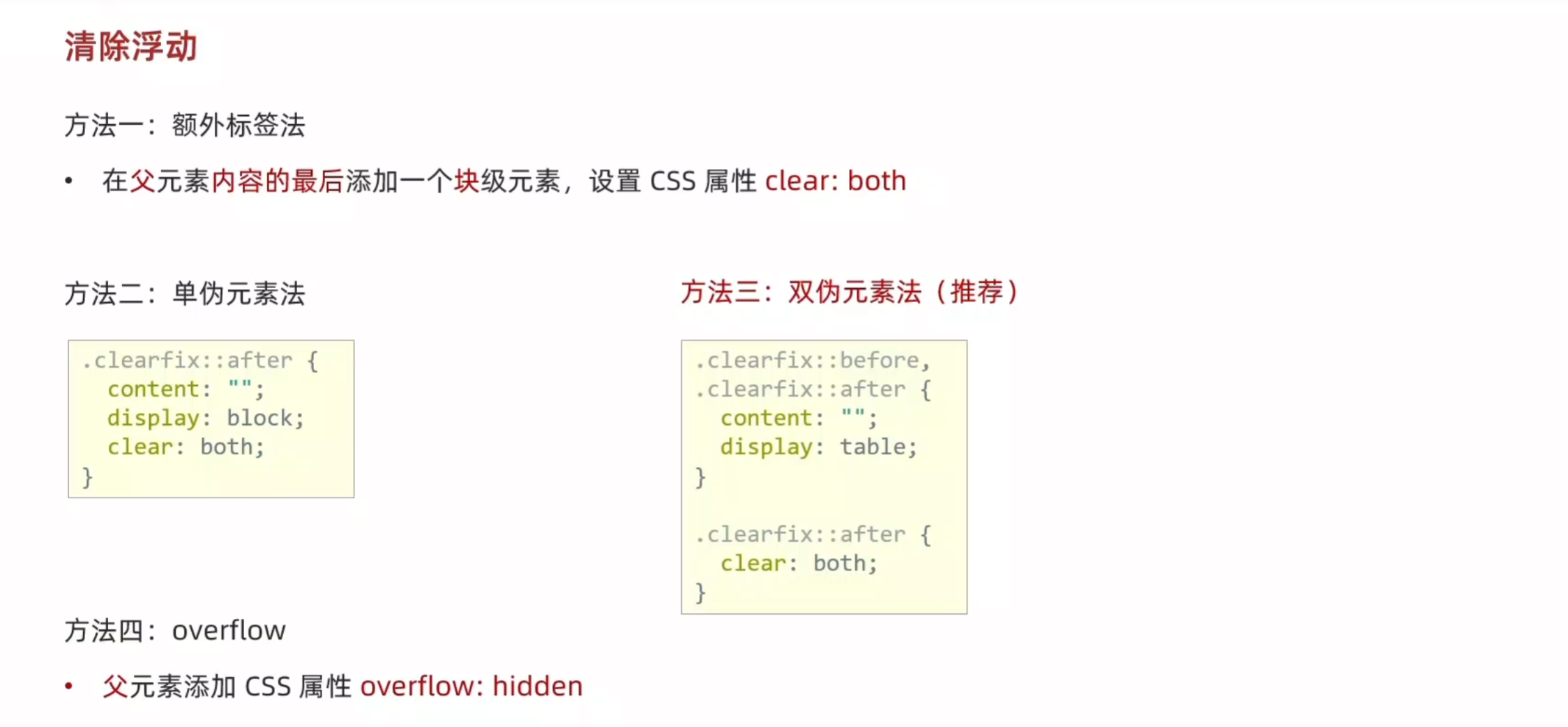
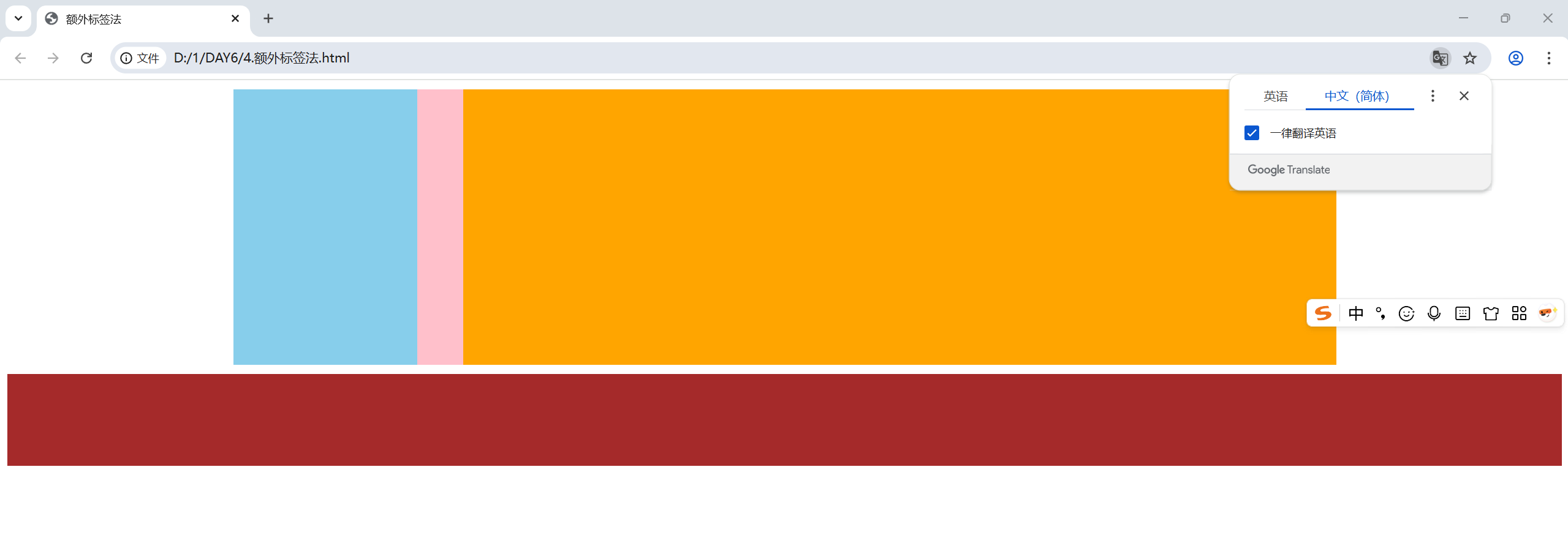
额外标签法,在出现异常的标签的基础上再添加一个标签
<!DOCTYPE html>
<html lang="en">
<head>
    <meta charset="UTF-8">
    <meta name="viewport" content="width=device-width, initial-scale=1.0">
    <title>额外标签法</title>
    <style>
        .top{
            margin: 10px auto;
            width: 1200px;
            /* 注释掉父级的高度,子集无法撑开父级高度,会导致页面错乱 */
            /* height: 300px; */
            background-color: pink;
        }
        .right{
            float: left;
            width: 200px;
            height: 300px;
            background-color: skyblue;
        }
        .left{
            float: right;
            width: 950px;
            height: 300px;
            background-color: orange;
        }
        .bottom{
            height: 100px;
            background-color: brown;
        }
        .clearfix{
            clear: both;
        }
    </style>
</head>
<body>
    <div class="top">
        <div class="left"></div>
        <div class="right"></div>
        <div class="clearfix"></div>
    </div>
    <div class="bottom"></div>
</body>
</html>
单伪元素法
<!DOCTYPE html>
<html lang="en">
<head>
    <meta charset="UTF-8">
    <meta name="viewport" content="width=device-width, initial-scale=1.0">
    <title>单伪元素法</title>
    <style>
        .top{
            margin: 10px auto;
            width: 1200px;
            /* 注释掉父级的高度,子集无法撑开父级高度,会导致页面错乱 */
            /* height: 300px; */
            background-color: pink;
        }
        .right{
            float: left;
            width: 200px;
            height: 300px;
            background-color: skyblue;
        }
        .left{
            float: right;
            width: 950px;
            height: 300px;
            background-color: orange;
        }
        .bottom{
            height: 100px;
            background-color: brown;
        }
        .clearfix::after{
            content: "";
            display: block;
            clear: both;
        }
    </style>
</head>
<body>
    <div class="top clearfix">
        <div class="left"></div>
        <div class="right"></div>
     </div>
     <div class="bottom"></div>
</body>
</html>
双伪元素法
<!DOCTYPE html>
<html lang="en">
<head>
    <meta charset="UTF-8">
    <meta name="viewport" content="width=device-width, initial-scale=1.0">
    <title>双伪元素法</title>
    <style>
        .top{
            margin: 10px auto;
            width: 1200px;
            /* 注释掉父级的高度,子集无法撑开父级高度,会导致页面错乱 */
            /* height: 300px; */
            background-color: pink;
        }
        .right{
            float: left;
            width: 200px;
            height: 300px;
            background-color: skyblue;
        }
        .left{
            float: right;
            width: 950px;
            height: 300px;
            background-color: orange;
        }
        .bottom{
            height: 100px;
            background-color: brown;
        }
        .clearfix::before,
        .clearfix::after {
            content: "";
            display: table;
        }
        .clearfix::after {
            clear: both;
        }
    </style>
</head>
<body>
    <div class="top clearfix">
        <div class="left"></div>
        <div class="right"></div>
    </div>
    <div class="bottom"></div>
</body>
</html>

 浙公网安备 33010602011771号