

linear-gradient渐变
开发中遇到需要给div添加条纹纹理效果,使用到linear-gradien();
<div class="linear"></div>

<style type="text/css">
  .linear{
    background-image:(10deg,red 25%,yellow 25%,yellow 50%,blue 50%);
  }
</style>
效果如下:
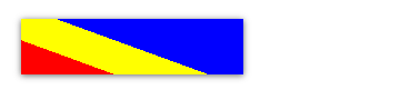
10deg:角度
red 25%:该颜色起点默认为边界,终点为25%位置
yellow 25%:该颜色起点为25%位置
yellow 50%:该颜色终点为50%位置
blue 50%:该颜色起点为50%位置,最后一个颜色,则终点为边界
设置颜色的时候可以使用rgba与transparent一起使用,若.linear为js动态生成的元素,设置元素background属性会覆盖background-image,改为设置元素background-color即可

 浙公网安备 33010602011771号