

57. VUE TabBar 开发
如果组件需要引入样式,直接: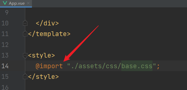 @import即可。
一般tabbar的控件高度是49px 是专门研究过的?? 总之49px即可!
开发阶段, 分解TabBar,结合插槽(div 因为插槽会覆盖),所有代码如下 注释已写出:
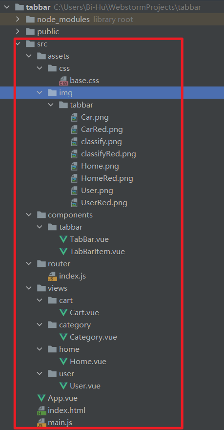 这里是项目结构,,
APP.vue:


<template>
  <div id="app">
    <router-view> </router-view>
    <tab-bar>
      <tab-bar-item path="/home" Color="blue">
        <img slot="item-img-inactive" src="./assets/img/tabbar/Home.png" alt="">
        <img slot="item-img-active" src="./assets/img/tabbar/HomeRed.png" alt="">
        <p slot="item-text">首页</p>
      </tab-bar-item>
      <tab-bar-item path="/category" Color="blue">
        <img slot="item-img-inactive" src="./assets/img/tabbar/classify.png" alt="">
        <img slot="item-img-active" src="./assets/img/tabbar/classifyRed.png" alt="">
        <p slot="item-text">分类</p>
      </tab-bar-item>
      <tab-bar-item path="/cart" Color="blue">
        <img slot="item-img-inactive" src="./assets/img/tabbar/Car.png" alt="">
        <img slot="item-img-active" src="./assets/img/tabbar/CarRed.png" alt="">
        <p slot="item-text">购物车</p></tab-bar-item>
      <tab-bar-item path="/user" Color="blue">
        <img slot="item-img-inactive" src="./assets/img/tabbar/User.png" alt="">
        <img slot="item-img-active" src="./assets/img/tabbar/UserRed.png" alt="">
        <p slot="item-text">个人</p></tab-bar-item>
    </tab-bar>
  </div>
</template>

<script>
import TabBar from './components/tabbar/TabBar'   //导入TabBar组件
import TabBarItem from './components/tabbar/TabBarItem'   //导入TabBarItem组件

export default {
name:"App",
  components: {TabBar,TabBarItem},
}
</script>


<style>

</style>
TabBar.vue:
<template>
  <div id="tab-bar">
  <slot></slot>
  </div>
</template>

<script>
export default {
  name: "TabBar"
}
</script>


<style scoped>
#tab-bar{
  display: flex;    /*flex布局*/
  position: fixed;  /*底部显示*/
  left: 0;
  right: 0;
  bottom: 0;
  box-shadow: 0px -3px 6px rgba(0,0,0,.06);
}
</style>
TabBarItem.vue:
<template>
  <div class="tab-bar-item" @click="itemClick">   <!--点击跳转itemClick-->
    <div v-if="!isActive">
      <slot name="item-img-inactive"></slot>   <!--未选中图-->
    </div>
    <div v-else>
      <slot name="item-img-active"></slot>   <!--选中图-->
    </div>
    <div :style="activeColor" :class="{active:isActive}">
      <slot name="item-text"></slot>
    </div>
  </div>
</template>

<script>
export default {
  name: "TabBarItem",
  props:{
    path:String,   //这个path是动态的  在标签哪里的属性直接取值 所以达到跳转路由的作用
    Color:{
      type:String,
      default:"red"
    }
  },
  methods:{
    itemClick(){
      this.$router.replace(this.path);
    }
  },
  computed:{
    isActive(){     //计算属性计算 isActive 是否true/false ,小算法算当前路由
      return this.$route.path.indexOf(this.path) !== -1;
    },
    activeColor(){
      return this.isActive ? {color:this.Color}:{};
    }
  }
}
</script>

<style scoped>
@import "../../assets/css/base.css";    /*导入CSS*/
.tab-bar-item{
  flex: 1 ; /*分1行显示*/
  text-align: center;/*文本居中*/
  height: 49px; /*控件高49px*/
  font-size: 15px;/*设置字体大小*/
}

.tab-bar-item img{
  width: 23px;  /*设置图标整体大小*/
  height: 23px;
  vertical-align: middle; /*设置图片密度*/
  margin-top: 5px;/*设置图片底部位置*/
}

</style>
路由:
import Vue from 'vue'
import VueRouter from 'vue-router'

Vue.use(VueRouter)

const Home = () => import('../views/home/Home')
const Category = () => import('../views/category/Category')
const Cart = () => import('../views/cart/Cart')
const User = () => import('../views/user/User')


const routes = [
  {path:'/home',component:Home},
  {path:'/category',component:Category},
  {path:'/cart',component:Cart},
  {path:'/user',component:User},

]

const router = new VueRouter({
  mode: 'history',
  routes
})

export default router
 这四个组件不列举 因为只有一个p标签。
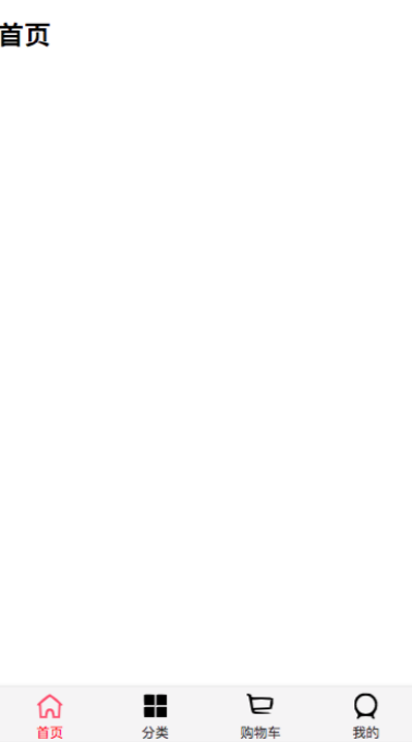
最后运行:

这里的字体颜色是可以更改的,因为父组件传递给了子组件。
看不懂就看:
https://www.bilibili.com/video/BV15741177Eh?p=122
https://www.bilibili.com/video/BV15741177Eh?p=123
本文来自博客园,作者:咸瑜,转载请注明原文链接:https://www.cnblogs.com/bi-hu/p/15147064.html

 浙公网安备 33010602011771号