


WPF 使用Path(自定义控件,圆形进度条)
原文:https://www.cnblogs.com/tsliwei/p/5609035.html
原文链接:https://blog.csdn.net/johnsuna/article/details/1885597
以下是学习笔记,感觉原作者的分享:
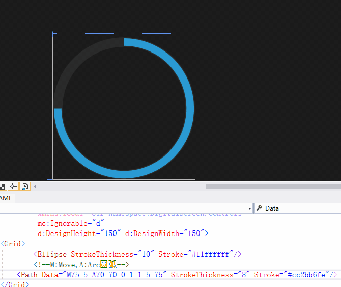
圆形进度条效果:

1,自定义控件
【1.1】xaml代码
<UserControl x:Class="DigitalScreen.Controls.CircularProgressBar"
             xmlns="http://schemas.microsoft.com/winfx/2006/xaml/presentation"
             xmlns:x="http://schemas.microsoft.com/winfx/2006/xaml"
             xmlns:mc="http://schemas.openxmlformats.org/markup-compatibility/2006"
             xmlns:d="http://schemas.microsoft.com/expression/blend/2008"
             xmlns:local="clr-namespace:DigitalScreen.Controls"
             Name="root"
             mc:Ignorable="d"
             d:DesignHeight="150" d:DesignWidth="150">
    <Grid Name="layout" Height="{Binding RelativeSource={RelativeSource Self},Path=ActualWidth}">
            <Ellipse StrokeThickness="8"
                     Stroke="{Binding BackColor,RelativeSource={RelativeSource AncestorType=UserControl,Mode=FindAncestor}}"
                     Name="backEllipse"/>
            <!--M:Move,A:Arc圆弧-->
        <!--<Path Data="M75 5 A70 70 0 0 1 145 75" StrokeThickness="8" Stroke="#cc2bb6fe"/>-->
        <!--<Path Data="M75.001 5 A70 70 0 1 1 5 75" StrokeThickness="8" Stroke="#cc2bb6fe"/>-->
        <!--Path微语言-->
        <Path Data="M75.001 5 A70 70 0 1 1 75 5" StrokeThickness="6" Stroke="{Binding ForeColor,RelativeSource={RelativeSource AncestorType=UserControl,Mode=FindAncestor}}" Name="path"/>
        <Viewbox Margin="14">
            <TextBlock Text="{Binding Value,ElementName=root,StringFormat={}{0:P0}}" VerticalAlignment="Center" HorizontalAlignment="Center"
                        Foreground="{Binding ElementName=root,Path=Foreground}"/>
        </Viewbox>
        <!--分成2列,让文本显示在第1列的右侧-->
        <Grid VerticalAlignment="Top" Margin="0,-3,0,0">
            <Grid.ColumnDefinitions>
                <ColumnDefinition/>
                <ColumnDefinition/>
            </Grid.ColumnDefinitions>
            <!--Canvas可以显示在Grid区间外面,Canvas没有区间界限限制-->
            <Canvas>
                <TextBlock Text="{Binding ElementName=root,Path=Header}" HorizontalAlignment="Right" FontSize="9" Canvas.Right="8" Foreground="#55ffffff"/>
            </Canvas>
        </Grid>
    </Grid>
</UserControl>
【1.2】自定义控件的后台代码:
namespace DigitalScreen.Controls
{
    /// <summary>
    /// ProgressBar.xaml 的交互逻辑
    /// </summary>
    public partial class CircularProgressBar : UserControl
    {
        //依赖属性,依赖对象【很重要的理念】  代码片段:propdp 2次tab
        public double Value
        {
            get { return (double)GetValue(ValueProperty); }//依赖对象才有这个方法this.GetValue,普通对象没有这个方法
            set { SetValue(ValueProperty, value); }//依赖对象才有这个方法this.SetValue,普通对象没有这个方法
        }
        //依赖属性用来绑定的 Value="{Bingding dddd}" 参数1,名称。参数2,什么类型的数据。参数3,这个属性属于谁
        public static readonly DependencyProperty ValueProperty =
            DependencyProperty.Register("Value", typeof(double), typeof(CircularProgressBar),
                new PropertyMetadata(0.0, new PropertyChangedCallback(OnPropetyChanged)));


        /// <summary>
        /// 圆形背景色
        /// </summary>
        public Brush BackColor
        {
            get { return (Brush)GetValue(BackColorProperty); }
            set { SetValue(BackColorProperty, value); }
        }

        // Using a DependencyProperty as the backing store for BackColor.  This enables animation, styling, binding, etc...
        public static readonly DependencyProperty BackColorProperty =
            DependencyProperty.Register("BackColor", typeof(Brush), typeof(CircularProgressBar), new PropertyMetadata(default(Brush)));


        /// <summary>
        /// 圆形前景色
        /// </summary>
        public Brush ForeColor
        {
            get { return (Brush)GetValue(ForeColorProperty); }
            set { SetValue(ForeColorProperty, value); }
        }

        // Using a DependencyProperty as the backing store for ForeColor.  This enables animation, styling, binding, etc...
        public static readonly DependencyProperty ForeColorProperty =
            DependencyProperty.Register("ForeColor", typeof(Brush), typeof(CircularProgressBar), new PropertyMetadata(default(Brush)));

        /// <summary>
        /// 标题(没有标题时不要复制)
        /// </summary>
        public string Header
        {
            get { return (string)GetValue(HeaderProperty); }
            set { SetValue(HeaderProperty, value); }
        }

        // Using a DependencyProperty as the backing store for Header.  This enables animation, styling, binding, etc...
        public static readonly DependencyProperty HeaderProperty =
            DependencyProperty.Register("Header", typeof(string), typeof(CircularProgressBar), new PropertyMetadata(default(string)));


        //当Value值发生变化,触发执行这个委托
        public static void OnPropetyChanged(DependencyObject d, DependencyPropertyChangedEventArgs e)
        {
            var obj = d as CircularProgressBar;
            obj.UpdateValue();
        }

        //根据Value值,计算弧形大小
        private void UpdateValue()
        {
            this.layout.Width = Math.Min(this.RenderSize.Width, this.RenderSize.Height);
            this.layout.Height = Math.Min(this.RenderSize.Width, this.RenderSize.Height);
            double radius = Math.Min(this.RenderSize.Width, this.RenderSize.Height) / 2;
            if(radius<=0)return;

            double newX = 0.0;
            double newY = 0.0;
            newX=radius+(radius-3)*Math.Cos((this.Value%100.0*100*3.6-90)*Math.PI/180);
            newY=radius+(radius-3)*Math.Sin((this.Value%100.0*100*3.6-90)*Math.PI/180);
            string pathDataStr = "M{0} 3A{3} {3} 0 {4} 1 {1} {2}";
            pathDataStr = string.Format(pathDataStr, radius + 0.01, newX, newY, radius - 3, this.Value <0.5 ? 0 : 1);
            var converter = TypeDescriptor.GetConverter(typeof(Geometry));
            this.path.Data = (Geometry)converter.ConvertFrom(pathDataStr);
        }
        public CircularProgressBar()
        {
            InitializeComponent();
            //【要重新触发一次,才有用】
            this.SizeChanged += CircularProgressBar_SizeChanged;
        }

        private void CircularProgressBar_SizeChanged(object sender, SizeChangedEventArgs e)
        {
           this.UpdateValue();
        }
    }
}
2,使用自定义控件
【2.1】引入命名空间:
xmlns:zxc="clr-namespace:DigitalScreen.Controls"
【2.2】具体使用:
                            <StackPanel Grid.Column="3" HorizontalAlignment="Center">
                                <TextBlock Text="A产品良品率" Foreground="#aa999999"   FontSize="12" Margin="0,5"/>
                                <zxc:CircularProgressBar Value="0.67" BackColor="#11ffffff" ForeColor="#cc2bb6fe" Foreground="White" Width="55" Height="55" Margin="0,10,0,0"/>
                            </StackPanel>
                            <StackPanel Grid.Column="4" HorizontalAlignment="Center">
                                <TextBlock Text="B产品良品率" Foreground="#aa999999"  FontSize="12" Margin="0,5"/>
                                <zxc:CircularProgressBar Value="0.87" BackColor="#11ffffff" ForeColor="Red" Foreground="Yellow"  Width="55" Height="55" Margin="0,10,0,0"/>
                            </StackPanel>
                            <StackPanel Grid.Column="5" HorizontalAlignment="Center">
                                <TextBlock Text="C产品良品率" Foreground="#aa999999" FontSize="12" Margin="0,5"/>
                                <zxc:CircularProgressBar Value="0.97" BackColor="#11ffffff" ForeColor="Blue" Foreground="red"  Width="55" Height="55" Margin="0,10,0,0"/>
                            </StackPanel>
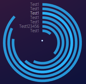
                            <Grid>
                                <zxc:CircularProgressBar Value="0.87" BackColor="Transparent" ForeColor="#cc2bb6fe" Foreground="Transparent" Width="180" Height="180" Margin="0,10,0,0" Header="Test1"/>
                                <zxc:CircularProgressBar Value="0.82" BackColor="Transparent" ForeColor="#cc2bb6fe" Foreground="Transparent" Width="160" Height="160" Margin="0,10,0,0" Header="Test1"/>
                                <zxc:CircularProgressBar Value="0.77" BackColor="Transparent" ForeColor="#cc2bb6fe" Foreground="Transparent" Width="140" Height="140" Margin="0,10,0,0" Header="Test1"/>
                                <zxc:CircularProgressBar Value="0.64" BackColor="Transparent" ForeColor="#cc2bb6fe" Foreground="Transparent" Width="140" Height="140" Margin="0,10,0,0" Header="Test1"/>
                                <zxc:CircularProgressBar Value="0.62" BackColor="Transparent" ForeColor="#cc2bb6fe" Foreground="Transparent" Width="120" Height="140" Margin="0,10,0,0" Header="Test1"/>
                                <zxc:CircularProgressBar Value="0.57" BackColor="Transparent" ForeColor="#cc2bb6fe" Foreground="Transparent" Width="100" Height="140" Margin="0,10,0,0" Header="Test1"/>
                                <zxc:CircularProgressBar Value="0.37" BackColor="Transparent" ForeColor="#cc2bb6fe" Foreground="Transparent" Width="80" Height="140" Margin="0,10,0,0" Header="Test123456"/>
                                <zxc:CircularProgressBar Value="0.12" BackColor="Transparent" ForeColor="#cc2bb6fe" Foreground="Transparent" Width="60" Height="140" Margin="0,10,0,0" Header="Test1"/>
                            </Grid>
3,Path使用资料
Path可以用这些形状绘制:
ArcSegment 类 表示两点之间的一条椭圆弧。
BezierSegment 类 表示在两个点之间绘制的一条三次贝塞尔曲线。
LineSegment 类 在PathFigure中的两个点之间创建一条直线。
PolyBezierSegment 类 表示一条或多条三次方贝塞尔曲线。
PolyLineSegment 类 表示由PointCollection定义的线段集合,每个Point指定线段的终点。
PolyQuadraticBezierSegment 类 表示一系列二次贝塞尔线段。
QuadraticBezierSegment 类 在PathFigure的两点之间创建一条二次贝塞尔曲线。
【例1】
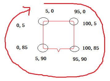
对于这样有棱角的图形,我们只需要找到他所有的顶点就行了
这个形状宽和高都是100,其中矩形宽100高90,三角宽10高10居中
然后顺时针依次连起来,用PolyLineSegment折线来表示就行了
            <Path Stroke="Red" StrokeThickness="1">
                <Path.Data>
                    <PathGeometry>
                        <PathFigure StartPoint="0,0">
                            <PolyLineSegment Points="100,0 100,90 55,90 50,100 45,90 0,90 0,0"></PolyLineSegment>
                        </PathFigure>
                    </PathGeometry>
                </Path.Data>
            </Path>
【例2】
来看这个带有圆角的图形,4个圆弧的半径是5,其他属性和上图一样.我们需要将它拆分,拆分成8个部分,4个圆弧和4个边,因为左上角圆弧的关系,起点设置成(5,0),每一部分的起点,都是上一部分的终点:
- 上边的直线:终点(95,0)
- 右上角的圆弧:终点(100,5),Size(5,5) 因为圆弧表示的是椭圆的圆弧,Size就是Size(宽,高),当宽和高都一样设置为5时,就指的是半径为5的圆的圆弧了
- 右边的直线:终点(100,85)
- 右下角的圆弧:终点(95,90),Size(5,5)
- 下边的折线:点的集合(55,90 50,100 45,90 5,90) 由于我们是顺时针来的,下边点的集合是从右到左依次来的
- 左下角圆弧:终点(0,85),Size(5,5)
- 左边的直线:终点(0,5)
- 左上角的圆弧:终点(5,0) 与起点重合
            <Path Stroke="Red" StrokeThickness="1">
                <Path.Data>
                    <PathGeometry>
                        <PathFigure StartPoint="5,0">
                            <LineSegment Point="95,0"></LineSegment>
                            <!--SweepDirection获取或设置一个值,该值指定是以 Clockwise 方向还是以 Counterclockwise 方向绘制弧-->
                            <!--顺时针绘制还是逆时针绘制,你试下另一个值,看下效果就知道怎么回事了-->
                            <ArcSegment Point="100,5" Size="5,5" SweepDirection="Clockwise"></ArcSegment>
                            <LineSegment Point="100,85"></LineSegment>
                            <ArcSegment Point="95,90" Size="5,5" SweepDirection="Clockwise"></ArcSegment>
                            <PolyLineSegment Points="55,90 50,100 45,90 5,90"></PolyLineSegment>
                            <ArcSegment Point="0,85" Size="5,5" SweepDirection="Clockwise"></ArcSegment>
                            <LineSegment Point="0,5"></LineSegment>
                            <ArcSegment Point="5,0" Size="5,5" SweepDirection="Clockwise"></ArcSegment>
                        </PathFigure>
                    </PathGeometry>
                </Path.Data>
            </Path>
1. 移动指令:Move Command(M):M 起始点 或者:m 起始点
比如:M 100,240或m 100,240
使用大写M时,表示绝对值; 使用小写m时; 表示相对于前一点的值,如果前一点没有指定,则使用(0,0)。
2. 绘制指令(Draw Command):
我们可以绘制以下形状:
(1) 直线:Line(L)
(2) 水平直线: Horizontal line(H)
(3) 垂直直线: Vertical line(V)
(4) 三次方程式贝塞尔曲线: Cubic Bezier curve(C)
(5) 二次方程式贝塞尔曲线: Quadratic Bezier curve(Q)
(6) 平滑三次方程式贝塞尔曲线: Smooth cubic Bezier curve(S)
(7) 平滑二次方程式贝塞尔曲线: smooth quadratic Bezier curve(T)
(8) 椭圆圆弧: elliptical Arc(A)
上面每种形状后用括号括起的英文字母为命令简写的大写形式,但你也可以使用小写。使用大写与小写的区别是:大写是绝对值,小写是相对值。
比如:L 100, 200 L 300,400表示从绝对坐标点(100,200)到另一绝对坐标点(300,400)的一条直线。而l 100, 200 l 300,400则表示相对上一点(如果未指定,则默认为(0,0)坐标点)开始计算的坐标点(100,200)到坐标点为(300,400)的一条直线。
当我们重复使用同一种类型时,就可以省略前面的命令。比如:L 100, 200 L 300,400简写为:L 100, 200 300,400。
绘制指令格式语法:
(1) 直线:Line(L)
格式:L 结束点坐标 或: l 结束点坐标。
比如:L 100,100 或 l 100 100。坐标值可以使用x,y(中间用英文逗号隔开)或x y(中间用半角空格隔开)的形式。
(2) 水平直线 Horizontal line(H):绘制从当前点到指定x坐标的直线。
格式:H x值 或 h x值(x为System.Double类型的值)
比如:H 100或h 100,也可以是:H 100.00或h 100.00等形式。
(3) 垂直直线 Vertical line(V):绘制从当前点到指定y坐标的直线。
格式:V y值 或 v y值(y为System.Double类型的值)
比如:V 100或y 100,也可以是:V 100.00或v 100.00等形式。
(4) 三次方程式贝塞尔曲线 Cubic Bezier curve(C):通过指定两个控制点来绘制由当前点到指定结束点间的三次方程贝塞尔曲线。
格式:C 第一控制点 第二控制点 结束点 或 c 第一控制点 第二控制点 结束点
比如:C 100,200 200,400 300,200 或 c 100,200 200,400 300,200
其中,点(100,200)为第一控制点,点(200,400)为第二控制点,点(300,200)为结束点。
(5) 二次方程式贝塞尔曲线 Quadratic Bezier curve(Q):通过指定的一个控制点来绘制由当前点到指定结束点间的二次方程贝塞尔曲线。
格式:Q 控制点 结束点 或 q 控制点 结束点
比如:q 100,200 300,200。其中,点(100,200)为控制点,点(300,200)为结束点。
(6) 平滑三次方程式贝塞尔曲线: Smooth cubic Bezier curve(S):通过一个指定点来“平滑地”控制当前点到指定点的贝塞尔曲线。
格式:S 控制点 结束点 或 s 控制点 结束点
比如:S 100,200 200,300
(7) 平滑二次方程式贝塞尔曲线 smooth quadratic Bezier curve(T):与平滑三次方程贝塞尔曲线类似。
格式:T 控制点 结束点 或 t 控制点 结束点
比如:T 100,200 200,300
(8) 椭圆圆弧: elliptical Arc(A) : 在当前点与指定结束点间绘制圆弧。
A 尺寸 圆弧旋转角度值 优势弧的标记 正负角度标记 结束点
或:
a 尺寸 圆弧旋转角度值 优势弧的标记 正负角度标记 结束点
参数1:横向的半径的尺寸(Size): System.Windows.Size类型,指定椭圆圆弧X方向上的半径值。
参数2:纵向的半径的尺寸(Size): System.Windows.Size类型,指定椭圆圆弧Y方向上的半径值。
参数3:旋转角度(rotationAngle):System.Double类型。如果是1个正圆,就是0
圆弧旋转角度值(rotationAngle):椭圆弧的旋转角度值。
参数4:大弧还是小弧,优势弧的标记(isLargeArcFlag):是否为优势弧,如果弧的角度大于等于180度,则设为1,否则为0。
参数5:旋转顺时针还是逆时针,正负角度标记(sweepDirectionFlag):当正角方向绘制时设为1,否则为0。
结束点(endPoint):System.Windows.Point类型。
3. 关闭指令(close Command):用以将图形的首、尾点用直线连接,以形成一个封闭的区域。
用Z或z表示。

 浙公网安备 33010602011771号