
flex弹性布局操练1
实现弹性布局之前常用浮动,相对定位和绝对定位等,但是现在好了,随着flex的兴起,方便了很多,而且也符合未来响应式布局的方向。
理论的东西可参考css3手册,这里专注实操。
一:单个元素
<div id="wrap">
        <ul class="box1">
            <li></li>
        </ul>
    </div>
ul.box1 {
            list-style:none;
            background-color:black;
            display:flex;
            width:100px;
            height:100px;
            padding:5px;
        }
ul.box1 li {
            counter-increment:count;
            background-color:red;
            color:white;
            width:15px;
            height:15px;
            margin:1px;
        }
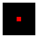
 这是实现的默认效果,看不出来什么意思吧。
水平方向变化1:让红点水平居中:
ul.box1 {
            list-style:none;
            background-color:black;
            display:flex;
            justify-content:center;/*水平轴居中*/
            width:100px;
            height:100px;
            padding:5px;
        }
 水平方向居中了。
水平方向变化2:水平方向置后
ul.box1 {
            list-style:none;
            background-color:black;
            display:flex;
            justify-content:flex-end;/*水平轴的位置,默认是flex-start就是第一种情况*/
            width:100px;
            height:100px;
            padding:5px;
        }

垂直方向变化:
ul.box1 {
            list-style:none;
            background-color:black;
            display:flex;
            justify-content:flex-end;/*水平轴的位置,默认是flex-start就是第一种情况*/
            align-items:center;/*垂直轴的位置*/
            width:100px;
            height:100px;
            padding:5px;
        }

垂直和水平都置后:
ul.box1 {
            list-style:none;
            background-color:black;
            display:flex;
            justify-content:flex-end;/*水平轴的位置,默认是flex-start就是第一种情况*/
            align-items:flex-end;/*垂直轴的位置*/
            width:100px;
            height:100px;
            padding:5px;
        }

垂直水平居中
ul.box1 {
            list-style:none;
            background-color:black;
            display:flex;
            justify-content:center;/*水平轴的位置,默认是flex-start就是第一种情况*/
            align-items:center;/*垂直轴的位置*/
            width:100px;
            height:100px;
            padding:5px;
        }

 浙公网安备 33010602011771号