


python工具——Matplotlib
Matplotlib 是一个 Python 的 2D绘图库
安装
pip install matplotlib
绘图的准备
1.添加Figure对象
2.添加Axes
import matplotlib.pyplot as plt
fig = plt.figure()
ax = fig.add_subplot(111)
ax.set(xlim=[0.5, 4.5], ylim=[-2, 8], title='An Example Axes',
       ylabel='Y-Axis', xlabel='X-Axis')
plt.show()

在处理复杂的绘图时,需要借助Axes,简单的可以使用下面的方法
绘制简单图形
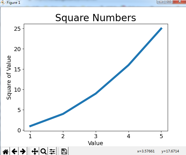
import matplotlib.pyplot as plt
#图形输入值
input_values = [1,2,3,4,5]
#图形输出值
squares = [1,4,9,16,25]
#plot根据列表绘制出有意义的图形,linewidth是图形线宽
plt.plot(input_values,squares,linewidth=5)
#设置图标标题
plt.title("Square Numbers",fontsize = 24)
#设置坐标轴标签
plt.xlabel("Value",fontsize = 14)
plt.ylabel("Square of Value",fontsize = 14)
#设置刻度标记的大小
plt.tick_params(axis='both',labelsize = 14)
#打开matplotlib查看器,并显示绘制图形
plt.show()
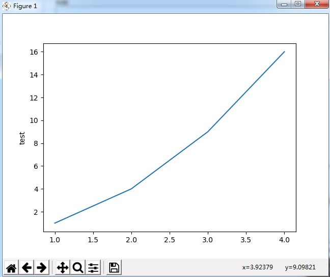
import matplotlib.pyplot as plt
plt.plot([1,2,3,4], [1,4,9,16])
plt.ylabel('test')
plt.show()
说明:
第三个可选参数,它是字符串格式的,表示颜色和线的类型
字符串参数是’b-‘,表示蓝色的实线
线条风格
-        实线
:        虚线
–        破折线
None     什么都不画
-.       点划线
线条标记
o                 圆圈
.                 点
D                 菱形
s                 正方形
h                 六边形1
*                 星号
H                 六边形2
d                 小菱形
_                 水平线
v                 一角朝下的三角形
8                 八边形
<                 一角朝左的三角形
p                 五边形
>                 一角朝右的三角形
,                 像素
^                 一角朝上的三角形
+                 加号
\                 竖线
None              无
x                 X
颜色
b               蓝色
g               绿色
r               红色
y               黄色
c               青色
k               黑色
m               洋红色
w               白色
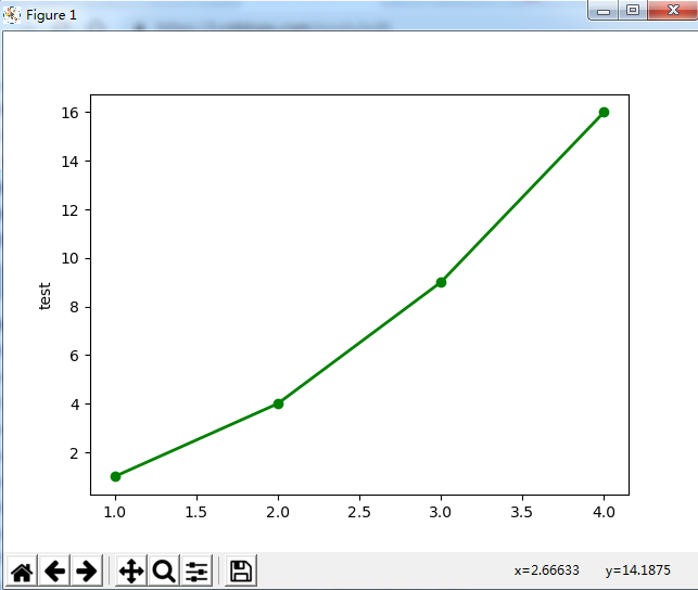
eg:
import matplotlib.pyplot as plt
plt.plot([1,2,3,4], [1,4,9,16], 'go-', label='line 1', linewidth=2)
plt.ylabel('test')
plt.show()
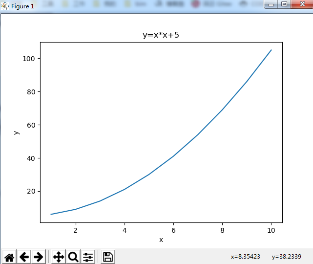
绘制一个函数图像
import numpy as np
from matplotlib import pyplot as plt

x = np.arange(1,11)     # x轴数据
y =  x * x +  5         # 函数关系
plt.title("y=x*x+5")     # 图像标题
plt.xlabel("x")     # x轴标签
plt.ylabel("y")     # y轴标签
plt.plot(x,y)     # 生成图像
plt.show()    # 显示图像
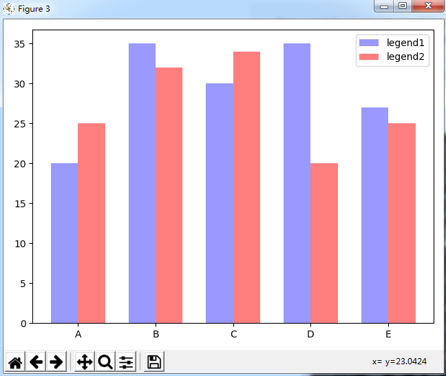
柱形图
import numpy as np
import matplotlib.pyplot as plt
plt.figure(3)
x_index = np.arange(5)   #柱的索引
x_data = ('A', 'B', 'C', 'D', 'E')
y1_data = (20, 35, 30, 35, 27)
y2_data = (25, 32, 34, 20, 25)
bar_width = 0.35   #定义一个数字代表每个独立柱的宽度
#参数:左偏移、高度、柱宽、透明度、颜色、图例
rects1 = plt.bar(x_index, y1_data, width=bar_width,alpha=0.4, color='b',label='legend1')
rects2 = plt.bar(x_index + bar_width, y2_data, width=bar_width,alpha=0.5,color='r',label='legend2')
plt.xticks(x_index + bar_width/2, x_data)   #x轴刻度线
plt.legend()
plt.tight_layout()
plt.show()
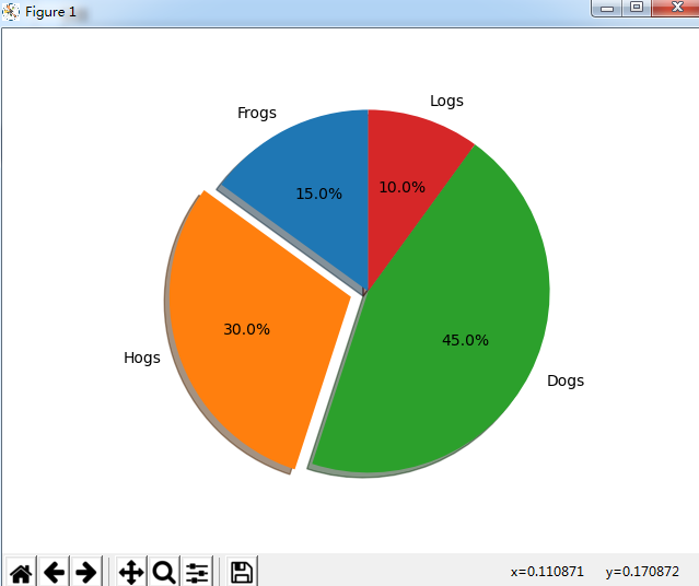
饼图
import matplotlib.pyplot as plt
labels = 'Frogs', 'Hogs', 'Dogs', 'Logs'
sizes = [15, 30, 45, 10]
explode = (0, 0.1, 0, 0)

fig1, ax1 = plt.subplots()
ax1.pie(sizes, explode=explode, labels=labels, autopct='%1.1f%%',
        shadow=True, startangle=90)
ax1.axis('equal')

plt.show()
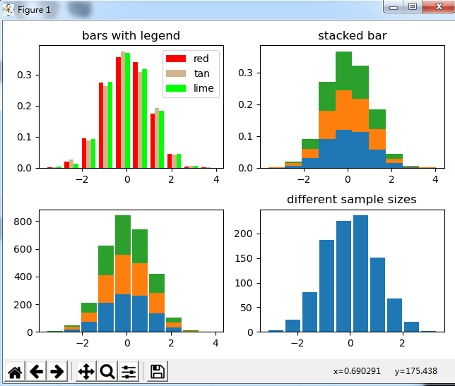
直方图
import matplotlib.pyplot as plt
import numpy as np
np.random.seed(19680801)

n_bins = 10
x = np.random.randn(1000, 3)

fig, axes = plt.subplots(nrows=2, ncols=2)
ax0, ax1, ax2, ax3 = axes.flatten()

colors = ['red', 'tan', 'lime']
ax0.hist(x, n_bins, density=True, histtype='bar', color=colors, label=colors)
ax0.legend(prop={'size': 10})
ax0.set_title('bars with legend')

ax1.hist(x, n_bins, density=True, histtype='barstacked')
ax1.set_title('stacked bar')

ax2.hist(x,  histtype='barstacked', rwidth=0.9)

ax3.hist(x[:, 0], rwidth=0.9)
ax3.set_title('different sample sizes')

fig.tight_layout()
plt.show()
更多参考


 浙公网安备 33010602011771号