ArkUI容器类组件
容器组件指的是它可以包含一个或多个子组件的组件,除了前边介绍过的公共属性外。
一、线性布局容器(Row、Column)
线性容器类表示按照水平方向或者竖直方向排列子组件的容器,ArkUI开发框架通过 Row 和 Colum 来实现线性布局。
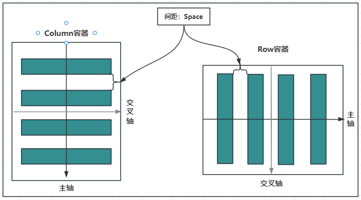
1.1.主轴和纵轴概念
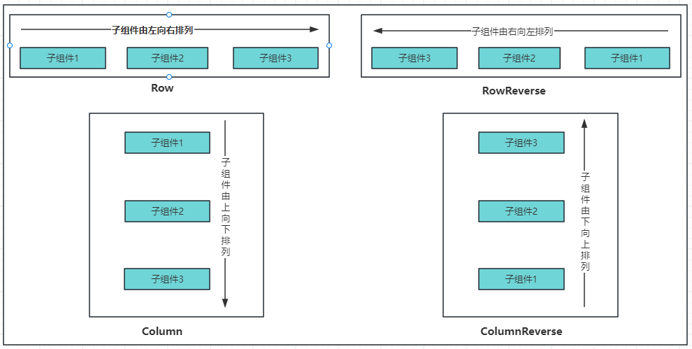
什么是主轴和纵轴?
对于线性容器来说,有主轴和纵轴之分:
- 如果布局是沿水平方向,那么主轴就指水平方向,而纵轴就是垂直方向;
- 如果布局是沿垂直方向,那么主轴就是指垂直方向,而纵轴就是水平方向。
如下图所示:
容器属性说明:
| 属性方法名 | 说明 | 参数 |
| justifyContent | 设置子元素在主轴方向的对齐格式 | FlexAlign枚举 |
| alignItems | 设置子元素在交叉轴方向的对齐格式 |
Row容器使用VerticalAlign枚举 Column容器使用 |
1.2.Column
Column 按照垂直方向布局子组件,主轴为垂直方向,纵轴为水平方向。
1.2.1.Column定义
沿垂直方向布局的容器。接口如下:
Column(value?: {space?: string | number})
value:可选参数, space 表示设置 Column 的子组件在垂直方向上的间距,参数:
|
参数名 |
参数类型 |
必填 |
参数描述 |
|---|---|---|---|
|
space |
string | number |
否 |
纵向布局元素垂直方向间距。 从API version 9开始,space为负数或者justifyContent设置为FlexAlign.SpaceBetween、FlexAlign.SpaceAround、FlexAlign.SpaceEvenly时不生效。 默认值:0 说明: 可选值为大于等于0的数字,或者可以转换为数字的字符串。 |
1.2.2.Column属性介绍
alignItems:设置子组件在水平方向上的布局方式, HorizontalAlign 定义了以下三种对其方式:
- Start:设置子组件在水平方向上按照语言方向起始端对齐。
- Center(默认值):设置子组件在水平方向上居中对齐。
- End:设置子组件在水平方向上按照语言方向末端对齐。
案例如下:
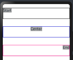
@Entry
@Component
struct ColumnExample {
  build() {
    //只能有一个根容器
    Column(){

      Column(){
        Text("Start")
          .fontSize(20)
          .backgroundColor("#A9A9A9")
      }
      .alignItems(HorizontalAlign.Start) //子容器:设置子组件在水平方向上按照语言方向起始端对齐。
      .size({width:"100%",height:60})    //容器的宽和高
      .borderWidth(2)                    //框线的宽度
      .borderColor("#000000")            //框线的颜色
      .margin({top:20, bottom:20})       //外上、下边距

      Column(){
        Text("Center")
          .fontSize(20)
          .backgroundColor("#A9A9A9")
      }
      .alignItems(HorizontalAlign.Center)//子容器:设置子组件在水平方向上居左对齐。
      .size({width:"100%",height:60})    //容器的宽和高
      .borderWidth(2)                    //框线的宽度
      .borderColor("#0000CD")            //框线的颜色
      .margin({top:20, bottom:20})       //外上、下边距

      Column(){
        Text("End")
          .fontSize(20)
          .backgroundColor("#A9A9A9")
      }
      .alignItems(HorizontalAlign.End)  //子容器:设置子组件在水平方向上按照语言方向末端对齐。
      .size({width:"100%",height:60})   //容器的宽和高
      .borderWidth(2)                   //框线的宽度
      .borderColor("#FF1493")           //框线的颜色
      .margin({top:20, bottom:20})      //外上、下边距
    }
  }
}
预览效果如下:
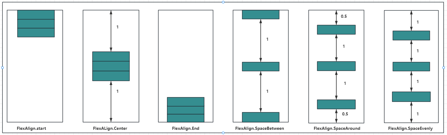
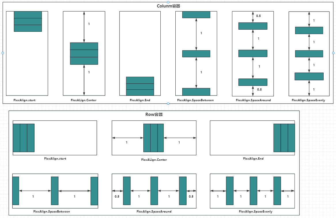
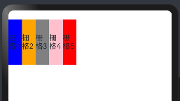
justifyContent:设置子组件在垂直方向上的对齐方式, FlexAlign枚举 定义了一下几种类型:
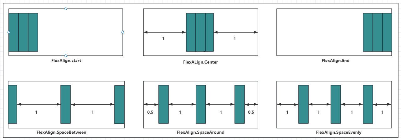
- Start:元素在主轴方向首端对齐, 第一个元素与行首对齐,同时后续的元素与前一个对齐。
- Center:元素在主轴方向中心对齐,第一个元素与行首的距离与最后一个元素与行尾距离相同。
- End:元素在主轴方向尾部对齐, 最后一个元素与行尾对齐,其他元素与后一个对齐。
- SpaceBetween:主轴方向均匀分配弹性元素,相邻元素之间距离相同。 第一个元素与行首对齐,最后一个元素与行尾对齐。
- SpaceAround:主轴方向均匀分配弹性元素,相邻元素之间距离相同。 第一个元素到行首的距离和最后一个元素到行尾的距离时相邻元素之间距离的一半。
- SpaceEvenly:主轴方向元素等间距布局, 相邻元素之间的间距、第一个元素与行首的间距、最后一个元素到行尾的间距都完全一样。
如下图所示:
案例代码如下:
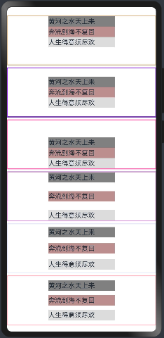
@Entry
@Component
struct ColumnExample {
  build() {

    Column({space:5}){  // 设置子元素垂直方向间距为5

      Column(){
        Text("黄河之水天上来").size({width:160, height:25}).backgroundColor("#808080")
        Text("奔流到海不复回").size({width:160, height:25}).backgroundColor("#BC8F8F")
        Text("人生得意须尽欢").size({width:160, height:25}).backgroundColor("#DCDCDC")
      }
        .alignItems(HorizontalAlign.Center) //设置水平方向子容器居中
        .justifyContent(FlexAlign.Start) //元素在主轴方向首端对齐, 第一个元素与行首对齐,同时后续的元素与前一个对齐
        .size({width:"100%", height:120}) //容器大小
        .borderWidth(2)
        .borderColor("#D2B48C")

      Column(){
        Text("黄河之水天上来").size({width:160, height:25}).backgroundColor("#808080")
        Text("奔流到海不复回").size({width:160, height:25}).backgroundColor("#BC8F8F")
        Text("人生得意须尽欢").size({width:160, height:25}).backgroundColor("#DCDCDC")
      }
      .alignItems(HorizontalAlign.Center) //设置水平方向子容器居中
      .justifyContent(FlexAlign.Center) //元素在主轴方向中心对齐,第一个元素与行首的距离与最后一个元素与行尾距离相同。
      .size({width:"100%", height:120}) //容器大小
      .borderWidth(2)
      .borderColor("#8A2BE2")

      Column(){
        Text("黄河之水天上来").size({width:160, height:25}).backgroundColor("#808080")
        Text("奔流到海不复回").size({width:160, height:25}).backgroundColor("#BC8F8F")
        Text("人生得意须尽欢").size({width:160, height:25}).backgroundColor("#DCDCDC")
      }
      .alignItems(HorizontalAlign.Center) //设置水平方向子容器居中
      .justifyContent(FlexAlign.End) //元素在主轴方向尾部对齐, 最后一个元素与行尾对齐,其他元素与后一个对齐。
      .size({width:"100%", height:120}) //容器大小
      .borderWidth(2)
      .borderColor("#FF69B4")

      Column(){
        Text("黄河之水天上来").size({width:160, height:25}).backgroundColor("#808080")
        Text("奔流到海不复回").size({width:160, height:25}).backgroundColor("#BC8F8F")
        Text("人生得意须尽欢").size({width:160, height:25}).backgroundColor("#DCDCDC")
      }
      .alignItems(HorizontalAlign.Center) //设置水平方向子容器居中
      .justifyContent(FlexAlign.SpaceBetween) //元素在主轴方向均匀分配弹性元素,相邻元素之间距离相同。 第一个元素与行首对齐,最后一个元素与行尾对齐。Q
      .size({width:"100%", height:120}) //容器大小
      .borderWidth(2)
      .borderColor("#DDA0DD")

      Column(){
        Text("黄河之水天上来").size({width:160, height:25}).backgroundColor("#808080")
        Text("奔流到海不复回").size({width:160, height:25}).backgroundColor("#BC8F8F")
        Text("人生得意须尽欢").size({width:160, height:25}).backgroundColor("#DCDCDC")
      }
      .alignItems(HorizontalAlign.Center) //设置水平方向子容器居中
      .justifyContent(FlexAlign.SpaceAround) //元素在主轴方向均匀分配弹性元素,相邻元素之间距离相同。 第一个元素到行首的距离和最后一个元素到行尾的距离时相邻元素之间距离的一半。
      .size({width:"100%", height:120}) //容器大小
      .borderWidth(2)
      .borderColor("#E6E6FA")


      Column(){
        Text("黄河之水天上来").size({width:160, height:25}).backgroundColor("#808080")
        Text("奔流到海不复回").size({width:160, height:25}).backgroundColor("#BC8F8F")
        Text("人生得意须尽欢").size({width:160, height:25}).backgroundColor("#DCDCDC")
      }
      .alignItems(HorizontalAlign.Center) //设置水平方向子容器居中
      .justifyContent(FlexAlign.SpaceEvenly) //元素在主轴方向元素等间距布局, 相邻元素之间的间距、第一个元素与行首的间距、最后一个元素到行尾的间距都完全一样。
      .size({width:"100%", height:120}) //容器大小
      .borderWidth(2)
      .borderColor("#FFB6C1")

    }
    .width("100%")
    .margin({top:20})

  }
}
预览效果如下:
1.3.Row
Row 按照水平方向布局子组件,主轴为水平方向,纵轴为竖直方向。
1.3.1.Row定义介绍
沿水平方向布局容器。接口如下:
Row(value?:{space?: number | string })
value:可选参数, space 表示设置 Row 的子组件在水平方向上的间距,案例如下:
@Entry
@Component
struct RowExample01 {
  build() {
    Column({space:20}){
      Row(){
        Text().width(90).height("100%").backgroundColor("#FFB6C1")

        Text().width(20).height("100%") //模拟元素直接间隔

        /**
         * 父容器尺寸确定时,设置了layoutWeight属性的子元素与兄弟元素占主轴尺寸按照权重进行分配,忽略元素本身尺寸设置,表示自适应占满剩余空间。
         默认值:0
         说明:
         仅在Row/Column/Flex布局中生效。
         可选值为大于等于0的数字,或者可以转换为数字的字符串。
         */
        Text().width(20).height("100%").layoutWeight(1).backgroundColor(Color.Blue)
      }
      .width("100%")
      .height(60)

      Row({space:20}){ //Row容器的间隔
        Text().width(90).height("100%").backgroundColor("#FFB6C1")

        /**
         * 父容器尺寸确定时,设置了layoutWeight属性的子元素与兄弟元素占主轴尺寸按照权重进行分配,忽略元素本身尺寸设置,表示自适应占满剩余空间。
         默认值:0
         说明:
         仅在Row/Column/Flex布局中生效。
         可选值为大于等于0的数字,或者可以转换为数字的字符串。
         */
        Text().width(20).height("100%").layoutWeight(1).backgroundColor(Color.Blue)
      }
      .width("100%")
      .height(60)
    }
    .width("100%")
    .padding(10)
  }
}
注意:
layoutWeight:父容器尺寸确定时,设置了layoutWeight属性的子元素与兄弟元素占主轴尺寸按照权重进行分配,忽略元素本身尺寸设置,表示自适应占满剩余空间。默认值:0说明:
- 仅在Row/Column/Flex布局中生效。
- 可选值为大于等于0的数字,或者可以转换为数字的字符串。
预览效果如下:
1.3.2.Row属性介绍
alignItems:参数类型为 VerticalAlign ,表示子组件在垂直方向上的布局方式, VerticalAlign 定义了以下三种对其方式:
- Top:设置子组件在竖直方向上居顶部对齐。
- Center(默认值):设置子组件在竖直方向上居中对其。
- Bottom:设置子组件在竖直方向上居底部对齐。
案例代码如下:
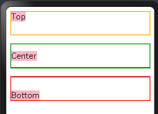
@Entry
@Component
struct RowExample01 {
  build() {
    Column({space:20}){
      Row(){
        //这里为了看到消息,不要设置子元素的宽和高
        Text("Top").fontSize(20).backgroundColor("#FFB6C1")
      }
      .width("100%")
      .height(60)
      .alignItems(VerticalAlign.Top)  //设置子组件在垂直方法顶部对象
      .borderWidth(2)                 //设置框线宽度
      .borderColor(Color.Orange)      //框线颜色


      Row({space:20}){ //Row容器的间隔
        Text("Center").fontSize(20).backgroundColor("#FFB6C1")
      }
      .width("100%")
      .height(60)
      .alignItems(VerticalAlign.Center)  //设置子组件在垂直方法居中对齐
      .borderWidth(2)                 //设置框线宽度
      .borderColor(Color.Green)       //框线颜色

      Row({space:20}){ //Row容器的间隔
        Text("Bottom").fontSize(20).backgroundColor("#FFB6C1")
      }
      .width("100%")
      .height(60)
      .alignItems(VerticalAlign.Bottom)  //设置子组件在垂直方法居中对齐
      .borderWidth(2)                    //设置框线宽度
      .borderColor(Color.Red)            //框线颜色

    }
    .width("100%")
    .padding(10)
  }
}
预览效果如下:
justifyContent:设置子组件在水平方向上的对齐方式, FlexAlign 定义了一下几种类型:
- Start:元素在主轴方向首端对齐, 第一个元素与行首对齐,同时后续的元素与前一个对齐。
- Center:元素在主轴方向中心对齐,第一个元素与行首的距离与最后一个元素与行尾距离相同。
- End:元素在主轴方向尾部对齐, 最后一个元素与行尾对齐,其他元素与后一个对齐。
- SpaceBetween:主轴方向均匀分配弹性元素,相邻元素之间距离相同。 第一个元素与行首对齐,最后一个元素与行尾对齐。
- SpaceAround:主轴方向均匀分配弹性元素,相邻元素之间距离相同。 第一个元素到行首的距离和最后一个元素到行尾的距离时相邻元素之间距离的一半。
- SpaceEvenly:主轴方向元素等间距布局, 相邻元素之间的间距、第一个元素与行首的间距、最后一个元素到行尾的间距都完全一样。
示意图如下:
案例代码如下:
@Entry
@Component
struct RowExample03 {
  build() {
    Column({space:10}){
      Row(){
        Text().size({width:30,height:50}).backgroundColor("#FFB6C1")
        Text().size({width:30,height:50}).backgroundColor("#FAFAD2")
        Text().size({width:30,height:50}).backgroundColor("#7FFF00")
      }
      .justifyContent(FlexAlign.Start) //元素在主轴方向首端对齐, 第一个元素与行首对齐,同时后续的元素与前一个对齐。
      .size({width:"100%", height:100})
      .borderWidth(2)
      .borderColor(Color.Orange)

      Row(){
        Text().size({width:30,height:50}).backgroundColor("#FFB6C1")
        Text().size({width:30,height:50}).backgroundColor("#FAFAD2")
        Text().size({width:30,height:50}).backgroundColor("#7FFF00")
      }
      .justifyContent(FlexAlign.Center) //元素在主轴方向中心对齐,第一个元素与行首的距离与最后一个元素与行尾距离相同。
      .size({width:"100%", height:100})
      .borderWidth(2)
      .borderColor(Color.Orange)

      Row(){
        Text().size({width:30,height:50}).backgroundColor("#FFB6C1")
        Text().size({width:30,height:50}).backgroundColor("#FAFAD2")
        Text().size({width:30,height:50}).backgroundColor("#7FFF00")
      }
      .justifyContent(FlexAlign.End) //元素在主轴方向尾部对齐, 最后一个元素与行尾对齐,其他元素与后一个对齐。
      .size({width:"100%", height:100})
      .borderWidth(2)
      .borderColor(Color.Orange)

      Row(){
        Text().size({width:30,height:50}).backgroundColor("#FFB6C1")
        Text().size({width:30,height:50}).backgroundColor("#FAFAD2")
        Text().size({width:30,height:50}).backgroundColor("#7FFF00")
      }
      .justifyContent(FlexAlign.SpaceBetween) //主轴方向均匀分配弹性元素,相邻元素之间距离相同。 第一个元素与行首对齐,最后一个元素与行尾对齐
      .size({width:"100%", height:100})
      .borderWidth(2)
      .borderColor(Color.Orange)

      Row(){
        Text().size({width:30,height:50}).backgroundColor("#FFB6C1")
        Text().size({width:30,height:50}).backgroundColor("#FAFAD2")
        Text().size({width:30,height:50}).backgroundColor("#7FFF00")
      }
      .justifyContent(FlexAlign.SpaceAround) //主轴方向均匀分配弹性元素,相邻元素之间距离相同。 第一个元素到行首的距离和最后一个元素到行尾的距离时相邻元素之间距离的一半。
      .size({width:"100%", height:100})
      .borderWidth(2)
      .borderColor(Color.Orange)

      Row(){
        Text().size({width:30,height:50}).backgroundColor("#FFB6C1")
        Text().size({width:30,height:50}).backgroundColor("#FAFAD2")
        Text().size({width:30,height:50}).backgroundColor("#7FFF00")
      }
      .justifyContent(FlexAlign.SpaceEvenly) //主轴方向元素等间距布局, 相邻元素之间的间距、第一个元素与行首的间距、最后一个元素到行尾的间距都完全一样。
      .size({width:"100%", height:100})
      .borderWidth(2)
      .borderColor(Color.Orange)

    }
    .width("100%")
    .padding({top:20})

  }
}
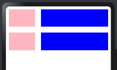
如果 Row 设置了 space 参数,则 justifyContent 参数不起作用。预览效果如下:

1.4.Blank
Blank 表示空白填充组件,它用在 Row 和 Column 组件内来填充组件在主轴方向上的剩余尺寸的能力。
1.4.1.Blank定义
空白填充组件,在容器主轴方向上,空白填充组件具有自动填充容器空余部分的能力。仅当父组件为Row/Column/Flex时生效。接口如下:
Blank(min?: number | string)
参数:
|
参数名 |
参数类型 |
必填 |
参数描述 |
|---|---|---|---|
|
min |
number | string |
否 |
空白填充组件在容器主轴上的最小大小。 默认值:0 说明: 不支持设置百分比。负值使用默认值。当最小值大于容器可用空间时,使用最小值作为自身大小并超出容器。 |
1.4.2.Blank属性
除支持通用属性外,还支持以下属性:
|
名称 |
参数类型 |
描述 |
|---|---|---|
|
color |
ResourceColor |
设置空白填充的填充颜色。 默认值:Color.Transparent 从API version 9开始,该接口支持在ArkTS卡片中使用。 |
1.4.3.案例
案例代码如下:
@Entry
@Component
struct BlackExample {
  build() {
    Column({space:20}){
      // blank父组件不设置宽度时,Blank失效,可以通过设置min最小宽度填充固定宽度
      Row(){
        Text("Bluetooth")
          .fontSize(20) //文本
        Blank().color(Color.Green) //不设置空白颜色
        Toggle({type:ToggleType.Switch}) //按钮开关
      }
      .backgroundColor(Color.Pink)
      .borderRadius(8)
      .size({height:80})
      .justifyContent(FlexAlign.SpaceBetween) //设置
      .padding(10)


      Row(){
        Text("Bluetooth")
          .fontSize(20) //靠左显示
        // 设置最小宽度为160
        Blank(160).color(Color.Orange) //设置空白颜色
        Toggle({type:ToggleType.Switch}) //按钮开关
      }
      .backgroundColor(Color.Pink)
      .borderRadius(8)
      .size({width:"100%", height:80})
      .justifyContent(FlexAlign.SpaceBetween) //设置
      .padding(10)

    }
    .padding(20)
    .size({width: "100%", height: "100%"})
  }
}
预览效果如下:
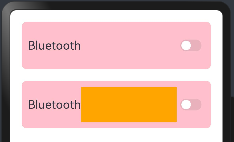
Blank 的特点:
- Black只在
Row和Column容器中生效。 - 除了
color外不支持通用属性。 - 只在
Row和Column有剩余空间才生效。 - 适合用在多设备适配场景中。
1.5.完整案例演示
学习上面的内容需要知道:纵向布局使用Column容器,横向布局采用Row容器,通过justifyContent和alignItems分别用来设置主轴和交叉轴的对齐方式:
| 属性方法名 | 说明 | 参数 |
| justifyContent | 设置子元素在主轴方向的对齐格式 | FlexAlign枚举 |
| alignItems | 设置子元素在交叉轴方向的对齐格式 |
Row容器使用VerticalAlign枚举 Column容器使用 |
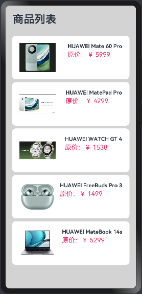
1.5.1.需求如下
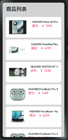
实现商品列表的展示,如下:
分析页面元素构成:
1.5.2.实现思路
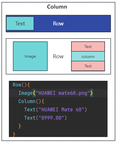
这里的商品列表是,不能通过一个一个的Row容器实现,需要通过ForEach实现,很多时间是不确定有多少个商品的,如下:
代码如下:
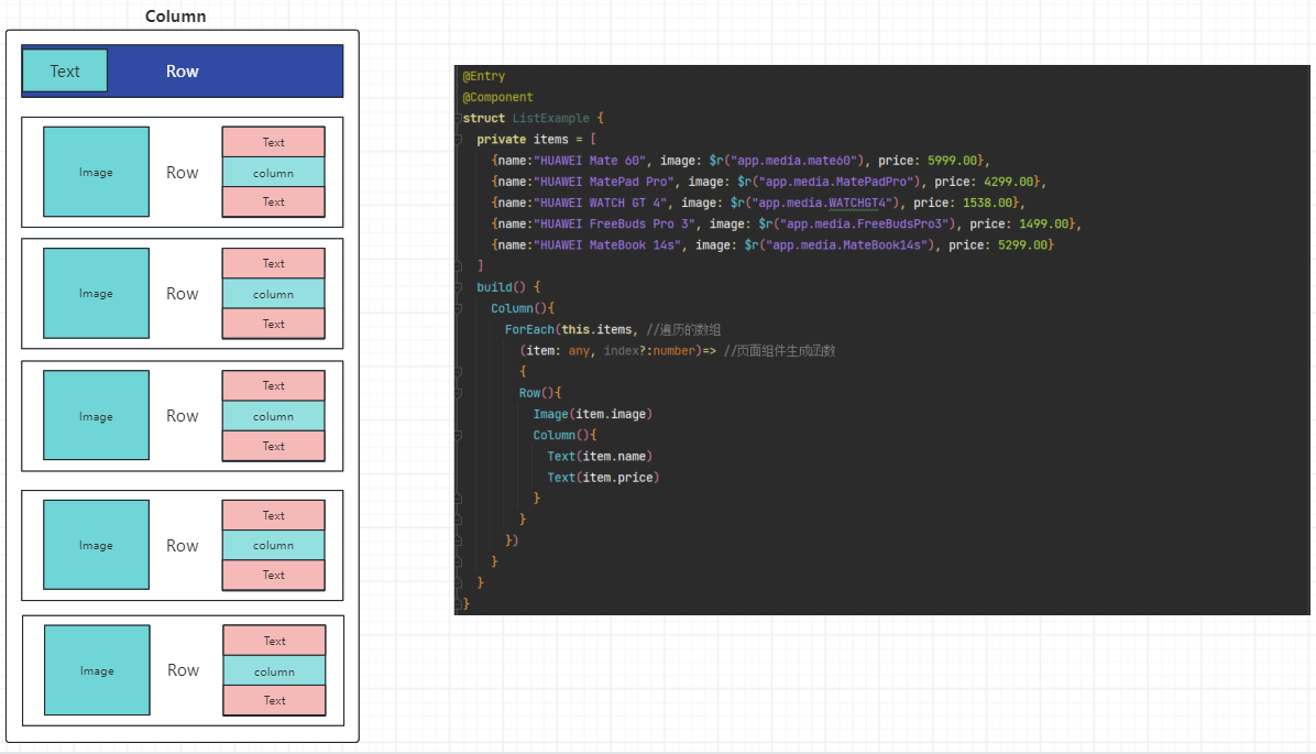
@Entry
@Component
struct ListExample {
  private items = [
    {name:"HUAWEI Mate 60", image: $r("app.media.mate60"), price: 5999.00},
    {name:"HUAWEI MatePad Pro", image: $r("app.media.MatePadPro"), price: 4299.00},
    {name:"HUAWEI WATCH GT 4", image: $r("app.media.WATCHGT4"), price: 1538.00},
    {name:"HUAWEI FreeBuds Pro 3", image: $r("app.media.FreeBudsPro3"), price: 1499.00},
    {name:"HUAWEI MateBook 14s", image: $r("app.media.MateBook14s"), price: 5299.00}
  ]
  build() {
    Column(){
      ForEach(this.items, //遍历的数组
        (item: any, index?:number)=> //页面组件生成函数
        {
        Row(){
          Image(item.image)
          Column(){
            Text(item.name)
            Text(item.price)
          }
        }
      })
    }
  }
}
1.5.3.实现单个商品展示
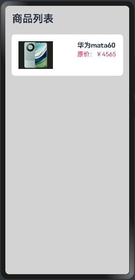
不要一蹴而就,先编写单个商品的展示,调整好样式,在考虑后续的,代码如下:
@Entry
@Component
struct ListExample {
  build() {
    Column({space:8}){
      Row(){
        Text("商品列表")
          .fontSize(30)
          .fontWeight(FontWeight.Bold)
      }
      .width("100%")
      .padding(20)

      Row({space:10}){
        Image($r('app.media.mate60')).width(100)
        Column({space:4}){
          Text("华为mata60").fontSize(20).fontWeight(FontWeight.Bold)
          Text("原价:¥4565").fontColor("#F36").fontSize(18)
        }
        .height("100%")
        .alignItems(HorizontalAlign.Start) //设置子组件在水平方向上按照语言方向起始端对齐。
      }
      .width("90%")  //设置宽度
      .height(120)    //设置高度
      .justifyContent(FlexAlign.SpaceBetween) //设置主轴方向主轴方向均匀分配弹性元素,相邻元素之间距离相同。 第一个元素与行首对齐,最后一个元素与行尾对齐。
      .backgroundColor("#FFFFFF") //设置背景为白色
      .borderRadius(10) //这是圆角班级
      .padding(20) //内边距

    }
    .width("100%")
    .height("100%")
    .backgroundColor("#D3D3D3")

  }
}
预览效果如下:
1.5.4.实现商品列表,展示商品
由于后期商品很多数量不确定,不可能写多个Row标签,所以这里使用ForEach循环渲染出来商品列表信息:
class Item{
  //定位属性
  name: string
  image: any
  price: number

  constructor(name: string, image: any, price: number) {
    this.name = name
    this.image = image
    this.price = price
  }
}

@Entry
@Component
struct ListExample {
  private items:Array<Item> = [
    new Item("HUAWEI Mate 60 Pro",$r("app.media.mate60"),  5999.00),
    new Item("HUAWEI MatePad Pro",$r("app.media.MatePadPro"),4299.00),
    new Item("HUAWEI WATCH GT 4", $r("app.media.WATCHGT4"), 1538.00),
    new Item("HUAWEI FreeBuds Pro 3", $r("app.media.FreeBudsPro3"), 1499.00),
    new Item("HUAWEI MateBook 14s", $r("app.media.MateBook14s"), 5299.00)
  ]
  build() {
    Column({space:8}){
      Row(){
        Text("商品列表")
          .fontSize(30)
          .fontWeight(FontWeight.Bold)
      }
      .width("100%")
      .padding(20)


      ForEach(this.items,(item: Item, index?:number)=>{
        Row({space:10}){
          Image(item.image).width(100)
          Column({space:4}){
            Text(item.name).fontSize(15).fontWeight(FontWeight.Bold)
            Text(`原价:¥ ${item.price}`).fontColor("#F36").fontSize(18)
          }
          .height("100%")
          .alignItems(HorizontalAlign.Start)
        }
        .width("90%")  //设置宽度
        .height(120)    //设置高度
        .justifyContent(FlexAlign.SpaceBetween) //设置主轴方向主轴方向均匀分配弹性元素,相邻元素之间距离相同。 第一个元素与行首对齐,最后一个元素与行尾对齐。
        .backgroundColor("#FFFFFF") //设置背景为白色
        .borderRadius(10) //这是圆角班级
        .padding(20) //内边距
      })
    }
    .width("100%")
    .height("100%")
    .backgroundColor("#D3D3D3")

  }
}
预览效果如下:
上面的内容虽然可以展示商品,但是商品的数量过多,无法展示出来,这时候就要采用List容器来采用滚动的方式实现。
二、弹性布局容器(Flex)
ArkUI 开发框架为了方便开发者实现灵活的页面布局方式,提供了弹性布局 Flex ,它用来为盒装模型提供最大的灵活性。 Flex 和 Row 、 Column 组件一样,也有主轴和纵轴之分。
说明:
- Flex组件在渲染时存在二次布局过程,因此在对性能有严格要求的场景下建议使用Column、Row代替。
- Flex组件主轴默认不设置时撑满父容器,Column、Row组件主轴不设置时默认是跟随子节点大小。
2.1.Flex接口
Flex(value?: { direction?: FlexDirection, wrap?: FlexWrap, justifyContent?: FlexAlign, alignItems?: ItemAlign, alignContent?: FlexAlign })
2.2.参数
value是一个对象。
2.2.1.direction
direction:设置子组件的的排列方向即主轴方向, 类型FlexDirection 定义了以下4种排列方式:
|
名称 |
描述 |
|---|---|
|
Row |
主轴与行方向一致作为布局模式。 |
|
RowReverse |
与Row方向相反方向进行布局。 |
|
Column |
主轴与列方向一致作为布局模式。 |
|
ColumnReverse |
与Column相反方向进行布局。 |
示例图如下:
说明:
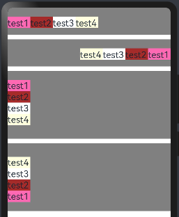
1)Row(默认值):子组件水平排列,即主轴为水平方向纵轴为竖直方向,子组件由左向右排列:
2)Column:子组件竖直排列,即主轴为垂直方向,起点在上边,子组件由上到下排列。
3)Column:子组件竖直排列,即主轴为垂直方向,起点在上边,子组件由上到下排列。
4)ColumnReverse:子组件竖直排列,即主轴为垂直方向,起点在下边,子组件由下到上排列。
案例代码如下:
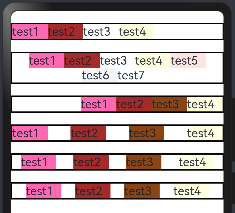
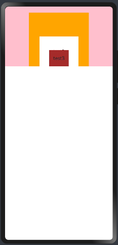
@Entry
@Component
struct FlexExample {
  build() {
    Column({space:10}){
      //Row(默认值):子组件水平排列,即主轴为水平方向纵轴为竖直方向,子组件由左向右排列。
      Flex({direction: FlexDirection.Row}){
        Text("test1").fontSize(20).backgroundColor("#FF69B4").width(50).height(25)
        Text("test2").fontSize(20).backgroundColor("#A52A2A").width(50).height(25)
        Text("test3").fontSize(20).backgroundColor("#FFFFFF").width(50).height(25)
        Text("test4").fontSize(20).backgroundColor("#FFFFE0").width(50).height(25)
      }.width("100%")
      .height(60)
      .backgroundColor("#808080")
      .padding({top:20,bottom:20})

      //RowReverse:子组件水平排列,即主轴为水平方向纵轴为竖直方向,子组件由右向左排列。
      Flex({direction: FlexDirection.RowReverse}){
        Text("test1").fontSize(20).backgroundColor("#FF69B4").width(50).height(25)
        Text("test2").fontSize(20).backgroundColor("#A52A2A").width(50).height(25)
        Text("test3").fontSize(20).backgroundColor("#FFFFFF").width(50).height(25)
        Text("test4").fontSize(20).backgroundColor("#FFFFE0").width(50).height(25)
      }.width("100%")
      .height(60)
      .backgroundColor("#808080")
      .padding({top:20,bottom:20})

      //Column:子组件竖直排列,即主轴为垂直方向,起点在上边,子组件由上到下排列。
      Flex({direction: FlexDirection.Column}){
        Text("test1").fontSize(20).backgroundColor("#FF69B4").width(50).height(25)
        Text("test2").fontSize(20).backgroundColor("#A52A2A").width(50).height(25)
        Text("test3").fontSize(20).backgroundColor("#FFFFFF").width(50).height(25)
        Text("test4").fontSize(20).backgroundColor("#FFFFE0").width(50).height(25)
      }.width("100%")
      .height(150)
      .backgroundColor("#808080")
      .padding({top:20,bottom:20})

      //ColumnReverse:子组件竖直排列,即主轴为垂直方向,起点在下边,子组件由下到上排列。
      Flex({direction: FlexDirection.ColumnReverse}){
        Text("test1").fontSize(20).backgroundColor("#FF69B4").width(50).height(25)
        Text("test2").fontSize(20).backgroundColor("#A52A2A").width(50).height(25)
        Text("test3").fontSize(20).backgroundColor("#FFFFFF").width(50).height(25)
        Text("test4").fontSize(20).backgroundColor("#FFFFE0").width(50).height(25)
      }.width("100%")
      .height(150)
      .backgroundColor("#808080")
      .padding({top:20,bottom:20})
    }
    .width("100%")
    .height("100%")
  }
}
预览效果如下:
2.2.2.wrap
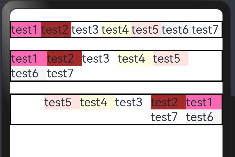
wrap:设置子组件是单行/列还是多行/列排序, FlexWrap枚举提供了以下3种类型:
|
名称 |
描述 |
|---|---|
|
NoWrap |
Flex容器的元素单行/列布局,子项不允许超出容器。 |
|
Wrap |
Flex容器的元素多行/列排布,子项允许超出容器。 |
|
WrapReverse |
Flex容器的元素反向多行/列排布,子项允许超出容器。 |
案例代码如下:
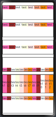
@Entry
@Component
struct FlexExample02 {
  build() {
    Column({space:20}){
      //1.NoWrap(默认值):子组件单行/列排序,子组件不允许超出容器。会挤在一起
      Flex({direction:FlexDirection.Row, wrap: FlexWrap.NoWrap}){
        Text("test1").fontSize(20).backgroundColor("#FF69B4").width(60).height(25)
        Text("test2").fontSize(20).backgroundColor("#A52A2A").width(60).height(25)
        Text("test3").fontSize(20).backgroundColor("#FFFFFF").width(60).height(25)
        Text("test4").fontSize(20).backgroundColor("#FFFFE0").width(60).height(25)
        Text("test5").fontSize(20).backgroundColor("#FFE4E1").width(60).height(25)
        Text("test6").fontSize(20).backgroundColor("#F5F5F5").width(60).height(25)
        Text("test7").fontSize(20).backgroundColor("#FFFFFF").width(60).height(25)
      }
      .borderWidth(2)

      //2.Wrap:子组件多行/列排序,子组件允许超出容器。
      Flex({direction:FlexDirection.Row, wrap: FlexWrap.Wrap}){
        Text("test1").fontSize(20).backgroundColor("#FF69B4").width(60).height(25)
        Text("test2").fontSize(20).backgroundColor("#A52A2A").width(60).height(25)
        Text("test3").fontSize(20).backgroundColor("#FFFFFF").width(60).height(25)
        Text("test4").fontSize(20).backgroundColor("#FFFFE0").width(60).height(25)
        Text("test5").fontSize(20).backgroundColor("#FFE4E1").width(60).height(25)
        Text("test6").fontSize(20).backgroundColor("#F5F5F5").width(60).height(25)
        Text("test7").fontSize(20).backgroundColor("#FFFFFF").width(60).height(25)
      }
      .borderWidth(2)

      //3.WrapReverse:子组件反向多行/列排序,子组件允许超出容器。
      Flex({direction:FlexDirection.Row, wrap: FlexWrap.WrapReverse}){
        Text("test1").fontSize(20).backgroundColor("#FF69B4").width(60).height(25)
        Text("test2").fontSize(20).backgroundColor("#A52A2A").width(60).height(25)
        Text("test3").fontSize(20).backgroundColor("#FFFFFF").width(60).height(25)
        Text("test4").fontSize(20).backgroundColor("#FFFFE0").width(60).height(25)
        Text("test5").fontSize(20).backgroundColor("#FFE4E1").width(60).height(25)
        Text("test6").fontSize(20).backgroundColor("#F5F5F5").width(60).height(25)
        Text("test7").fontSize(20).backgroundColor("#FFFFFF").width(60).height(25)
      }
      .borderWidth(2)

    }
    .width("100%")
    .height("100%")
    .padding({top:20, bottom:20})
  }
}
预览效果如下:
2.2.3.justifyContent
justifyContent:设置子组件在主轴上的对齐方式, FlexAlign 提供了以下 6 种对齐方式:
|
名称 |
描述 |
|---|---|
|
Start |
元素在主轴方向首端对齐,第一个元素与行首对齐,同时后续的元素与前一个对齐。 |
|
Center |
元素在主轴方向中心对齐,第一个元素与行首的距离与最后一个元素与行尾距离相同。 |
|
End |
元素在主轴方向尾部对齐,最后一个元素与行尾对齐,其他元素与后一个对齐。 |
|
SpaceBetween |
Flex主轴方向均匀分配弹性元素,相邻元素之间距离相同。第一个元素与行首对齐,最后一个元素与行尾对齐。 |
|
SpaceAround |
Flex主轴方向均匀分配弹性元素,相邻元素之间距离相同。第一个元素到行首的距离和最后一个元素到行尾的距离是相邻元素之间距离的一半。 |
|
SpaceEvenly |
Flex主轴方向均匀分配弹性元素,相邻元素之间的距离、第一个元素与行首的间距、最后一个元素到行尾的间距都完全一样。 |
如下图所示:
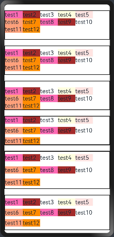
案例代码如下:
@Entry
@Component
struct FlexExample02 {
  build() {
    Column({space:20}){
      //Start(默认值):元素在主轴方向首端对齐, 第一个元素与行首对齐,同时后续的元素与前一个对齐。
      Flex({direction:FlexDirection.Row, wrap: FlexWrap.Wrap, justifyContent:FlexAlign.Start}){
        Text("test1").fontSize(20).backgroundColor("#FF69B4").width(60).height(25)
        Text("test2").fontSize(20).backgroundColor("#A52A2A").width(60).height(25)
        Text("test3").fontSize(20).backgroundColor("#FFFFFF").width(60).height(25)
        Text("test4").fontSize(20).backgroundColor("#FFFFE0").width(60).height(25)

      }
      .borderWidth(2)

      //Center:元素在主轴方向中心对齐,第一个元素与行首的距离与最后一个元素与行尾距离相同。
      Flex({direction:FlexDirection.Row, wrap: FlexWrap.Wrap,justifyContent:FlexAlign.Center}){
        Text("test1").fontSize(20).backgroundColor("#FF69B4").width(60).height(25)
        Text("test2").fontSize(20).backgroundColor("#A52A2A").width(60).height(25)
        Text("test3").fontSize(20).backgroundColor("#FFFFFF").width(60).height(25)
        Text("test4").fontSize(20).backgroundColor("#FFFFE0").width(60).height(25)
        Text("test5").fontSize(20).backgroundColor("#FFE4E1").width(60).height(25)
        Text("test6").fontSize(20).backgroundColor("#F5F5F5").width(60).height(25)
        Text("test7").fontSize(20).backgroundColor("#FFFFFF").width(60).height(25)
      }
      .borderWidth(2)

      //End:元素在主轴方向尾部对齐, 最后一个元素与行尾对齐,其他元素与后一个对齐。
      Flex({direction:FlexDirection.Row, wrap: FlexWrap.Wrap,justifyContent:FlexAlign.End}){
        Text("test1").fontSize(20).backgroundColor("#FF69B4").width(60).height(25)
        Text("test2").fontSize(20).backgroundColor("#A52A2A").width(60).height(25)
        Text("test3").fontSize(20).backgroundColor("#8B4513").width(60).height(25)
        Text("test4").fontSize(20).backgroundColor("#FFFFE0").width(60).height(25)
      }
      .borderWidth(2)

      //SpaceBetween:Flex 主轴方向均匀分配弹性元素,相邻元素之间距离相同。 第一个元素与行首对齐,最后一个元素与行尾对齐。
      Flex({direction:FlexDirection.Row, wrap: FlexWrap.Wrap,justifyContent:FlexAlign.SpaceBetween}){
        Text("test1").fontSize(20).backgroundColor("#FF69B4").width(60).height(25)
        Text("test2").fontSize(20).backgroundColor("#A52A2A").width(60).height(25)
        Text("test3").fontSize(20).backgroundColor("#8B4513").width(60).height(25)
        Text("test4").fontSize(20).backgroundColor("#FFFFE0").width(60).height(25)
      }
      .borderWidth(2)


      //SpaceAround: Flex 主轴方向均匀分配弹性元素,相邻元素之间距离相同。 第一个元素到行首的距离和最后一个元素到行尾的距离时相邻元素之间距离的一半。
      Flex({direction:FlexDirection.Row, wrap: FlexWrap.Wrap,justifyContent:FlexAlign.SpaceAround}){
        Text("test1").fontSize(20).backgroundColor("#FF69B4").width(60).height(25)
        Text("test2").fontSize(20).backgroundColor("#A52A2A").width(60).height(25)
        Text("test3").fontSize(20).backgroundColor("#8B4513").width(60).height(25)
        Text("test4").fontSize(20).backgroundColor("#FFFFE0").width(60).height(25)
      }
      .borderWidth(2)


      //SpaceEvenly: Flex 主轴方向元素等间距布局, 相邻元素之间的间距、第一个元素与行首的间距、最后一个元素到行尾的间距都完全一样。
      Flex({direction:FlexDirection.Row, wrap: FlexWrap.Wrap,justifyContent:FlexAlign.SpaceEvenly}){
        Text("test1").fontSize(20).backgroundColor("#FF69B4").width(60).height(25)
        Text("test2").fontSize(20).backgroundColor("#A52A2A").width(60).height(25)
        Text("test3").fontSize(20).backgroundColor("#8B4513").width(60).height(25)
        Text("test4").fontSize(20).backgroundColor("#FFFFE0").width(60).height(25)
      }
      .borderWidth(2)

    }
    .width("100%")
    .height("100%")
    .padding({top:20, bottom:20})
  }
}
预览效果如下:
2.2.4.alignItems
所有子组件在Flex容器交叉轴上的对齐格式。默认值是ItemAlign.Start,ItemAlign枚举有6种对齐方式:
|
名称 |
描述 |
|---|---|
|
Auto |
使用Flex容器中默认配置。 |
|
Start |
元素在Flex容器中,交叉轴方向首部对齐。 |
|
Center |
元素在Flex容器中,交叉轴方向居中对齐。 |
|
End |
元素在Flex容器中,交叉轴方向底部对齐。 |
|
Stretch |
元素在Flex容器中,交叉轴方向拉伸填充。容器为Flex且设置Wrap为FlexWrap.Wrap或FlexWrap.WrapReverse时,元素拉伸到与当前行/列交叉轴长度最长的元素尺寸。其余情况在元素未设置尺寸时,拉伸到容器尺寸。 |
|
Baseline |
元素在Flex容器中,交叉轴方向文本基线对齐。 |
代码如下:为了看到效果,不要设置wrap(设置子组件是单行/列还是多行/列排序)
@Entry
@Component
struct FlexExample02 {
  build() {
    Column({space:20}){
      //ItemAlign.Auto使用Flex容器中默认配置。
      Flex({direction:FlexDirection.Row, alignItems:ItemAlign.Auto}){
        Text("test1").fontSize(20).backgroundColor("#FF69B4").width(60).height(25)
        Text("test2").fontSize(20).backgroundColor("#A52A2A").width(60).height(25)
        Text("test3").fontSize(20).backgroundColor("#FFFFFF").width(60).height(25)
        Text("test4").fontSize(20).backgroundColor("#FFFFE0").width(60).height(25)
        Text("test5").fontSize(20).backgroundColor("#FFE4E1").width(60).height(25)
        Text("test6").fontSize(20).backgroundColor("#FFA07A").width(60).height(25)
        Text("test7").fontSize(20).backgroundColor("#FF8C00").width(60).height(25)
        Text("test8").fontSize(20).backgroundColor("#FF69B4").width(60).height(25)

      }
      .borderWidth(2)
      .width("100%")
      .height(100)

      //ItemAlign.Start 元素在Flex容器中,交叉轴方向首部对齐。。
      Flex({direction:FlexDirection.Row, alignItems:ItemAlign.Start}){
        Text("test1").fontSize(20).backgroundColor("#FF69B4").width(60).height(25)
        Text("test2").fontSize(20).backgroundColor("#A52A2A").width(60).height(25)
        Text("test3").fontSize(20).backgroundColor("#FFFFFF").width(60).height(25)
        Text("test4").fontSize(20).backgroundColor("#FFFFE0").width(60).height(25)
        Text("test5").fontSize(20).backgroundColor("#FFE4E1").width(60).height(25)
        Text("test6").fontSize(20).backgroundColor("#FFA07A").width(60).height(25)
        Text("test7").fontSize(20).backgroundColor("#FF8C00").width(60).height(25)
        Text("test8").fontSize(20).backgroundColor("#FF69B4").width(60).height(25)
      }
      .borderWidth(2)
      .width("100%")
      .height(100)

      //ItemAlign.Center 元素在Flex容器中,交叉轴方向居中对齐
      Flex({direction:FlexDirection.Row,alignItems:ItemAlign.Center}){
        Text("test1").fontSize(20).backgroundColor("#FF69B4").width(60).height(25)
        Text("test2").fontSize(20).backgroundColor("#A52A2A").width(60).height(25)
        Text("test3").fontSize(20).backgroundColor("#FFFFFF").width(60).height(25)
        Text("test4").fontSize(20).backgroundColor("#FFFFE0").width(60).height(25)
        Text("test5").fontSize(20).backgroundColor("#FFE4E1").width(60).height(25)
        Text("test6").fontSize(20).backgroundColor("#FFA07A").width(60).height(25)
        Text("test7").fontSize(20).backgroundColor("#FF8C00").width(60).height(25)
        Text("test8").fontSize(20).backgroundColor("#FF69B4").width(60).height(25)

      }
      .borderWidth(2)
      .width("100%")
      .height(100)

      //ItemAlign.End:元素在Flex容器中,交叉轴方向底部对齐。
      Flex({direction:FlexDirection.Row, alignItems:ItemAlign.End}){
        Text("test1").fontSize(20).backgroundColor("#FF69B4").width(60).height(25)
        Text("test2").fontSize(20).backgroundColor("#A52A2A").width(60).height(25)
        Text("test3").fontSize(20).backgroundColor("#FFFFFF").width(60).height(25)
        Text("test4").fontSize(20).backgroundColor("#FFFFE0").width(60).height(25)
        Text("test5").fontSize(20).backgroundColor("#FFE4E1").width(60).height(25)
        Text("test6").fontSize(20).backgroundColor("#FFA07A").width(60).height(25)
        Text("test7").fontSize(20).backgroundColor("#FF8C00").width(60).height(25)
        Text("test8").fontSize(20).backgroundColor("#FF69B4").width(60).height(25)
        Text("test9").fontSize(20).backgroundColor("#A52A2A").width(60).height(25)
        Text("test10").fontSize(20).backgroundColor("#FFFFFF").width(60).height(25)
        Text("test11").fontSize(20).backgroundColor("#FFA07A").width(60).height(25)
        Text("test12").fontSize(20).backgroundColor("#FF8C00").width(60).height(25)
      }
      .borderWidth(2)
      .width("100%")
      .height(100)


      //ItemAlign.Stretch:元素在Flex容器中,交叉轴方向拉伸填充。
      //容器为Flex且设置Wrap为FlexWrap.Wrap或FlexWrap.WrapReverse时,
      //元素拉伸到与当前行/列交叉轴长度最长的元素尺寸。其余情况在元素未设置尺寸时,拉伸到容器尺寸。
      Flex({direction:FlexDirection.Row, alignItems:ItemAlign.Stretch}){
        Text("test1").fontSize(20).backgroundColor("#FF69B4").width(60).height(25)
        Text("test2").fontSize(20).backgroundColor("#A52A2A").width(60).height(25)
        Text("test3").fontSize(20).backgroundColor("#FFFFFF").width(60).height(25)
        Text("test4").fontSize(20).backgroundColor("#FFFFE0").width(60).height(25)
        Text("test5").fontSize(20).backgroundColor("#FFE4E1").width(60).height(25)
        Text("test6").fontSize(20).backgroundColor("#FFA07A").width(60).height(25)
        Text("test7").fontSize(20).backgroundColor("#FF8C00").width(60).height(25)
        Text("test8").fontSize(20).backgroundColor("#FF69B4").width(60).height(25)
        Text("test9").fontSize(20).backgroundColor("#A52A2A").width(60).height(25)
        Text("test10").fontSize(20).backgroundColor("#FFFFFF").width(60).height(25)
        Text("test11").fontSize(20).backgroundColor("#FFA07A").width(60).height(25)
        Text("test12").fontSize(20).backgroundColor("#FF8C00").width(60).height(25)
      }
      .borderWidth(2)
      .width("100%")
      .height(130)


      //ItemAlign.Baseline:元素在Flex容器中,交叉轴方向文本基线对齐。。
      Flex({direction:FlexDirection.Row, alignItems:ItemAlign.Baseline}){
        Text("test1").fontSize(20).backgroundColor("#FF69B4").width(60).height(25)
        Text("test2").fontSize(20).backgroundColor("#A52A2A").width(60).height(25)
        Text("test3").fontSize(20).backgroundColor("#FFFFFF").width(60).height(25)
        Text("test4").fontSize(20).backgroundColor("#FFFFE0").width(60).height(25)
        Text("test5").fontSize(20).backgroundColor("#FFE4E1").width(60).height(25)
        Text("test6").fontSize(20).backgroundColor("#FFA07A").width(60).height(25)
        Text("test7").fontSize(20).backgroundColor("#FF8C00").width(60).height(25)
        Text("test8").fontSize(20).backgroundColor("#FF69B4").width(60).height(25)
        Text("test9").fontSize(20).backgroundColor("#A52A2A").width(60).height(25)
        Text("test10").fontSize(20).backgroundColor("#FFFFFF").width(60).height(25)
        Text("test11").fontSize(20).backgroundColor("#FFA07A").width(60).height(25)
        Text("test12").fontSize(20).backgroundColor("#FF8C00").width(60).height(25)
      }
      .borderWidth(2)
      .width("100%")
      .height(120)

    }
    .width("100%")
    .height("100%")
    .padding({top:20, bottom:20})
  }
}
预览效果如下:
2.2.5.alignContent
alignContent:当交叉轴有额外的空间时,多行内容的对齐方式。该属性仅在 wrap 属性为 Wrap 或者 WrapReverse 时才生效, FlexAlign 定义了以下 6 种对齐方式:
|
名称 |
描述 |
|---|---|
|
Start |
元素在主轴方向首端对齐,第一个元素与行首对齐,同时后续的元素与前一个对齐。 |
|
Center |
元素在主轴方向中心对齐,第一个元素与行首的距离与最后一个元素与行尾距离相同。 |
|
End |
元素在主轴方向尾部对齐,最后一个元素与行尾对齐,其他元素与后一个对齐。 |
|
SpaceBetween |
Flex主轴方向均匀分配弹性元素,相邻元素之间距离相同。第一个元素与行首对齐,最后一个元素与行尾对齐。 |
|
SpaceAround |
Flex主轴方向均匀分配弹性元素,相邻元素之间距离相同。第一个元素到行首的距离和最后一个元素到行尾的距离是相邻元素之间距离的一半。 |
|
SpaceEvenly |
Flex主轴方向均匀分配弹性元素,相邻元素之间的距离、第一个元素与行首的间距、最后一个元素到行尾的间距都完全一样。 |
案例代码如下:
@Entry
@Component
struct FlexExample02 {
  build() {
    Column({space:20}){
      //Start(默认值):设置子组件在交叉轴(纵轴)方向首部对齐。
      Flex({direction:FlexDirection.Row, wrap: FlexWrap.Wrap, alignContent:FlexAlign.Start}){
        Text("test1").fontSize(20).backgroundColor("#FF69B4").width(60).height(25)
        Text("test2").fontSize(20).backgroundColor("#A52A2A").width(60).height(25)
        Text("test3").fontSize(20).backgroundColor("#FFFFFF").width(60).height(25)
        Text("test4").fontSize(20).backgroundColor("#FFFFE0").width(60).height(25)
        Text("test5").fontSize(20).backgroundColor("#FFE4E1").width(60).height(25)
        Text("test6").fontSize(20).backgroundColor("#FFA07A").width(60).height(25)
        Text("test7").fontSize(20).backgroundColor("#FF8C00").width(60).height(25)
        Text("test8").fontSize(20).backgroundColor("#FF69B4").width(60).height(25)
        Text("test9").fontSize(20).backgroundColor("#A52A2A").width(60).height(25)
        Text("test10").fontSize(20).backgroundColor("#FFFFFF").width(60).height(25)
        Text("test11").fontSize(20).backgroundColor("#FFA07A").width(60).height(25)
        Text("test12").fontSize(20).backgroundColor("#FF8C00").width(60).height(25)
      }
      .borderWidth(2)
      .width("100%")
      .height(100)

      //Center:设置子组件在交叉轴(纵轴)方向居中对齐。
      Flex({direction:FlexDirection.Row, wrap: FlexWrap.Wrap,alignContent:FlexAlign.Center}){
        Text("test1").fontSize(20).backgroundColor("#FF69B4").width(60).height(25)
        Text("test2").fontSize(20).backgroundColor("#A52A2A").width(60).height(25)
        Text("test3").fontSize(20).backgroundColor("#FFFFFF").width(60).height(25)
        Text("test4").fontSize(20).backgroundColor("#FFFFE0").width(60).height(25)
        Text("test5").fontSize(20).backgroundColor("#FFE4E1").width(60).height(25)
        Text("test6").fontSize(20).backgroundColor("#FFA07A").width(60).height(25)
        Text("test7").fontSize(20).backgroundColor("#FF8C00").width(60).height(25)
        Text("test8").fontSize(20).backgroundColor("#FF69B4").width(60).height(25)
        Text("test9").fontSize(20).backgroundColor("#A52A2A").width(60).height(25)
        Text("test10").fontSize(20).backgroundColor("#FFFFFF").width(60).height(25)
        Text("test11").fontSize(20).backgroundColor("#FFA07A").width(60).height(25)
        Text("test12").fontSize(20).backgroundColor("#FF8C00").width(60).height(25)
      }
      .borderWidth(2)
      .width("100%")
      .height(100)

      //End:设置子组件在交叉轴(纵轴)方向尾部对齐。
      Flex({direction:FlexDirection.Row, wrap: FlexWrap.Wrap,alignContent:FlexAlign.End}){
        Text("test1").fontSize(20).backgroundColor("#FF69B4").width(60).height(25)
        Text("test2").fontSize(20).backgroundColor("#A52A2A").width(60).height(25)
        Text("test3").fontSize(20).backgroundColor("#FFFFFF").width(60).height(25)
        Text("test4").fontSize(20).backgroundColor("#FFFFE0").width(60).height(25)
        Text("test5").fontSize(20).backgroundColor("#FFE4E1").width(60).height(25)
        Text("test6").fontSize(20).backgroundColor("#FFA07A").width(60).height(25)
        Text("test7").fontSize(20).backgroundColor("#FF8C00").width(60).height(25)
        Text("test8").fontSize(20).backgroundColor("#FF69B4").width(60).height(25)
        Text("test9").fontSize(20).backgroundColor("#A52A2A").width(60).height(25)
        Text("test10").fontSize(20).backgroundColor("#FFFFFF").width(60).height(25)
        Text("test11").fontSize(20).backgroundColor("#FFA07A").width(60).height(25)
        Text("test12").fontSize(20).backgroundColor("#FF8C00").width(60).height(25)
      }
      .borderWidth(2)
      .width("100%")
      .height(100)

      //SpaceBetween:设置子组件在交叉轴(纵轴)方向等间距布局。
      Flex({direction:FlexDirection.Row, wrap: FlexWrap.Wrap,alignContent:FlexAlign.SpaceBetween}){
        Text("test1").fontSize(20).backgroundColor("#FF69B4").width(60).height(25)
        Text("test2").fontSize(20).backgroundColor("#A52A2A").width(60).height(25)
        Text("test3").fontSize(20).backgroundColor("#FFFFFF").width(60).height(25)
        Text("test4").fontSize(20).backgroundColor("#FFFFE0").width(60).height(25)
        Text("test5").fontSize(20).backgroundColor("#FFE4E1").width(60).height(25)
        Text("test6").fontSize(20).backgroundColor("#FFA07A").width(60).height(25)
        Text("test7").fontSize(20).backgroundColor("#FF8C00").width(60).height(25)
        Text("test8").fontSize(20).backgroundColor("#FF69B4").width(60).height(25)
        Text("test9").fontSize(20).backgroundColor("#A52A2A").width(60).height(25)
        Text("test10").fontSize(20).backgroundColor("#FFFFFF").width(60).height(25)
        Text("test11").fontSize(20).backgroundColor("#FFA07A").width(60).height(25)
        Text("test12").fontSize(20).backgroundColor("#FF8C00").width(60).height(25)
      }
      .borderWidth(2)
      .width("100%")
      .height(100)


      //SpaceAround:设置子组件在交叉轴(纵轴)方向间距布局,并且首尾子组件到 Flex 的间距是子组件间距的一半。
      Flex({direction:FlexDirection.Row, wrap: FlexWrap.Wrap,alignContent:FlexAlign.SpaceAround}){
        Text("test1").fontSize(20).backgroundColor("#FF69B4").width(60).height(25)
        Text("test2").fontSize(20).backgroundColor("#A52A2A").width(60).height(25)
        Text("test3").fontSize(20).backgroundColor("#FFFFFF").width(60).height(25)
        Text("test4").fontSize(20).backgroundColor("#FFFFE0").width(60).height(25)
        Text("test5").fontSize(20).backgroundColor("#FFE4E1").width(60).height(25)
        Text("test6").fontSize(20).backgroundColor("#FFA07A").width(60).height(25)
        Text("test7").fontSize(20).backgroundColor("#FF8C00").width(60).height(25)
        Text("test8").fontSize(20).backgroundColor("#FF69B4").width(60).height(25)
        Text("test9").fontSize(20).backgroundColor("#A52A2A").width(60).height(25)
        Text("test10").fontSize(20).backgroundColor("#FFFFFF").width(60).height(25)
        Text("test11").fontSize(20).backgroundColor("#FFA07A").width(60).height(25)
        Text("test12").fontSize(20).backgroundColor("#FF8C00").width(60).height(25)
      }
      .borderWidth(2)
      .width("100%")
      .height(130)


      //SpaceEvenly:设置子组件在交叉轴(纵轴)方向等间距布局,并且首尾子组件到 Flex 的间距子组件之间的间距都相等。
      Flex({direction:FlexDirection.Row, wrap: FlexWrap.Wrap,alignContent:FlexAlign.SpaceEvenly}){
        Text("test1").fontSize(20).backgroundColor("#FF69B4").width(60).height(25)
        Text("test2").fontSize(20).backgroundColor("#A52A2A").width(60).height(25)
        Text("test3").fontSize(20).backgroundColor("#FFFFFF").width(60).height(25)
        Text("test4").fontSize(20).backgroundColor("#FFFFE0").width(60).height(25)
        Text("test5").fontSize(20).backgroundColor("#FFE4E1").width(60).height(25)
        Text("test6").fontSize(20).backgroundColor("#FFA07A").width(60).height(25)
        Text("test7").fontSize(20).backgroundColor("#FF8C00").width(60).height(25)
        Text("test8").fontSize(20).backgroundColor("#FF69B4").width(60).height(25)
        Text("test9").fontSize(20).backgroundColor("#A52A2A").width(60).height(25)
        Text("test10").fontSize(20).backgroundColor("#FFFFFF").width(60).height(25)
        Text("test11").fontSize(20).backgroundColor("#FFA07A").width(60).height(25)
        Text("test12").fontSize(20).backgroundColor("#FF8C00").width(60).height(25)
      }
      .borderWidth(2)
      .width("100%")
      .height(120)

    }
    .width("100%")
    .height("100%")
    .padding({top:20, bottom:20})
  }
}
预览结果如下:
三、层叠布局容器(Stack)
堆叠容器组件 Stack的布局方式是把子组件按照设置的对齐方式顺序依次堆叠,后一个子组件覆盖在前一个子组件上边。
注意:Stack 组件层叠式布局,尺寸较小的布局会有被遮挡的风险,
3.1.接口
堆叠容器组件 Stack接口如下:
Stack(value?: { alignContent?: Alignment })
3.2.参数
参数只有一个如下:
|
参数名 |
参数类型 |
必填 |
参数描述 |
|---|---|---|---|
|
alignContent |
Alignment |
否 |
设置子组件在容器内的对齐方式。 默认值:Alignment.Center |
参数alignContent,参数类型为Alignment枚举有9个参数值如下:
|
名称 |
描述 |
|---|---|
|
TopStart |
子组件在 |
|
Top |
设置子组件在 |
|
TopEnd |
设置子组件在 |
|
Start |
子组件靠 |
|
Center |
设置子组件居中对齐 |
|
End |
设置子组件靠右竖直居中对齐 |
|
BottomStart |
设置子组件左下角对齐 |
|
Bottom |
设置子组件底部水平居中对齐 |
|
BottomEnd |
设置子组件右下角对齐 |
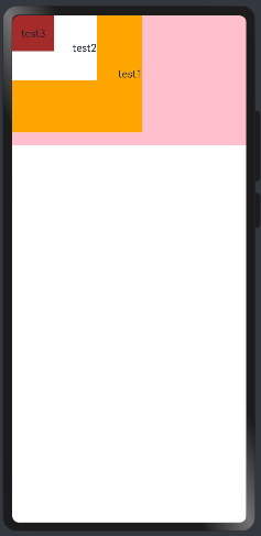
1)TopStart:子组件在 Stack 内靠左上角对齐,简单样例如下所示:
@Entry
@Component
struct StackExample {
  build() {
    //TopStart:子组件在 Stack 内靠左上角对齐,
    Stack({alignContent:Alignment.TopStart}){
      Text("test1")
        .width(200)                     //宽
        .height(180)                    //高
        .textAlign(TextAlign.End)
        .backgroundColor(Color.Orange)  //设置背景

      Text("test2")
        .width(130)                     //宽
        .height(100)                    //高
        .textAlign(TextAlign.End)
        .backgroundColor(Color.White)  //设置背景

      Text("test3")
        .width(65)                     //宽
        .height(55)                    //高
        .textAlign(TextAlign.Center)
        .backgroundColor(Color.Brown)  //设置背景
    }
    .width("100%")
    .height(200)
    .backgroundColor(Color.Pink)
  }
}
预览效果如下:
2)Top:设置子组件在 Stack 内靠顶部水平居中对齐,如下图所示:

3)TopEnd:设置子组件在 Stack 内部靠右上角对齐,如下所示:

4)Start:子组件靠 Stack 左边侧竖直居中对齐,如下所示:

5)Center(默认值):设置子组件居中对齐,如下所示:

6)End:设置子组件靠右竖直居中对齐,如下所示:

7)BottomStart:设置子组件左下角对齐,如下所示:

8)Bottom:设置子组件底部水平居中对齐,如下所示:
9)BottomEnd:设置子组件右下角对齐,如下所示:

3.3.属性
除支持通用属性外,还支持以下属性:
|
参数名 |
参数类型 |
参数描述 |
|---|---|---|
|
alignContent |
Alignment |
设置所有子组件在容器内的对齐方式。 默认值:Alignment.Center 从API version 9开始,该接口支持在ArkTS卡片中使用。 说明: 该属性与通用属性align同时设置时,后设置的属性生效。 |
alignContent:设置子组件的对齐方式,通过另一种方式设置而已, Alignment 的讲解同上,就没有在说明。
四、List容器
列表包含一系列相同宽度的列表项。适合连续、多行呈现同类数据,例如图片和文本。
- 列表项ListItem是listItem的子项
-
列表项(ListItem)数量过多超出屏幕后,会自动提供滚动功能
-
列表项(ListItem)既可以纵向排列,也可以横向排列
- 注意list是容器,ListItem不是容器, ListItem中只能包含一个根组件,可以在里面先写一个跟组件,例如row容器,在编写内容
4.1.接口
接口说明:
List(value?:{space?: number | string, initialIndex?: number, scroller?: Scroller})
参数:
|
参数名 |
参数类型 |
必填 |
参数描述 |
|---|---|---|---|
|
space |
number | string |
否 |
子组件主轴方向的间隔。 默认值:0 说明: 设置为除-1外其他负数或百分比时,按默认值显示。 space参数值小于List分割线宽度时,子组件主轴方向的间隔取分割线宽度。 |
|
initialIndex |
number |
否 |
设置当前List初次加载时视口起始位置显示的item的索引值。 默认值:0 说明: 设置为除-1外其他负数或超过了当前List最后一个item的索引值时视为无效取值,无效取值按默认值显示。 |
|
scroller |
Scroller |
否 |
可滚动组件的控制器。用于与可滚动组件进行绑定。 说明: 不允许和其他滚动类组件绑定同一个滚动控制对象。 |
4.2.属性
除支持通用属性外,还支持以下属性:
|
名称 |
参数类型 |
描述 |
|---|---|---|
|
listDirection |
Axis |
设置List组件排列方向。 默认值:Axis.Vertical 从API version 9开始,该接口支持在ArkTS卡片中使用。 |
|
divider |
{ strokeWidth: Length, color?:ResourceColor, startMargin?: Length, endMargin?: Length } | null |
设置ListItem分割线样式,默认无分割线。 - strokeWidth: 分割线的线宽。 - color: 分割线的颜色。 - startMargin: 分割线与列表侧边起始端的距离。 - endMargin: 分割线与列表侧边结束端的距离。 从API version 9开始,该接口支持在ArkTS卡片中使用。 endMargin +startMargin 不能超过列宽度。 startMargin和endMargin不支持设置百分比。 List的分割线画在主轴方向两个子组件之间,第一个子组件上方和最后一个子组件下方不会绘制分割线。 多列模式下,ListItem与ListItem之间的分割线起始边距从每一列的交叉轴方向起始边开始计算,其他情况从List交叉轴方向起始边开始计算。 |
|
scrollBar |
BarState |
设置滚动条状态。 默认值:BarState.Off 从API version 9开始,该接口支持在ArkTS卡片中使用。 |
|
cachedCount |
number |
设置列表中ListItem/ListItemGroup的预加载数量,其中ListItemGroup将作为一个整体进行计算,ListItemGroup中的所有ListItem会一次性全部加载出来。具体使用可参考减少应用白块说明。 默认值:1 从API version 9开始,该接口支持在ArkTS卡片中使用。 说明: 单列模式下,会在List显示的ListItem前后各缓存cachedCount个ListItem。 多列模式下, 会在List显示的ListItem前后各缓存cachedCount*列数个ListItem。 |
|
editMode(deprecated) |
boolean |
声明当前List组件是否处于可编辑模式。可参考示例3实现删除选中的list项。 从API version9开始废弃。 默认值:false |
|
edgeEffect |
EdgeEffect |
设置组件的滑动效果。 默认值:EdgeEffect.Spring 从API version 9开始,该接口支持在ArkTS卡片中使用。 |
|
chainAnimation |
boolean |
设置当前List是否启用链式联动动效,开启后列表滑动以及顶部和底部拖拽时会有链式联动的效果。链式联动效果:List内的list-item间隔一定距离,在基本的滑动交互行为下,主动对象驱动从动对象进行联动,驱动效果遵循弹簧物理动效。 默认值:false - false:不启用链式联动。 - true:启用链式联动。 从API version 9开始,该接口支持在ArkTS卡片中使用。 |
|
multiSelectable8+ |
boolean |
是否开启鼠标框选。 默认值:false - false:关闭框选。 - true:开启框选。 从API version 9开始,该接口支持在ArkTS卡片中使用。 |
|
lanes9+ |
number | LengthConstrain |
以列模式为例(listDirection为Axis.Vertical): lanes用于决定List组件在交叉轴方向按几列布局。 默认值:1 规则如下: - lanes为指定的数量时,根据指定的数量与List组件的交叉轴尺寸除以列数作为列的宽度。 - lanes设置了{minLength,maxLength}时,根据List组件的宽度自适应决定lanes数量(即列数),保证缩放过程中lane的宽度符合{minLength,maxLength}的限制。其中,minLength条件会被优先满足,即优先保证符合ListItem的交叉轴尺寸符合最小限制。 - lanes设置了{minLength,maxLength},如果父组件交叉轴方向尺寸约束为无穷大时,固定按一列排列,列宽度按显示区域内最大的ListItem计算。 - ListItemGroup在多列模式下也是独占一行,ListItemGroup中的ListItem按照List组件的lanes属性设置值来布局。 - lanes设置了{minLength,maxLength}时,计算列数会按照ListItemGroup的交叉轴尺寸计算。当ListItemGroup交叉轴尺寸与List交叉轴尺寸不一致时ListItemGroup中的列数与List中的列数可能不一样。 该接口支持在ArkTS卡片中使用。 |
|
alignListItem9+ |
ListItemAlign |
List交叉轴方向宽度大于ListItem交叉轴宽度 * lanes时,ListItem在List交叉轴方向的布局方式,默认为首部对齐。 默认值:ListItemAlign.Start 该接口支持在ArkTS卡片中使用。 |
|
sticky9+ |
StickyStyle |
配合ListItemGroup组件使用,设置ListItemGroup中header和footer是否要吸顶或吸底。 默认值:StickyStyle.None 该接口支持在ArkTS卡片中使用。 说明: sticky属性可以设置为 StickyStyle.Header | StickyStyle.Footer 以同时支持header吸顶和footer吸底。 |
ListItemAlign9+枚举说明:
|
名称 |
描述 |
|---|---|
|
Start |
ListItem在List中,交叉轴方向首部对齐。 |
|
Center |
ListItem在List中,交叉轴方向居中对齐。 |
|
End |
ListItem在List中,交叉轴方向尾部对齐。 |
StickyStyle9+枚举说明:
|
名称 |
描述 |
|---|---|
|
None |
ListItemGroup的header不吸顶,footer不吸底。 |
|
Header |
ListItemGroup的header吸顶,footer不吸底。 |
|
Footer |
ListItemGroup的footer吸底,header不吸顶。 |
- List组件通用属性clip的默认值为true。
4.3.事件
|
名称 |
功能描述 |
|---|---|
|
onItemDelete(deprecated)(event: (index: number) => boolean) |
当List组件在编辑模式时,点击ListItem右边出现的删除按钮时触发。 从API version9开始废弃。 - index: 被删除的列表项的索引值。 |
|
onScroll(event: (scrollOffset: number, scrollState: ScrollState) => void) |
列表滑动时触发。 - scrollOffset: 每帧滚动的偏移量,List的内容向上滚动时偏移量为正,向下滚动时偏移量为负。 - scrollState: 当前滑动状态。 使用控制器调用ScrollEdge和ScrollToIndex时不会触发,其余情况有滚动就会触发该事件。 从API version 9开始,该接口支持在ArkTS卡片中使用。 |
|
onScrollIndex(event: (start: number, end: number) => void) |
列表滑动时触发。 计算索引值时,ListItemGroup作为一个整体占一个索引值,不计算ListItemGroup内部ListItem的索引值。 - start: 滑动起始位置索引值。 - end: 滑动结束位置索引值。 触发该事件的条件:列表初始化时会触发一次,List显示区域内第一个子组件的索引值或后一个子组件的索引值有变化时会触发。 List的边缘效果为弹簧效果时,在List划动到边缘继续划动和松手回弹过程不会触发onScrollIndex事件。 从API version 9开始,该接口支持在ArkTS卡片中使用。 |
|
onReachStart(event: () => void) |
列表到达起始位置时触发。 从API version 9开始,该接口支持在ArkTS卡片中使用。 说明: List初始化时如果initialIndex为0会触发一次,List滚动到起始位置时触发一次。List边缘效果为弹簧效果时,划动经过起始位置时触发一次,回弹回起始位置时再触发一次。 |
|
onReachEnd(event: () => void) |
列表到底末尾位置时触发。 从API version 9开始,该接口支持在ArkTS卡片中使用。 说明: List边缘效果为弹簧效果时,划动经过末尾位置时触发一次,回弹回末尾位置时再触发一次。 |
|
onScrollFrameBegin9+(event: (offset: number, state: ScrollState) => { offsetRemain }) |
列表开始滑动时触发,事件参数传入即将发生的滑动量,事件处理函数中可根据应用场景计算实际需要的滑动量并作为事件处理函数的返回值返回,列表将按照返回值的实际滑动量进行滑动。 - offset:即将发生的滑动量,单位vp。 - state:当前滑动状态。 - offsetRemain:实际滑动量,单位vp。 触发该事件的条件:手指拖动List、List惯性划动时每帧开始时触发;List超出边缘回弹、使用滚动控制器的滚动不会触发。 该接口支持在ArkTS卡片中使用。 说明: 当listDirection的值为Axis.Vertical时,返回垂直方向滑动量,当listDirection的值为Axis.Horizontal时,返回水平方向滑动量。 |
|
onScrollStart9+(event: () => void) |
列表滑动开始时触发。手指拖动列表或列表的滚动条触发的滑动开始时,会触发该事件。使用Scroller滑动控制器触发的带动画的滑动,动画开始时会触发该事件。 该接口支持在ArkTS卡片中使用。 |
|
onScrollStop(event: () => void) |
列表滑动停止时触发。手拖动列表或列表的滚动条触发的滑动,手离开屏幕并且滑动停止时会触发该事件;使用Scroller滑动控制器触发的带动画的滑动,动画停止会触发该事件。 从API version 9开始,该接口支持在ArkTS卡片中使用。 |
|
onItemMove(event: (from: number, to: number) => boolean) |
列表元素发生移动时触发。 - from: 移动前索引值。 - to: 移动后索引值。 |
|
onItemDragStart(event: (event: ItemDragInfo, itemIndex: number) => ((() => any) | void) |
开始拖拽列表元素时触发。 - event: 见ItemDragInfo对象说明。 - itemIndex: 被拖拽列表元素索引值。 |
|
onItemDragEnter(event: (event: ItemDragInfo) => void) |
拖拽进入列表元素范围内时触发。 - event: 见ItemDragInfo对象说明。 |
|
onItemDragMove(event: (event: ItemDragInfo, itemIndex: number, insertIndex: number) => void) |
拖拽在列表元素范围内移动时触发。 - event: 见ItemDragInfo对象说明。 - itemIndex: 拖拽起始位置。 - insertIndex: 拖拽插入位置。 |
|
onItemDragLeave(event: (event: ItemDragInfo, itemIndex: number) => void) |
拖拽离开列表元素时触发。 - event: 见ItemDragInfo对象说明。 - itemIndex: 拖拽离开的列表元素索引值。 |
|
onItemDrop(event: (event: ItemDragInfo, itemIndex: number, insertIndex: number, isSuccess: boolean) => void) |
绑定该事件的列表元素可作为拖拽释放目标,当在列表元素内停止拖拽时触发。 - event: 见ItemDragInfo对象说明。 - itemIndex: 拖拽起始位置。 - insertIndex: 拖拽插入位置。 - isSuccess: 是否成功释放。 说明: 跨List拖拽时,当拖拽释放的位置绑定了onItemDrop时会返回true,否则为false。List内部拖拽时,isSuccess为onItemMove事件的返回值。 |
ScrollState枚举说明:
|
名称 |
描述 |
|---|---|
|
Idle |
未滑动状态。 |
|
Scroll |
手指拖动状态。 |
|
Fling |
惯性滑动状态。 |
要使List处于可编辑模式需配合onItemDelete事件和ListItem的editable属性,即可编辑模式实现删除列表项功能,需满足以下条件:
-
editMode属性设置为true。
-
绑定onItemDelete事件,且事件回调返回true。
-
ListItem的editable属性设置为true。
实现ListItem拖拽,需满足以下条件:
-
editMode属性设置为true。
-
绑定onDragStart事件,且事件回调中返回浮动UI布局。
4.4.案例
4.4.1.示例一:
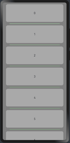
@Entry
@Component
struct ListItemExample {
  private arr1:number[] = [0,1,2,3,4,5,6,7,8,9,11,12,13,14,15,16,17,18,19,20]
  build() {
    Column(){
      List({space:20, initialIndex:0}){ //initialIndex设置当前List初次加载时视口起始位置显示的item的索引值。默认值:0

        ForEach(this.arr1, (item)=>{
          ListItem(){
            Text('' + item)
              .width("100%") //宽
              .height(100)  //高
              .fontSize(16) //字体大小
              .textAlign(TextAlign.Center) //居中显示
              .borderRadius(10) //设置圆角半径
              .backgroundColor("#A9A9A9") //设置背景颜色
          }
          // 结束ForEach循环,并且指定item作为每个列表项的标识符。
        },item => item)
      }
      .listDirection(Axis.Vertical) //排列方向 Vertical垂直方向
      /**
       * 设置ListItem分割线样式,默认无分割线。
       * - strokeWidth: 分割线的线宽。
       * - color: 分割线的颜色。
       * - startMargin: 分割线与列表侧边起始端的距离。
       * - endMargin: 分割线与列表侧边结束端的距离。
       */
      .divider({strokeWidth:2, color: "#8FBC8F", startMargin:20, endMargin:20})
      .edgeEffect(EdgeEffect.Spring) //滑动到边缘无效果,默认值:EdgeEffect.Spring
      /**
       * 列表滑动时触发。
       * - start: 滑动起始位置索引值。
       * - end: 滑动结束位置索引值。
       */
      .onScrollIndex((start: number,end:number) => {
        console.info(`start: ${start}`)
        console.info(`end: ${end}`)
      })
      .width("90%")
    }
    .width("100%")
    .height("100%")
    .backgroundColor("#808080")
    .padding({top:10})
  }
}
预览效果如下:
4.4.2.示例二
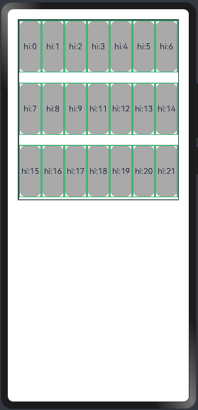
@Entry
@Component
struct ListLanesExample  {
  @State arr1:number[] = [0,1,2,3,4,5,6,7,8,9,11,12,13,14,15,16,17,18,19,20,21]

  build() {
    Column(){
      List({space:20}){
        ForEach(this.arr1, (item)=>{
          ListItem(){
            Text("hi:"+item)
              .width("100%") //宽
              .height(100)  //高
              .fontSize(16) //字体大小
              .textAlign(TextAlign.Center) //居中显示
              .borderRadius(10) //设置圆角半径
              .backgroundColor("#A9A9A9") //设置背景颜色
          }
          .border({width:2, color: "#3CB371"})
          //结束ForEach循环,并且指定item作为每个列表项的标识符。可以不写
        },item=>item)
      }
      .height(360) //高
      .width("100%") //宽
      .border({width: 2, color: "#2F4F4F"}) //框线颜色和宽度

      /*
      * 设置了最小交叉轴长度为40vp,最大交叉轴长度为80vp,然后由于List没有设置listDirection,所以List的交叉轴方向为水平方向,
      * 如果列表的交叉轴方向上的大小 小于最小交叉轴长度的两倍,那么只能展示一列。
      * 如果将列表的交叉轴上的大小改成大于最小交叉轴长度的两倍,列数就会改变()。
      */
      .lanes({minLength:40, maxLength:80})

      //一种是直接传一个number,比如上面的列表我想让它交叉轴方向上展示三个子项
      //.lanes(6)

      /**
       *
       * List交叉轴方向宽度大于ListItem交叉轴宽度 * lanes时,ListItem在List交叉轴方向的布局方式,默认为首部对齐。
       * 默认值:ListItemAlign.Start
       */
      .alignListItem(ListItemAlign.Start)

    }
    .width("100%")
    .height("100%")
    .padding(20)
  }
}
预览效果如下:
4.4.3.示例三
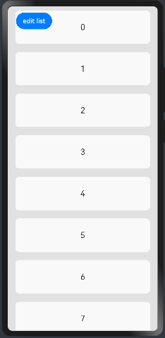
@Entry
@Component
struct ListExample02 {
  @State arr1:number[] = [0,1,2,3,4,5,6,7,8,9,11,12,13,14,15,16,17,18,19,20]
  @State editFlag:boolean = false

  build() {
    //采用层叠布局(创建column容器、然后创建button按钮堆叠在column容器上面), TopStart子组件在 Stack 内靠左上角对齐
    Stack({alignContent:Alignment.TopStart}){
      //创建column容器
      Column(){
        List({space:20, initialIndex:0}){
          ForEach(this.arr1, (item, index:number)=>{
            ListItem(){
              //弹性布局(水平排列),也可以采用row容器
              Flex({direction:FlexDirection.Row}){
                Text(""+item)
                  .width("100%")
                  .height(80)
                  .fontSize(20)
                  .textAlign(TextAlign.Center)
                  .borderRadius(10)
                  .backgroundColor("#F9F9FA")
                  .flexShrink(1)

                if(this.editFlag){
                  //如果editFlag为true则显示按钮
                  Button(){
                    Text("delete").fontSize(16).borderRadius(5)
                  }
                  .width("30%")
                  .height(40)
                  .onClick(()=>{
                    //输出打印到控制太
                    console.info("删除元素:"+this.arr1[index])
                    //删除元素
                    this.arr1.splice(index,1)
                    //输出剩余元素
                    console.info(JSON.stringify(this.arr1))
                    //修改值为false
                    this.editFlag = false
                    //是否启用按钮按下时的切换效果。当状态设置为 false 时,切换效果无效。
                  }).stateEffect(true)
                }
              }
            }
          })
        }.width("90%")
      }.width("100%")


      //创建button按钮
      Button("edit list").onClick(()=>{
        //点击修改修改值为true
        this.editFlag = true
      }).margin({top:5, left:20})
    }
    .size({height:"100%", width:"100%"})
    .backgroundColor("#E1E1E1")
    .padding({top:10})
  }
}
预览效果如下:
4.4.4.示例四
章节一中的内容,商品如果比较多的时候无法下拉选择的,只能展示一行,这里采用List容器来解决这个问题,如下:
class Item{
  //定位属性
  name: string
  image: any
  price: number

  constructor(name: string, image: any, price: number) {
    this.name = name
    this.image = image
    this.price = price
  }
}

@Entry
@Component
struct ListExample {
  private items:Array<Item> = [
    new Item("HUAWEI Mate 60 Pro",$r("app.media.mate60"),  7999.00),
    new Item("HUAWEI MatePad Pro",$r("app.media.MatePadPro"),4299.00),
    new Item("HUAWEI WATCH GT 4", $r("app.media.WATCHGT4"), 1538.00),
    new Item("HUAWEI FreeBuds Pro 3", $r("app.media.FreeBudsPro3"), 1499.00),
    new Item("HUAWEI MateBook 14s", $r("app.media.MateBook14s"), 5299.00),
    new Item("HUAWEI FreeBuds Pro 3", $r("app.media.FreeBudsPro3"), 1499.00),
    new Item("HUAWEI MateBook 14s", $r("app.media.MateBook14s"), 5299.00),
    new Item("HUAWEI Mate 60",$r("app.media.mate60"),  5999.00),
    new Item("HUAWEI MatePad2 Pro",$r("app.media.MatePadPro"),4599.00),
    new Item("HUAWEI WATCH GT 5", $r("app.media.WATCHGT4"), 1638.00),
    new Item("HUAWEI FreeBuds Pro 4", $r("app.media.FreeBudsPro3"), 1699.00),
  ]
  build() {
    Column({space:8}){
      Row(){
        Text("商品列表")
          .fontSize(30)
          .fontWeight(FontWeight.Bold)
      }
      .width("100%")
      .padding(20)

      List({space:10}){
        ForEach(this.items,(item: Item)=>{
          ListItem(){
            Row({space:10}){
              Image(item.image).width(100)
              Column({space:4}){
                Text(item.name).fontSize(15).fontWeight(FontWeight.Bold)
                Text(`原价:¥ ${item.price}`).fontColor("#F36").fontSize(18)
              }
              .height("100%")
              .alignItems(HorizontalAlign.Start)
            }
            .width("90%")  //设置宽度
            .height(120)    //设置高度
            .justifyContent(FlexAlign.SpaceBetween) //设置主轴方向主轴方向均匀分配弹性元素,相邻元素之间距离相同。 第一个元素与行首对齐,最后一个元素与行尾对齐。
            .backgroundColor("#FFFFFF") //设置背景为白色
            .borderRadius(10) //这是圆角班级
            .padding(20) //内边距
          }
        })
      }
        .alignListItem(ListItemAlign.Center) //ListItem在List交叉轴方向的布局方式,默认为首部对齐。这里改为居中对齐
        .height("100%")
        .width("100%")

    }
    .width("100%")
    .height("100%")
    .backgroundColor("#D3D3D3")
  }
}
预览效果如下:
五、格栅布局容器
GridContainer纵向排布栅格布局容器,仅在栅格布局场景中使用。该组件不再维护,推荐使用新组件GridCol、GridRow。
5.1.栅格容器GridRow
栅格容器组件,仅可以和栅格子组件(GridCol)在栅格布局场景中使用。
5.1.1.接口
GridRow(option?: {columns?: number | GridRowColumnOption, gutter?: Length | GutterOption, breakpoints?: BreakPoints, direction?: GridRowDirection})
栅格容器有columns、gutter、direction、breakpoints四个参数:
|
参数名 |
类型 |
必填 |
说明 |
|---|---|---|---|
|
gutter |
Length | GutterOption |
否 |
设置元素之间的距离,决定内容间的紧密程度(x代表水平方向) |
|
columns |
number | GridRowColumnOption |
否 |
栅格布局的主要定位工具,设置栅格布局的总列数,默认12。 |
|
breakpoints |
BreakPoints |
否 |
以设备宽度为基准,将应用宽度分成了几个不同的区间,即不同的断点。开发者可根据需要在不同的区间下实现不同的页面布局效果。 |
|
direction |
GridRowDirection |
否 |
设置栅格子组件在栅格容器中的排列方向。 |
1)GutterOption类型参数说明
|
参数名 |
参数类型 |
必填 |
参数描述 |
|---|---|---|---|
|
x |
Length | GridRowSizeOption |
否 |
水平gutter option。 |
|
y |
Length | GridRowSizeOption |
否 |
竖直gutter option。 |
首先通过设置断点,得到一系列断点区间;然后,借助栅格组件能力监听应用窗口大小的变化,判断应用当前处于哪个断点区间,最后调整应用的布局。
2)GridRowColumnOption:栅格在不同宽度设备类型下,栅格列数。
|
参数名 |
参数类型 |
必填 |
参数描述 |
|---|---|---|---|
|
xs |
number |
否 |
最小宽度类型设备。 |
|
sm |
number |
否 |
小宽度类型设备。 |
|
md |
number |
否 |
中等宽度类型设备。 |
|
lg |
number |
否 |
大宽度类型设备。 |
|
xl |
number |
否 |
特大宽度类型设备。 |
|
xxl |
number |
否 |
超大宽度类型设备。 |
3)GridRowSizeOption栅格在不同宽度设备类型下,gutter(元素距离)的大小。
|
参数名 |
参数类型 |
必填 |
参数描述 |
|---|---|---|---|
|
xs |
Length |
否 |
最小宽度类型设备。 |
|
sm |
Length |
否 |
小宽度类型设备。 |
|
md |
Length |
否 |
中等宽度类型设备。 |
|
lg |
Length |
否 |
大宽度类型设备。 |
|
xl |
Length |
否 |
特大宽度类型设备。 |
|
xxl |
Length |
否 |
超大宽度类型设备。 |
4)BreakPoints(以设备宽度为基准,将应用宽度分成了几个不同的区间,即不同的断点。开发者可根据需要在不同的区间下实现不同的页面布局效果)
|
参数名 |
参数类型 |
必填 |
参数描述 |
|---|---|---|---|
|
value |
Array<string> |
否 |
设置断点位置的单调递增数组。 默认值:["320vp", "520vp", "840vp"] |
|
reference |
BreakpointsReference |
否 |
断点切换参照物。 |
 // 启用xs、sm、md共3个断点
  breakpoints: {value: ["100vp", "200vp"]}
  // 启用xs、sm、md、lg共4个断点,断点范围值必须单调递增
  breakpoints: {value: ["320vp", "520vp", "840vp"]}
  // 启用xs、sm、md、lg、xl共5个断点,断点范围数量不可超过断点可取值数量-1
  breakpoints: {value: ["320vp", "520vp", "840vp", "1080vp"]}
BreakpointsReference枚举类型
|
枚举名 |
描述 |
|---|---|
|
WindowSize |
以窗口为参照。 |
|
ComponentSize |
以容器为参照。 |
5)GridRowDirection枚举类型
设置栅格子组件在栅格容器中的排列方向。
|
枚举名 |
描述 |
|---|---|
|
Row |
栅格元素按照行方向排列。 |
|
RowReverse |
栅格元素按照逆序行方向排列。 |
栅格最多支持xs、sm、md、lg、xl、xxl六个断点,且名称不可修改。假设传入的数组是[n0, n1, n2, n3, n4],各个断点取值如下:
|
断点 |
取值范围 |
|---|---|
|
xs |
[0, n0) |
|
sm |
[n0, n1) |
|
md |
[n1, n2) |
|
lg |
[n2, n3) |
|
xl |
[n3, n4) |
|
xxl |
[n4, INF) |
说明:
- 栅格元素仅支持Row/RowReverse排列,不支持column/ColumnReverse方向排列。
- 栅格子组件仅能通过span、offset计算子组件位置与大小。多个子组件span超过规定列数时自动换行。
- 单个元素span大小超过最大列数时后台默认span为最大column数。
- 新一行的Offset加上子组件的span超过总列数时,将下一个子组件在新的一行放置。
5.1.2.栅格系统断点
断点以设备宽度为基准,将应用宽度分成了几个不同的区间,即不同的断点。开发者根据需求在不同的区间实现不同的页面布局效果。
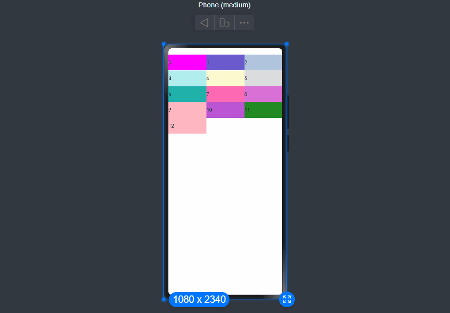
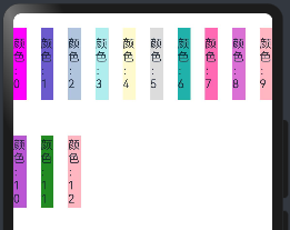
下例中,使用栅格的默认列数12列,通过断点设置将应用宽度分成六个区间,在各区间中,每个栅格子元素占用的列数均不同。效果如图:
@Entry
@Component
struct GridRowExample01 {
  @State bgColors:Array<String> = ["#FF00FF", "#6A5ACD", "#B0C4DE", "#AFEEEE", "#FFFACD", "#DCDCDC", "#20B2AA", "#FF69B4", "#DA70D6","#FFB6C1", "#BA55D3", "#228B22", "#FFB6C1"]

  build() {
    //创建一个GridRow组件,并传入一个对象作为参数,对象中包含了breakpoints属性,用于定义响应式布局的断点。
    GridRow({
      //以设备宽度为基准,将应用宽度分成了几个不同的区间,即不同的断点。开发者可根据需要在不同的区间下实现不同的页面布局效果。
      breakpoints: {
        value: ['200vp', '300vp', '400vp', '500vp', '600vp'], //定义了不同断点下的窗口尺寸值。
        reference: BreakpointsReference.WindowSize            //指定了断点的参考对象为WindowSize,表示断点值是相对于窗口大小的。
      }
    }) {
      ForEach(this.bgColors, (color, index) => {
        // 创建一个GridCol组件,并传入一个对象作为参数,对象中包含了span属性,用于定义在不同断点下的栅格布局。
        GridCol({
          span: { //定义了在不同断点下的栅格布局的列宽比例。
            xs: 2,
            sm: 3,
            md: 4,
            lg: 6,
            xl: 8,
            xxl: 12
          }
        }) {
          Row() {
            Text(`${index}`)
          }.width("100%").height("50vp")
        }
        .backgroundColor(color)
        .margin({top:20})
      })
    }
  }
}
预览效果如下:
5.1.3.栅格布局的总列数
GridRow中通过columns设置栅格布局的总列数。
1)columns默认值为12,当未设置columns时,在任何断点下,栅格布局被分成12列。
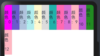
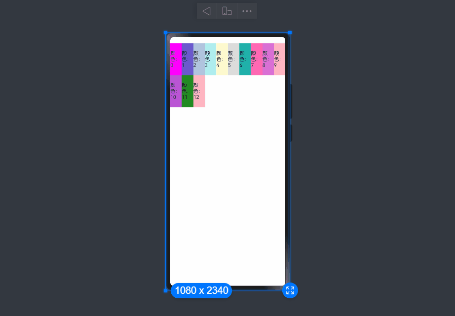
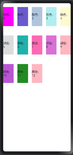
准备13个颜色,循环渲染,发现第一行只显示了12个栅格,最后一个显示到了下一行,代码如下:
@Entry
@Component
struct GridRowExample01 {
  @State bgColors:Array<String> = ["#FF00FF", "#6A5ACD", "#B0C4DE", "#AFEEEE", "#FFFACD", "#DCDCDC", "#20B2AA", "#FF69B4", "#DA70D6","#FFB6C1", "#BA55D3", "#228B22", "#FFB6C1"]

  build() {
    GridRow({
      /**
       * 以设备宽度为基准,将应用宽度分成了几个不同的区间,即不同的断点。
       * 开发者可根据需要在不同的区间下实现不同的页面布局效果。
       */
      breakpoints:{
        value:["200vp", "300vp", "400vp", "500vp", "600vp"], //设置断点位置的单调递增数组。默认值:["320vp", "520vp", "840vp"],这里启用xs、sm、md、lg、xl共5个断点,断点范围数量不可超过断点可取值数量-1
        reference: BreakpointsReference.WindowSize  //根据窗口宽度响应断点更改
      }
    }){
      ForEach(this.bgColors, (item,index)=>{
        //
        GridCol()
        {
          Row(){
            Text(`颜色:${index}`)
          }.width("100%").height(100)
          .backgroundColor(item)
        }
      })
    }
  }
}
预览效果如下:
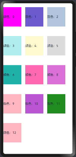
2)当columns类型为number时,栅格布局在任何尺寸设备下都被分为columns列。
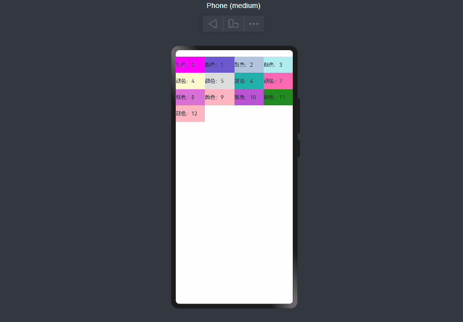
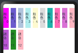
下面分别设置栅格布局列数为4,子元素默认占一列,代码如下:
@Entry
@Component
struct GridRowExample02 {
  @State bgColors:Array<String> = ["#FF00FF", "#6A5ACD", "#B0C4DE", "#AFEEEE", "#FFFACD", "#DCDCDC", "#20B2AA", "#FF69B4", "#DA70D6","#FFB6C1", "#BA55D3", "#228B22", "#FFB6C1"]

  build() {
    Row(){

      GridRow({
        columns:4, //栅格布局在任何尺寸设备下都被分为4列

      }){
        ForEach(this.bgColors, (item,index)=>{
          //
          GridCol()
          {
            Row(){
              Text(`颜色:${index}`)
            }.width("100%").height(50)
            .backgroundColor(item)
          }
        })
      }
    }.padding({top:20})
  }
}
预览发现怎么变化屏幕尺寸,每行都是固定的4列,如下:
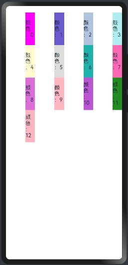
3)当columns类型为GridRowColumnOption时,支持下面六种不同尺寸(xs, sm, md, lg, xl, xxl)设备的总列数设置,各个尺寸下数值可不同。
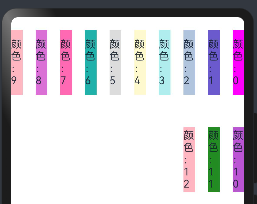
@Entry
@Component
struct GridRowExample02 {
  @State bgColors:Array<String> = ["#FF00FF", "#6A5ACD", "#B0C4DE", "#AFEEEE", "#FFFACD", "#DCDCDC", "#20B2AA", "#FF69B4", "#DA70D6","#FFB6C1", "#BA55D3", "#228B22", "#FFB6C1"]

  build() {
    Row(){

      GridRow(
        {
          columns: {sm:4,md:8},
          breakpoints: {value:['200vp', '300vp', '400vp', '500vp', '600vp']}
        }
      ){
        ForEach(this.bgColors, (item,index)=>{
          //
          GridCol()
          {
            Row(){
              Text(`颜色:${index}`)
            }.width("100%").height(100)
            .backgroundColor(item)
          }
        })
      }
    }.padding({top:20})
  }
}
注意:
如上,若只设置sm, md的栅格总列数,则较小的尺寸使用默认columns值12,较大的尺寸使用前一个尺寸的columns。这里只设置sm:8, md:10,则较小尺寸的xs:12,较大尺寸的参照md的设置,lg:10, xl:10, xxl:10。预览效果如下:
5.1.4.栅格子组件间距
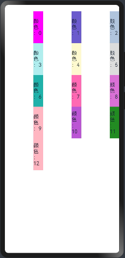
GridRow中通过gutter设置子元素在水平和垂直方向的间距。
1)当gutter类型为number时,同时设置栅格子组件间水平和垂直方向边距且相等。下例中,设置子组件水平与垂直方向距离相邻元素的间距为10。语法如下:
GridRow({ gutter: 10 }){}
案例代码:
@Entry
@Component
struct GridRowExample02 {
  @State bgColors:Array<String> = ["#FF00FF", "#6A5ACD", "#B0C4DE", "#AFEEEE", "#FFFACD", "#DCDCDC", "#20B2AA", "#FF69B4", "#DA70D6","#FFB6C1", "#BA55D3", "#228B22", "#FFB6C1"]

  build() {
    Row(){

      GridRow(
        { gutter: 10,
          columns: {sm:8,md:10},
          breakpoints: {value:['200vp', '300vp', '400vp', '500vp', '600vp']}
        }
      ){
        ForEach(this.bgColors, (item,index)=>{
          //
          GridCol()
          {
            Row(){
              Text(`颜色:${index}`)
            }.width("100%").height(100)
            .backgroundColor(item)
          }
        })
      }
    }.padding({top:20})
  }
}
预览效果如下:
2)当gutter类型为GutterOption时,单独设置栅格子组件水平垂直边距,x属性为水平方向间距,y为垂直方向间距。 语法如下:
GridRow({ gutter: { x: 20, y: 50 } }){}
案例代码如下:
@Entry
@Component
struct GridRowExample02 {
  @State bgColors:Array<String> = ["#FF00FF", "#6A5ACD", "#B0C4DE", "#AFEEEE", "#FFFACD", "#DCDCDC", "#20B2AA", "#FF69B4", "#DA70D6","#FFB6C1", "#BA55D3", "#228B22", "#FFB6C1"]

  build() {
    Row(){

      GridRow(
        { gutter: { x:20, y:50 },
          columns: {sm:8,md:10},
          breakpoints: {value:['200vp', '300vp', '400vp', '500vp', '600vp']}
        }
      ){
        ForEach(this.bgColors, (item,index)=>{
          //
          GridCol()
          {
            Row(){
              Text(`颜色:${index}`)
            }.width("100%").height(100)
            .backgroundColor(item)
          }
        })
      }
    }.padding({top:20})
  }
}
预览效果如下:

5.1.5.排列方向
通过GridRow的direction属性设置栅格子组件在栅格容器中的排列方向。
1)子组件默认从左往右排列。语法如下:
GridRow({ direction: GridRowDirection.Row }){}
案例代码如下:
@Entry
@Component
struct GridRowExample02 {
  @State bgColors:Array<String> = ["#FF00FF", "#6A5ACD", "#B0C4DE", "#AFEEEE", "#FFFACD", "#DCDCDC", "#20B2AA", "#FF69B4", "#DA70D6","#FFB6C1", "#BA55D3", "#228B22", "#FFB6C1"]

  build() {
    Row(){

      GridRow(
        {
          gutter: { x:20, y:50 },
          direction: GridRowDirection.Row,
          columns: {sm:8,md:10},
          breakpoints: {value:['200vp', '300vp', '400vp', '500vp', '600vp']}
        }
      ){
        ForEach(this.bgColors, (item,index)=>{
          //
          GridCol()
          {
            Row(){
              Text(`颜色:${index}`)
            }.width("100%").height(100)
            .backgroundColor(item)
          }
        })
      }
    }.padding({top:20})
  }
}
预览效果如下:

2)子组件从右往左排列
GridRow({ direction: GridRowDirection.RowReverse }){}
预览效果如下:
5.2.栅格子组件GridCol
GridCol组件作为GridRow组件的子组件,通过给GridCol传参或者设置属性两种方式,设置span,offset,order的值。
-
span的设置
//参数设置
GridCol({ span: 2 }){}
GridCol({ span: { xs: 1, sm: 2, md: 3, lg: 4 } }){}
//属性设置
GridCol(){}.span(2)
GridCol(){}.span({ xs: 1, sm: 2, md: 3, lg: 4 })
- offset的设置
//参数设置
GridCol({ offset: 2 }){}
GridCol({ offset: { xs: 2, sm: 2, md: 2, lg: 2 } }){}
//属性设置
GridCol(){}.offset(2)
GridCol(){}.offset({ xs: 1, sm: 2, md: 3, lg: 4 })
- order的设置
GridCol({ order: 2 }){}
GridCol({ order: { xs: 1, sm: 2, md: 3, lg: 4 } }){}
GridCol(){}.order(2)
GridCol(){}.order({ xs: 1, sm: 2, md: 3, lg: 4 })
5.2.1.span
子组件占栅格布局的列数,决定了子组件的宽度,默认为1。
1)当类型为number时,子组件在所有尺寸设备下占用的列数相同。
@Entry
@Component
struct GridRowExample02 {
  @State bgColors:Array<String> = ["#FF00FF", "#6A5ACD", "#B0C4DE", "#AFEEEE", "#FFFACD", "#DCDCDC", "#20B2AA", "#FF69B4", "#DA70D6","#FFB6C1", "#BA55D3", "#228B22", "#FFB6C1"]

  build() {
    Row(){

      GridRow(
        {
          gutter: { x:20, y:50 },
          direction: GridRowDirection.Row,
          columns: {sm:8,md:10},
          breakpoints: {value:['200vp', '300vp', '400vp', '500vp', '600vp']}
        }
      ){
        ForEach(this.bgColors, (item,index)=>{
          //
          GridCol({span:2})
          {
            Row(){
              Text(`颜色:${index}`)
            }.width("100%").height(100)
            .backgroundColor(item)
          }
        })
      }
    }.padding({top:20})
  }
}
预览效果如下:
没有设置时
添加之后,子组件占两列,如下
2)当类型为GridColColumnOption时,支持六种不同尺寸(xs, sm, md, lg, xl, xxl)设备中子组件所占列数设置,各个尺寸下数值可不同。 语法如下:
GridCol({ offset: { xs: 1, sm: 2, md: 3, lg: 4 } })
代码如下:
@Entry
@Component
struct GridRowExample02 {
  @State bgColors:Array<String> = ["#FF00FF", "#6A5ACD", "#B0C4DE", "#AFEEEE", "#FFFACD", "#DCDCDC", "#20B2AA", "#FF69B4", "#DA70D6","#FFB6C1", "#BA55D3", "#228B22", "#FFB6C1"]

  build() {
    Row(){

      GridRow(
        {
          gutter: { x:20, y:50 },
          direction: GridRowDirection.Row,
          columns: {sm:8,md:10},
          breakpoints: {value:['200vp', '300vp', '400vp', '500vp', '600vp']}
        }
      ){
        ForEach(this.bgColors, (item,index)=>{
          //
          GridCol({span: { xs: 1, sm: 2, md: 3, lg: 4 }})
          {
            Row(){
              Text(`颜色:${index}`)
            }.width("100%").height(100)
            .backgroundColor(item)
          }
        })
      }
    }.padding({top:20})
  }
}
预览如下:
5.2.2.offset
栅格子组件相对于前一个子组件的偏移列数,默认为0。
1)当类型为number时,子组件偏移相同列数。
@Entry
@Component
struct GridRowExample04 {
  @State bgColors:Array<String> = ["#FF00FF", "#6A5ACD", "#B0C4DE", "#AFEEEE", "#FFFACD", "#DCDCDC", "#20B2AA", "#FF69B4", "#DA70D6","#FFB6C1", "#BA55D3", "#228B22", "#FFB6C1"]

  build() {
    Row(){

      GridRow(
        {
          //gutter: { x:20, y:50 },
          direction: GridRowDirection.Row,
          //columns: {sm:8,md:10}, //注意不要设置栅格数,默认就是12个栅格
          breakpoints: {value:['200vp', '300vp', '400vp', '500vp', '600vp']}
        }
      ){
        ForEach(this.bgColors, (item,index)=>{
          //offset子组件偏移的列数
          GridCol({offset:2})
          {
            Row(){
              Text(`颜色:${index}`)
            }.width("100%").height(100)
            .backgroundColor(item)
          }
        })
      }
    }.padding({top:20})
  }
}
栅格默认分成12列,每一个子组件默认占1列,偏移2列,每个子组件及间距共占3列,一行放四个子组件。预览效果如下:
2)当类型为GridColColumnOption时,支持六种不同尺寸(xs, sm, md, lg, xl, xxl)设备中子组件所占列数设置,各个尺寸下数值可不同。
@Entry
@Component
struct GridRowExample04 {
  @State bgColors:Array<String> = ["#FF00FF", "#6A5ACD", "#B0C4DE", "#AFEEEE", "#FFFACD", "#DCDCDC", "#20B2AA", "#FF69B4", "#DA70D6","#FFB6C1", "#BA55D3", "#228B22", "#FFB6C1"]

  build() {
    Row(){

      GridRow(
        {
          //gutter: { x:20, y:50 },
          direction: GridRowDirection.Row,
          //columns: {sm:8,md:10}, //注意不要设置栅格数,默认就是12个栅格
          breakpoints: {value:['200vp', '300vp', '400vp', '500vp', '600vp']}
        }
      ){
        ForEach(this.bgColors, (item,index)=>{
          //offset子组件偏移的列数
          GridCol({ offset: { xs: 1, sm: 2, md: 3, lg: 4 } })
          {
            Row(){
              Text(`颜色:${index}`)
            }.width("100%").height(100)
            .backgroundColor(item)
          }
        })
      }
    }.padding({top:20})
  }
}
预览效果如下:
5.2.3.order
栅格子组件的序号,决定子组件排列次序。当子组件不设置order或者设置相同的order, 子组件按照代码顺序展示。当子组件设置不同的order时,order较大的组件在前,较小的在后。 当子组件部分设置order,部分不设置order时,未设置order的子组件依次排序靠前,设置了order的子组件按照数值从大到小排列。
1)当类型为number时,子组件在任何尺寸下排序次序一致。
@Entry
@Component
struct GridRowExample05 {

  build() {
    Column(){
      GridRow(){
        //order指定栅格的顺序
        GridCol({order:5}){
          Row({}){
            Text("栅格5")
          }.width("100%").height(100)
        }.backgroundColor(Color.Red)

        GridCol({order:4}){
          Row(){
            Text("栅格4")
          }.width("100%").height(100)
        }.backgroundColor(Color.Pink)

        GridCol({order:3}){
          Row(){
            Text("栅格3")
          }.width("100%").height(100)
        }.backgroundColor(Color.Gray)

        GridCol({order:2}){
          Row(){
            Text("栅格2")
          }.width("100%").height(100)
        }.backgroundColor(Color.Orange)

        GridCol({order:1}){
          Row(){
            Text("栅格1")
          }.width("100%").height(100)
        }.backgroundColor(Color.Blue)

      }
    }
    .width("100%").height(150)
    .padding({top:20})
  }
}
预览效果如下:
2)当类型为GridColColumnOption时,支持六种不同尺寸(xs, sm, md, lg, xl, xxl)设备中子组件排序次序设置。
@Entry
@Component
struct GridRowExample05 {

  build() {
    Column(){
      GridRow(){
        //order指定栅格的顺序
        GridCol({ order: { xs:1, sm:5, md:3, lg:7}}) {
          Row() {
            Text("1")
          }.width("100%").height(150)
        }.backgroundColor(Color.Red)


        GridCol({ order: { xs:2, sm:2, md:6, lg:1} }) {
          Row() {
            Text("2")
          }.width("100%").height(150)
        }.backgroundColor(Color.Orange)

        GridCol({ order: { xs:3, sm:3, md:1, lg:6} }) {
          Row() {
            Text("3")
          }.width("100%").height(150)
        }.backgroundColor(Color.Yellow)

        GridCol({ order: { xs:4, sm:4, md:2, lg:5} }) {
          Row() {
            Text("4")
          }.width("100%").height(150)
        }.backgroundColor(Color.Green)


      }
    }
    .width("100%").height(150)
    .padding({top:20})
  }
}
预览效果如下:
六、侧边栏容器(SideBarContainer)
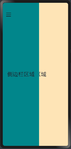
提供侧边栏可以显示和隐藏的侧边栏容器,通过子组件定义侧边栏和内容区,第一个子组件表示侧边栏,第二个子组件表示内容区。
6.1:SideBarContainer定义
接口定义如下:
SideBarContainer( type?: SideBarContainerType )
参数type:设置侧边栏的显示类型, SideBarContainerType 定义了一下 2 中类型:
- Embed:侧边栏嵌入到组件内,侧边栏和内容区并列显示。
- Overlay:侧边栏浮在内容区上面。
案例代码如下:
@Entry
@Component
struct SideBarContainerExample {
  build() {
    /**
     * Embed:侧边栏嵌入到组件内,侧边栏和内容区并列显示。
     * Overlay:侧边栏浮在内容区上面。
     */
    SideBarContainer(SideBarContainerType.Overlay){

      Column(){
        Text("侧边栏区域").width("100%").height("100%").fontSize(30).textAlign(TextAlign.Center)
      }.width(5).height("100%").backgroundColor("#00868B")

      Column(){
        Text("主页区域").width("100%").height("100%").fontSize(30).textAlign(TextAlign.Center)
      }.width(10).height("100%").backgroundColor("#FFE4B5")

    }.width("100%").height("100%")
  }
}
预览效果如下:
6.2.SideBarContainer属性
属性如下:
- showSideBar:设置是否显示侧边栏,默认为 true 表示显示侧边栏。
- controlButton:设置侧边栏控制按钮的属性,
ButtonStyle参数说明如下:- left:设置侧边栏控制按钮距离容器左界限的间距。
- top:设置侧边栏控制按钮距离容器上界限的间距。
- width:设置侧边栏控制按钮的宽度。
- height:设置侧边栏控制按钮的高度。
- icons:设置侧边栏控制按钮的图标:
- shown:设置侧边栏显示时控制按钮的图标。
- hidden:设置侧边栏隐藏时控制按钮的图标。
- switching:设置侧边栏显示和隐藏状态切换时控制按钮的图标。
- sideBarWidth:设置侧边栏的宽度,默认为 200 。
- minSideBarWidth:设置侧边栏最小宽度,默认为 200 。
- maxSideBarWidth:设置侧边栏最大宽度,默认为 280 。
6.3.SideBarContainer事件
|
名称 |
功能描述 |
|---|---|
|
onChange(callback: (value: boolean) => void) |
当侧边栏的状态在显示和隐藏之间切换时触发回调。true表示显示,false表示隐藏。 触发该事件的条件: 1、showSideBar属性值变换时; 2、showSideBar属性自适应行为变化时; 3、分割线拖拽触发autoHide时。 |
6.4.案例代码
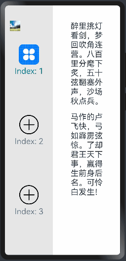
@Entry
@Component
struct SideBarContainerExample {
  normalIcon: Resource = $r("app.media.more")  // 定义一个名为normalIcon的资源变量,用于存储普通状态下的图标资源
  selectedIcon: Resource = $r("app.media.icon")  // 定义一个名为selectedIcon的资源变量,用于存储选中状态下的图标资源
  @State arr: number[] = [1,2,3]  // 定义一个名为arr的状态变量,类型为数字数组,并初始化为[1,2,3]
  @State current:number = 1  // 定义一个名为current的状态变量,类型为数字,并初始化为1

  build() {
    /**
     * Embed:侧边栏嵌入到组件内,侧边栏和内容区并列显示。
     * Overlay:侧边栏浮在内容区上面。
     */
    SideBarContainer(SideBarContainerType.Embed){  // 创建一个侧边栏容器,类型为Overlay
      Column({space:10}){  // 创建一个列布局,设置子组件间距为10
        ForEach(this.arr, (item,index)=>{  // 遍历arr数组
          Column({space:5}){  // 创建一个列布局,设置子组件间距为5
            //加载图片,根据current的值展示图片
            Image(this.current == item?this.selectedIcon:this.normalIcon).width(64).height(64)  // 根据current的值展示不同的图片,设置图片宽高为64
            Text(`Index: ${index+1}`).fontSize(25).fontColor(this.current == item? '#008B8B':'#708090')  // 显示索引文本,根据current的值设置字体颜色
          }.onClick(()=>{  // 点击事件监听
            this.current = item  // 点击后更新current的值为当前item的值
          })
        }
        )
      }
      .width("100%")                         // 设置宽度为100%
      .backgroundColor("#19000000")          // 设置背景颜色为透明黑色
      .justifyContent(FlexAlign.SpaceEvenly) // 设置垂直等距离布局

      //正文内容
      Column({space:20}){  // 创建一个列布局,用于显示正文内容
        Text('醉里挑灯看剑,梦回吹角连营。八百里分麾下炙,五十弦翻塞外声,沙场秋点兵。').fontSize(25)  // 显示文本1,设置字体大小为25
        Text('马作的卢飞快,弓如霹雳弦惊。了却君王天下事,赢得生前身后名。可怜白发生!').fontSize(25)  // 显示文本2,设置字体大小为25
      }.margin(50)  // 设置外边距为50

    }.controlButton({  // 设置控制按钮的样式
      //设置按钮样式时回调controlButton函数
      icons: {
        hidden: $r('app.media.manjaro'),  // 隐藏状态下的图标资源
        shown: $r('app.media.Snip'),  // 显示状态下的图标资源
        switching: $r('app.media.MatePadPro')  // 切换状态下的图标资源
      }
    })
    .sideBarWidth(150)           // 设置侧边栏的宽度为150vp
    .minSideBarWidth(50)         // 设置侧边栏最小宽度为50vp
    .maxSideBarWidth(200)        // 设置侧边栏最大宽度为200vp
    .onChange((value:boolean)=>{  // 监听侧边栏显示状态的变化
      console.info("status: "+value)  // 在控制台输出侧边栏显示状态的信息
    })
  }
}
预览效果如下:
七、Tabs组件(Tabs、TabContent)
ArkUI框架提供可以通过页签进行内容视图切换的容器组件,每个页签对应一个内容视图的容器组件 Tabs ,它允许包含子组件且子组件只能是 TabContent .
7.1.Tabs定义
Tabs(value?: {barPosition?: BarPosition, index?: number, controller?: TabsController})
参数说明:
- barPosition:指定页签位置来创建
Tabs容器组件,BarPosition定义了以下两种类型:- Start(默认值):当
vertical属性方法设置为 true 时,页签位于容器左侧;vertical属性方法设置为 false 时,页签位于容器顶部。 - End:
vertical属性方法设置为 true 时,页签位于容器右侧;vertical属性方法设置为 false 时,页签位于容器底部。
- Start(默认值):当
- index:指定初次初始页签索引,默认值为 0 。
- controller:设置
Tabs控制器。
案例代码如下:
@Entry
@Component
struct TabsExample01 {
  private controller: TabsController = new TabsController();  // 创建一个名为controller的TabsController实例,并设置为私有变量

  build() {
    Column(){  // 创建一个列布局
      /**
       * Tabs不设置vertical属性时,默认上下排版
       * barPosition:BarPosition.Start:
       * controller:this.controller 设置Tabs控制器
       */
      Tabs({barPosition:BarPosition.Start, controller:this.controller}){  // 创建Tabs组件,设置标签栏位置为起始位置,设置控制器为controller
        TabContent(){  // 创建标签内容
          Column().width("100%").height("100%").backgroundColor("#B4CDCD")  // 创建一个列布局,设置宽高和背景颜色
        }.size({width:"100%",height:"100%"}).tabBar("联系人")  // 设置标签内容的尺寸和标签名称为“联系人”

        TabContent(){  // 创建标签内容
          Column().width("100%").height("100%").backgroundColor("#FFDEAD")  // 创建一个列布局,设置宽高和背景颜色
        }.size({width:"100%",height:"100%"}).tabBar("消息")  // 设置标签内容的尺寸和标签名称为“消息”

        TabContent(){  // 创建标签内容
          Column().width("100%").height("100%").backgroundColor("#EE6363")  // 创建一个列布局,设置宽高和背景颜色
        }.size({width:"100%",height:"100%"}).tabBar("动态")  // 设置标签内容的尺寸和标签名称为“动态”

      }

    }.width("100%").height("100%").padding(20)  // 设置列布局的宽高和内边距
  }
}
预览效果如下:

7.2.Tabs属性
1)vertical:设置 Tab 是否为左右排列,默认为 false ,表示上下排列。
①.vertical设置为false:
barPosition: BarPosition.Start 显示在顶部
barPosition: BarPosition.End 显示在底部
案例代码如下BarPosition.Start:
@Entry
@Component
struct TabsExample01 {
  private controller: TabsController = new TabsController();  // 创建一个名为controller的TabsController实例,并设置为私有变量

  build() {
    Column(){  // 创建一个列布局
      /**
       * Tabs不设置vertical属性时,默认上下排版
       * barPosition:BarPosition.Start:
       * controller:this.controller 设置Tabs控制器
       */
      Tabs({barPosition:BarPosition.Start, controller:this.controller}){  // 创建Tabs组件,设置标签栏位置为起始位置,设置控制器为controller
        TabContent(){  // 创建标签内容
          Column().width("100%").height("100%").backgroundColor("#B4CDCD")  // 创建一个列布局,设置宽高和背景颜色
        }.size({width:"100%",height:"100%"}).tabBar("联系人")  // 设置标签内容的尺寸和标签名称为“联系人”

        TabContent(){  // 创建标签内容
          Column().width("100%").height("100%").backgroundColor("#FFDEAD")  // 创建一个列布局,设置宽高和背景颜色
        }.size({width:"100%",height:"100%"}).tabBar("消息")  // 设置标签内容的尺寸和标签名称为“消息”

        TabContent(){  // 创建标签内容
          Column().width("100%").height("100%").backgroundColor("#EE6363")  // 创建一个列布局,设置宽高和背景颜色
        }.size({width:"100%",height:"100%"}).tabBar("动态")  // 设置标签内容的尺寸和标签名称为“动态”

      }.vertical(false) //vertical:设置 Tab 是否为左右排列,默认为 false ,表示上下排列

    }.width("100%").height("100%").padding(20)  // 设置列布局的宽高和内边距
  }
}
预览如下:

案例代码如下BarPosition.End:
@Entry
@Component
struct TabsExample01 {
  private controller: TabsController = new TabsController();  // 创建一个名为controller的TabsController实例,并设置为私有变量

  build() {
    Column(){  // 创建一个列布局
      /**
       * Tabs不设置vertical属性时,默认上下排版
       * barPosition:BarPosition.Start:
       * controller:this.controller 设置Tabs控制器
       */
      Tabs({barPosition:BarPosition.End, controller:this.controller}){  // 创建Tabs组件,设置标签栏位置为起始位置,设置控制器为controller
        TabContent(){  // 创建标签内容
          Column().width("100%").height("100%").backgroundColor("#B4CDCD")  // 创建一个列布局,设置宽高和背景颜色
        }.size({width:"100%",height:"100%"}).tabBar("联系人")  // 设置标签内容的尺寸和标签名称为“联系人”

        TabContent(){  // 创建标签内容
          Column().width("100%").height("100%").backgroundColor("#FFDEAD")  // 创建一个列布局,设置宽高和背景颜色
        }.size({width:"100%",height:"100%"}).tabBar("消息")  // 设置标签内容的尺寸和标签名称为“消息”

        TabContent(){  // 创建标签内容
          Column().width("100%").height("100%").backgroundColor("#EE6363")  // 创建一个列布局,设置宽高和背景颜色
        }.size({width:"100%",height:"100%"}).tabBar("动态")  // 设置标签内容的尺寸和标签名称为“动态”

      }.vertical(false) //vertical:设置 Tab 是否为左右排列,默认为 false ,表示上下排列

    }.width("100%").height("100%").padding(20)  // 设置列布局的宽高和内边距
  }
}
预览效果如下:

②.vertical设置为true:
barPosition: BarPosition.Start  显示在左侧
barPosition: BarPosition.End    显示在右侧
案例 BarPosition.Start,代码如下:
@Entry
@Component
struct TabsExample01 {
  private controller: TabsController = new TabsController();  // 创建一个名为controller的TabsController实例,并设置为私有变量

  build() {
    Column(){  // 创建一个列布局
      /**
       * Tabs不设置vertical属性时,默认上下排版
       * barPosition:BarPosition.Start:
       * controller:this.controller 设置Tabs控制器
       */
      Tabs({barPosition:BarPosition.Start, controller:this.controller}){  // 创建Tabs组件,设置标签栏位置为起始位置,设置控制器为controller
        TabContent(){  // 创建标签内容
          Column().width("100%").height("100%").backgroundColor("#B4CDCD")  // 创建一个列布局,设置宽高和背景颜色
        }.size({width:"100%",height:"100%"}).tabBar("联系人")  // 设置标签内容的尺寸和标签名称为“联系人”

        TabContent(){  // 创建标签内容
          Column().width("100%").height("100%").backgroundColor("#FFDEAD")  // 创建一个列布局,设置宽高和背景颜色
        }.size({width:"100%",height:"100%"}).tabBar("消息")  // 设置标签内容的尺寸和标签名称为“消息”

        TabContent(){  // 创建标签内容
          Column().width("100%").height("100%").backgroundColor("#EE6363")  // 创建一个列布局,设置宽高和背景颜色
        }.size({width:"100%",height:"100%"}).tabBar("动态")  // 设置标签内容的尺寸和标签名称为“动态”

      }.vertical(true) //vertical:设置 Tab 是否为左右排列,默认为 false ,表示上下排列

    }.width("100%").height("100%").padding(20)  // 设置列布局的宽高和内边距
  }
}
预览效果如下:

案例 BarPosition.End,代码如下:
@Entry
@Component
struct TabsExample01 {
  private controller: TabsController = new TabsController();  // 创建一个名为controller的TabsController实例,并设置为私有变量

  build() {
    Column(){  // 创建一个列布局
      /**
       * Tabs不设置vertical属性时,默认上下排版
       * barPosition:BarPosition.Start:
       * controller:this.controller 设置Tabs控制器
       */
      Tabs({barPosition:BarPosition.End, controller:this.controller}){  // 创建Tabs组件,设置标签栏位置为起始位置,设置控制器为controller
        TabContent(){  // 创建标签内容
          Column().width("100%").height("100%").backgroundColor("#B4CDCD")  // 创建一个列布局,设置宽高和背景颜色
        }.size({width:"100%",height:"100%"}).tabBar("联系人")  // 设置标签内容的尺寸和标签名称为“联系人”

        TabContent(){  // 创建标签内容
          Column().width("100%").height("100%").backgroundColor("#FFDEAD")  // 创建一个列布局,设置宽高和背景颜色
        }.size({width:"100%",height:"100%"}).tabBar("消息")  // 设置标签内容的尺寸和标签名称为“消息”

        TabContent(){  // 创建标签内容
          Column().width("100%").height("100%").backgroundColor("#EE6363")  // 创建一个列布局,设置宽高和背景颜色
        }.size({width:"100%",height:"100%"}).tabBar("动态")  // 设置标签内容的尺寸和标签名称为“动态”

      }.vertical(true) //vertical:设置 Tab 是否为左右排列,默认为 false ,表示上下排列

    }.width("100%").height("100%").padding(20)  // 设置列布局的宽高和内边距
  }
}
预览效果如下:

2)scrollable:是否可以通过滑动进行页面切换,默认为 true ,表示可以滑动切换页面。
3)barMode:设置 TabBar 的布局模式, TabBar 的类型说明如下:
- Scrollable:
TabBar使用实际布局宽度, 超过总长度后可滑动。 - Fixed:所有
TabBar平均分配宽度。
4)barWidth:设置 TabBar 的宽度值,不设置时使用系统主题中的默认值。
5)barHeight:设置 TabBar 的高度值,不设置时使用系统主题中的默认值。
6)animationDuration:设置 TabContent 滑动动画时长,默认值为 200 。
7.3.事件
除支持通用事件外,还支持以下事件:
|
名称 |
功能描述 |
|---|---|
|
onChange(event: (index: number) => void) |
Tab页签切换后触发的事件。 - index:当前显示的index索引,索引从0开始计算。 触发该事件的条件: 1、TabContent支持滑动时,组件触发滑动时触发。 2、通过控制器API接口调用。 3、通过状态变量构造的属性值进行修改。 4、通过页签处点击触发。 |
八、TabContent
TabContent仅在Tabs中使用,对应一个切换页签的内容视图,是Tabs的一个子组件。
8.1.TabContent定义
接口如下:
TabContent()
8.2.TabContent属性
支持以下属性:
|
名称 |
参数类型 |
描述 |
|---|---|---|
|
tabBar |
string | Resource | { icon?: string | Resource, text?: string |Resource } | CustomBuilder8+ |
设置TabBar上显示内容。 CustomBuilder: 构造器,内部可以传入组件(API8版本以上适用)。 说明: 如果icon采用svg格式图源,则要求svg图源删除其自有宽高属性值。如采用带有自有宽高属性的svg图源,icon大小则是svg本身内置的宽高属性值大小。 |
|
tabBar9+ |
SubTabBarStyle | BottomTabBarStyle |
设置TabBar上显示内容。 SubTabBarStyle: 子页签样式,参数为文字。 BottomTabBarStyle: 底部页签和侧边页签样式,参数为文字和图片。 说明: 底部样式没有下划线效果。icon异常时显示灰色图块。 |
8.2.Tabs案例
代码如下:
@Entry
@Component
struct TabsDemo {
  private controller: TabsController = new TabsController();  // 创建一个名为controller的TabsController实例,并设置为私有变量
  @State index: number = 0; //选项卡下标,默认为第一个

  /**
   * 自定义tabs图标和文字组件,后面的每一个TabContent调用即可
   * @param selectId 本次页面索引
   * @param title 页面描述
   * @param selectImage 选中时候的图标
   * @param normalImage 未选中时的图标
   */
  @Builder tabMessage(selectId:number,title:string,selectImage:Resource, normalImage:Resource) {
    Column() {
      //三目运算符,点击选中和不选中会是不同的效果
      Image(this.index == selectId ? selectImage : normalImage)  // 根据index的值显示不同的图片
        .size({ width: 25, height: 25 })  // 设置图片尺寸
      Text(title).fontSize(16).fontColor(this.index == selectId ? "#2a58d0" : "#6b6b6b")  // 显示文本“消息”,根据index的值设置字体颜色
    }
    .height("100%")  // 设置高度为100%
    .width("100%")   // 设置宽度为100%
    .justifyContent(FlexAlign.Center)
    .alignItems(HorizontalAlign.Center)
    .onClick(() => {  // 点击事件监听
      //修改状态
      this.index = selectId  // 点击后更新index的值为0
      /**
       * 用来调用TabsController实例的changeIndex方法,目的是更新选项卡的索引。
       * 在这段代码中,this.controller是一个TabsController实例,通过调用changeIndex方法并传入this.index作为参数,
       * 可以实现在用户点击选项卡时更新选项卡的索引位置,从而实现选项卡内容的切换。
       */
      this.controller.changeIndex(this.index)  // 调用控制器的changeIndex方法,更新选项卡的索引
    })
  }

  build() {
    Column() {
      Tabs({
        barPosition: BarPosition.End, // TabBar排列在下方
        controller: this.controller,   // 绑定控制器
      }) {
        TabContent() {
          Column() {
            Text('消息')
              .fontSize(30)  // 设置字体大小为30
          }
          .width('100%')  // 设置宽度为100%
          .height('100%')  // 设置高度为100%
          .backgroundColor("#FFF0F5")  // 设置背景颜色
        }
        .tabBar(this.tabMessage(0,"消息",$r("app.media.icon_message_selected"), $r("app.media.icon_message_normal")))      // 使用自定义TabBar

        TabContent() {
          Column() {
            Text('联系人')
              .fontSize(30)  // 设置字体大小为30
          }
          .width('100%')  // 设置宽度为100%
          .height('100%')  // 设置高度为100%
          .backgroundColor("#bbccaa")  // 设置背景颜色
        }
        .tabBar(this.tabMessage(1,"联系人",$r("app.media.icon_contract_selected"),$r("app.media.icon_contract_normal")))     // 使用自定义TabBar

        TabContent() {
          Column() {
            Text('动态')
              .fontSize(30)  // 设置字体大小为30
          }
          .width('100%')  // 设置宽度为100%
          .height('100%')  // 设置高度为100%
          .backgroundColor("#ccaabb")  // 设置背景颜色
        }
        .tabBar(this.tabMessage(2,"动态",$r("app.media.icon_dynamic_selected"),$r("app.media.icon_dynamic_normal")))    // 使用自定义TabBar
      }
      .width('100%')  // 设置宽度为100%
      .height('100%')  // 设置高度为100%
      .barHeight(60)   // 设置标签栏高度为60
      .barMode(BarMode.Fixed)         // TabBar均分布局模式,具体描述见BarMode枚举说明。默认值:BarMode.Fixed\
      .onChange((idx: number) => {  // 页面切换回调
        this.index = idx;
      })
    }
    .width("100%")  // 设置宽度为100%
    .height("100%")  // 设置高度为100%
  }
}
预览效果如下:

九、角标组件(Badge)
Badge 容器组件,用来标记提示信息的容器组件,最常用的场景比如 Launcher 桌面上的消息提示等。
9.1.Badge 定义
9.1.1.创建数字标记组件。
方法1:创建数字标记组件。
Badge(value: {count: number, position?: BadgePosition, maxCount?: number, style: BadgeStyle})
参数:
|
参数名 |
参数类型 |
必填 |
默认值 |
参数描述 |
|---|---|---|---|---|
|
count |
number |
是 |
- |
设置提醒消息数。 说明: 小于等于0时不显示信息标记。 取值范围:[-2147483648,2147483647],非整数时会舍去小数部分取整数部分,如5.5取5。 |
|
position |
BadgePosition |
否 |
BadgePosition.RightTop |
设置提示点显示位置。 |
|
maxCount |
number |
否 |
99 |
最大消息数,超过最大消息时仅显示maxCount+。 |
|
style |
BadgeStyle |
是 |
- |
Badge组件可设置样式,支持设置文本颜色、尺寸、圆点颜色和尺寸。 |
9.2. 根据字符串创建标记组件。
方法2: 根据字符串创建标记组件。
Badge(value: {value: string, position?: BadgePosition, style: BadgeStyle})
从API version 9开始,该接口支持在ArkTS卡片中使用。
参数:
|
参数名 |
参数类型 |
必填 |
默认值 |
参数描述 |
|---|---|---|---|---|
|
value |
string |
是 |
- |
提示内容的文本字符串。 |
|
position |
BadgePosition |
否 |
BadgePosition.RightTop |
设置提示点显示位置。 |
|
style |
BadgeStyle |
是 |
- |
Badge组件可设置样式,支持设置文本颜色、尺寸、圆点颜色和尺寸。 |
9.3.枚举说明
1)BadgePosition枚举说明
|
名称 |
描述 |
|---|---|
|
RightTop |
圆点显示在右上角。 |
|
Right |
圆点显示在右侧纵向居中。 |
|
Left |
圆点显示在左侧纵向居中。 |
2)BadgeStyle对象说明
|
名称 |
类型 |
必填 |
默认值 |
描述 |
|---|---|---|---|---|
|
color |
ResourceColor |
否 |
Color.White |
文本颜色。 |
|
fontSize |
number | string |
否 |
10 |
文本大小。 单位:vp 说明: 不支持设置百分比。 |
|
badgeSize |
number | string |
否 |
16 |
Badge的大小。不支持百分比形式设置。当设置为非法值时,按照默认值处理。 单位:vp |
|
badgeColor |
ResourceColor |
否 |
Color.Red |
Badge的颜色。 |
9.4.案例
代码如下:
@Entry
@Component
struct BadgeExample01 {
  @State count:number = 0

  build() {
    Column(){
      Row(){

        //方法1:创建数字标记组件。
        Badge({
          count:5,  // 设置标记的数量为5
          position:BadgePosition.RightTop,  // 设置标记的位置为右上角
          maxCount:10,  // 设置最大标记数量为10
          style:{color:Color.White,fontSize:15,badgeSize:20,badgeColor:Color.Red}  // 设置标记样式,包括颜色、字体大小、标记大小和标记颜色
        }){
          Text("Badge1")  // 显示文本“Badge1”
            .size({width: 100, height: 50})  // 设置文本框尺寸
            .fontSize(20)  // 设置字体大小为20
            .borderRadius(8)  // 设置边框圆角半径为8
            .textAlign(TextAlign.Center)  // 设置文本居中对齐
            .backgroundColor("#008B8B")  // 设置背景颜色为蓝绿色
        }

        //方法2:根据字符串创建标记组件。
        Badge({
          value:"9",  // 设置标记的值为字符串"9"
          position:BadgePosition.RightTop,  // 设置标记的位置为右上角
          // 设置标记样式,包括颜色、字体大小、标记大小和标记颜色
          style:{color:Color.White,fontSize:15, badgeSize:20,badgeColor:Color.Red}
        }){
          Text("Badge2")  // 显示文本“Badge2”
            .size({width: 100, height: 50})  // 设置文本框尺寸
            .fontSize(20)  // 设置字体大小为20
            .borderRadius(8)  // 设置边框圆角半径为8
            .textAlign(TextAlign.Center)  // 设置文本居中对齐
            .backgroundColor("#008B8B")  // 设置背景颜色为蓝绿色
        }

        //点击会根据自增然后显示到角标
        Badge({
          count: this.count,  // 设置标记的值为字符串"9"
          position:BadgePosition.RightTop,  // 设置标记的位置为右上角
          maxCount:10,  // 设置最大标记数量为10
          style:{color:Color.White,fontSize:15,badgeSize:20,badgeColor:Color.Red}  // 设置标记样式,包括颜色、字体大小、标记大小和标记颜色
        }){
          Button("message")
            .type(ButtonType.Normal)
            .borderRadius(8)
            .backgroundColor("#008B8B") //设置按钮背景
            .size({width: 100, height: 50})  // 设置文本框尺寸
            .fontSize(20) //字体大小
            .onClick(()=>{
              this.count += 1
            })
        }

      }.width("100%")  // 设置宽度为100%
      .height(60)  // 设置高度为60
      .padding(20)  // 设置内边距为20
      .justifyContent(FlexAlign.SpaceAround)  // 设置内容在行方向上的对齐方式为四周对齐
    }
    .width("100%")  // 设置宽度为100%
    .height("100%")  // 设置高度为100%
    .padding({top:20})  // 设置顶部内边距为20
  }
}
点到10超过最大数量后就变成了加号,在点击也不会变成数字,预览结果如下:

十、计数器组件(Counter)
ArkUI 框架提供了 Counter 组件来实现计数器功能,计数器的使用场景很常见,比如购物类 APP 购物车在添加或者减少商品的时候会使用到计数器,它可以包含一个子组件,
10.1.Counter 定义
接口:
Counter()
10.2.事件
不支持通用事件和手势, 仅支持如下事件:
|
名称 |
功能描述 |
|---|---|
|
onInc(event: () => void) |
监听数值增加事件。 从API version 9开始,该接口支持在ArkTS卡片中使用。 |
|
onDec(event: () => void) |
监听数值减少事件。 从API version 9开始,该接口支持在ArkTS卡片中使用。 |
10.3.案例
案例代码如下:
@Entry
@Component
struct CounterExample {
  @State value:number = 0  // 定义一个状态变量value,初始值为0
  build() {
    Column(){  // 创建一个垂直布局的Column组件
      Counter(){  // 渲染Counter组件
        Text(this.value.toString())  // 在Counter组件中显示状态变量value的值,并将其转换为字符串类型
      }
      .onInc(()=>{  // 当触发增加事件时执行以下操作
        this.value++  // 将状态变量value加1
      })
      .onDec(()=>{  // 当触发减少事件时执行以下操作
        this.value--  // 将状态变量value减1
      })

    }.width("100%")  // 设置宽度为100%
    .padding(20)  // 设置内边距为20
  }
}
预览效果如下:

十一、相对布局容器(RelativeContainer)
ArkUI 框架提供了 RelativeContainer 组件来实现相对布局,该布局适用于复杂场景下多元素对齐的情况。该组件可以包含多个子组件,
在RelativeContainer中,每个子组件都可以设置相对于父容器或其他组件的位置和大小。可以通过设置相对位置、偏移量、宽度和高度来实现布局。相对位置可以设置为左侧、上方、右侧和下方。偏移量可以设置为相对位置的偏移值,例如向右偏移10像素或向下偏移5像素。宽度和高度可以设置为相对值或绝对值。
使用RelativeContainer时,要注意避免组件重叠或越出容器边界的情况。可以使用zIndex属性来设置组件的堆叠顺序,避免遮盖问题。同时,也可以使用padding属性来设置内边距,避免组件紧贴容器边缘。
10.1.RelativeContainer定义
接口:
RelativeContainer()
规则说明
- 容器内子组件区分水平方向,垂直方向:
- 水平方向为left, middle, right,对应容器的HorizontalAlign.Start, HorizontalAlign.Center, HorizontalAlign.End。
- 垂直方向为top, center, bottom,对应容器的VerticalAlign.Top, VerticalAlign.Center, VerticalAlign.Bottom。
- 子组件可以将容器或者其他子组件设为锚点:
- 参与相对布局的容器内组件必须设置id,不设置id的组件不显示,容器id固定为__container__。
- 此子组件某一方向上的三个位置(水平方向为left、middle、right,垂直方向为top、center、bottom)可以指定容器或其他子组件同方向的三个位置(水平方向为HorizontalAlign.Start、HorizontalAlign.Center、HorizontalAlign.End,垂直方向为VerticalAlign.Top、VerticalAlign.Center、VerticalAlign.Bottom)为锚点。若同方向上设置两个以上锚点,水平方向Start和Center优先,垂直方向Top和Center优先。例如,水平方向上指定了left以容器的HorizontalAlign.Start为锚点,middle以容器的HorizontalAlign.Center为锚点,又指定right的锚点为容器的HorizontalAlign.End,当组件的width和容器的width不能同时满足3条约束规则时,优先取Start和Center的约束规则。
- 前端页面设置的子组件尺寸大小不会受到相对布局规则的影响。子组件某个方向上设置两个或以上alignRules时不建议设置此方向尺寸大小。
- 对齐后需要额外偏移可设置offset。
- 特殊情况
- 互相依赖,环形依赖时容器内子组件全部不绘制。
- 同方向上两个以上位置设置锚点但锚点位置逆序时此子组件大小为0,即不绘制。
- 容器不设置宽高时,容器与容器内子组件不绘制。
RelativeContainer 默认构造方法无需任何额外参数,也没有定义额外的属性方法,
@Entry
@Component
struct RelativeContainer1 {
  build() {
    Column(){
      RelativeContainer(){

        Text("test1")
          .fontSize(100)
          .width(300)
          .fontColor("#FFFAFA")
          .id("test1") //必须添加id,否则不显示
          .textAlign(TextAlign.End)
          .backgroundColor("#EE5C42")

        Text("test2")
          .fontSize(50)
          .width(150)
          .fontColor("#FFFAFA")
          .id("test2") //必须添加id,否则不显示
          .textAlign(TextAlign.Start)
          .backgroundColor("#8968CD")

        Text("test3")
          .fontSize(25)
          .width(75)
          .fontColor("#FFFAFA")
          .id("test3") //必须添加id,否则不显示
          .textAlign(TextAlign.Center)
          .backgroundColor("#8B8989")

      }
      .width("100%")
      .height(190)
      .backgroundColor("#458B74")

    }
    .width("100%")
    .height("100%")
    .backgroundColor("#FFF0F5")
  }
}
RelativeContainer 在默认情况下,子组件是按照堆叠排列并沿着自身左上角对齐。预览效果如下:

10.2.设置依赖关系
10.2.1 锚点设置
在网页中,锚点是指可以跳转到页面中特定位置的链接。设置锚点需要以下步骤:
-
在 HTML 页面中找到要设置锚点的位置。
-
在该位置的标签中添加一个 ID 属性,并为其赋一个唯一的值。例如:
<h2 id="section1">Section 1</h2>。 -
在引用该锚点的链接中,将链接目标指向该 ID。例如:
<a href="#section1">Go to Section 1</a>。
当用户点击链接时,页面会自动滚动到设定的锚点位置。
但在RelativeContainer中锚点其实是对于的参照物,具体用法介绍如下:
- 在水平方向上,可以设置left、middle、right的锚点。
- 在竖直方向上,可以设置top、center、bottom的锚点。
- 必须为RelativeContainer及其子元素设置ID,用于指定锚点信息。RelativeContainer的ID默认为
__container__
10.2.2 设置相对于锚点的对齐位置
1、在水平方向上,对齐位置可以设置为HorizontalAlign.Start、HorizontalAlign.Center、HorizontalAlign.End

2、在竖直方向上,对齐位置可以设置为VerticalAlign.Top、VerticalAlign.Center、VerticalAlign.Bottom

10.3:RelativeContainer对齐说明
RelativeContainer 对子组件的对齐方式分为水平方向和竖直方向:
10.3.1.设置水平方向对齐
RelativeContainer 的子组件在水平方向对齐方式分为 left 、middle 和 right,分别说明如下:
1)left: 设置子组件在水平方向上 左边框 的对齐方式,可选值说明如下:
- HorizontalAlign.Start: 设置子组件左边框相对锚点组件的左边框位置对齐。
- HorizontalAlign.Center: 设置子组件左边框相对锚点组件的中间位置对齐。
- HorizontalAlign.End: 设置子组件左边框相对锚点组件的右边框位
案例代码如下:
@Entry
@Component
struct RelativeContainer2 {
  build() {
    Column({space:10}){  // 创建一个垂直布局的Column组件,设置子组件之间的间距为10

      RelativeContainer(){  // 渲染RelativeContainer组件
        Text("Start")  // 显示文本“Start”
          .fontSize(25)  // 设置字体大小为25
          .width(120)  // 设置宽度为120
          .height(40)  // 设置高度为40
          .backgroundColor("#43CD80")  // 设置背景颜色为绿宝石色
          .alignRules({left:{anchor:"__container__", align: HorizontalAlign.Start}})  // 设置相对定位规则,使其左对齐
          .id("test1")  // 设置组件的唯一标识为test1
      }
      .width("100%")  // 设置宽度为100%
      .height(70)  // 设置高度为70
      .backgroundColor(Color.Pink)  // 设置背景颜色为粉色

      RelativeContainer(){  // 渲染RelativeContainer组件
        Text("Center")  // 显示文本“Center”
          .fontSize(25)  // 设置字体大小为25
          .width(120)  // 设置宽度为120
          .height(40)  // 设置高度为40
          .backgroundColor("#43CD80")  // 设置背景颜色为绿宝石色
          .alignRules({left:{anchor:"__container__",  align: HorizontalAlign.Center}})  // 设置相对定位规则,使其水平居中对齐
          .id("test2")  // 设置组件的唯一标识为test2
      }
      .width("100%")  // 设置宽度为100%
      .height(70)  // 设置高度为70
      .backgroundColor("#FFDEAD")  // 设置背景颜色为蜜色

      RelativeContainer(){  // 渲染RelativeContainer组件
        Text("End")  // 显示文本“End”
          .fontSize(25)  // 设置字体大小为25
          .width(120)  // 设置宽度为120
          .height(40)  // 设置高度为40
          .backgroundColor("#43CD80")  // 设置背景颜色为绿宝石色
          .alignRules({left:{anchor:"__container__", align: HorizontalAlign.End}})  // 设置相对定位规则,使其右对齐
          .id("test3")  // 设置组件的唯一标识为test3
      }
      .width("100%")  // 设置宽度为100%
      .height(70)  // 设置高度为70
      .backgroundColor("#9AC0CD")  // 设置背景颜色为天蓝色

    }
    .width("100%")  // 设置宽度为100%
    .height("100%")  // 设置高度为100%
    .backgroundColor("#FFF0F5")  // 设置背景颜色为浅粉紫色
    .padding({left:50,top:10,right:50, bottom:10})  // 设置内边距为{左:50, 上:10, 右:50, 下:10}
  }
}
预览效果如下:

2)middle: 设置子组件在水平方向上 中间点 的齐方式,可选值说明如下:
- HorizontalAlign.Start: 设置子组件中间点相对锚点组件的左边框位置对齐。
- HorizontalAlign.Center: 设置子组件中间点相对锚点组件的中间点位置对齐。
- HorizontalAlign.End: 设置子组件中间点相对锚点组件的右边框位置对齐。
案例代码如下:
@Entry
@Component
struct RelativeContainer2 {
  build() {
    Column({space:10}){

      RelativeContainer(){
        Text("Start")
          .fontSize(25)
          .width(120)
          .height(40)
          .backgroundColor("#43CD80")
          .alignRules({middle:{anchor:"__container__", align: HorizontalAlign.Start}})
          .id("test1")
      }
      .width("100%")
      .height(70)
      .backgroundColor(Color.Pink)

      RelativeContainer(){
        Text("Center")
          .fontSize(25)
          .width(120)
          .height(40)
          .backgroundColor("#43CD80")
          .alignRules({middle:{anchor:"__container__",  align: HorizontalAlign.Center}})
          .id("test2")
      }
      .width("100%")
      .height(70)
      .backgroundColor("#FFDEAD")

      RelativeContainer(){
        Text("End")
          .fontSize(25)
          .width(120)
          .height(40)
          .backgroundColor("#43CD80")
          .alignRules({middle:{anchor:"__container__", align: HorizontalAlign.End}})
          .id("test3")
      }
      .width("100%")
      .height(70)
      .backgroundColor("#9AC0CD")

    }
    .width("100%")
    .height("100%")
    .backgroundColor("#FFF0F5")
    .padding({left:50,top:10,right:50, bottom:10})
  }
}
预览效果如下:

3)right: 设置子组件在水平方向上 右边框 的齐方式,可选值说明如下:
- HorizontalAlign.Start: 设置子组件右边框相对锚点组件的左边框位置对齐。
- HorizontalAlign.Center: 设置子组件右边框相对锚点组件的中间点位置对齐。
- HorizontalAlign.End: 设置子组件右边框相对锚点组件的右边框位置对齐。
代码案例如下:
@Entry
@Component
struct RelativeContainer2 {
  build() {
    Column({space:10}){

      RelativeContainer(){
        Text("Start")
          .fontSize(20)
          .width(100)
          .height(40)
          .backgroundColor("#43CD80")
          .alignRules({right:{anchor:"__container__", align: HorizontalAlign.Start}})
          .id("test1")
      }
      .width("100%")
      .height(70)
      .backgroundColor(Color.Pink)

      RelativeContainer(){
        Text("Center")
          .fontSize(20)
          .width(100)
          .height(40)
          .backgroundColor("#43CD80")
          .alignRules({right:{anchor:"__container__",  align: HorizontalAlign.Center}})
          .id("test2")
      }
      .width("100%")
      .height(70)
      .backgroundColor("#FFDEAD")

      RelativeContainer(){
        Text("End")
          .fontSize(20)
          .width(100)
          .height(40)
          .backgroundColor("#43CD80")
          .alignRules({right:{anchor:"__container__", align: HorizontalAlign.End}})
          .id("test3")
      }
      .width("100%")
      .height(70)
      .backgroundColor("#9AC0CD")

    }
    .width("100%")
    .height("100%")
    .backgroundColor("#FFF0F5")
    .padding({left:50,top:10,right:50, bottom:10})
  }
}
预览效果如下:

10.3.2.设置竖直方向对齐
RelativeContainer 的子组件在竖直方向对齐配置分为:top、center 和 bottom,分别说明如下:
1)top: 设置子组件在竖直方向上 上边框 的对齐方式,可选值说明如下:
- VerticalAlign.Top: 设置子组件上边框相对锚点组件的上边框位置对齐。
- VerticalAlign.Center: 设置子组件上边框相对锚点组件的中间点位置对齐。
- VerticalAlign.Bottom: 设置子组件上边框相对锚点组件的下边框位置对齐。
代码如下
@Entry
@Component
struct RelativeContainer2 {
  build() {
    Column({space:10}){

      RelativeContainer(){
        Text("Start")
          .fontSize(20)
          .width(120)
          .height(40)
          .backgroundColor("#43CD80")
          .alignRules({top:{anchor:"__container__", align: VerticalAlign.Top}})
          .id("test1")
      }
      .width("100%")
      .height(90)
      .backgroundColor(Color.Pink)

      RelativeContainer(){
        Text("Center")
          .fontSize(20)
          .width(120)
          .height(40)
          .backgroundColor("#43CD80")
          .alignRules({ top: { anchor: "__container__", align: VerticalAlign.Center } })
          .id("test2")
      }
      .width("100%")
      .height(90)
      .backgroundColor("#FFDEAD")

      RelativeContainer(){
        Text("End")
          .fontSize(20)
          .width(120)
          .height(40)
          .backgroundColor("#43CD80")
          .alignRules({top:{anchor:"__container__", align: VerticalAlign.Bottom}})
          .id("test3")
      }
      .width("100%")
      .height(90)
      .backgroundColor("#9AC0CD")

    }
    .width("100%")
    .height("100%")
    .backgroundColor("#FFF0F5")
    .padding({left:50,top:10,right:50, bottom:10})
  }
}
预览效果如下:

2)center: 设置子组件在竖直方向上 中间点 的对齐方式,可选值说明如下:
- VerticalAlign.Top: 设置子组件中间点相对锚点组件的上边框位置对齐。
- VerticalAlign.Center: 设置子组件中间点相对锚点组件的中间点位置对齐。
- VerticalAlign.Bottom: 设置子组件中间点相对锚点组件的下边框位置对齐。
代码如下:
@Entry
@Component
struct RelativeContainer2 {
  build() {
    Column({space:10}){

      RelativeContainer(){
        Text("Start")
          .fontSize(20)
          .width(120)
          .height(40)
          .backgroundColor("#43CD80")
          .alignRules({center:{anchor:"__container__", align: VerticalAlign.Top}})
          .id("test1")
      }
      .width("100%")
      .height(90)
      .backgroundColor(Color.Pink)

      RelativeContainer(){
        Text("Center")
          .fontSize(20)
          .width(120)
          .height(40)
          .backgroundColor("#43CD80")
          .alignRules({ center: { anchor: "__container__", align: VerticalAlign.Center } })
          .id("test2")
      }
      .width("100%")
      .height(90)
      .backgroundColor("#FFDEAD")

      RelativeContainer(){
        Text("End")
          .fontSize(20)
          .width(120)
          .height(40)
          .backgroundColor("#43CD80")
          .alignRules({center:{anchor:"__container__", align: VerticalAlign.Bottom}})
          .id("test3")
      }
      .width("100%")
      .height(90)
      .backgroundColor("#9AC0CD")

    }
    .width("100%")
    .height("100%")
    .backgroundColor("#FFF0F5")
    .padding({left:50,top:10,right:50, bottom:10})
  }
}
预览效果如下:

3)bottom: 设置子组件在竖直方向上 下边框 的对齐方式,可选值说明如下:
- VerticalAlign.Top: 设置子组件下边框相对锚点组件的上边框位置对齐。
- VerticalAlign.Center: 设置子组件下边框相对锚点组件的中间点位置对齐。
- VerticalAlign.Bottom: 设置子组件下边框相对锚点组件的下边框位置对齐。
案例代码如下:
@Entry
@Component
struct RelativeContainer2 {
  build() {
    Column({space:10}){

      RelativeContainer(){
        Text("Start")
          .fontSize(20)
          .width(120)
          .height(40)
          .backgroundColor("#43CD80")
          .alignRules({bottom:{anchor:"__container__", align: VerticalAlign.Top}})
          .id("test1")
      }
      .width("100%")
      .height(90)
      .backgroundColor(Color.Pink)

      RelativeContainer(){
        Text("Center")
          .fontSize(20)
          .width(120)
          .height(40)
          .backgroundColor("#43CD80")
          .alignRules({ bottom: { anchor: "__container__", align: VerticalAlign.Center } })
          .id("test2")
      }
      .width("100%")
      .height(90)
      .backgroundColor("#FFDEAD")

      RelativeContainer(){
        Text("End")
          .fontSize(20)
          .width(120)
          .height(40)
          .backgroundColor("#43CD80")
          .alignRules({bottom:{anchor:"__container__", align: VerticalAlign.Bottom}})
          .id("test3")
      }
      .width("100%")
      .height(90)
      .backgroundColor("#9AC0CD")

    }
    .width("100%")
    .height("100%")
    .backgroundColor("#FFF0F5")
    .padding(50)
  }
}
预览效果如下:

注意事项:
- 子组件可以将容器或者其他子组件设为锚点:
- 参与相对布局的容器内组件必须设置id,不设置id的组件不显示,容器id固定为
__container__。 - 此子组件某一方向上的三个位置可以将容器或其他子组件的同方向三个位置为锚点,同方向上两个以上位置设置锚点以后会跳过第三个。
- 前端页面设置的子组件尺寸大小不会受到相对布局规则的影响。子组件某个方向上设置两个或以上alignRules时不建议设置此方向尺寸大小。
- 对齐后需要额外偏移可设置offset。
- 参与相对布局的容器内组件必须设置id,不设置id的组件不显示,容器id固定为
- 特殊情况
- 互相依赖,环形依赖时容器内子组件全部不绘制。
- 同方向上两个以上位置设置锚点但锚点位置逆序时此子组件大小为0,即不绘制。
10.4.完整案例
代码如下:
@Entry
@Component
struct RelativeContainerExample {
  build() {
    Row(){  // 创建一个水平布局的Row组件

      RelativeContainer(){  // 渲染RelativeContainer组件
        Row()  // 创建一个水平布局的Row组件
          .width(100)  // 设置宽度为100
          .height(100)  // 设置高度为100
          .backgroundColor("#FF3333")  // 设置背景颜色为红色
          .alignRules({  // 设置相对定位规则
            top:{anchor:"__container__", align:VerticalAlign.Top},  // 以父容器为锚点,竖直方向顶头对齐
            middle:{anchor:"__container__", align:HorizontalAlign.Center}  // 以父容器为锚点,水平方向居中对齐
          })
          .id("row1") // 设置组件的唯一标识为row1

        Row(){  // 创建一个水平布局的Row组件
          Image($r("app.media.icon"))  // 显示一个图片
        }
        .width(100)  // 设置宽度为100
        .height(100)  // 设置高度为100
        .alignRules({  // 设置相对定位规则
          top:{anchor:"row1", align:VerticalAlign.Bottom},  // 以row1为锚点,竖直方向底部对齐
          middle:{anchor:"row1", align:HorizontalAlign.Center}  // 以row1为锚点,水平方向居中对齐
        })
        .id("row2") // 设置组件的唯一标识为row2

        Row()  // 创建一个水平布局的Row组件
          .width(100)  // 设置宽度为100
          .height(100)  // 设置高度为100
          .backgroundColor("#B452CD")  // 设置背景颜色为紫红色
          .alignRules({  // 设置相对定位规则
            top:{anchor:"row2",align:VerticalAlign.Top}  // 以row2为锚点,竖直方向顶部对齐
          })
          .id("row3")  // 设置组件的唯一标识为row3

        Row()  // 创建一个水平布局的Row组件
          .width(100)  // 设置宽度为100
          .height(100)  // 设置高度为100
          .backgroundColor('#FF9966')  // 设置背景颜色为橙红色
          .alignRules({  // 设置相对定位规则
            top: { anchor: 'row2', align: VerticalAlign.Top },  // 以row2为锚点,竖直方向顶部对齐
            left: {anchor: 'row2', align: HorizontalAlign.End }  // 以row2为锚点,水平方向末尾对齐
          })
          .id('row4')  // 设置组件的唯一标识为row4

        Row()  // 创建一个水平布局的Row组件
          .width(100)  // 设置宽度为100
          .height(100)  // 设置高度为100
          .backgroundColor('#00688B')  // 设置背景颜色为墨绿色
          .alignRules({  // 设置相对定位规则
            top: { anchor: 'row2', align: VerticalAlign.Bottom },  // 以row2为锚点,竖直方向底部对齐
            middle: { anchor: 'row2', align: HorizontalAlign.Center }  // 以row2为锚点,水平方向居中对齐
          })
          .id('row5')  // 设置组件的唯一标识为row5
      }.width(300).height(300).border({width:2, color:"#B2DFEE"}).margin(30)  // 设置RelativeContainer的宽度、高度、边框和外边距

    }.height("100%")  // 设置高度为100%
  }
}
预览效果如下:


 浙公网安备 33010602011771号