echarts那些事儿
工作中经常会遇到图表,而echarts是比较常用的图表组件,这里记录一下遇到的小技巧。。。
1、为echarts图表添加点击事件:
var chart = Echarts.getInstanceByDom(document.getElementById("chart55_chart"));
if (chart == undefined) {
    chart = Echarts.init(document.getElementById("chart55_chart"));
}
chart.on('click', function (params) {
    if (params.componentType === 'xAxis' && params.targetType == "axisLabel") {
      $("#dbMore" + selStationIndex).text(params.value);
      selStationIndex *= -1
    }else if (params.componentType === 'series'){

    }
})
2、柱状图中,为特定柱子修改颜色或添加边框:
for(var i = 0; i < datas.length; i++){
    var data = datas[i];
    //设置横轴数据
    options.xAxis.data.push(data.date);
    //折线图数据
    options.series[1].data.push(data.goal_value);
        if(data.real_value < data.goal_value){
             options.series[0].data.push({
                  value: data.real_val,
           //在这里添加样式,会覆盖柱状图统一设置的样式
                  itemStyle: {
                      normal: {
                          borderWidth: 2,
                          borderColor: outTargetColor  //添加边框颜色
                          //color: newecharts.graphic.LinearGradient(0, 0, 0,1, [{offset: 0, color: outTargetColor}, {offset: 1, color: '#F19595'}])  //修改柱子颜色
                      }
                  }
            });
       }else{
            options.series[0].data.push(data.real_value);
       }

}
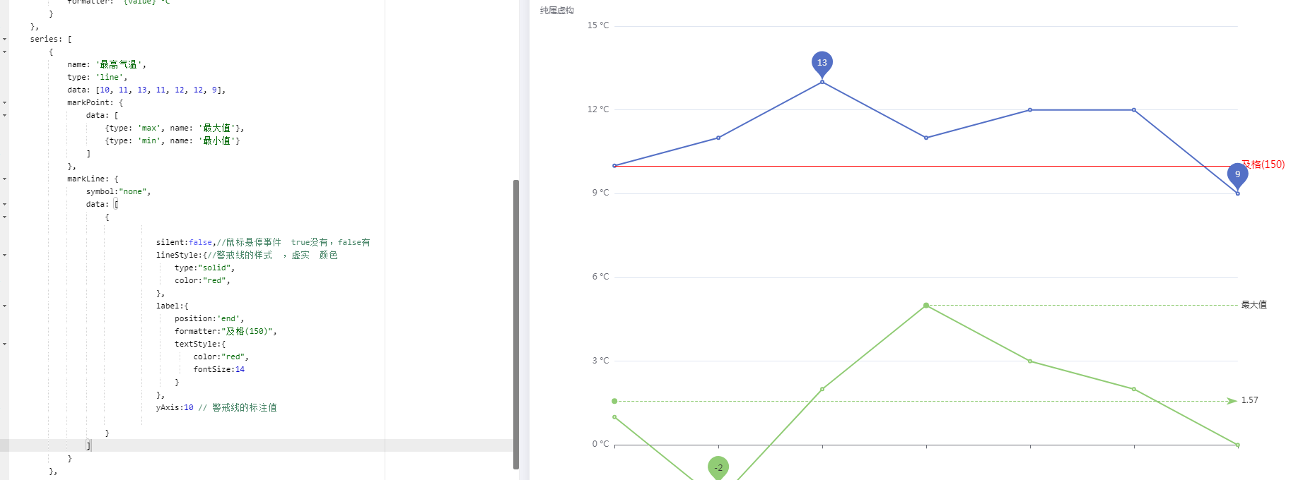
3、添加markline
series: [
        {
            name: '最高气温',
            type: 'line',
            data: [10, 11, 13, 11, 12, 12, 9],
            markPoint: {
                data: [
                    {type: 'max', name: '最大值'},
                    {type: 'min', name: '最小值'}
                ]
            },
            markLine: {
                symbol:"none",
                data: [
                      {

                               silent:false,//鼠标悬停事件  true没有,false有
                               lineStyle:{//警戒线的样式  ,虚实  颜色
                                   type:"solid",
                                   color:"red",
                               },
                               label:{
                                   position:'end',
                                   formatter:"及格(150)",
                                   textStyle:{
                                       color:"red",
                                       fontSize:14
                                   }
                               },
                               yAxis:10 // 警戒线的标注值

                    }
                ]
            }
        }
]

 浙公网安备 33010602011771号