
服务过美国总统竞选的非传统投票UI [解析及DEMO]
上篇文章和大家介绍了需求情况和难点分析,大家可以看这个链接了解详细

=================正文开始=====================================
这些天一直在忙,抽空把代码完成了。和大家分享一下实现。
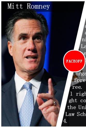
大家先在chorme上看一下DEMO吧,在线DEMO地址 http://codepen.io/arfeizhang/full/liIHa
(DEMO只是为了说明原理,所以没做浏览器兼容,请大家在chrome上体验下)
DEMO看着还可以吧,我们开始分析啦~
1 <div id="faceoff">
2 <div id="person1" class="pic_wrap">
3 <div class="pic">
4 <div class="desc">
5 <div class="content">
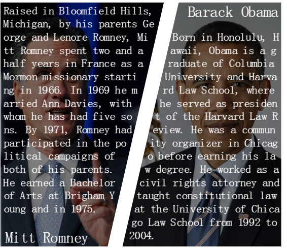
6 Raised in Bloomfield Hills, Michigan, by his parents George and Lenore Romney, Mitt Romney spent two and a half years in France as a Mormon missionary starting in 1966. In 1969 he married Ann Davies, with whom he has had five sons. By 1971, Romney had participated in the political campaigns of both of his parents. He earned a Bachelor of Arts at Brigham Young and in 1975.
7 </div>
8 <div class="title">Mitt Romney</div>
9 </div>
10 </div>
11 </div>
12 <div id="faceoffIcon">FACEOFF</div>
13 <div id="person2" class="pic_wrap">
14 <div class="pic">
15 <div class="desc">
16 <div class="title">Barack Obama</div>
17 <div class="content">
18 Born in Honolulu, Hawaii, Obama is a graduate of Columbia University and Harvard Law School, where he served as president of the Harvard Law Review. He was a community organizer in Chicago before earning his law degree. He worked as a civil rights attorney and taught constitutional law at the University of Chicago Law School from 1992 to 2004.
19 </div>
20 </div>
21 </div>
22 </div>
23 </div>
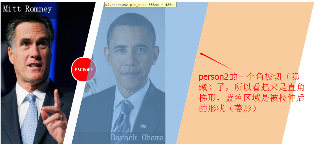
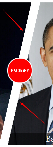
接着来解决直角梯形UI,我想着可以这样实现:把一个矩形进行沿x轴歪斜(skew),这个矩形就会变成个棱形(如下图),然后我们把左尖角或右尖角遮住,就变成直角梯形了(相当于切掉左/右角)。不过在过程中发现了一个问题:形状达到我们要求了,但随之而来的问题是,里面的图像也扭曲了,就像下面这样。

直角梯形的原理,如下图所示:

PS.还可以用webkit clip来实现非常规形状,大家可以查下它的用法。
做好了形状,接着来完成文字部分,这种非常规排版方式,adobe有过提议(CSS Shape),但目前CSS Shape只能在Webkit Nightly和Chrome Canary浏览器中实现,等以后等普及后,我们可以做出类似于这种效果。

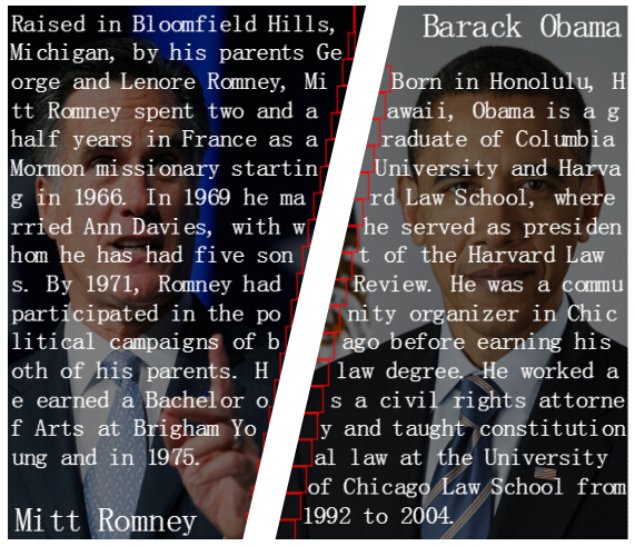
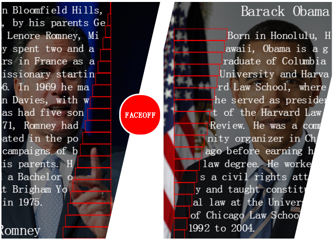
上面最后一张图,为了方便大家看,我把介绍内容给移了一下。大家应该看出来了吧,我是利用一些透明的占位元素(这里加了红色边框是为了使大家看得清楚),将介绍给挤成我们要的形状。
这种做法需要解决的是,这些占位元素的宽度各是多少?这里我们借助程序来实现。
1 //依据角的邻边算对边长度
2 function getWidth(height) {
3   return Math.tan(deg * Math.PI / 180) * height;
4 }
5 // 依据行数得到角的邻边长度,进而算得对边长度
6 function getWidthByLineIndex(i) {
7   return getWidth(i * lineHeight);
8 }
这个程序的作用是,依据索引值生成一些依次递增或递减的span并把它加入到介绍div内。我们需要预定好角度值deg,这里我定义的是13度,和页面上的直角梯形角度一致。


 1 #person1>.pic:hover>.desc {
 2     -webkit-animation: left-show 0.8s 0s normal forwards;
 3     -webkit-animation-timing-function: ease-in;
 4 }
 5 #person1>.pic>.desc {
 6     -webkit-animation: left-hide 0.8s 0s normal forwards;
 7     -webkit-animation-timing-function: ease-out;
 8 }
 9 #person2>.pic:hover>.desc {
10     -webkit-animation: right-show 0.8s 0s normal forwards;
11     -webkit-animation-timing-function: ease-in;
12 }
13 #person2>.pic>.desc {
14     -webkit-animation: right-hide 0.8s 0s normal forwards;
15     -webkit-animation-timing-function: ease-out;
16 }
17 @-webkit-keyframes left-show {
18     from {
19         margin-top: -440px;
20     }
21     to {
22         margin-top: 0px;
23     }
24 }
25 @-webkit-keyframes left-hide {
26     from {
27         margin-top: 0px;
28     }
29     to {
30         margin-top: -440px;
31     }
32 }
33 @-webkit-keyframes right-show {
34     from {
35         margin-top: 440px;
36     }
37     to {
38         margin-top: 0px;
39     }
40 }
41 @-webkit-keyframes right-hide {
42     from {
43         margin-top: 0px;
44     }
45     to {
46         margin-top: 440px;
47     }
48 }
恩,上下滑动功能正常,鼠标响应区域和文本内容也是直角梯形。好了,我们把它完成了!!!活动下手~~~~~~~ 等等,有个问题,被我们旋转的左右部分div,斜边出现了锯齿,还是比较明显的。
所有代码如下:
  1 <!DOCTYPE HTML>
  2 <html manifest="" lang="en-US">
  3 <head>
  4     <meta charset="UTF-8">
  5         <title>Faceoff</title>
  6         <style type="text/css">
  7 div#faceoff {
  8     overflow: hidden;
  9     width: 710px;
 10 }
 11 .pic>.desc {
 12     background-color: rgba(0, 0, 0, 0.5);
 13     color: white;
 14 }
 15 .pic>.desc>.content {
 16     font-size: 22px;
 17     line-height: 26px;
 18     word-break: break-all;
 19 }
 20 .pic>.desc>.title {
 21     font-size: 30px;
 22     margin-bottom: 20px;
 23 }
 24 .pic_wrap {
 25     -webkit-transform: skewX(-13deg) translateZ(0);
 26     overflow: hidden;
 27     width: 353px;
 28     height: 480px;
 29     position: relative;
 30 }
 31 #person1 {
 32     left: -87px;
 33     float: left;
 34 }
 35 #person1>.pic {
 36     width: 461px;
 37     height: 480px;
 38     background: url("resources/1.jpg") no-repeat;
 39     background-position: -51px 0px;
 40     background-size: 620px 480px;
 41     -webkit-transform: skewX(13deg);
 42 }
 43 #person1>.pic>.desc {
 44     width: 312px;
 45     float: left;
 46     margin-left: 90px;
 47     margin-top: -440px;
 48 }
 49 #person1>.pic>.desc>.title {
 50     text-align: left;
 51     padding-left: 5px;
 52 }
 53 #person1>.pic>.desc>.content {
 54     padding: 2px;
 55     height: 440px;
 56 }
 57 #person2 {
 58     left: -57px;
 59 }
 60 #person2>.pic {
 61     width: 361px;
 62     height: 480px;
 63     background: url("resources/2.jpg") no-repeat;
 64     background-position: 20px -25px;
 65     background-size: 376px 540px;
 66     -webkit-transform: skewX(13deg);
 67     margin-left: -100px;
 68 }
 69 #person2>.pic>.desc {
 70     width: 320px;
 71     float: right;
 72 }
 73 #person2>.pic>.desc>.title {
 74     text-align: right;
 75     padding-right: 5px;
 76 }
 77 #person2>.pic>.desc>.content {
 78     padding-right: 2px;
 79     height: 440px;
 80 }
 81 .space {
 82     /* border: 1px solid red;*/
 83     height: 22px;
 84 }
 85 .space.left {
 86     float: left;
 87     clear: left;
 88 }
 89 .space.right {
 90     float: right;
 91     clear: right;
 92 }
 93 #faceoffIcon {
 94     width: 80px;
 95     height: 80px;
 96     position: absolute;
 97     background-color: red;
 98     border: 3px solid white;
 99     border-radius: 40px;
100     top: 194px;
101     left: 247px;
102     z-index: 2;
103     color: white;
104     line-height: 80px;
105     text-align: center;
106     font-weight: bold;
107 }
108 #faceoff:hover>#faceoffIcon {
109     display: none;
110 }
111 #person1>.pic:hover>.desc {
112     -webkit-animation: left-show 0.8s 0s normal forwards;
113     -webkit-animation-timing-function: ease-in;
114 }
115 #person1>.pic>.desc {
116     -webkit-animation: left-hide 0.8s 0s normal forwards;
117     -webkit-animation-timing-function: ease-out;
118 }
119 #person2>.pic:hover>.desc {
120     -webkit-animation: right-show 0.8s 0s normal forwards;
121     -webkit-animation-timing-function: ease-in;
122 }
123 #person2>.pic>.desc {
124     -webkit-animation: right-hide 0.8s 0s normal forwards;
125     -webkit-animation-timing-function: ease-out;
126 }
127 @-webkit-keyframes left-show {
128     from {
129         margin-top: -440px;
130     }
131     to {
132         margin-top: 0px;
133     }
134 }
135 @-webkit-keyframes left-hide {
136     from {
137         margin-top: 0px;
138     }
139     to {
140         margin-top: -440px;
141     }
142 }
143 @-webkit-keyframes right-show {
144     from {
145         margin-top: 440px;
146     }
147     to {
148         margin-top: 0px;
149     }
150 }
151 @-webkit-keyframes right-hide {
152     from {
153         margin-top: 0px;
154     }
155     to {
156         margin-top: 440px;
157     }
158 }
159
160     </style>
161 </head>
162 <body>
163   <div id="faceoff">
164     <div id="person1" class="pic_wrap">
165         <div class="pic">
166          <div class="desc">
167           <div class="content">
168             Raised in Bloomfield Hills, Michigan, by his parents George and Lenore Romney, Mitt Romney spent two and a half years in France as a Mormon missionary starting in 1966. In 1969 he married Ann Davies, with whom he has had five sons. By 1971, Romney had participated in the political campaigns of both of his parents. He earned a Bachelor of Arts at Brigham Young and in 1975.
169         </div>
170           <div class="title">Mitt Romney</div>
171         </div>
172       </div>
173     </div>
174 <div id="faceoffIcon">FACEOFF</div>
175     <div id="person2" class="pic_wrap">
176      <div class="pic">
177         <div class="desc">
178           <div class="title">Barack Obama</div>
179           <div class="content">
180                    Born in Honolulu, Hawaii, Obama is a graduate of Columbia University and Harvard Law School, where he served as president of the Harvard Law Review. He was a community organizer in Chicago before earning his law degree. He worked as a civil rights attorney and taught constitutional law at the University of Chicago Law School from 1992 to 2004.
181                </div>
182         </div>
183       </div>
184     </div>
185 </div>
186
187 <script type="text/javascript">
188 //角度为13度
189 var deg = 13,
190   //占位元素的高
191   lineHeight = 22,
192   //元素高
193   contentHeight = 460,
194   //占位元素个数(行数)
195   lineCount = Math.ceil(contentHeight / lineHeight),
196   //相邻两个占位元素的宽度偏移量
197   lineOffset = getWidth(lineHeight),
198   //最大占位容器宽度,右侧的占位容器从大到小递减,左侧的占位元素从小到大递增
199   lineMaxWidth = getWidth(contentHeight);
200
201 //用占位容器来填充形状
202 function SetShape(isRight) {
203   var oFrag = document.createDocumentFragment();
204   if (isRight) {
205     for (var i = 0; i < lineCount; i++) {
206       var op = document.createElement("span");
207       op.classList.add("space");
208       op.classList.add("left");
209       // 右侧的占位容器从大到小递减
210       op.style.width = (lineMaxWidth - i * lineOffset) + "px";
211       oFrag.appendChild(op);
212     }
213     document.querySelector("#person2 .desc").insertBefore(oFrag, document.querySelector("#person2 .content"));
214   } else {
215     for (var i = 0; i < lineCount; i++) {
216       var op = document.createElement("span");
217       op.classList.add("space");
218       op.classList.add("right");
219       // 左侧的占位元素从小到大递增
220       op.style.width = (i * lineOffset) + "px";
221       oFrag.appendChild(op);
222     }
223     document.querySelector("#person1 .desc").insertBefore(oFrag, document.querySelector("#person1 .content"));
224   }
225
226 }
227 //依据角的邻边算对边长度
228 function getWidth(height) {
229   return Math.tan(deg * Math.PI / 180) * height;
230 }
231 // 依据行数得到角的邻边长度,进而算得对边长度
232 function getWidthByLineIndex(i) {
233   return getWidth(i * lineHeight);
234 }
235 SetShape(false);
236 SetShape(true);
237 </script>
238
239     </body>
240     </html>
素材两张(尺寸已缩小,可右键下载源图):


本文是博主Arfei Zhang原创,欢迎转载。转载请注明转自博客园,并附上本文链接http://www.cnblogs.com/arfeizhang/p/faceoffdemo.html,谢谢!

