
如题:中间自适应,左边和右边固定宽度为300px,高度为100px
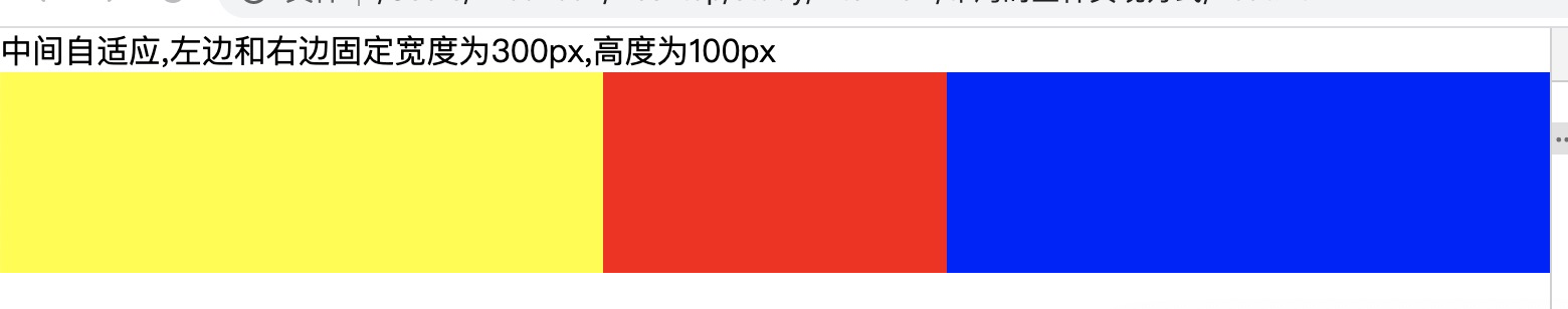
第一种:利用浮动
这里要注意center_section的位置,see https://segmentfault.com/q/1010000005118331
 <div>中间自适应,左边和右边固定宽度为300px,高度为100px</div>
    <div>
        <div class="main_box">
            <div class="left_section"></div>
            <div class="right_section"></div>
            <div class="center_section"></div>
        </div>
    </div>
    <style>
        html * {
            padding: 0;
            margin: 0
        }
        .main_box {
            height: 100px;
        }
        .left_section {
            float: left;
            width: 300px;
            background: yellow;
            height: 100%;
        }
        .right_section {
            float: right;
            width: 300px;
            background: blue;
            height: 100%;
        }
        .center_section {
            background: red;
            height: 100%;
        }
    </style>
第二种 flex布局
<div>中间自适应,左边和右边固定宽度为300px,高度为100px</div>
    <div>
        <div class="main_box">
            <div class="left_section"></div>
            <div class="center_section"></div>
            <div class="right_section"></div>
        </div>
    </div>
    <style>
        .main_box {
            display: flex;
        }
        .left_section {
            width: 300px;
            background: yellow;
            height: 100px;
        }
        .right_section {
            width: 300px;
            background: blue;
            height: 100px;
        }
        .center_section {
            background: red;
            height: 100px;
            flex: 1;
        }
    </style>
第三种 定位
<div>中间自适应,左边和右边固定宽度为300px,高度为100px</div>
    <div>
        <div class="main_box">
            <div class="left_section"></div>
            <div class="center_section"></div>
            <div class="right_section"></div>
        </div>
    </div>
    <style>
        .left_section {
            width: 300px;
            background: yellow;
            height: 100px;
            position: absolute;
            left: 0;
        }
        .right_section {
            width: 300px;
            background: blue;
            height: 100px;
            position: absolute;
            right: 0;
        }
        .center_section {
            position: absolute;
            background: red;
            height: 100px;
            left: 300px;
            right:300px;
        }
    </style>
4.table布局
<div>中间自适应,左边和右边固定宽度为300px,高度为100px</div>
    <div>
        <div class="main_box">
            <div class="left_section"></div>
            <div class="center_section"></div>
            <div class="right_section"></div>
        </div>
    </div>
    <style>
        .main_box {
            width: 100%;
            display: table;
        }
        .left_section {
            width: 300px;
            background: yellow;
            height: 100px;
            display: table-cell;
        }
        .right_section {
            width: 300px;
            background: blue;
            height: 100px;
            display: table-cell;
        }
        .center_section {
            background: red;
            height: 100px;
            display: table-cell;
        }
    </style>
5.网格布局
<div>中间自适应,左边和右边固定宽度为300px,高度为100px</div>
    <div>
        <div class="main_box">
            <div class="left_section"></div>
            <div class="center_section"></div>
            <div class="right_section"></div>
        </div>
    </div>
    <style>
        .main_box {
            display: grid;
            grid-template-rows: 100px;
            width: 100%;
            grid-template-columns: 300px auto 300px;
        }
        .left_section {
            background: yellow;
        }
        .right_section {
            background: blue;
        }
        .center_section {
            background: red;
        }
    </style>
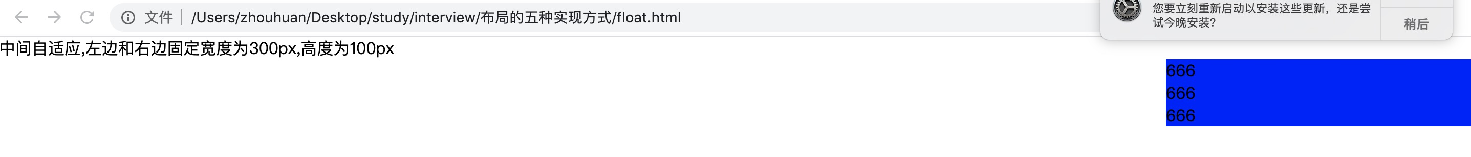
如果去掉高度已知,靠文字撑开或者图片撑开高度哪个布局不再适用,比较下面的flex去掉高度
 <div>中间自适应,左边和右边固定宽度为300px,高度为100px</div>
    <div>
        <div class="main_box">
            <div class="left_section"></div>
            <div class="center_section">
                <div>666</div>
                <div>666</div>
                <div>666</div>
            </div>
            <div class="right_section"></div>
        </div>
    </div>
    <style>
        .main_box {
            display: flex;
        }
        .left_section {
            width: 300px;
            background: yellow;
            /* height: 100px; */
        }
        .right_section {
            width: 300px;
            background: blue;
            /* height: 100px; */
        }
        .center_section {
            background: red;
            /* height: 100px; */
            flex: 1;
        }
    </style>
仍然能够适用

不能适用的
其他的,自己试试吧
如果去掉高度已知,靠文字撑开或者图片撑开高度哪个布局不再适用?table布局和flex布局仍然适用,而float,网络布局,定位布局不可以
几种布局的特点?
1.float在特定情况下要清除浮动 2.定位比较稳,不易出错,但是他的其他两块里面的内容都要脱离文档流 3.flex能解决前两个问题 4其他待补充

 浙公网安备 33010602011771号