
前端常用CSS小技巧
注意:以下前缀兼容性写法注释
-o-:Opera
-ms://IE10
-moz://火狐
-webkit://Safari 4-5, Chrome 1-9
1. 去除 iOS移动端 input,textarea输入框聚焦时上方内阴影样式
input, textarea, select{
   appearance: none;
   -moz-appearance: none; //Firefox
   -webkit-appearance: none; //Safari 和 Chrome
}

appearance属性,用来移除原生控件样式。亦可以用来去除 select 默认样式右侧的下拉小三角形。
2. 自定义滚动条样式
整体部分 ::-webkit-scrollbar
两端按钮 ::-webkit-scrollbar-button
外层轨道 ::-webkit-scrollbar-track
内层轨道 ::-webkit-scrollbar-track-piece
滚动滑块 ::-webkit-scrollbar-thumb
边角 ::-webkit-scrollbar-corner
边角拖动块的样式 ::-webkit-resizer
横向滚动条
.scroll-horizontal::-webkit-scrollbar{
    height: 10px;
}
.scroll-horizontal::-webkit-scrollbar-button{
    display: block;
    width: 5px;
    border: 5px solid transparent;
}
.scroll-horizontal::-webkit-scrollbar-button:start:decrement{
    border-right-color: red;
}
.scroll-horizontal::-webkit-scrollbar-button:end:increment{
    border-left-color: red;
}
.scroll-horizontal::-webkit-scrollbar-button:end:decrement{
    display: none;
}
.scroll-horizontal::-webkit-scrollbar-button:start:increment{
    display: none;
}
.scroll-horizontal::-webkit-scrollbar-thumb{
    background-color: green;
    border-radius: 30px;
}
.scroll-horizontal::-webkit-scrollbar-track-piece{
    /* background-color: #0898b2; */
    border-radius: 30px;
}
.scroll-horizontal::-webkit-scrollbar-track{
    border: 1px solid #721f1f;
    border-radius: 30px;
    margin: 0 5px;
}
竖向滚动条
.scroll-vertical::-webkit-scrollbar{
    width: 10px;
}
.scroll-vertical::-webkit-scrollbar-button{
    display: block;
    height: 10px;
    border: 5px solid transparent;
}
.scroll-vertical::-webkit-scrollbar-button:end:increment{
    border-top-color: #1166DF;
}
.scroll-vertical::-webkit-scrollbar-button:start:decrement {
    border-bottom-color: #1166DF;
}
.scroll-vertical::-webkit-scrollbar-button:end:decrement,
.scroll-vertical::-webkit-scrollbar-button:start:increment{
    display: none;
}
.scroll-vertical::-webkit-scrollbar-track-piece{
    border-radius: 30px;
    background-color: #0b97b0;
    margin: 5px auto;
}
.scroll-vertical::-webkit-scrollbar-thumb{
    border-radius: 30px;
    background-color: green;
}

3. 实现文字竖向排版
实现文字竖向排版,最简单的方法是设置较小的宽度,然后高度自适应。
p{
    width: 25px;
    line-height: 18px;
    height: auto;
    font-size: 12px;
    padding: 8px 5px;
}

但是当想要多列展示时,设置宽度就不能实现我们想要的效果了,此时可以使用 writing-mode 属性。
p{
    height: 210px;
    line-height: 30px;
    text-align: justify;
    writing-mode: vertical-lr;  //从左向右
    writing-mode: tb-lr;        //IE从左向右

    //writing-mode: vertical-rl;  -- 从右向左
    //writing-mode: tb-rl;        -- 从右向左
}
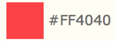
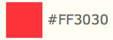
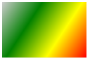
4. 实现按比例计算浅红到深红的颜色值
设置 rgb,固定 r 值为 ff, 让 g = b,从 ff 渐变到 0

5. select 下拉选择设置右对齐
select option {
    direction: rtl;
}
6. IOS键盘字母输入,默认首字母大写,解决方案
<input type="text" autocapitalize="off" />
7. 文字渐变效果
.text-gradient{
    background-image: linear-gradient(135deg, deeppink, deepskyblue);
    -webkit-background-clip: text;
    color: transparent;
}
8. calc 可以使我们不用考虑元素的宽度值,直接交给浏览器去计算
当我们遇到左侧宽度值固定,右侧宽度值不定的时候,使用 calc 去设置元素的宽度是最好的解决办法。
在IE9+、FireFox4.0+、Chrome19+、Safari6+都有较好的支持
支持 " + " 、" - " 、 " * " 、" / " (运算符前后要加空格)
支持 " px " 、 " % " 、 " em " 、 " rem " 等单位 (可混合使用)
div .left{
    width: 200px;   //左侧宽度固定
}
div .right{
    width: calc(100% - 200px);
    width: -moz-calc(100% - 200px);
    width: -webkit-calc(100% - 200px);
}
9. CSS实现图片自动按比例等比例缩小并垂直水平居中,图片不变形
div{
    position: relative;
    width: 270px;
    height: 200px;
    border: 1px solid #e2e2e2;
}
div img{
    position: absolute;
    display: block;
    top: 50%;
    left: 50%;
    transform: translate(-50%, -50%);
    -moz-transform: translate(-50%, -50%);
    -ms-transform: translate(-50%, -50%);
    -o-transform: translate(-50%, -50%);
    -webkit-transform: translate(-50%, -50%);
    max-width: 270px;
    max-height: 200px;
    width:expression(this.width > 270? "270px" : this.width);  //当低版本IE浏览器 不支持max-width属性时执行该语句
    height:expression(this.height > 200? "200px" : this.height);
}
10. 多行文本溢出显示省略号
.box{
    width: 100%;
    overflow: hidden;
    display: -webkit-box;   //将对象作为弹性伸缩盒子模型显示  *必须结合的属性*
    -webkit-box-orient: vertical;   //设置伸缩盒对象的子元素的排列方式  *必须结合的属性*
    -webkit-line-clamp: 3;   //用来限制在一个块元素中显示的文本的行数
    word-break: break-all;   //让浏览器实现在任意位置的换行 *break-all为允许在单词内换行*
}
11. 单行文本溢出显示省略号
a{
    overflow: hidden;   //超出隐藏
    display: block;
    max-width: 116px;
    text-overflow: ellipsis;   //当文本内容溢出时显示省略号
    white-space: nowrap;   //文本在同一行上不会换行,直到遇到 <br> 标签为止
    height: 40px;
    line-height: 40px;
    background-color: #f8f8f8;
    padding: 0 10px;
}
主要代码:
overflow: hidden;
text-overflow: ellipsis;
white-space: nowrap;
text-overflow: clip | ellipsis
clip: 不显示省略号(...)
ellipsis: 当文本内容溢出时显示省略号(...)
12. 左右两边 div 的高度自适应相等
需要将 margin 和 padding 的数值设置的越大越好
需要给父元素设置 overflow: hidden;
<div class="w c pagecont">
    <div class="l pageleft"></div>
    <div class="l pageright"></div>
</div>
.c{
    overflow: hidden;
    zoom: 1;
}
.pageleft,
.pageright {
    padding: 30px;
    margin-bottom: -10000px;
    padding-bottom: 10030px;
}
13. CSS实现文本两端对齐
div{
    text-align: justify;
    text-justify: distribute-all-lines;  //ie6-8
    text-align-last: justify;  //一个块或行的最后一行对齐方式
    -moz-text-align-last: justify;
    -webkit-text-align-last: justify;
}
14. IE6浏览器常见兼容问题
// 横向双倍margin
IE6中设置元素浮动后,会出现横向双倍margin值。--添加 _display: inline;
// 3px bug
浮动块元素处于同一行时,有默认的3px间距。--设置非浮动元素浮动。
// 透明度
opacity: 0.6; --filter: alpha(opacity = 60);
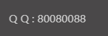
15. PC端调用QQ实现在线聊天
点击图标或者文字可以直接调用QQ实现在线聊天
<a href="http://wpa.qq.com/msgrd?v=3&uin=80080088&site=qq&menu=yes" target="_self"><img border="0" src="http://wpa.qq.com/pa?p=2:80080088:51" title="在线客服" /></a>
//修改两处QQ号即可

<a href="tencent://message/?uin=80080088&Site=Sambow&Menu=yes">80080088</a>
//修改一处QQ号即可
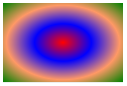
16. CSS3 Gradient 渐变
CSS3 Gradient 分为线性渐变和径向渐变。
<div class = "gradient" style = "width: 120px; height: 80px; "></div>
background: #e6e6e6;   //当浏览器不支持背景渐变时该语句将会被执行
background: -o-linear-gradient(top, #fdfdfd,  #e6e6e6);
background: -moz-linear-gradient(top, #fdfdfd, #e6e6e6);
background: -webkit-linear-gradient(top, #fdfdfd, #e6e6e6);   //最新发布语法
background: -webkit-gradient(linear, 0% 0%, 0% 100%, from(#fdfdfd), #e6e6e6);   //老式语法
示例:
background: -webkit-linear-gradient(left top, #ccc, green, yellow, red); //线性渐变
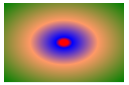
background: -webkit-radial-gradient(center, red, blue, #f96, green); //径向渐变
//不设置位置,将会均匀分布
background: -webkit-linear-gradient(top, #ccc 5%, #F95 30%, red);   //线性渐变
background: -webkit-radial-gradient(center, red 5%, blue 10%, #f96 40%,  green 100%);   //径向渐变
//设置位置

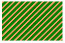
background: -webkit-repeating-linear-gradient(-45deg, #f96, #f96 3px, green 3px, green 8px);   //线性重复渐变
background: -webkit-repeating-radial-gradient(red, #f96 2px, green 2px, green 8px);   //径向重复渐变

共有三个参数,第一个参数表示线性渐变的方向,top是从上到下,left是从左到右,如果定义成left top 或者角度(-45deg),那就是从左上角到右下角。第二个参数是起点颜色,第三个参数是终点颜色。可以在它们之间插入更多的参数,表示多种颜色的渐变。
IE依靠滤镜实现渐变。
startColorstr表示起点的颜色,endColorstr表示终点颜色。GradientType表示渐变类型,0表示垂直渐变,1表示水平渐变。
filter: progid:DXImageTransform.Microsoft.gradient(GradientType=0, startColorstr=#f96, endColorstr=#ccc);   //IE9
-ms-filter: "progid:DXImageTransform.Microsoft.gradient (GradientType=0, startColorstr=#f96, endColorstr=#ccc)";   //IE8+
实例 (实现鼠标移上时出现黑心圆点效果)
span{
    display: block;
    float: left;
    width: 13px;
    height: 13px;
    border-radius: 50%;
    border: 1px solid #ccc;
    font-size: 0;
    background: #fff;
    margin: 0 5px;
}
span:hover{
    background: #676767;
    background: -o-radial-gradient(center, #676767 26%, #fff 44%, #fff 100%);
    background: -moz-radial-gradient(center, #676767 26%, #fff 44%, #fff 100%);
    background: -webkit-radial-gradient(center, #676767 26%, #fff 44%, #fff 100%);
}
17. CSS3 columns多列布局
div{
    //把div元素中的文本划分为4列
           -moz-columns: 4;
        -webkit-columns: 4;
                columns: 4;
    //将div元素中的文本分为三列,并列间30px的间隔
        -moz-column-gap: 30px;
     -webkit-column-gap: 30px;
             column-gap: 30px;
    //规定列之间的宽度、样式和颜色
       -moz-column-rule: 1px outset #fff;
    -webkit-column-rule: 1px outset #fff;
            column-rule: 1px outset #fff;
}
18. 设置表单file控件上传文件时可以选择多个文件
<input type='file' multiple='true'> //设置multiple属性值为true
19. CSS实现一行水平居中,多行左对齐效果
<p class='text'><span>一行水平居中,多行左对齐。</span></p>
<p class='text'><span>一行水平居中,多行左对齐。一行水平居中,多行左对齐。一行水平居中,多行左对齐。</span></p>
.text {text-align: center;}
.text span {display: inline-block; text-align: left;}
20. 空白会被保留
white-space: pre;
21. 修改input输入框中光标的颜色不改变字体的颜色
input{
    color:  #fff;
    caret-color: red;
}

22. 修改input 输入框中 placeholder 默认字体样式
//webkit内核的浏览器
input::-webkit-input-placeholder {
    color: #c2c6ce;
}
//Firefox版本4-18
input:-moz-placeholder {
    color: #c2c6ce;
}
//Firefox版本19+
input::-moz-placeholder {
    color: #c2c6ce;
}
//IE浏览器
input:-ms-input-placeholder {
    color: #c2c6ce;
}
23. 去除浏览器中 input button 等标签获得焦点时的带颜色
input, textarea, button{
    outline:none;
}
 去除焦点后
去除焦点后 

 浙公网安备 33010602011771号