![]()
参考网站 https://lhammer.cn/You-need-to-know-css/#/zh-cn/
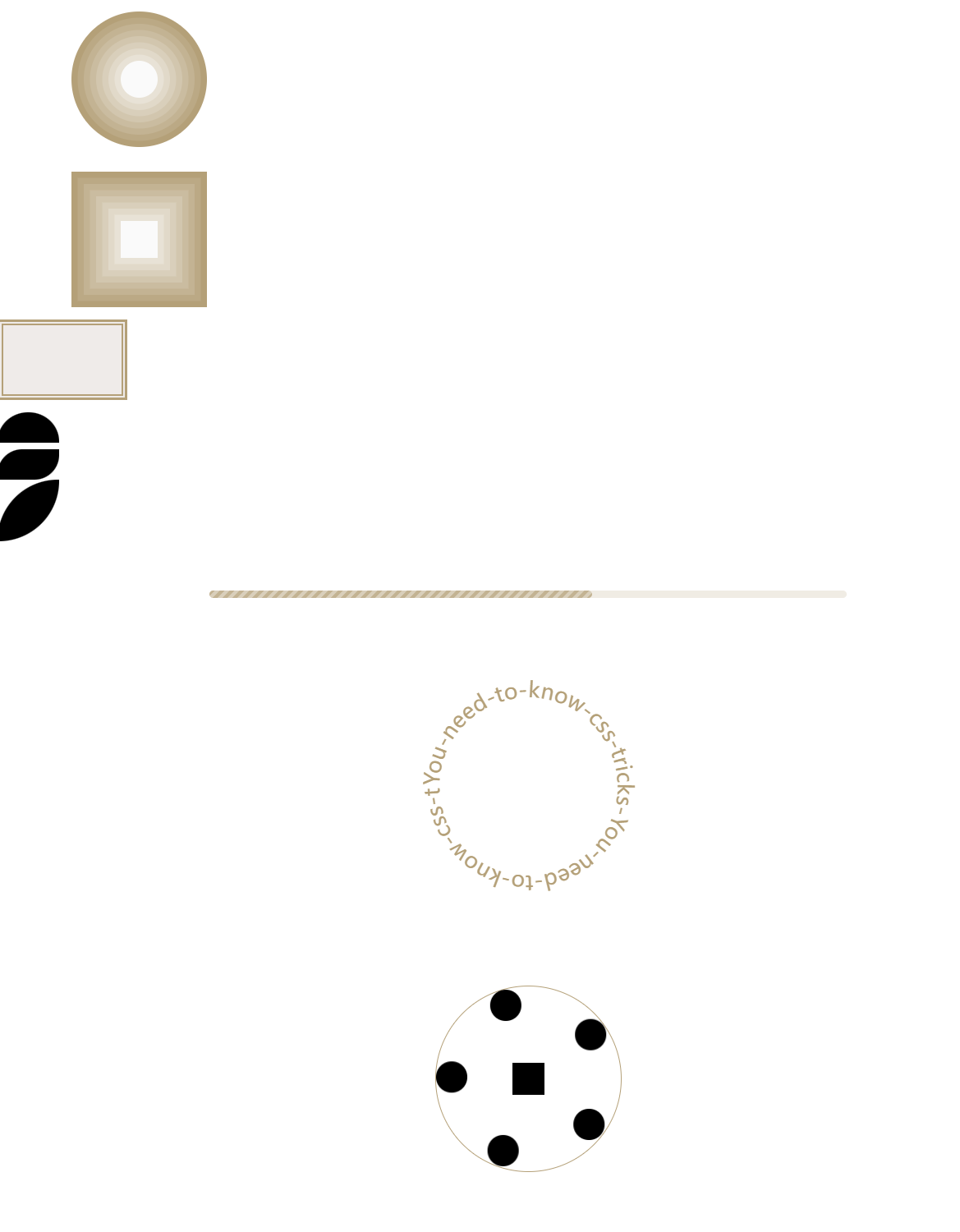
<!DOCTYPE html>
<html lang="en">
<head>
  <meta charset="UTF-8">
  <title>Title</title>

  <style>
    /* 通用样式,去除默认的外边距和内边距 */
    *{
      padding: 0;
      margin: 0;
    }
    /* 设置body字体大小 */
    body{
      font-size: 14px;
    }

    /* 设置box1和box0的共同样式 */
    .box1,
    .box0{
      width: 60px;
      height: 60px;
      background: #fafafa;
      margin:200px 0 0 200px;
      /* 设置多重阴影效果 */
      box-shadow: 0 0 0 10px #E8E2D6, 0 0 0 20px #E1D9C9,
      0 0 0 30px #D9CFBB, 0 0 0 40px #D2C6AE,
      0 0 0 50px #CABCA0, 0 0 0 60px #C3B393,
      0 0 0 70px #BBA985, 0 0 0 80px #B4A078;
    }
    /* 设置box0为圆形 */
    .box0{
      margin:100px 0 0 200px;
      border-radius: 50%;
    }

    /* 定义box2的样式 */
    .box2{
      margin-top:100px;
      width: 200px;
      height: 120px;
      background: #efebe9;
      border: 5px solid #B4A078;
      outline: #B4A078 solid 3px;
      outline-offset: -10px;
      margin-bottom: 20px;;
    }

    /* 定义box3, box3-1, box3-2的样式,这些盒子主要是实现不同形状 */
    .box3{
      margin-bottom: 10px;
      width: 100px;
      height: 50px;
      border-radius: 100px 100px 0 0;
      background: #000;
    }
    .box3-1{
      width: 100px;
      height: 50px;
      border-radius: 40px 0 40px 0;
      background: #000;
    }
    .box3-2{
      width: 100px;
      height: 100px;
      border-radius: 100px 0 100px 0;
      background: #000;
    }

    /* 进度条样式 */
    .box4 {
      width: 100%;
      padding: 80px 0;
      display: flex;
      flex-wrap: wrap;
      justify-content: space-around;
    }
    .box4 .progress-outer {
      width: 60%;
      height: 12px;
      border-radius: 8px;
      overflow: hidden;
      position: relative;
    }
    .box4 .progress-enter {
      height: inherit;
      background: rgba(180, 160, 120, .2);
    }
    .box4 .progress-bg {
      width: 60%;
      height: inherit;
      border-radius: 6px;
      /* 使用渐变背景模拟进度条的条纹 */
      background: repeating-linear-gradient(-45deg, #D9CFBB  25%, #C3B393 0, #C3B393 50%, #D9CFBB 0, #D9CFBB 75%, #C3B393 0);
      background-size: 16px 16px;
      /* 使进度条动画移动,模拟加载效果 */
      animation: panoramic 20s linear infinite;
    }

    /* 圆形文本样式 */
    .box5 {
      width: 289px; height: 289px;
      margin: 80px auto;
      font-size: 12px;
    }
    .box5 svg {
      overflow: visible;
      animation: circular-text-rotate 5s linear paused infinite;
    }
    .box5 svg:hover {
      animation-play-state: running;
    }

    /* 旋转的头像效果 */
    .box6 {
      width: 100%; height: 529px;
      display: flex;
      flex-direction: column;
      align-items: center;
    }
    .box6 .path {
      width: 300px; height: 300px;
      border-radius: 50%;
      margin: 100px auto;
      position: relative;
      display: flex;
      border: 1px solid #b4a078;
    }
    .box6 .logo {
      width: 52px;
      height: 52px;
      margin: auto;
      background: #000;
    }
    .box6 .avatar {
      width: 50px;
      position: absolute;
      top: 124px; left: 124px;
      animation: circular-smooth-spin 7.5s infinite linear;
      animation-play-state: running;
    }
    .box6 .avatar > span {
      font-weight: 500;
      position: absolute;
      white-space: nowrap;
      top: -50%; left: 50%;
      padding: 3px 12px;
      opacity: 0;
      transform: scale(0);
      transition: opacity, transform .8s;
      transform-origin: 0 bottom;
    }
    .box6 .avatar > div {
      width: 50px;
      height: 50px;
      border-radius: 50%;
      overflow: hidden;
      background: #000;
    }

    /* 动画定义部分 */
    @keyframes panoramic {
      to {
        background-position: 200% 0;
      }
    }
    @keyframes circular-text-rotate {
      to {
        transform: rotate(1turn);
      }
    }
    @keyframes circular-smooth-spin {
      from {
        transform: rotate(0turn) translateY(-124px) rotate(1turn)
      }
      to {
        opacity: 1;
        transform: rotate(1turn) translateY(-124px) rotate(0turn)
      }
    }
  </style>
</head>
<body>

<!-- 以下部分是HTML结构 -->

<!-- 圆形盒子 -->
<div class="box0"></div>
<!-- 带有多重阴影的盒子 -->
<div class="box1"></div>
<!-- 带有外框的矩形盒子 -->
<div class="box2"></div>
<!-- 不同形状的黑色盒子 -->
<div class="box3"></div>
<div class="box3-1"></div>
<div class="box3-2"></div>
<!-- 进度条组件 -->
<div class="box4">
  <div class="progress-outer">
    <div class="progress-enter">
      <div class="progress-bg"></div>
    </div>
  </div>
</div>
<!-- 圆形文本组件 -->
<div class="box5">
  <svg viewBox="0 0 100 100">
    <path d="M 0,50 a 50,50 0 1,1 0,1 z" id="circle" />
    <text>
      <textPath xlink:href="#circle">
        You-need-to-know-css-tricks-You-need-to-know-css-tricks-You-
      </textPath>
    </text>
  </svg>
</div>

<!-- 旋转的头像组件 -->
<div class="box6">
  <div class="path">
    <div class="logo"></div>
    <!-- 这里的头像会在主盒子中旋转 -->
    <div class="avatar">
      <span>Evan You</span>
      <div></div>
    </div>
    <div class="avatar">
      <span>Damian Dulisz</span>
      <div></div>
    </div>
    <div class="avatar">
      <span>defcc</span>
      <div></div>
    </div>
    <div class="avatar">
      <span>Edd Yerburgh</span>
      <div></div>
    </div>
    <div class="avatar">
      <span>Sarah Drasner</span>
      <div></div>
    </div>
  </div>
</div>
</body>
</html>


 浙公网安备 33010602011771号