RaisedButton - 定义按钮
// 在Flutter中,您可以通过RaisedButton组件来定义一个按钮。
// RaisedButton提供了多种参数,下面只是展示了一个简单的使用方法:

return RaisedButton(
    child: Text('女装'),
    // 设置按钮文本的颜色,这里采用了当前主题的强调颜色
    textColor: Theme.of(context).accentColor,
    // 这里是按钮的点击事件,目前为空
    onPressed: (){},
);
Wrap组件的介绍
// Wrap组件允许实现流布局。
// 当Wrap组件只有一行时,它的行为与Row组件非常相似;
// 当Wrap组件只有一列时,它的行为与Column组件非常相似。
// 但与Row和Column不同的是,Wrap在主轴上的空间不足时,会在交叉轴上扩展。

// 属性介绍:
// direction: 主轴方向,默认为水平。
// alignment: 主轴上的对齐方式。
// spacing: 主轴上的间距。
// textDirection: 文本的方向。
// verticalDirection: 定义子元素的摆放顺序,默认为down。

Wrap({
    Key key,
    this.direction = Axis.horizontal,
    this.alignment = WrapAlignment.start,
    this.spacing = 0.0,
    this.runAlignment = WrapAlignment.start, // run的对齐方式,理解为新行或列的对齐方式。
    this.runSpacing = 0.0, // run的间距。
    this.crossAxisAlignment = WrapCrossAlignment.start, // 交叉轴的对齐方式。
    this.textDirection,
    this.verticalDirection = VerticalDirection.down,
    List<Widget> children = const <Widget>[],
})
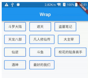
Wrap组件的案例
![]()
// 案例一:使用Wrap组件来布局多个Container
return Container(
  child: Wrap(
    children: <Widget>[
      Container(margin: EdgeInsets.all(5), width: 100, height: 30, decoration: BoxDecoration(color: Colors.red),),
      Container(margin: EdgeInsets.all(5), width: 100, height: 30, decoration: BoxDecoration(color: Colors.red),),
      Container(margin: EdgeInsets.all(5), width: 100, height: 30, decoration: BoxDecoration(color: Colors.red),),
      Container(margin: EdgeInsets.all(5), width: 100, height: 30, decoration: BoxDecoration(color: Colors.red),),
      Container(margin: EdgeInsets.all(5), width: 100, height: 30, decoration: BoxDecoration(color: Colors.red),),
      Container(margin: EdgeInsets.all(5), width: 100, height: 30, decoration: BoxDecoration(color: Colors.red),)
    ],
  ),
);

// 案例二:创建一个自定义按钮组件,并使用Wrap布局
class HomenCenter extends StatelessWidget {
  Widget build(BuildContext context) {
    return Wrap(
      spacing: 5,
      children: <Widget>[
         MyButton('按钮1'),
        MyButton('按钮1'),
        MyButton('按钮1'),
        MyButton('按钮1'),
        MyButton('按钮1'),
        MyButton('按钮1'),
        MyButton('按钮1'),
      ],
    );
  }
}

class MyButton extends StatelessWidget {
  final text;
  MyButton(this.text);
  @override
  Widget build(BuildContext context) {
    return RaisedButton (
      child: Text(this.text),
      color: Colors.red,
      textColor: Colors.white,
      onPressed: () {},
    );
  }
}


 浙公网安备 33010602011771号