|
|
Posted on
2013-01-30 14:57
analyzer
阅读( 487)
评论()
收藏
举报
1. 固定的顶部工具栏
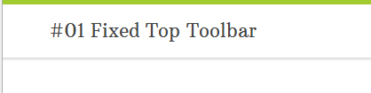
在线演示
代码:
07 |
border-top: 5px solid #a1cb2f; |
09 |
-moz-box-shadow: 0 2px 3px 0px rgba(0, 0, 0, 0.16); |
10 |
-webkit-box-shadow: 0 2px 3px 0px rgba(0, 0, 0, 0.16); |
11 |
box-shadow: 0 2px 3px 0px rgba(0, 0, 0, 0.16); |
2. 下列式导航菜单
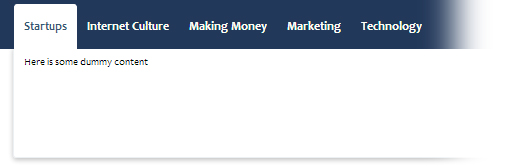
在线演示
代码:
01 |
#bar { display: block; height: 45px; background: #22385a; padding-top: 5px; margin-bottom: 150px; position: relative; } |
02 |
#bar ul { margin: 0px15px; font-family: Candara, Calibri, "Segoe UI", Segoe, Arial, sans-serif; } |
03 |
#bar ul li { background: #22385a; display: block; font-size: 1.2em; position: relative; float: left; } |
10 |
text-decoration: none; |
14 |
#bar ul li a:hover, #bar ul li a.selected { |
17 |
border-top-left-radius: 3px; |
18 |
border-top-right-radius: 3px; |
19 |
-webkit-border-top-left-radius: 3px; |
20 |
-webkit-border-top-right-radius: 3px; |
21 |
-moz-border-radius-topleft: 3px; |
22 |
-moz-border-radius-topright: 3px; |
33 |
border: 1px solid #edf0f3; |
35 |
padding: 10px 0 10px10px; |
37 |
-moz-border-radius-bottomleft: 3px; |
38 |
-moz-border-radius-bottomleft: 3px; |
39 |
-webkit-border-bottom-left-radius: 3px; |
40 |
-webkit-border-bottom-right-radius: 3px; |
41 |
border-bottom-right-radius: 3px; |
42 |
border-bottom-right-radius: 3px; |
43 |
-moz-box-shadow: 0px 2px 7px rgba(0,0,0,0.25); |
44 |
-webkit-box-shadow: 0px 2px 7px rgba(0,0,0,0.25); |
45 |
box-shadow: 0px 2px 7px rgba(0,0,0,0.25); |
46 |
-ms-filter: "progid:DXImageTransform.Microsoft.Shadow(Strength=3, Direction=180, Color='#333333')"; |
47 |
filter: progid:DXImageTransform.Microsoft.Shadow(Strength=3, Direction=180, Color='#333333'); |
3. 带光泽阴影按钮

在线演示
代码:
06 |
font-family: Arial, Tahoma, sans-serif; |
09 |
-moz-border-radius: 2px; |
10 |
-webkit-border-radius: 2px; |
13 |
border-color: #0053a6 #0053a6 #000; |
14 |
background-color: #6891e7; |
15 |
background-image: -moz-linear-gradient(top,#4495e7 0, #0053a6 100%); |
16 |
background-image: -ms-linear-gradient(top,#4495e7 0, #0053a6 100%); |
17 |
background-image: -o-linear-gradient(top,#4495e7 0, #0053a6 100%); |
18 |
background-image: -webkit-gradient(linear,left top,leftbottom,color-stop(0, #4495e7),color-stop(100%, #0053a6)); |
19 |
background-image: -webkit-linear-gradient(top,#4495e7 0,#0053a6 100%); |
20 |
background-image: linear-gradient(to bottom,#4495e7 0,#0053a6 100%); |
21 |
text-shadow: 1px 1px 0 rgba(0, 0, 0, .6); |
22 |
-moz-box-shadow: inset 0 1px 0 rgba(256, 256, 256, .35); |
23 |
-ms-box-shadow: inset 0 1px 0 rgba(256, 256, 256, .35); |
24 |
-webkit-box-shadow: inset 0 1px 0 rgba(256, 256, 256, .35); |
25 |
box-shadow: inset 0 1px 0 rgba(256, 256, 256, .35); |
26 |
filter: progid:DXImageTransform.Microsoft.Gradient(GradientType=0,StartColorStr=#4495e7,EndColorStr=#0053a6); |
30 |
border-color: #002d59 #002d59 #000; |
31 |
-moz-box-shadow: inset 0 1px 0 rgba(256, 256, 256, 0.55), 1px 1px 3pxrgba(0, 0, 0, 0.25); |
32 |
-ms-box-shadow: inset 0 1px 0 rgba(256, 256, 256, 0.55), 1px 1px 3pxrgba(0, 0, 0, 0.25); |
33 |
-webkit-box-shadow: inset 0 1px 0 rgba(256, 256, 256, 0.55), 1px 1px 3pxrgba(0, 0, 0, 0.25); |
34 |
box-shadow: inset 0 1px 0 rgba(256, 256, 256, 0.55), 1px 1px 3pxrgba(0, 0, 0, .25); |
35 |
filter: progid:DXImageTransform.Microsoft.Gradient(GradientType=0,StartColorStr=#3a8cdf,EndColorStr=#0053a6); |
36 |
background-image: -moz-linear-gradient(top,#3a8cdf 0,#0053a6 100%); |
37 |
background-image: -ms-linear-gradient(top,#3a8cdf 0,#0053a6 100%); |
38 |
background-image: -o-linear-gradient(top,#3a8cdf 0,#0053a6 100%); |
39 |
background-image: -webkit-gradient(linear,left top,leftbottom,color-stop(0,#3a8cdf),color-stop(100%,#0053a6)); |
40 |
background-image: -webkit-linear-gradient(top,#3a8cdf 0,#0053a6 100%); |
41 |
background-image: linear-gradient(to bottom,#3a8cdf 0,#0053a6 100%); |
45 |
border-color: #000 #002d59 #002d59; |
46 |
-moz-box-shadow: inset 0 1px 3px rgba(0,0,0,0.2),0 1px 0 #fff; |
47 |
-ms-box-shadow: inset 0 1px 3px rgba(0,0,0,0.2),0 1px 0 #fff; |
48 |
-webkit-box-shadow: inset 0 1px 3px rgba(0,0,0,0.2),0 1px 0 #fff; |
49 |
box-shadow: inset 0 1px 3px rgba(0,0,0,0.2),0 1px 0 #fff; |
50 |
filter: progid:DXImageTransform.Microsoft.Gradient(GradientType=0,StartColorStr=#005ab4,EndColorStr=#175ea6); |
51 |
background-image: -moz-linear-gradient(top,#005ab4 0,#175ea6 100%); |
52 |
background-image: -ms-linear-gradient(top,#005ab4 0,#175ea6 100%); |
53 |
background-image: -o-linear-gradient(top,#005ab4 0,#175ea6 100%); |
54 |
background-image: -webkit-gradient(linear,left top,leftbottom,color-stop(0,#005ab4),color-stop(100%,#175ea6)); |
55 |
background-image: -webkit-linear-gradient(top,#005ab4 0,#175ea6 100%); |
56 |
background-image: linear-gradient(to bottom,#005ab4 0,#175ea6 100%); |
4. 弹出通知栏

在线演示
代码:
06 |
font-family: 'Lucida Grande', Tahoma, Verdana, Arial, sans-serif; |
07 |
background-color: white; |
09 |
background: rgba(255, 255, 255, 0.9); |
10 |
border: 1px solid #c5c5c5; |
11 |
-webkit-box-shadow: 0 3px 8px rgba(0, 0, 0, .25); |
12 |
-moz-box-shadow: 0 3px 8px rgba(0, 0, 0, .25); |
13 |
box-shadow: 0 3px 8px rgba(0, 0, 0, .25); |
14 |
-webkit-border-radius: 3px; |
15 |
-moz-border-radius: 3px; |
20 |
background-image: url('images/tip.png'); |
21 |
background-repeat: no-repeat; |
22 |
background-size: auto; |
31 |
text-transform: uppercase; |
36 |
border-bottom: 1px solid #dcdbda; |
38 |
.flyout p { padding-bottom: 25px; font-size: 1.1em; color: #222; } |
5. 苹果页面包装

在线演示
代码:
07 |
border-color: #e5e5e5 #dbdbdb #d2d2d2; |
08 |
-webkit-border-radius: 4px; |
09 |
-moz-border-radius: 4px; |
11 |
-webkit-box-shadow: rgba(0, 0, 0, 0.3) 0 1px 3px; |
12 |
-moz-box-shadow: rgba(0,0,0,0.3) 0 1px 3px; |
13 |
box-shadow: rgba(0, 0, 0, 0.3) 0 1px 3px; |
19 |
box-sizing: border-box; |
22 |
padding: 16px 7px 6px 22px; |
23 |
font: 12px/18px"Lucida Grande", "Lucida Sans Unicode", Helvetica, Arial, Verdana, sans-serif; |
25 |
border-right: 1px solid #dadada; |
6. 苹果内容框效果

在线演示
代码:
04 |
box-sizing: border-box; |
06 |
padding: 20px 20px 10px; |
08 |
border: 1px solid #ccc; |
10 |
-webkit-border-radius: 4px; |
11 |
-moz-border-radius: 4px; |
12 |
-o-border-radius: 4px; |
13 |
-webkit-box-shadow: inset 0px 1px 1px rgba(0, 0, 0, .3); |
14 |
-moz-box-shadow: inset 0px 1px 1px rgba(0, 0, 0, .3); |
15 |
box-shadow: inset 0px 1px 1px rgba(0, 0, 0, .3); |
7. 精选链接
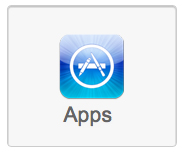
在线演示
代码:
05 |
display: inline-block; |
12 |
border: 1px solid #ccc; |
14 |
text-decoration: none; |
18 |
-webkit-box-shadow: inset 0 1px 2px rgba(0, 0, 0, .3); |
19 |
-moz-box-shadow: inset 0 1px 2px rgba(0, 0, 0, .3); |
20 |
box-shadow: inset 0 1px 2px rgba(0, 0, 0, .3); |
21 |
-webkit-border-radius: 4px; |
22 |
-moz-border-radius: 4px; |
25 |
.applefeature a:hover { |
27 |
background: -webkit-gradient(linear, 0% 0%, 0% 100%, from(#fff), to(#f7f7f7)); |
28 |
background: -moz-linear-gradient(100% 100% 90deg, #f7f7f7, #fff); |
29 |
-webkit-box-shadow: inset 0 1px 2pxrgba(0,0,0,.3); |
30 |
-moz-box-shadow: inset 0 1px 2pxrgba(0,0,0,.3); |
31 |
box-shadow: inset 0 1px 2px rgba(0,0,0,.3); |
32 |
-webkit-border-radius: 4px; |
33 |
-moz-border-radius: 4px; |
39 |
margin: 26px auto 4px; |
45 |
font-family: Arial, Tahoma, sans-serif; |
8. 帧内图片

在线演示
代码:
04 |
-webkit-border-radius: 2px; |
05 |
-moz-border-radius: 2px; |
07 |
-webkit-box-shadow: 1px 2px 1px #d1d1d1; |
08 |
-moz-box-shadow: 1px 2px 1px #d1d1d1; |
09 |
box-shadow: 1px 2px 1px #d1d1d1; |
9. 具有焦点亮度效果的文本框

在线演示
代码:
01 |
.formwrap { display: block; margin-bottom: 15px; } |
03 |
display: inline-block; |
08 |
font-family: Arial, Tahoma, sans-serif; |
11 |
.formwrap .shadowfield { |
15 |
font-family: "Helvetica Neue", Arial, sans-serif; |
22 |
transition: all 0.2s ease-in-out 0s; |
23 |
-webkit-transition: all 0.2s ease-in-out 0s; |
24 |
-moz-transition: all 0.2s ease-in-out 0s; |
25 |
border: 1px solid #ad9c9c; |
26 |
border-radius: 6px 6px 6px 6px; |
27 |
box-shadow: 0 1px rgba(34, 25, 25, 0.2) inset, 0 1px #fff; |
29 |
.formwrap .shadowfield:focus { |
33 |
box-shadow: inset 0 1px rgba(34, 25, 25, 0.2), 0 1px rgba(255, 255, 255, 0.6), 00 7px rgba(235, 82, 82, 0.5); |
34 |
-moz-box-shadow: inset 0 1px rgba(34, 25, 25, 0.2), 0 1pxrgba(255, 255, 255, 0.6), 0 0 7px rgba(235, 82, 82, 0.5); |
35 |
-webkit-box-shadow: inset 0 1px rgba(34, 25, 25, 0.2), 0 1pxrgba(255, 255, 255, 0.6), 0 0 7px rgba(235, 82, 82, 0.5); |
10. 弹性阴影按钮

在线演示
代码:
02 |
display: inline-block; |
03 |
-moz-border-radius: .25em; |
05 |
-webkit-box-shadow: 0 2px 0 0 rgba(0,0,0,0.1), inset 0 -2px 0 0 rgba(0,0,0,0.2); |
06 |
-moz-box-shadow: 0 2px 0 0 rgba(0,0,0,0.1), inset 0 -2px 0 0 rgba(0,0,0,0.2); |
07 |
box-shadow: 0 2px 0 0 rgba(0,0,0,0.1), inset 0 -2px 0 0 rgba(0,0,0,0.2); |
08 |
background-color: #276195; |
09 |
background-image: -moz-linear-gradient(#3c88cc,#276195); |
10 |
background-image: -ms-linear-gradient(#3c88cc,#276195); |
11 |
background-image: -webkit-gradient(linear,left top,leftbottom,color-stop(0%,#3c88cc),color-stop(100%,#276195)); |
12 |
background-image: -webkit-linear-gradient(#3c88cc,#276195); |
13 |
background-image: -o-linear-gradient(#3c88cc,#276195); |
14 |
filter: progid:DXImageTransform.Microsoft.gradient(startColorstr='#3c88cc',endColorstr='#276195',GradientType=0); |
15 |
-ms-filter: "progid:DXImageTransform.Microsoft.gradient(startColorstr='#3c88cc', endColorstr='#276195', GradientType=0)"; |
16 |
background-image: linear-gradient(#3c88cc,#276195); |
20 |
text-decoration: none; |
27 |
text-shadow: 0 1px 0 rgba(0,0,0,0.35); |
28 |
font-family: Arial, Tahoma, sans-serif; |
29 |
-webkit-transition: all linear .2s; |
30 |
-moz-transition: all linear .2s; |
31 |
-o-transition: all linear .2s; |
32 |
-ms-transition: all linear .2s; |
33 |
transition: all linear .2s |
35 |
.blu-btn:hover, .blu-btn:focus { |
36 |
-webkit-box-shadow: 0 2px 0 0 rgba(0,0,0,0.1), inset 0 -2px 0 0rgba(0,0,0,0.3), inset 0 12px 20px 2px #3089d8; |
37 |
-moz-box-shadow: 0 2px 0 0 rgba(0,0,0,0.1), inset 0 -2px 0 0rgba(0,0,0,0.3), inset 0 12px 20px 2px #3089d8; |
38 |
box-shadow: 0 2px 0 0 rgba(0,0,0,0.1), inset 0 -2px 0 0 rgba(0,0,0,0.3), inset 012px 20px 2px #3089d8; |
41 |
-webkit-box-shadow: inset 0 2px 0 0 rgba(0,0,0,0.2), inset 0 12px 20px 6pxrgba(0,0,0,0.2), inset 0 0 2px 2px rgba(0,0,0,0.3); |
42 |
-moz-box-shadow: inset 0 2px 0 0 rgba(0,0,0,0.2), inset 0 12px 20px 6pxrgba(0,0,0,0.2), inset 0 0 2px 2px rgba(0,0,0,0.3); |
43 |
box-shadow: inset 0 2px 0 0 rgba(0,0,0,0.2), inset 0 12px 20px 6pxrgba(0,0,0,0.2), inset 0 0 2px 2px rgba(0,0,0,0.3); |
48 |
display: inline-block; |
49 |
-moz-border-radius: .25em; |
51 |
-webkit-box-shadow: 0 2px 0 0 rgba(0,0,0,0.1), inset 0 -2px 0 0 rgba(0,0,0,0.2); |
52 |
-moz-box-shadow: 0 2px 0 0 rgba(0,0,0,0.1), inset 0 -2px 0 0 rgba(0,0,0,0.2); |
53 |
box-shadow: 0 2px 0 0 rgba(0,0,0,0.1), inset 0 -2px 0 0 rgba(0,0,0,0.2); |
54 |
background-color: #659324; |
55 |
background-image: -moz-linear-gradient(#81bc2e,#659324); |
56 |
background-image: -ms-linear-gradient(#81bc2e,#659324); |
57 |
background-image: -webkit-gradient(linear,left top,leftbottom,color-stop(0%,#81bc2e),color-stop(100%,#659324)); |
58 |
background-image: -webkit-linear-gradient(#81bc2e,#659324); |
59 |
background-image: -o-linear-gradient(#81bc2e,#659324); |
60 |
filter: progid:DXImageTransform.Microsoft.gradient(startColorstr='#81bc2e',endColorstr='#659324',GradientType=0); |
61 |
-ms-filter: "progid:DXImageTransform.Microsoft.gradient(startColorstr='#81bc2e', endColorstr='#659324', GradientType=0)"; |
62 |
background-image: linear-gradient(#81bc2e,#659324); |
66 |
text-decoration: none; |
73 |
text-shadow: 0 1px 0 rgba(0,0,0,0.35); |
74 |
font-family: Arial, Tahoma, sans-serif; |
75 |
-webkit-transition: all linear .2s; |
76 |
-moz-transition: all linear .2s; |
77 |
-o-transition: all linear .2s; |
78 |
-ms-transition: all linear .2s; |
79 |
transition: all linear .2s; |
81 |
.grn-btn:hover, .grn-btn:focus { |
82 |
-webkit-box-shadow: 0 2px 0 0 rgba(0,0,0,0.1), inset 0 -2px 0 0rgba(0,0,0,0.3), inset 0 12px 20px 2px #85ca26; |
83 |
-moz-box-shadow: 0 2px 0 0 rgba(0,0,0,0.1), inset 0 -2px 0 0rgba(0,0,0,0.3), inset 0 12px 20px 2px #85ca26; |
84 |
box-shadow: 0 2px 0 0 rgba(0,0,0,0.1), inset 0 -2px 0 0 rgba(0,0,0,0.3), inset 012px 20px 2px #85ca26; |
87 |
-webkit-box-shadow: inset 0 2px 0 0 rgba(0,0,0,0.2), inset 0 12px 20px 6pxrgba(0,0,0,0.2), inset 0 0 2px 2px rgba(0,0,0,0.3); |
88 |
-moz-box-shadow: inset 0 2px 0 0 rgba(0,0,0,0.2), inset 0 12px 20px 6pxrgba(0,0,0,0.2), inset 0 0 2px 2px rgba(0,0,0,0.3); |
89 |
box-shadow: inset 0 2px 0 0 rgba(0,0,0,0.2), inset 0 12px 20px 6pxrgba(0,0,0,0.2), inset 0 0 2px 2px rgba(0,0,0,0.3); |
|


 浙公网安备 33010602011771号
