在material-ui基础上分装自己的组件库并发布到npm
一. webpack构建项目,创建一个项目文件,文件结构如下

package.json
注意:所有依赖都安装在 devDependencies中;
这里有用到peerDependencies,这里的意思是避免重复依赖,比如@material-ui/core在我的组件库被引入一次,在使用项目中又会再次被引入,避免两次安装冗余,以及两个版本差异带来的分险,所以用到了peerDependencies,具体左右可百度。
{
  "name": "test-library-hybird-libs",
  "version": "1.0.5",
  "description": "",
  //包的入口地址
  "main": "dist/src/widget/index.js",
  "files": [
    "dist"
  ],
  "keywords": [],
  "author": "",
  "license": "MIT",
  "private": false,
  //仓库地址
  "repository": {
    "type": "git",
    "url": "https://www.npmjs.com/package/test-library-hybird-libs"
  },
  //包的主页url
  "homepage": "https://www.npmjs.com/package/test-library-hybird-libs",
  "scripts": {
    "start": "webpack-dev-server --config webpack.dev.config.js",
    "dev": "webpack-dev-server --config webpack.dev.config.js",
    "build": "rimraf ./dist & rimraf ./dist.zip && md dist && webpack --config webpack.prod.config.js "
  },
  "dependencies": {
  },
  "devDependencies": {
    "@babel/core": "7.15.8",
    "@babel/plugin-transform-runtime": "7.16.0",
    "@babel/preset-env": "7.2.3",
    "@babel/preset-react": "7.16.0",
    "@babel/runtime": "7.16.0",
    "babel-loader": "8.2.2",
    "css-loader": "0.28.9",
    "eslint-config-airbnb-base": "14.2.1",
    "eslint-plugin-eslint-plugin": "3.6.1",
    "file-loader": "6.2.0",
    "html-webpack-plugin": "^5.5.0",
    "prop-types": "15.7.2",
    "style-loader": "0.19.1",
    "webpack": "5.58.1",
    "webpack-cli": "4.9.0",
    "webpack-dev-server": "^4.5.0",
    "react": "17.0.2",
    "react-dom": "17.0.2",
    "copy-webpack-plugin": "^4.6.0",
    "@date-io/moment": "1.3.13",
    "@material-ui/core": "4.12.2",
    "@material-ui/data-grid": "4.0.0-alpha.37",
    "@material-ui/icons": "4.11.2",
    "@material-ui/lab": "4.0.0-alpha.60",
    "@material-ui/pickers": "3.3.10",
    "@material-ui/styles": "4.11.4",
    "@material-ui/system": "4.12.1",
    "@mui/x-data-grid": "4.0.0",
    "@mui/x-data-grid-pro": "4.0.0"
  },
  "peerDependencies": {
    "react": "17.0.2",
    "react-dom": "17.0.2",
    "@date-io/moment": "1.3.13",
    "@material-ui/core": "4.12.2",
    "@material-ui/data-grid": "4.0.0-alpha.37",
    "@material-ui/icons": "4.11.2",
    "@material-ui/lab": "4.0.0-alpha.60",
    "@material-ui/pickers": "3.3.10",
    "@material-ui/styles": "4.11.4",
    "@material-ui/system": "4.12.1",
    "@mui/x-data-grid": "4.0.0",
    "@mui/x-data-grid-pro": "4.0.0"
  }
}
webpack.prod.config.js
const path = require('path');
const CopyWebpackPlugin = require('copy-webpack-plugin');

module.exports = {
  mode: 'production',
 // 配置 entry 属性,即构建时的入口。例如:此时组件入口是widget下的index.js。
  entry: {
    main: './src/widget/index.js',
  },
  output: {
    path: path.resolve(__dirname, './dist'),
    publicPath: '/dist',
    filename: 'build.js',
    // 配置 library 和 libraryTarget 属性
    library: 'test-library-hybird-libs',
    libraryTarget: 'umd',
  },
  resolve: {
    extensions: ['.js', '.jsx'],
  },
  module: {
    rules: [
      {
        test: /\.css$/,
        use: ['style-loader', 'css-loader'],
      },
      {
        test: /\.(js|jsx)$/,
        exclude: /(node_modules|bower_components)/,
        use: {
          loader: 'babel-loader',
        },
      },
      {
        test: /\.(woff|woff2|ttf|eot|ico)$/,
        use: [
          {
            loader: 'file-loader',
          },
        ],
      },
    ],
  },
  plugins: [
    new CopyWebpackPlugin([
      {
        from: path.resolve(__dirname, './src'),
        to: path.resolve(__dirname, './dist/src'),
      },
    ]),
  ],
};
二.编写组件
widget/index.js
import Checkbox from './Checkbox';

export { Checkbox };
widget/Checkbox.js
import React from 'react';
import { Checkbox as HACheckbox } from '@material-ui/core';
import PropTypes from 'prop-types';
import checkoutStyles from './style';
import theme from '../../themes/theme';

const CheckBox = ({ className, ...props }) => {
  const classes = checkoutStyles(props);
  return <HACheckbox
    className = {`${classes.checkboxRoot} ${className}`}
    inputProps={{"aria-label":'checkbox'}}
    checked={props.checked}
    onChange={props.onChange}
    color={['default','info','secondary','warning'].indexOf(props.color)>-1?props.color:'default'}
  />
};

CheckBox.propTypes = {
  /**
   * Checkbox color
   */
  color: PropTypes.oneOf(Object.keys(theme.themeColorList)),
  /**
   * Checkbox width
   */
  width: PropTypes.number,
  /**
   * Optional checked
   */
  checked: PropTypes.bool,
  /**
   * Optional default Checked
   */
  defaultChecked: PropTypes.bool,
  /**
   * class Name
   */
  className: PropTypes.string,
  /**
   * Optional change handler
   */
  onChange: PropTypes.func,
};

CheckBox.defaultProps = {
  defaultChecked: false,
  checked: false,
  color: 'default',
};

export default CheckBox;
widget/style.js
import { makeStyles } from '@material-ui/core/styles';

const checkoutStyles = makeStyles((theme) => ({
  checkboxRoot: {
    padding: '2px',
    '@global': {
      '.MuiSvgIcon-root': {
        fill: (props) => theme.themeColorList[props.color] || theme.themeColorList.Primary,
        width: (props) => props.width || '20px',
        height: (props) => props.width || '20px'
      }
    }
  }
}));

export default checkoutStyles;
三.安装依赖并打包组件
npm  i
npm run build
四. 本地模拟发布
打包完成后,继续在组件源码根目录下,执行命令:
npm pack
命令执行后,会在根目录下生成一下.tgz包,然后在需要引入组件的项目中执行以下命令:npm install 本地包路径,本地包路径为刚才生成的.tgz包路径,注意命令中斜杠方向!!!

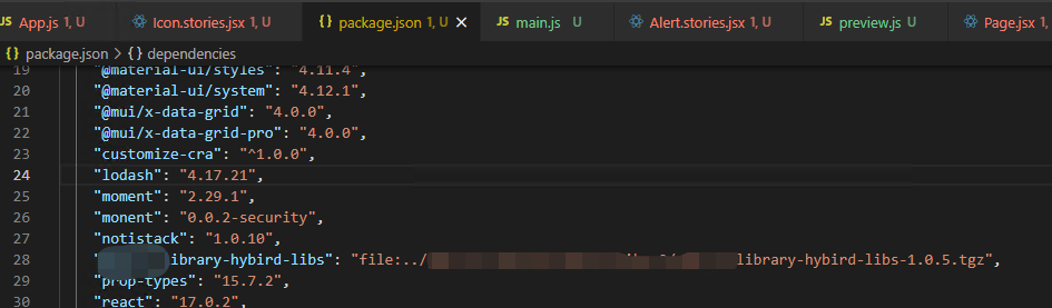
安装后,package中会出现一条依赖,但本条记录会显示文件路径,因为是本地模拟安装的。
到这一步就可以直接测试组件
五.发布组件到npm
1. 注册npm账号,这里不多说了
2. 切换到需要发包的项目根目录下,登录npm账号,输入用户名、密码、邮箱
npm login //登录

npm publish //发布
每次发布到npm上需要更改版本号,即package.json 里的 version 字段不可与已发布的包版本号相同
3.安装组件
npm install 组件名称
六,使用组件
import { MuiThemeProvider, CssBaseline } from '@material-ui/core';
import {CheckBox} from 'test-library-hybird-libs';
import theme from './themes/theme';
import GlobalStyles from './themes/GlobalStyles';

function App() {
  console.log(CheckBox)
  return (
    <MuiThemeProvider theme={theme}>
      <CssBaseline />
      <GlobalStyles />
      test
      <CheckBox color="Primary" checked/>
    </MuiThemeProvider>
  );
}

export default App;

 浙公网安备 33010602011771号