
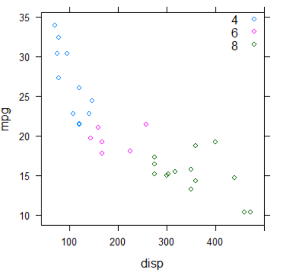
1.分组散点图
①xyplot()函数
> library(lattice)
> xyplot(mpg~disp,                #定义Y~X轴
+ data=mtcars,
+ groups=cyl,                     #定义分组
+ auto.key=list(corner=c(1,1)))   #设置图例
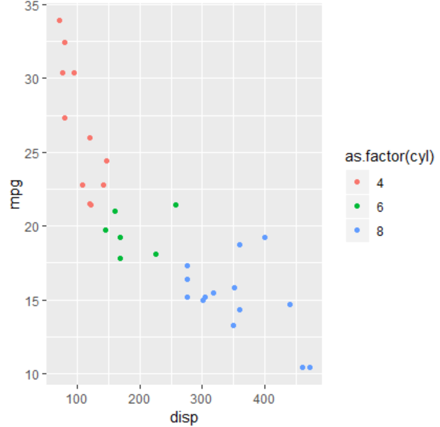
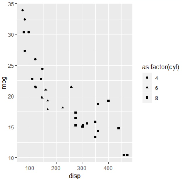
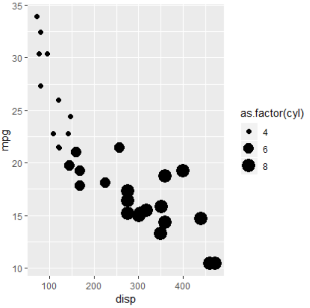
②qplot()函数
> library(ggplot2)                   #加载包
> qplot(disp,mpg,data=mtcars,
+ col= as.factor(cyl))               #用颜色分组
> qplot(disp,mpg,data=mtcars,
+ shape=as.factor(cyl))              #用形状分组
> qplot(disp,mpg,data=mtcars,
+ size=as.factor(cyl))               #用大小分组
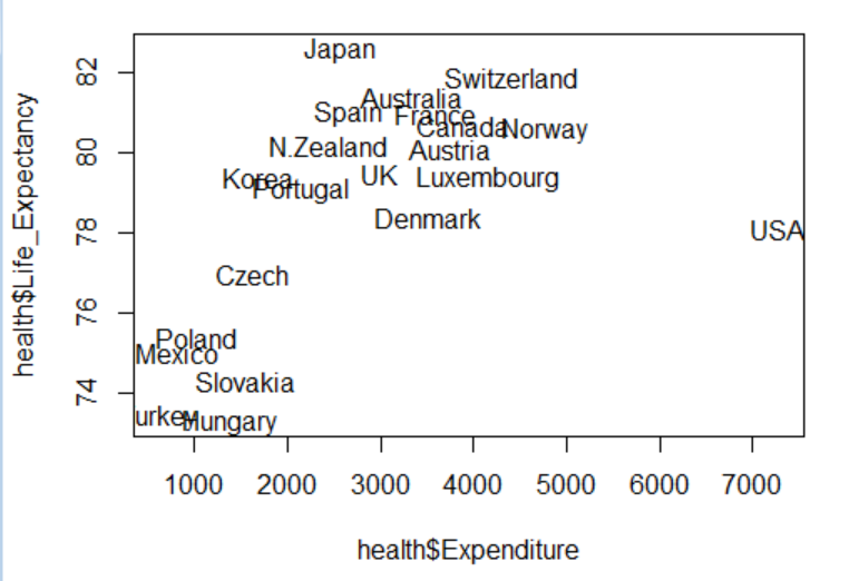
2.添加标识点 #text()函数
> health<-read.csv("HealthExpenditure.csv",header=TRUE)
> plot(health$Expenditure,health$Life_Expectancy,type="n")             #定义X轴,Y轴,以无散点形式画图
> text(health$Expenditure,health$Life_Expectancy,health$Country)       #以坐标添加城市名为标识点
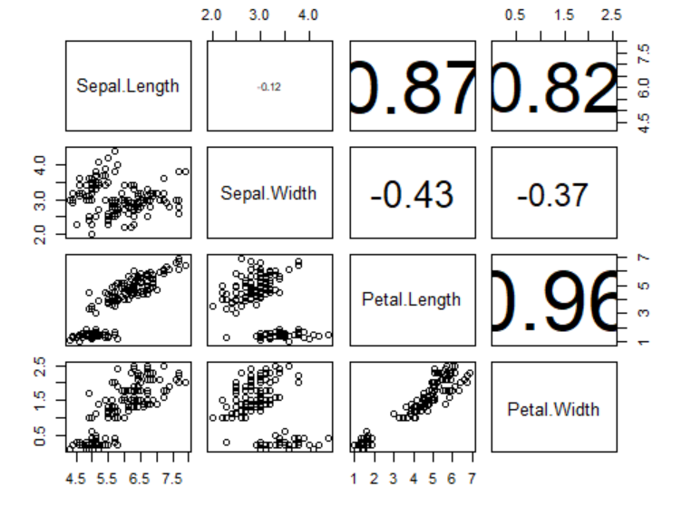
3.相关系数散点图
> panel.cor <- function(x, y, ...)
+ {
+ par(usr = c(0, 1, 0, 1))               #自定义每个坐标系范围
+ txt <- as.character(format(cor(x,      #cor计算相关系数,as.character转换为字符串
+ y), digits=2))                         #digits=2保留两位小数
+ text(0.5, 0.5, txt, cex = 6*           #以(0.5,0.5)的坐标标识相关系数
+ abs(cor(x, y)))                        #数字大小为相关系数的六倍
+ }
> pairs(iris[1:4],                       #以iris数据集的1到4列两两组合画散点图
+ upper.panel=panel.cor)                 #右上方的三角形区域画相关系数代替散点图
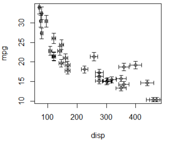
4.误差条 #arrows()函数
> plot(mpg~disp,data=mtcars)
> arrows(x0=mtcars$disp,        #设置起始点
+ y0=mtcars$mpg*0.95,           #设置向下的终点
+ x1=mtcars$disp,
+ y1=mtcars$mpg*1.05,           #设置向上的终点
+ angle=90,                     #设置角度
+ code=3,                       #设置样式
+ length=0.04,                  #设置长度
+ lwd=0.4)                      #设置宽度
> arrows(x0=mtcars$disp*0.95,   #设置向左的终点
+ y0=mtcars$mpg,                #设置起始点
+ x1=mtcars$disp*1.05,
+ y1=mtcars$mpg,
+ angle=90,
+ code=3,
+ length=0.04,
+ lwd=0.4)
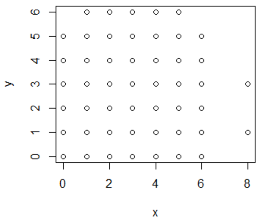
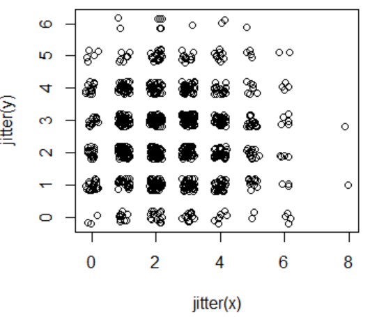
5.密集散点图 #jitter()函数:给向量加上少许噪音
> x <- rbinom(1000, 10, 0.25)    #随机生成1000个均值为10*0.25=2.5的数
> y <- rbinom(1000, 10, 0.25)
> plot(x,y)
> plot(jitter(x), jitter(y))
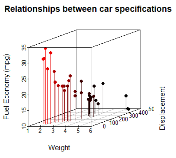
6.三维散点图 #scatterplot3d()函数
> library(scatterplot3d)
> scatterplot3d(x=mtcars$wt,
+ y=mtcars$disp,
+ z=mtcars$mpg)

> scatterplot3d(mtcars$wt,mtcars$disp,mtcars$mpg,
+ pch=16,                                              #实心散点
+ highlight.3d=TRUE,                                   #设置渐变颜色
+ angle=20,                                            #X和Y轴的夹角
+ xlab="Weight",
+ ylab="Displacement",
+ zlab="Fuel Economy (mpg)",
+ type="h",                                            #画散点垂直线
+ main="Relationships between car specifications")
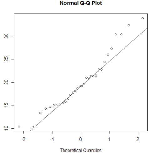
7.QQ图(检验数据是否服从正态分布)
> qqnorm(mtcars$mpg)        #画散点
> qqline(mtcars$mpg)        #画线(如果为一条直线,则数据服从正态分布)
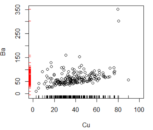
8.密度表示 #rug()函数
> metals<-read.csv("metals.csv")
> plot(Ba~Cu,data=metals,xlim=c(0,100))  #画散点图
> rug(metals$Cu)                         #密度表示(默认画在X轴方向)
> rug(metals$Ba,
+ side=2,                                #在Y轴方向表示
+ col="red",
+ ticksize=0.02)                         #设置长度
9.雾化散点图 #smoothScatter()函数
> n <- 10000
> x <- matrix(rnorm(n), ncol=2)
> y <- matrix(rnorm(n, mean=3,sd=1.5), ncol=2)
> smoothScatter(x,y)

