小程序 模态对话框自定义组件(modal)
1. 概述
1.1 说明
小程序中使用wx.showModal(Object object)打开一个模态对话框,但是目前小程序所提供的modal中的内容显示比较死板,不能够完全满足工作中所遇到的功能信息,故做一个自定义组件来处理相关的功能任务。
自定义组件所需功能:
- 全屏蒙版
- 模态对话框的显示内容:标题、内容、操作按钮
- 对模态框的操作,如显示与隐藏,取消按钮是否显示,按钮对应标题颜色等
- 模态对话框内容信息能够自定义操作
1.2 自定义组件
1.2.1 概述
多个页面中会存在相同功能模块或类似功能模块,此时就可以把这些相同或类似的功能模块抽象成自定义组件,进行减少工作量的开展与后期维护;也可对复杂的页面拆分功能模块处理。
小程序中的自定义组件也是由 json 、wxml 、wxss 、js 4个文件组成,直接右键点击新建component:
-
- json -- json文件中 "component": true (即显示声明自定义组件),则代表这个文件(json&wxml&wxss&js)为自定义组件
- wxml -- wxml文件中进行编写自定义组件结构,其中组件中可使用<slot>节点去承载组件引用时所提供的子节点信息,即组件中写入<slot></slot>的地方,在页面中引用时可以执行定义节点信息。
- wxss -- wxss文件中编写组件的样式,使用类选择器进行处理。
- js -- js文件是定义组件的组件构造器Component({***}),包含组件对外属性properties,组件内部数据data,组件方法methods等
1.2.2 引用
使用已注册(json中显示声明component为true)的自定义组件前,需要先在页面的json文件中引用声明,自定义组件的标签名和组件文件路径:
{
  "usingComponents": {
    "component-tag-name": "path/to/the/custom/component"
  }
}
页面中引用:
<view>
  <!-- 以下是对一个自定义组件的引用 -->
  <component-tag-name 属性="属性值"></component-tag-name>
</view>
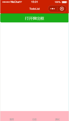
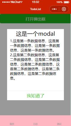
1.3 自定义组件图例
2. 代码
码云: https://gitee.com/ajuanK/wxSimpleTodoList.git
2.1 组件页面设计(wxml)
对话框中内容:标题、内容、操作按钮,其中内容使用slot去承接页面中自定义节点,按钮可以单按钮显示并更改其对应显示内容与颜色。
<view class='modal-wrapp' wx:if='{{modal.show}}'>
  <view class='modal-main' style='height:{{(modal.height)?modal.height:modalDefault.height}}'>
    <view class='modal-title'>{{(modal.title)?modal.title:modalDefault.title}}</view>
    <scroll-view scroll-y class='modal-content'>
      <slot></slot>
    </scroll-view>
    <view class='modal-button'>
      <view class='modal-cancel' style='color:{{(modal.cancelColor)?modal.cancelColor:modalDefault.cancelColor}}' wx:if='{{modal.showCancel}}' bindtap="modalCancel">{{(modal.cancelText)?modal.cancelText:modalDefault.cancelText}}</view>
      <view class='modal-confirm' style='color:{{(modal.confirmColor)?modal.confirmColor:modalDefault.confirmColor}}' bindtap="modalConfirm">{{(modal.confirmText)?modal.confirmText:modalDefault.confirmText}}</view>
    </view>
  </view>
</view>
2.2 组件构造器(js)
使用modal对象去承接弹出框相关配置,modalDefault对象配置默认数据信息,按钮点击事件触发返回事件success
Component({
  /**
   * 组件的属性列表
   *  show: false,//modal是否显示,默认false
      height: '',//modal显示内容高度,默认为50%
      title: '',//modal标题,默认提示
      showCancel: false,//是否显示取消按钮,默认显示
      cancelText: '取消',//取消按钮标题,默认为取消
      cancelColor: '',//取消按钮标题颜色,默认为#000000
      confirmText: '',//确定按钮标题,默认为确定
      confirmColor: '',//确定按钮标题颜色,默认为#3cc51f
      clickClose:true//点击取消或确认按钮后是否关闭modal,默认为true
   */
  properties: {
    modal: {
      type: Object,
      value: {
        show: false,
        height: '',
        title: '',
        showCancel: true,
        cancelText: '取消',
        cancelColor: '',
        confirmText: '',
        confirmColor: '',
        clickClose: true
      }
    }
  },

  /**
   * 组件的初始数据
   */
  data: {
    modalDefault: {
      show: false,
      height: '50%',
      title: '提示',
      showCancel: true,
      cancelText: '取消',
      cancelColor: '#000000',
      confirmText: '确定',
      confirmColor: '#3cc51f',
      clickClose: true
    }
  },

  /**
   * 组件的方法列表
   */
  methods: {
    /**
     * 取消按钮事件
     */
    modalCancel() {
      this.modalShowChange();
      this.triggerEvent('success', {
        res: 'cancel'
      })
    },
    /**
     * 确定按钮事件
     */
    modalConfirm() {
      this.modalShowChange();
      this.triggerEvent('success', {
        res: 'confirm'
      })
    },
    /**
     * 弹框显示属性更改
     */
    modalShowChange: function() {
      let clickClose = this.data.modalDefault.clickClose;
      if (this.data.modal && this.data.modal.clickClose != undefined) {
        if (this.data.modal.clickClose == false) {
          clickClose = false
        }
      }
      if (clickClose) {
        let objModal = {
          show: false
        }
        this.setData({
          modal: objModal
        })
      }
    }
  }
})
2.3 组件配置(json)
{
  "component": true,
  "usingComponents": {}
}
2.4 组件样式(wxss)
.modal-wrapp{
  position: fixed;
  left: 0;
  right: 0;
  top: 0;
  bottom: 0;
  display: flex;
  justify-content: center;
  align-items: center;
  background-color: rgba(0,0,0,0.4);
  z-index: 9999;
}
.modal-main{
  width: 80%;
  background-color: #fff;
  display: flex;
  flex-direction: column;
  justify-content: space-between;
  align-items: center;
}
.modal-title{
  font-size: 60rpx;
  height: 100rpx;
  line-height: 100rpx;
}
.modal-content{
  flex: 1;
  width: 100%;
  overflow: hidden;
}
.modal-content-scroll{
  margin-left: 32rpx;
  margin-right: 32rpx;
}
.modal-button{
  font-size: 48rpx;
  width: 100%;
   height: 100rpx;
  line-height: 100rpx;
  display: flex;
  flex-direction: row;
  border-top: 2rpx solid rgba(7,17,27,0.1);

}
.modal-cancel, .modal-confirm{
  flex: 1;
  height: 100rpx;
  line-height: 100rpx;
  text-align: center;
}
.modal-cancel{
  border-right: 2rpx solid rgba(7,17,27,0.1);
}
2.5 页面使用(json)
自定义组件是在与pages同一目录下的components文件夹中的modal中。
{
  "usingComponents": {
    "modal":"../../components/modal/index"
  }
}
2.6 页面使用(wxml)
使用 catchtouchmove="ture" 处理弹出对话框后下边滚动条穿透问题
<view>
  <button class="buttonClass" type="primary" bindtap='showModal'>打开弹出框</button>
  <modal modal="{{modal}}" bindsuccess='modalOperate' catchtouchmove="ture">
    <view class='modal-content' wx:for="{{content}}">{{item.text}}</view>
  </modal>
</view>
2.7 页面使用(js)
Page({

  /**
   * 页面的初始数据
   */
  data: {
    modal: {},
    content: [{
        text: '1.这是第一条数据信息,这是第一条数据信息,这是第一条数据信息,这是第一条数据信息。'
      },
      {
        text: '2.这是第二条数据信息,这是第二条数据信息,这是第二条数据信息,这是第二条数据信息,这是第二条数据信息,这是第二条数据信息,这是第二条数据信息。'
      }
    ]
  },
  showModal: function() {
    let objModal = {
      show: true,
      title: '这是一个modal',
      showCancel: false,
      height: '70%',
      confirmText: '我知道了'
    }
    this.setData({
      modal: objModal
    })
  },
  /**
   * 弹框按钮操作事件
   * @res 取消/确定按钮的相关信息
   */
  modalOperate: function(res) {
    if (res.detail.res == 'confirm') {
      console.log('confirm')
    } else if (res.detail.res == 'cancel') {
      console.log('cancel')
    }
  }
})
2.8 页面使用(wxss)
.modal-content{
  margin-left: 32rpx;
  margin-right: 32rpx;
}
.buttonClass{
  height: 100rpx
}

 浙公网安备 33010602011771号