css3学习笔记(一)
1. IE下的渐变: filter:progid:DXImageTransform.Microsoft.gradient(startColorstr='#ffffff',endColorstr='#ff0000',GradientType='0');
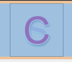
2.多背景:background:url(Images/c.png) no-repeat 0 0,url(Images/s-1.png) no-repeat 0 0;


<!DOCTYPE html>
<html xmlns="http://www.w3.org/1999/xhtml">
<head>
<meta http-equiv="Content-Type" content="text/html; charset=utf-8"/>
    <title></title>
    <style>
        .box
        {
            width:170px; height:170px; margin:0 auto; border:1px solid #000; background:url(Images/c.png) no-repeat 0 0,url(Images/s-1.png) no-repeat 0 0; -webkit-transition:1s all ease; /*后一个背景又叠加在前一个的下边*/
        }
            .box:hover
            {
                background-position:-170px -170px,0 0;
            }
    </style>
</head>
<body>
    <div class="box"></div>
</body>
</html>

<!DOCTYPE html>
<html xmlns="http://www.w3.org/1999/xhtml">
<head>
<meta http-equiv="Content-Type" content="text/html; charset=utf-8"/>
    <title></title>
    <style>
        body
        {
            background:#000;
        }
        .box
        {
           width:738px; text-align:center; font-weight:bold; margin:0 auto; font-size:100px; font-family:'Microsoft YaHei'; color:rgba(255,255,255,0.2);
           background:-webkit-linear-gradient(-30deg,rgba(255,255,255,0.1) 10%,rgba(255,255,255,1) 20%,rgba(255,255,255,0) 30%); -webkit-background-clip:text; -webkit-transition:1s linear all;
        }
        .box:hover
        {
                background-position:500px 0;
        }
    </style>
</head>
<body>
    <div class="box">人气不过肥皂泡</div>
</body>
</html>
3.rgba:
background:rgba(0,0,0,0.4);
4.背景图裁切 background-clip

<!DOCTYPE html>
<html xmlns="http://www.w3.org/1999/xhtml">
<head>
<meta http-equiv="Content-Type" content="text/html; charset=utf-8"/>
    <title></title>
    <style>
        .box
        {
            width:500px; height:200px; background:url(Images/a4.jpg); border:20px solid rgba(0,0,0,0.3); padding:20px;margin:0 auto; font-size:80px; font-family:"Microsoft YaHei";font-weight:bold; color:rgba(0,0,0,0.1); -webkit-background-clip:text; -webkit-transition:1s background-position linear;
        }
            .box:hover
            {
                background-position:0 1000px;
            }
    </style>
</head>
<body>
    <div class="box">
        我们都没错,只是不适合!
    </div>

</body>
</html>
5.背景图大小设置 background-size:20px 20px;
<!DOCTYPE html>
<html xmlns="http://www.w3.org/1999/xhtml">
<head>
<meta http-equiv="Content-Type" content="text/html; charset=utf-8"/>
    <title></title>
    <style>
        .box
        {
            width:800px;height:300px; margin:0 auto; background:url(Images/new_bg.png) no-repeat center; border:1px solid #000; background-size:20px 20px; -webkit-transition:1s all linear;
        }
        .box:hover
        {background-size:200px 200px;
        }
    </style>
</head>
<body>
    <div class="box"></div>
</body>
</html>
例:背景全屏固定显示: body{margin:0;height:1000px;background:url(miaov.png) no-repeat fixed; background-size:100% 100%;}
6.背景图原点设置
background-origin:content-box;
7.盒模型阴影 box-shadow:10px 10px 10px 4px rgba(0,0,0,0.8);
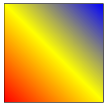
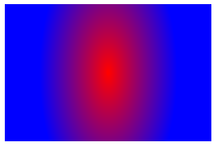
<!DOCTYPE html>
<html xmlns="http://www.w3.org/1999/xhtml">
<head>
<meta http-equiv="Content-Type" content="text/html; charset=utf-8"/>
    <title></title>
    <style>
        .box
        {
            width:200px; height:200px; border:1px solid #000; background:-webkit-linear-gradient(45deg,red 0%,yellow 50%,blue 100%);/*角度是逆时针的*/
        }
    </style>
</head>
<body>
    <div class="box"></div>
</body>
</html>
例2:-webkit-repeating-linear-gradient()
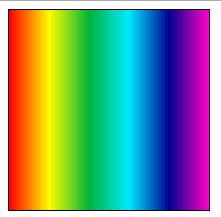
<!DOCTYPE html>
<html xmlns="http://www.w3.org/1999/xhtml">
<head>
<meta http-equiv="Content-Type" content="text/html; charset=utf-8"/>
    <title></title>
    <style>
        .box
        {
            width:200px; height:200px; border:1px solid #000; background:-webkit-repeating-linear-gradient(left,#f00,#fffc00,#01b439,#00eaff,#000390,#ff00c6),
        }
    </style>
</head>
<body>
    <div class="box"></div>
</body>
</html>
9.渐变配合背景 background:-webkit-linear-gradient(left top,#fff 0%,rgba(255,255,255,0) 40%,rgba(255,255,255,0) 50%,rgba(255,255,255,1) 50%,rgba(255,255,255,1) 60%,rgba(255,255,255,0) 60%,rgba(255,255,255,0) 70%,rgba(255,255,255,1) 70%),url(Images/new_bg.png) no-repeat;

<!DOCTYPE html>
<html xmlns="http://www.w3.org/1999/xhtml">
<head>
<meta http-equiv="Content-Type" content="text/html; charset=utf-8"/>
    <title></title>
    <style>

        .box
        {
            width:440px; height:300px; background:-webkit-linear-gradient(left top,#fff 0%,rgba(255,255,255,0) 40%,rgba(255,255,255,0) 50%,rgba(255,255,255,1) 50%,rgba(255,255,255,1) 60%,rgba(255,255,255,0) 60%,rgba(255,255,255,0) 70%,rgba(255,255,255,1) 70%),url(Images/new_bg.png) no-repeat;
        }
    </style>
</head>
<body>
    <div class="box"></div>
</body>
</html>
10.渐变旋转 background:-webkit-linear-gradient(0deg,#ff6e02 0%,#fffc00 50%,#ff6e02 100%);
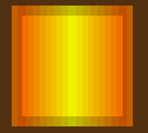
<!DOCTYPE html>
<html xmlns="http://www.w3.org/1999/xhtml">
<head>
<meta http-equiv="Content-Type" content="text/html; charset=utf-8"/>
    <title></title>
    <style>
        body{background:#5e3612;}
        #box
        {
            width:200px; height:200px;margin:30px auto; border:20px solid rgba(0,0,0,0.2); background:-webkit-linear-gradient(0deg,#ff6e02 0%,#fffc00 50%,#ff6e02 100%);
        }
    </style>
    <script>
        window.onload = function () {
            var oBox = document.getElementById("box");
            oBox.iDeg = 0;
            oBox.onmouseover = function () {
                move(oBox, 360);
            }
            oBox.onmouseout = function () {
                move(oBox, 0);
            }
        }
        function move(obj, iTarget) {
            if (obj.timer) {
                clearInterval(obj.timer);
            }
            if (iTarget > obj.iDeg) {
                var iSpeed = 5;
            }
            else {
                var iSpeed = -5;
            }
            obj.timer = setInterval(function () {
                if (obj.iDeg == iTarget) {
                    clearInterval(obj.timer);
                }
                else {

                    obj.iDeg += iSpeed;
                    obj.style.background = "-webkit-linear-gradient(" + obj.iDeg + "deg,#ff6e02 0%,#fffc00 50%,#ff6e02 100%)";
                }
            }, 14);
        }
    </script>
</head>
<body>
    <div id="box"></div>
</body>
</html>


 浙公网安备 33010602011771号