居中的几种方式
1,margin:0 auto;
2,text-align:center;
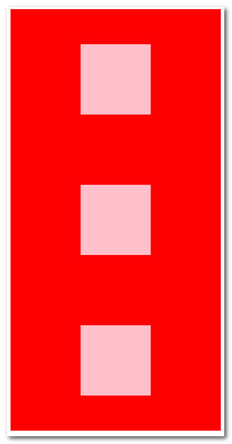
3. 弹性布局 适合于居中元素 宽高未知的情况
<!DOCTYPE html>
<html>
<head>
  <title></title>
  <style type="text/css">
     .container {
      width:600px;
      height:800px;
      background:red;
      margin:0 auto;
      display:flex;
      flex-direction: column;
      align-items: center;
      justify-content: space-around;
     }
     .items {
      width:100px;
      height:100px;
      background:pink;
     }
  </style>
</head>
<body>

<div class="container">
  <div class="items"></div>
  <div class="items"></div>
  <div class="items"></div>
</div>


<script src="http://mat1.gtimg.com/libs/jquery/1.12.0/jquery.js"></script>
</body>
</html>
4.绝对定位居中的方式 适合于居中元素宽高固定的情况下。
<!DOCTYPE html>
<html>
<head>
  <title></title>
  <style type="text/css">
     .div1 {
      width:300px;
      height:600px;
      margin:0 auto;
      position:relative;
      background:#ccc;
     }
     .div2 {
       width:30px;
       height:20px;
       background: red;
       position:absolute;
       top:50%;
       left:50%;
       margin-left:-15px;
       margin-top:-10px;
     }
  </style>
</head>
<body>
<div class="div1">
    <div class="div2"></div>
</div>


<script src="http://mat1.gtimg.com/libs/jquery/1.12.0/jquery.js"></script>
</body>
</html>

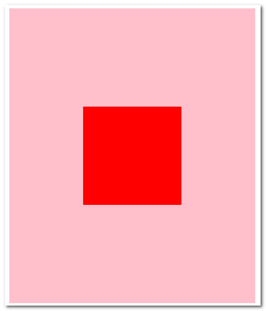
5.通过CSS3属性的方式也可以实现居中的效果;对于宽高不知的情况下,用这个方法比较好
<!DOCTYPE html>
<html>
<head>
  <title></title>
  <style type="text/css">
      .div1 {
        width:500px;
        height:600px;
        background:pink;
        margin:0 auto;
        position:relative;

      }
      .div2 {
        position:absolute;
        top:50%;
        left:50%;
        transform:translate(-50%,-50%);
        background: red;
        padding:100px;
      }
  </style>
</head>
<body>
<div class="div1">
    <div class="div2"></div>
</div>


<script src="http://mat1.gtimg.com/libs/jquery/1.12.0/jquery.js"></script>
</body>
</html>
用心努力学习才会有收获
既然选择远方,便只顾风雨兼程

 浙公网安备 33010602011771号