
css3中的 @Keyframes
一、介绍
keyframes被称为关键帧,其类似于Flash中的关键帧。在CSS3中其主要以“@keyframes”开头,后面跟着是动画名称加上一对花括号“{…}”,括号中是一些不同时间段样式规则。
语法:@keyframes animationname {keyframes-selector{css-styles;}}
在@keyframes中定义动画名称时,其中0%和100%还可以使用关键词from和to来代表,其中0%对应的是from,100%对应的是to。
在一个“@keyframes”中的样式规则可以由多个百分比构成的,如在“0%”到“100%”之间创建更多个百分比,分别给每个百分比中给需要有动画效果的元素加上不同的样式,从而达到
一种在不断变化的效果。
举个栗子:
@keyframes changecolor{
  0%{
    background: red;
  }
  20%{
    background:blue;
  }
  40%{
    background:orange;
  }
  60%{
    background:green;
  }
  80%{
    background:yellow;
  }
  100%{
    background: red;
  }
}
div {
  width: 150px;
  height: 100px;
  background: red;
  color:#fff;
  margin: 20px auto;
}
div:hover {
  animation: changecolor 5s ease-out .2s;
}

二 调用动画
animation-name属性主要是用来调用 @keyframes 定义好的动画。需要特别注意: animation-name 调用的动画名需要和“@keyframes”定义的动画名称完全一致(区分大
小写),如果不一致将不具有任何动画效果。
注意:需要在 Chrome 和 Safari 上面的基础上加上-webkit-前缀,Firefox加上-moz-。
/*
注意translate变化的坐标位置
四个角顺时针的坐标(0,0) (100,0) (100,100) (0,100)
因为圆半径为10
所以圆运动的坐标点得在角原来的坐标上-10px
 animation-delay设置0s,这样动画就不会有延迟
*/
@keyframes around{
  0% {
    transform: translate(-10px,-10px);
  }
  25%{
    transform: translate(90px,-10px);
  }
  50%{
    transform: translate(90px, 90px);
  }
  75%{
    transform:translate(-10px,90px);
  }
  100%{
    transform: translate(-10px,-10px);
  }
}
div {
  width: 100px;
  height: 100px;
  border: 1px solid #000;
  margin: 20px auto;
}
div span {
  display: inline-block;
  width: 20px;
  height: 20px;
  background: orange;
  border-radius: 100%;
  /*调用动画名*/
  animation-name:around;
  animation-duration: 10s;
  animation-timing-function: ease;
  animation-delay: 0s;
  /*动画无限循环*/
  animation-iteration-count:infinite;
}

三、设置动画的播放次数
animation-iteration-count属性主要用来定义动画的播放次数。
语法:animation-iteration-count: infinite | <number>
默认值为1,取值为infinite时,动画将无限次播放
@keyframes move {
  0%{
    transform: translate(0);
  }
  15%{
    transform: translate(50px,80px);
  }
  30%{
    transform: translate(100px,0);
  }
  45%{
    transform: translate(150px,80px);
  }
  60%{
    transform:translate(200px,0);
  }
  75%{
    transform: translate(250px,80px);
  }
  100%{
    transform: translate(300px,0);
  }
}

div {
  width:320px;
  height: 100px;
  border: 1px solid #000;
  margin: 20px auto;
}
div span {
  display: inline-block;
  width: 20px;
  height: 20px;
  background: green;
  border-radius: 100%;
  animation-name:move;
  animation-duration: 10s;
  animation-timing-function:ease;
  animation-delay:.1s;
  animation-iteration-count:infinite;
}
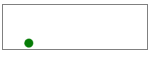
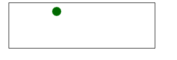
四、设置动画播放方向
animation-direction属性主要用来设置动画播放反向
语法:animation-direction:normal | alternate
- normal是默认值,如果设置为normal时,动画的每次循环都是向前播放;
- 另一个值是alternate,他的作用是,动画播放在第偶数次向前播放,第奇数次向反方向播放。
在上面栗子的 div span{…}加上animation-direction:alterate, 如图
五、设置动画的播放状态
animation-play-state属性主要用来控制元素动画的播放状态
有两个参数:running, paused
其中running是其默认值,主要作用就是类似于音乐播放器一样,可以通过paused将正在播放的动画停下来,也可以通过running将暂停的动画重新播放,这里的重新播放不一定
是从元素动画的开始播放,而是从暂停的那个位置开始播放。另外如果暂停了动画的播放,元素的样式将回到最原始设置状态。
@keyframes move {
  0%{
    transform: translateY(40px);
  }
  15%{
    transform: translate(40px,40px);
  }
  30%{
    transform: translate(40px,80px);
  }
  45%{
    transform: translate(40px,40px);
  }
  60%{
    transform: translate(40px,0);
  }
  75%{
    transform: translate(40px,40px);
  }
  90%{
    transform: translate(80px,40px);
  }
  100%{
    transform: translateY(40px);
  }
}

div {
  width: 100px;
  height: 100px;
  border: 1px solid red;
  margin: 20px auto;
}
span {
  display: inline-block;
  width: 20px;
  height: 20px;
  background: orange;
  transform: translateY(90px);
  animation-name: move;
  animation-duration: 10s;
  animation-timing-function: ease-in;
  animation-delay: 0s;
  animation-iteration-count:infinite;
  animation-direction:alternate;
   animation-play-state:paused;
}
div:hover span {
  animation-play-state:running;
}
六、设置动画时间外属性
animation-fill-mode属性定义在动画开始之前和结束之后发生的操作。有四个属性值:none | forwards | backwords |both
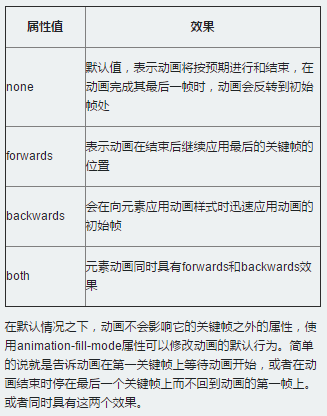
比如,如果想让动画停在最后一幀处:animation-fill-mode:forward;

 浙公网安备 33010602011771号