
css基础2
CSS基础二
在现代网页设计中,css提供了强大的样式控制能力,本文中我们会继续了解css的其他核心概念
一.超链接伪类
就是超链接在不同状态下的样子。比如:
-
没点过的链接是一种颜色(默认蓝色)
-
鼠标放上去时变个色或加下划线
-
点过之后变成另一种颜色(默认紫色)
这些不同状态的样式设置,就靠伪类实现。
<!DOCTYPE html>
<html lang="en">
<head>
<meta charset="UTF-8">
<title>Title</title>
<style>
/*默认的颜色*/
a{
text-decoration: none;
color: darkslategrey;
}
/*鼠标悬浮的颜色(只需要记住hover)*/
a:hover{
color:orange;
font-size: 50px;
}
/*鼠标按住未释放的颜色*/
a:active{
color: #3636d2;
}
</style>
</head>
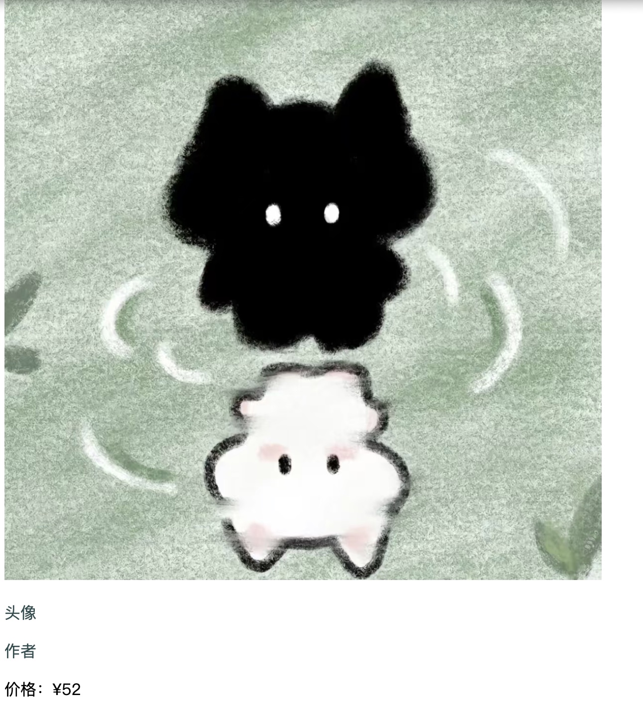
<body><a href="#">
<img src="../img/cf79334e52770746b707b4001c8f8958.jpg" height="600" width="600"/></img>
</a>
<p>
<a href="#">头像</a>
</p>
<p>
<a href="">作者</a>
</p>
<p>
价格:¥52
</p>
</body>
</html>
效果如下:
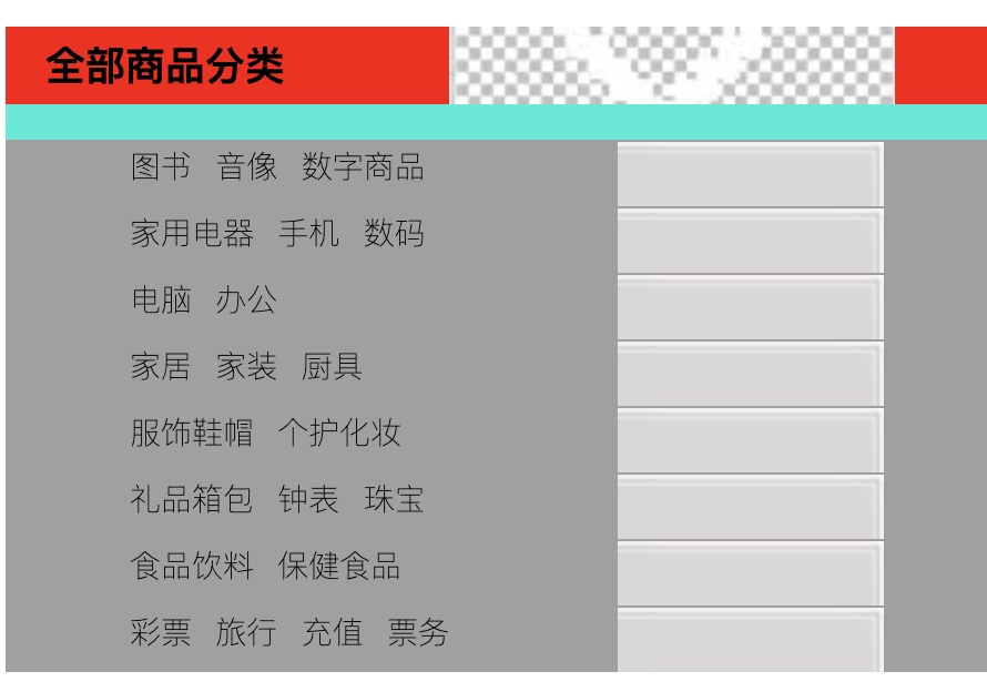
二. 列表样式
控制列表(比如带圆点、数字的列表)长啥样.
以下图为例:
<!DOCTYPE html>
<html lang="en">
<head>
<meta charset="UTF-8">
<title>Title</title>
<style>
#nav{
font-weight:100;
background: #0eecd7;
}
.title{
font-size: 18px;
font-weight: bold;
text-indent: 1em;
line-height: 35px;
background: red;
}
/*ul li*/
/*
list-style:
none 去掉原点
circle 空心圆
decimal 数字
square 正方形
*/
ul{
background: #a0a0a0;
}
ul li{
height: 30px;
list-style: none;
text-indent: 1em;
}
a{
text-decoration: none;
font-size: 14px;
color: #000;
}
a:hover{
color: orange;
text-decoration: underline;
}
</style>
</head>
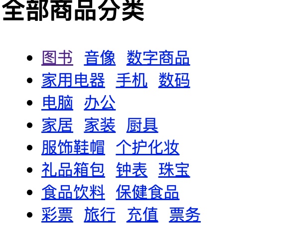
<body>
<div id="nav">
<link href="style.css" rel="stylesheet" type="text/css"/>
<h2 class="title">全部商品分类</h2>
<ul>
<li><a href=" ">图书</a > <a href="#">音像</a > <a href="#">数字商品</a ></li>
<li><a href="#">家用电器</a > <a href="#">手机</a > <a href="#">数码</a ></li>
<li><a href="#">电脑</a > <a href="#">办公</a ></li>
<li><a href="#">家居</a > <a href="#">家装</a > <a href="#">厨具</a ></li>
<li><a href="#">服饰鞋帽</a > <a href="#">个护化妆</a ></li>
<li><a href="#">礼品箱包</a > <a href="#">钟表</a > <a href="#">珠宝</a ></li>
<li><a href="#">食品饮料</a > <a href="#">保健食品</a ></li>
<li><a href="#">彩票</a > <a href="#">旅行</a > <a href="#">充值</a > <a href="#">票务</a >
</li>
</ul>
</div>
</body>
</html>
效果如下:
三.背景
给网页元素(比如盒子、段落)加背景。可以是:
-
单一颜色的背景(比如灰色的div块)
-
图片背景(比如网页顶部用一张图当背景)
-
还能设置背景图是否重复、位置在哪
<!DOCTYPE html>
<html lang="en">
<head>
    <meta charset="UTF-8">
    <title>Title</title>
    <style>
        div{
            width: 100px;
            height: 100px;
            border: 1px solid red;
            background-image: url("cf79334e52770746b707b4001c8f8958.jpg");
            /*默认是全部平铺的 repeat*/
        }
       .div1{
            background-repeat: repeat-x;
        }
        .div2{
            background-repeat: repeat-y;
        }
    </style>
</head>
<body>
<div class="div1"></div>
<div class="div2"></div>
</body>
</html>
效果如下:
图像应用
<!DOCTYPE html>
<html lang="en">
<head>
<meta charset="UTF-8">
<title>Title</title>
<style>
#nav{
font-weight:100;
background: #0eecd7;
}
.title{
font-size: 18px;
font-weight: bold;
text-indent: 1em;
line-height: 35px;
/*颜色,图片,图片位置*/
background:red url("16.jpg") 200px no-repeat}
ul{
background: #a0a0a0;
}
ul li{
height: 30px;
list-style: none;
text-indent: 1em;
background-image: url("12.jpg");
background-repeat: no-repeat;
background-position:236px 2px;
}
a {
text-decoration: none;
font-size: 14px;
color: #000;
}
</style>
</head>
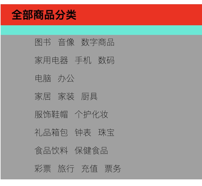
<body>
<div id="nav">
<link href="style.css" rel="stylesheet" type="text/css"/>
<h2 class="title">全部商品分类</h2>
<ul>
<li><a href=" ">图书</a > <a href="#">音像</a > <a href="#">数字商品</a ></li>
<li><a href="#">家用电器</a > <a href="#">手机</a > <a href="#">数码</a ></li>
<li><a href="#">电脑</a > <a href="#">办公</a ></li>
<li><a href="#">家居</a > <a href="#">家装</a > <a href="#">厨具</a ></li>
<li><a href="#">服饰鞋帽</a > <a href="#">个护化妆</a ></li>
<li><a href="#">礼品箱包</a > <a href="#">钟表</a > <a href="#">珠宝</a ></li>
<li><a href="#">食品饮料</a > <a href="#">保健食品</a ></li>
<li><a href="#">彩票</a > <a href="#">旅行</a > <a href="#">充值</a > <a href="#">票务</a >
</li>
</ul>
</div>
</body>
</html>
效果如下:
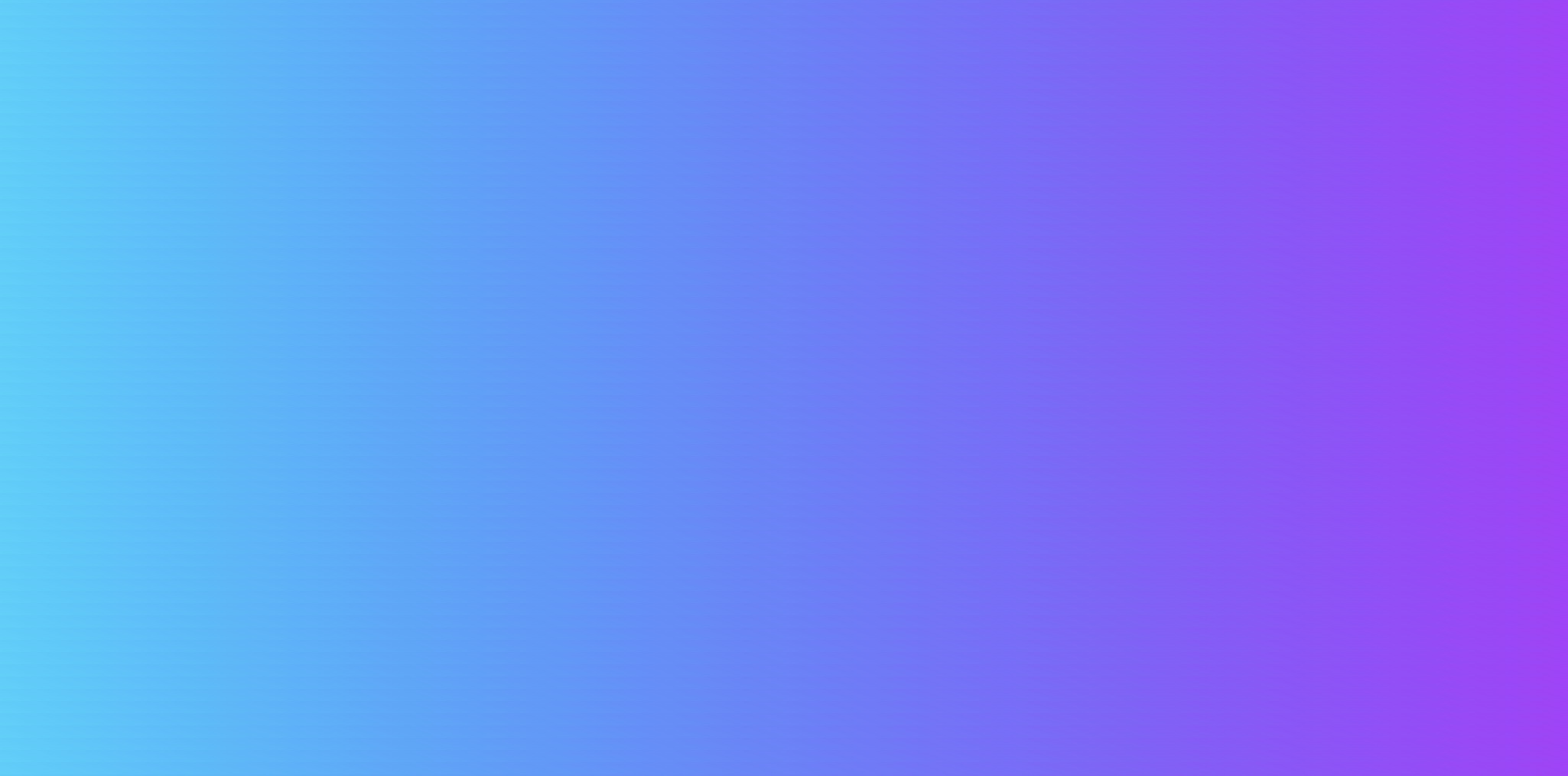
四.渐变
背景的一种特殊效果,颜色会慢慢过渡。比如:
-
从红色慢慢变成蓝色的按钮
-
从上到下由浅到深的网页背景
-
绕着一个点转圈变颜色的圆形渐变
<!DOCTYPE html>
<html lang="en">
<head>
    <meta charset="UTF-8">
    <title>Title</title>
    <!--径向渐变,圆形渐变-->
    <style>
        body {
            background-color: #21D4FD;
            background-image: linear-gradient(19deg, #21D4FD 0%, #B721FF 100%);
        }
    </style>
</head>
<body>

</body>
</html>
效果如下:
五.盒子模型
网页里所有元素(文字、图片、按钮等)都像一个“盒子”。
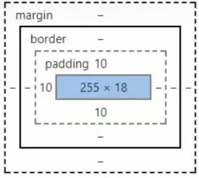
-
margin:外边距
-
padding:内边距
bogder:边框
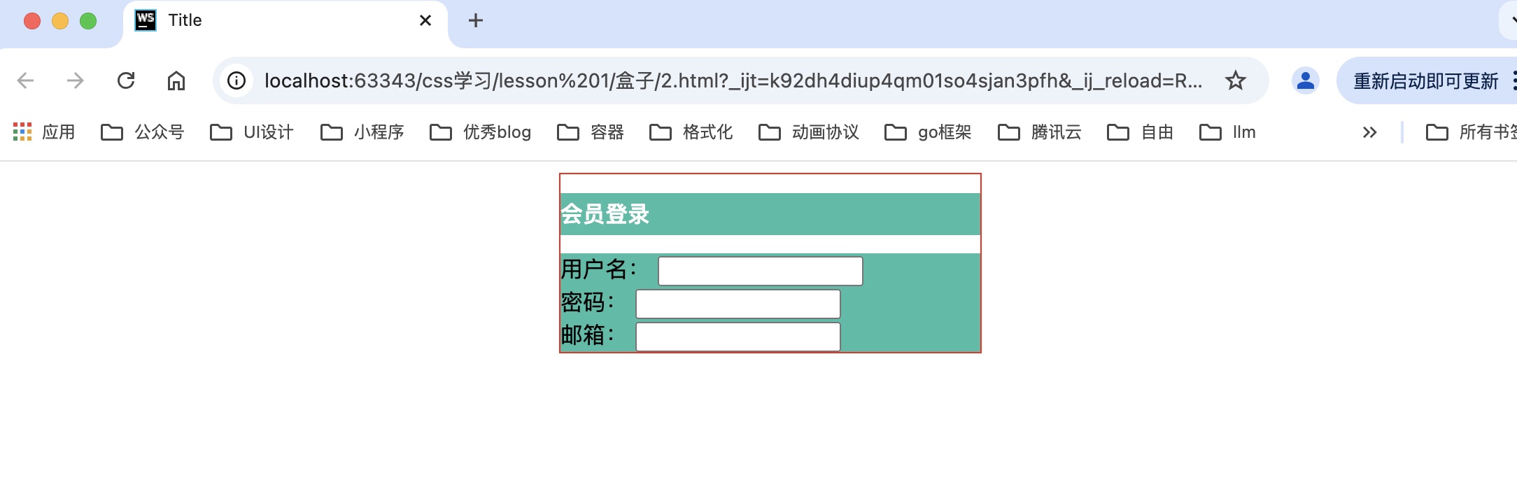
1.边框
<!DOCTYPE html>
<html lang="en">
<head>
<meta charset="UTF-8">
<title>Title</title>
<style>
/*body总有一个默认的外边距margin:0;*/
h1,ul,li,a,body{
margin: 0;
padding: 0;
text-decoration: none;
}
/*border: 粗细,样式,颜色*/
#box{
width: 300px;
border: 1px solid red;
}
h2{
font-size: 16px;
background-color: #3cbda6;
line-height: 30px;
color: white;
}
form{
background: #3cbda6;
}
div:nth-of-type(1) input{
border: 3px solid black;
}
div:nth-of-type(2) input{
border: 3px dashed #4d0b8c;
}
div:nth-of-type(2) input{
border: 2px dashed #008c27;
}
</style>
</head>
<body>
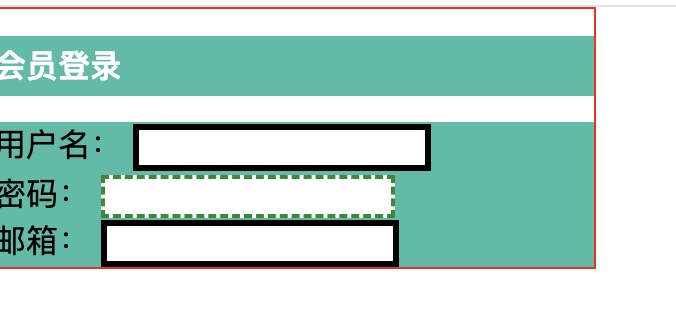
<div id="box">
<h2>会员登录</h2>
<form action="#">
<div>
<span>用户名:</span>
<input type="text">
</div>
<div>
<span>密码:</span>
<input type="text">
</div>
<div>
<span>邮箱:</span>
<input type="text">
</div>
</form>
</div>
</body>
</html>
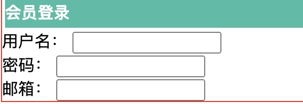
2.外边距
盒子外面的“空白距离”,用来隔开不同的元素
<!DOCTYPE html>
<html lang="en">
<head>
    <meta charset="UTF-8">
    <title>Title</title>
    <style>
        /*-外边距的妙用:居中元素 margin: 0 auto;*/
#box{
width: 300px;
border: 1px solid red;
    margin: 0 auto;
}
h2{
font-size: 16px;
background-color: #3cbda6;
line-height: 30px;
color: white;
}

form{
background: #3cbda6;
}
</style>
</head>
<body>

<div id="box">
    <h2>会员登录</h2>
    <form action="#">
        <div>
            <span>用户名:</span>
            <input type="text">
        </div>
        <div>
            <span>密码:</span>
            <input type="text">
        </div>
        <div>
            <span>邮箱:</span>
            <input type="text">
        </div>
    </form>
</div>
</body>
</html>
效果如下:整体框架会居中
3.内边距
盒子里面的“空白距离”,用来让内容不紧贴边框。
<!DOCTYPE html>
<html lang="en">
<head>
    <meta charset="UTF-8">
    <title>Title</title>
    <style>
#box{
width: 300px;
border: 1px solid red;
    margin: 0 auto;
}
        /*
       顺时针旋转
       margin:0
       margin:0 1px
       margin:0 1px 2px 3px
       */
h2{
font-size: 16px;
background-color: #3cbda6;
line-height: 30px;
color: white;
    margin: 0 1px 2px 3px;
}
form{
background: #3cbda6;
}
</style>
</head>
<body>

<div id="box">
    <h2>会员登录</h2>
    <form action="#">
        <div>
            <span>用户名:</span>
            <input type="text">
        </div>
        <div>
            <span>密码:</span>
            <input type="text">
        </div>
        <div>
            <span>邮箱:</span>
            <input type="text">
        </div>
    </form>
</div>
</body>
</html
盒子模型的计算方式:这个元素到底多大
margin+border+padding+内容的宽度
六.边框圆角
让元素的直角边框变成圆角。比如:
-
把方形按钮的角磨圆,变成圆角按钮
-
让图片、卡片的四个角变圆,看起来更柔和(就像手机APP里常见的卡片样式)
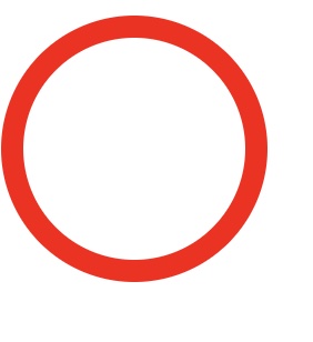
1.圆形
<!DOCTYPE html>
<html lang="en">
<head>
    <meta charset="UTF-8">
    <title>Title</title>
    <!--
     左上 右上 右下 左下,顺时针方向

     圆圈: 圆角 = 半径!
   -->

    <style>
        div{
            width: 100px;
            height: 100px;
            border: 10px solid red;
            border-radius: 100px;
        }
    </style>
</head>
<body>
<div></div>
</body>
效果如下:
2.边框圆角
<!DOCTYPE html>
<html lang="en">
<head>
    <meta charset="UTF-8">
    <title>Title</title>
  <style>
    div{
      width: 50px;
      height: 50px;
      margin: 30px;
      background: red;
      border-radius: 50px 0 0 0;
    }
    img{
      border-radius: 25px;
    }
  </style>
</head>
<body>
<div>
  <img src="12.jpg" alt="">
</div>

</body>
</html>
结语:
其实写这些文字的过程,更像一场和自己的对话——把零散的思考串起来,把模糊的感受捋清楚。如果其中某句话碰巧戳中了你,或是让你多了一点点新的想法,那这份“对话”就有了额外的意义。

 浙公网安备 33010602011771号