CSS3---美化网页详解
第五章 CSS3美化网页元素
目录
提示:以下是本篇文章正文内容,下面案例可供参考
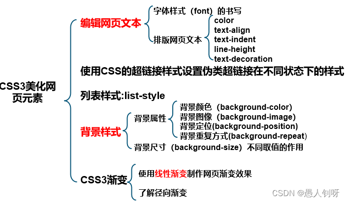
一、字体样式
| 属性名 | 含义 | 举例 |
| font-family | 设置字体类型 | font-family:"隶书"; |
| font-size | 设置字体大小 | font-size:12px; |
| font-style | 设置字体风格 | font-style:italic; |
| font-weight | 设置字体的粗细 | font-weight:bold; |
| font | 在一个声明中设置所有字体属性 | font:italic bold 36px "宋体"; |
1.1 font-family
font-family:
p{font-family:Verdana,"楷体";}
body{font-family: Times,"Times New Roman", "楷体";}
1.2 font-size
font-size:
单位:
px(像素)、em、rem
1.3 font-style
font-style:
normal、italic和oblique
1.4 font-weight
font-weight:
值
说明
normal
默认值,定义标准的字体
bold
粗体字体
bolder
更粗的字体
lighter
更细的字体
100、200、300、400、500、600、700、800、900
定义由细到粗的字体
400等同于normal,700等同于bold
1.5 font
font:
字体属性的顺序:字体风格→字体粗细→字体大小→字体类型
二、文本属性
| 属性 | 含义 | 举例 |
| color | 设置文本颜色 | color:#00C; |
| text-align | 设置元素水平对齐方式 | text-align:right; |
| text-indent | 设置首行文本的缩进 | text-indent:20px; |
| line-height | 设置文本的行高 | line-height:25px; |
| text-decoration | 设置文本的装饰 | text-decoration:underline; |
2.1 color
color:
RGB
十六进制方法表示颜色:前两位表示红色分量,中间两位表示绿色分量,最后两位表示蓝色分量
rgb(r,g,b) : 正整数的取值为0~255
RGBA
在RGB基础上增加了控制alpha透明度的参数,其中这个透明通道值为0~1
2.2 text-align
text-align:水平对齐方式
vertical-align(垂直对齐方式)属性:middle、top、bottom
值
说明
left
把文本排列到左边。默认值:由浏览器决定
right
把文本排列到右边
center
把文本排列到中间
justify
实现两端对齐文本效果
2.3 text-indent
text-indent:首行缩进,单位em或px
2.4 line-height
line-height:行高,单位px
2.5 text-decoration
text-decoration:文本装饰
值
说明
none
默认值,定义的标准文本
underline
设置文本的下划线
overline
设置文本的上划线
line-through
设置文本的删除线
三、超链接伪类
语法:标签名:伪类名{声明;}
eg:
a:hover {
color:#B46210;
text-decoration:underline;
}
| 伪类名称 | 含义 | 示例 |
| a:link | 未单击访问时超链接样式 | a:link{color:#9ef5f9;} |
| a:visited | 单击访问后超链接样式 | a:visited {color:#333;} |
| a:hover | 鼠标悬浮其上的超链接样式 | a:hover{color:#ff7300;} |
| a:active | 鼠标单击未释放的超链接样式 | a:active {color:#999;} |
设置伪类的顺序:a:link->a:visited->a:hover->a:active
四、列表及背景样式
4.1 列表样式
4.1.1 list-style-type
| 值 | 说明 | 语法示例 |
| none | 无标记符号 | list-style-type:none; |
| disc | 实心圆,默认类型 | list-style-type:disc; |
| circle | 空心圆 | list-style-type:circle; |
| square | 实心正方形 | list-style-type:square; |
| decimal | 数字 | list-style-type:decimal |
4.1.2 list-style
去除无序列表前的小黑点:
li {
list-style:none;
}
4.1.3 list-style-image
4.1.4 list-style-position
4.2 背景样式
| 名称 | 属性值 | ||||||||
| background-color | 16进制 | ||||||||
| background-image | background-image:url(图片路径); | ||||||||
| background-repeat | repeat:沿水平和垂直两个方向平铺 no-repeat:不平铺,即只显示一次 repeat-x:只沿水平方向平铺 repeat-y:只沿垂直方向平铺 | ||||||||
| background-position |
| ||||||||
| background | background:#C00 url(../image/arrow-down.gif) 205px 10px no-repeat; |
background-size:
| 属性值 | 描述 |
| auto | 默认值,使用背景图片保持原样 |
| percentage | 当使用百分值时,不是相对于背景的尺寸大小来计算的,而是相对于元素宽度来计算的 |
| cover | 整个背景图片放大填充了整个元素 |
| contain | 让背景图片保持本身的宽高比例,将背景图片缩放到宽度或者高度正好适应所定义背景的区域 |
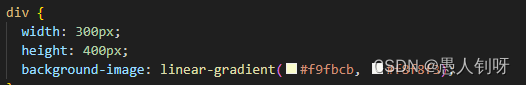
线性渐变:颜色沿着一条直线过渡:从左到右、从右到左、从上到下等。
linear-gradient ( position, color1, color2,…)
径向渐变:圆形或椭圆形渐变,颜色不再沿着一条直线变化,而是从一个起点朝所有方向混合。
常用图片平铺来替代渐变效果。
总结
提示:这里对文章进行总结:
练习:略
例如:以上就是今天要讲的内容。

 浙公网安备 33010602011771号