css奇淫巧计
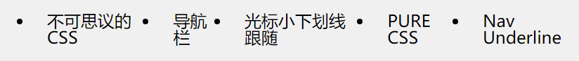
<!DOCTYPE html>
<html>
    <head>
        <meta charset="UTF-8">
        <title></title>
        <style>
            ul {
                display: flex;
                position: absolute;
                width: 800px;
                top: 50%;
                left: 50%;
                transform: translate(-50%, -50%);
            }

            li {
                position: relative;
                padding: 20px;
                font-size: 24px;
                color: #000;
                line-height: 1;
                transition: 0.2s all linear;
                cursor: pointer;
            }

            li::before {
                content: "";
                position: absolute;
                top: 0;
                left: 100%;
                width: 0;
                height: 100%;
                border-bottom: 2px solid #000;
                transition: 0.2s all linear;
            }

            li:hover::before {
                width: 100%;
                top: 0;
                left: 0;
                transition-delay: 0.1s;
                border-bottom-color: #000;
                z-index: -1;
            }

            li:active {
                background: #000;
                color: #fff;
            }

        </style>
    </head>
    <body>
        <ul>
          <li>不可思议的CSS</li>
          <li>导航栏</li>
          <li>光标小下划线跟随</li>
          <li>PURE CSS</li>
          <li>Nav Underline</li>
        </ul>
    </body>
</html>
效果图

 浙公网安备 33010602011771号