CSS栅格布局
认识栅格布局
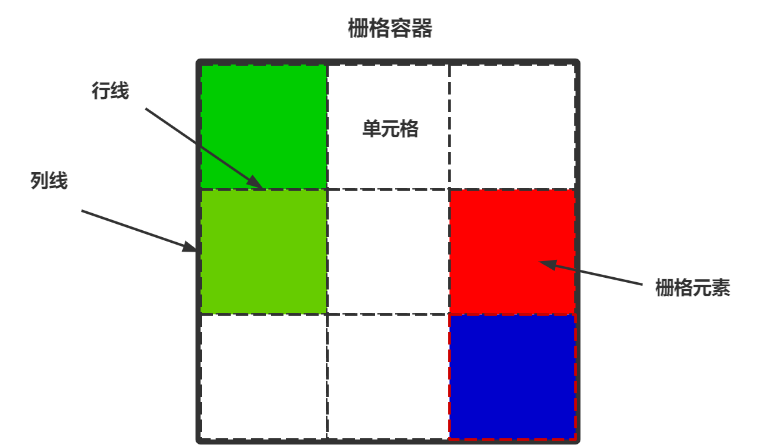
CSS的栅格布局也被称为网格布局(Grid Layout),它是一种新兴的布局方式。
栅格布局是一个二维系统,这意味着它可以同时处理列和行,与弹性布局相似,栅格系统也是由栅格容器包裹栅格元素进行使用。
对于栅格布局来说,它的思想实际上非常简单,将一块区域绘制成格子,然后将元素填进去即可。
我们学习者应该从下面两个角度来学习栅格布局:
1.怎么样画出栅格容器
值得一提的是,现在的一些旧版浏览器对于栅格布局并没有较好的支持性,所以这项技术的应用场景其实相比于传统式的浮动布局以及弹性布局来说会少一些。
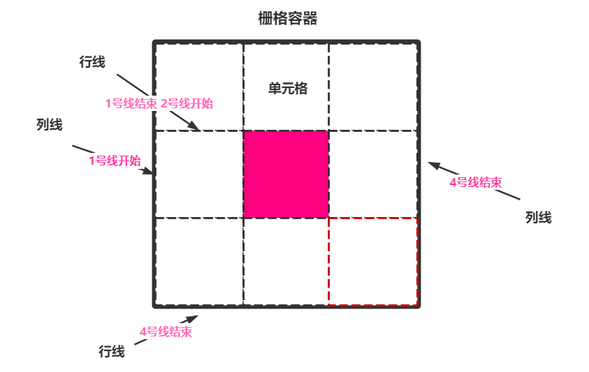
栅格容器
声明栅格容器
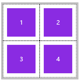
我们可以使用display:grid;来将一个容器声明为块级的栅格容器,它的特点是独占一行。
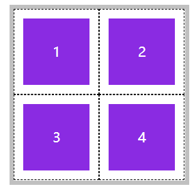
当然,也可以使用display:inline-grid;来将一个容器声明为内联块级容器,虽然没有独占一行但可以设置宽高。
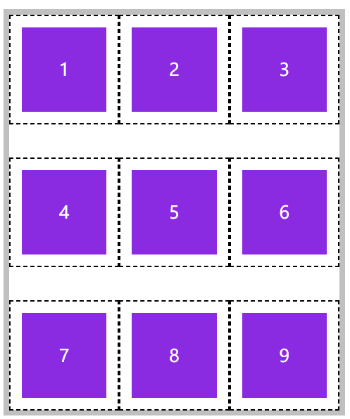
块级栅格容器
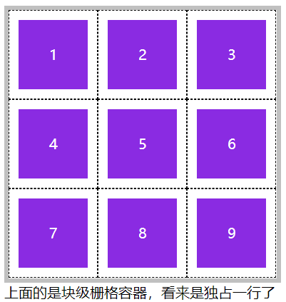


<!DOCTYPE html>
<html lang="en">

<head>
        <meta charset="UTF-8">
        <meta name="viewport" content="width=device-width, initial-scale=1.0">
        <title>Document</title>
        <style>
                * {
                        padding: 0;
                        margin: 0;
                }

                body{
                        padding: 100px;
                }

                main {
                        width:300px ;
                        height: 300px;
                        border: solid 5px silver;
                        display: grid;

                        /* 划分行列 */
                        grid-template-rows: repeat(3,100px);
                        grid-template-columns: repeat(3,100px);
                }

                section{
                        background-color: blueviolet;
                        background-clip: content-box;
                        padding: 10px;
                        border: dashed 1px black;

                        text-align: center;
                        line-height: 78px;
                        color: #fff;
                }

        </style>
</head>

<body>

        <main>
                <section>1</section>
                <section>2</section>
                <section>3</section>
                <section>4</section>
                <section>5</section>
                <section>6</section>
                <section>7</section>
                <section>8</section>
                <section>9</section>
        </main>
        上面的是块级栅格容器,看来是独占一行了

</body>

</html>
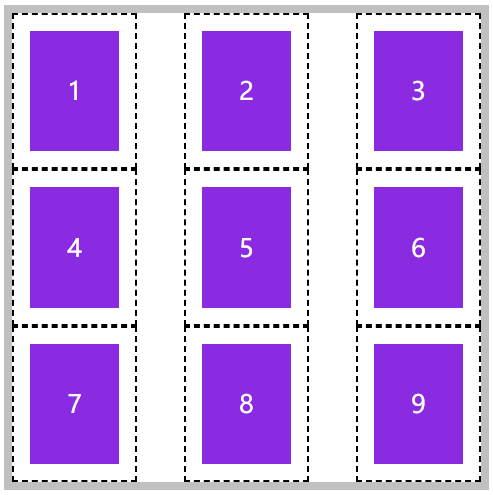
内联块级栅格容器
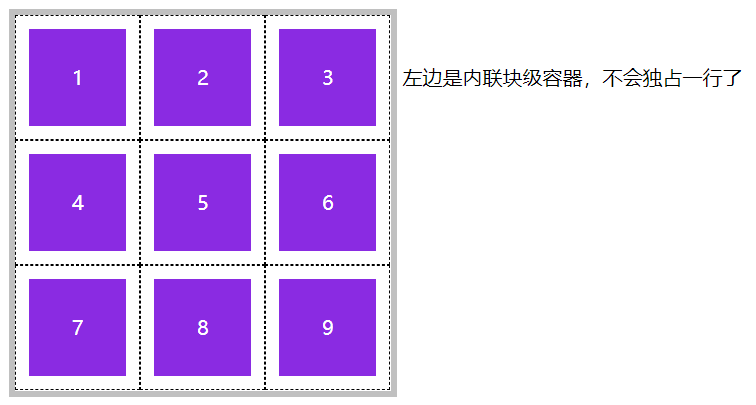
<!DOCTYPE html>
<html lang="en">

<head>
        <meta charset="UTF-8">
        <meta name="viewport" content="width=device-width, initial-scale=1.0">
        <title>Document</title>
        <style>
                * {
                        padding: 0;
                        margin: 0;
                }

                body{
                        padding: 100px;
                }

                main {
                        width:300px ;
                        height: 300px;
                        border: solid 5px silver;
                        display: inline-grid;

                        /* 划分行列 */
                        grid-template-rows: repeat(3,100px);
                        grid-template-columns: repeat(3,100px);
                }

                section{
                        background-color: blueviolet;
                        background-clip: content-box;
                        padding: 10px;
                        border: dashed 1px black;

                        text-align: center;
                        line-height: 78px;
                        color: #fff;
                }

        </style>
</head>

<body>

        <main>
                <section>1</section>
                <section>2</section>
                <section>3</section>
                <section>4</section>
                <section>5</section>
                <section>6</section>
                <section>7</section>
                <section>8</section>
                <section>9</section>
        </main>
        左边是内联块级容器,不会独占一行了

</body>

</html>
栅格容器之划分行列
光有栅格容器没用,还要为栅格容器划分行数与列数,并且为它们指定宽度。
grid-template-rows:划分行数
grid-template-columns:划分列数
下面就介绍几种划分的方式。
固定宽高
如我们想画一个2行3列的固定宽高的栅格容器,就可以使用下面这种方法来绘制出。
grid-template-rows: 100px 100px;
grid-template-columns: 100px 100px 100px;
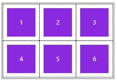
<!DOCTYPE html>
<html lang="en">

<head>
        <meta charset="UTF-8">
        <meta name="viewport" content="width=device-width, initial-scale=1.0">
        <title>Document</title>
        <style>
                * {
                        padding: 0;
                        margin: 0;
                }

                body{
                        padding: 100px;
                }

                main {

                        width: 300px;

                        border: solid 5px silver;
                        display: grid;

                        /* 划分行列 2行3列 每行代表高度,100px,每列代表宽度,100px */
                        grid-template-rows: 100px 100px;
                        grid-template-columns: 100px 100px  100px;
                }

                section{
                        background-color: blueviolet;
                        background-clip: content-box;
                        padding: 10px;
                        border: dashed 1px black;

                        text-align: center;
                        line-height: 78px;
                        color: #fff;
                }

        </style>
</head>

<body>

        <main>
                <section>1</section>
                <section>2</section>
                <section>3</section>
                <section>4</section>
                <section>5</section>
                <section>6</section>
        </main>

</body>

</html>
百分比宽高
除开固定宽高,也可以指定百分比。
如下图,栅格容器的宽度与高度均为200px,我们来画出一个2行2列的样式。
grid-template-rows: 50% 50%;
grid-template-columns: 50% 50%;
<!DOCTYPE html>
<html lang="en">

<head>
        <meta charset="UTF-8">
        <meta name="viewport" content="width=device-width, initial-scale=1.0">
        <title>Document</title>
        <style>
                * {
                        padding: 0;
                        margin: 0;
                }

                body{
                        padding: 100px;
                }

                main {

                        width: 200px;
                        height: 200px;

                        border: solid 5px silver;
                        display: grid;

                        /* 划分行列 2行2列 每行代表高度,100px,每列代表宽度,100px */
                        grid-template-rows: 50% 50%;
                        grid-template-columns: 50% 50%;
                }

                section{
                        background-color: blueviolet;
                        background-clip: content-box;
                        padding: 10px;
                        border: dashed 1px black;

                        text-align: center;
                        line-height: 78px;
                        color: #fff;
                }

        </style>
</head>

<body>

        <main>
                <section>1</section>
                <section>2</section>
                <section>3</section>
                <section>4</section>

        </main>

</body>

</html>
重复划分
可以看到,上面每个块的区域都是一样的,那么有没有什么办法能够重复绘制呢?使用repeat即可实现。
grid-template-rows: repeat(2, 50%);
grid-template-columns: repeat(2, 50%);
<!DOCTYPE html>
<html lang="en">

<head>
        <meta charset="UTF-8">
        <meta name="viewport" content="width=device-width, initial-scale=1.0">
        <title>Document</title>
        <style>
                * {
                        padding: 0;
                        margin: 0;
                }

                body {
                        padding: 100px;
                }

                main {

                        width: 200px;
                        height: 200px;

                        border: solid 5px silver;
                        display: grid;

                        /* 重复绘制2次,每行50%高度,重复绘制2次,每列50%宽度, */
                        grid-template-rows: repeat(2, 50%);
                        grid-template-columns: repeat(2, 50%);
                }

                section {
                        background-color: blueviolet;
                        background-clip: content-box;
                        padding: 10px;
                        border: dashed 1px black;

                        text-align: center;
                        line-height: 78px;
                        color: #fff;
                }
        </style>
</head>

<body>

        <main>
                <section>1</section>
                <section>2</section>
                <section>3</section>
                <section>4</section>

        </main>

</body>

</html>
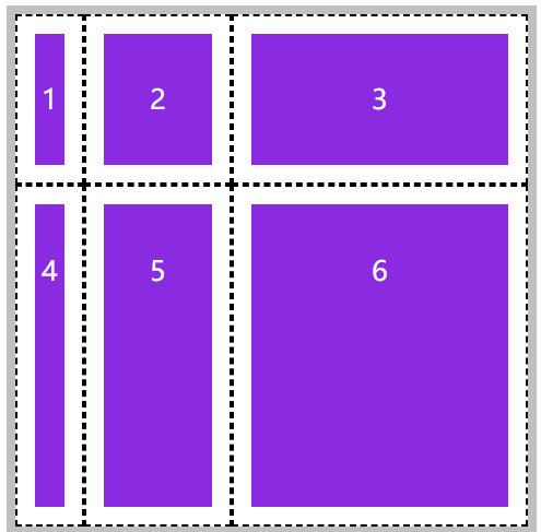
我们也可以重复绘制不同宽度的行或者列,比如我们想绘制16个单元格,每个单元格的高度都是100px,但是宽度的话偶数单元格都是50px,奇数单元格是100px,那么久可以进行如下设置:
grid-template-rows: repeat(2, 100px 100px);
grid-template-columns: repeat(2, 100px 50px);
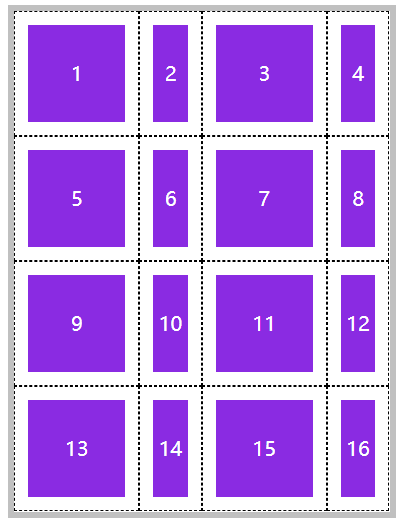
<!DOCTYPE html>
<html lang="en">

<head>
        <meta charset="UTF-8">
        <meta name="viewport" content="width=device-width, initial-scale=1.0">
        <title>Document</title>
        <style>
                * {
                        padding: 0;
                        margin: 0;
                }

                body {
                        padding: 100px;
                }

                main {


                        border: solid 5px silver;
                        display: grid;

                        /*
                                以列举例,第一次,绘制一个100px宽度的单元格,在绘制一个50px宽度的单元格,
                                第二次,以此类推。每次绘制2个。
                         */
                        grid-template-rows: repeat(2, 100px 100px);
                        grid-template-columns: repeat(2, 100px 50px);
                }

                section {
                        background-color: blueviolet;
                        background-clip: content-box;
                        padding: 10px;
                        border: dashed 1px black;

                        text-align: center;
                        line-height: 78px;
                        color: #fff;
                }
        </style>
</head>

<body>

        <main>
                <section>1</section>
                <section>2</section>
                <section>3</section>
                <section>4</section>
                <section>5</section>
                <section>6</section>
                <section>7</section>
                <section>8</section>
                <section>9</section>
                <section>10</section>
                <section>11</section>
                <section>12</section>
                <section>13</section>
                <section>14</section>
                <section>15</section>
                <section>16</section>
        </main>

</body>

</html>
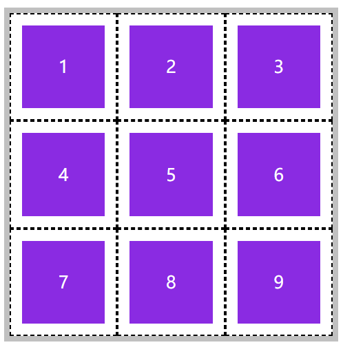
自动划分
自动划分是指不指定划分多少行或者列,而是只给他一个行列占比的具体数值,它会自动根据容器的大小来进行划分。
我们想在一个宽和高都是300px的栅格容器中进行绘制,而每个单元格的宽高都是100px,那就设置一下交给他自动绘制。
grid-template-rows: repeat(auto-fill, 100px);
grid-template-columns: repeat(auto-fill, 100px);
<!DOCTYPE html>
<html lang="en">

<head>
        <meta charset="UTF-8">
        <meta name="viewport" content="width=device-width, initial-scale=1.0">
        <title>Document</title>
        <style>
                * {
                        padding: 0;
                        margin: 0;
                }

                body {
                        padding: 100px;
                }

                main {
                        width: 300px;
                        height: 300px;

                        border: solid 5px silver;
                        display: grid;


                        grid-template-rows: repeat(auto-fill, 100px);
                        grid-template-columns: repeat(auto-fill, 100px);
                }

                section {
                        background-color: blueviolet;
                        background-clip: content-box;
                        padding: 10px;
                        border: dashed 1px black;

                        text-align: center;
                        line-height: 78px;
                        color: #fff;
                }
        </style>
</head>

<body>

        <main>
                <section>1</section>
                <section>2</section>
                <section>3</section>
                <section>4</section>
                <section>5</section>
                <section>6</section>
                <section>7</section>
                <section>8</section>
                <section>9</section>

        </main>

</body>

</html>
比例划分
可以使用 fr 单位设置元素在空间中所占的比例,它将按照比例来进行划分。
比如我们设置了一个2行3列的栅格容器,其中的一行高度为的1fr,而第二行为2fr,第一列为40px,而第二列为1fr,第三列为2fr。
grid-template-rows: 1fr 2fr;
grid-template-columns: 40px 1fr 2fr;
<!DOCTYPE html>
<html lang="en">

<head>
        <meta charset="UTF-8">
        <meta name="viewport" content="width=device-width, initial-scale=1.0">
        <title>Document</title>
        <style>
                * {
                        padding: 0;
                        margin: 0;
                }

                body {
                        padding: 100px;
                }

                main {
                        width: 300px;
                        height: 300px;

                        border: solid 5px silver;
                        display: grid;


                        grid-template-rows: 1fr 2fr;
                        grid-template-columns:  40px 1fr 2fr;
                }

                section {
                        background-color: blueviolet;
                        background-clip: content-box;
                        padding: 10px;
                        border: dashed 1px black;

                        text-align: center;
                        line-height: 78px;
                        color: #fff;
                }
        </style>
</head>

<body>

        <main>
                <section>1</section>
                <section>2</section>
                <section>3</section>
                <section>4</section>
                <section>5</section>
                <section>6</section>
        </main>

</body>

</html>
当然,它同样支持以该单位自动划分比例。
grid-template 简写
grid-template是 grid-template-rows、grid-template-columns、grid-template-areas 的三个属性的简写。
但是目前还没有学习grid-template-areas ,所以这里就只用grid-template来声明 grid-template-rows与grid-template-columns即可。
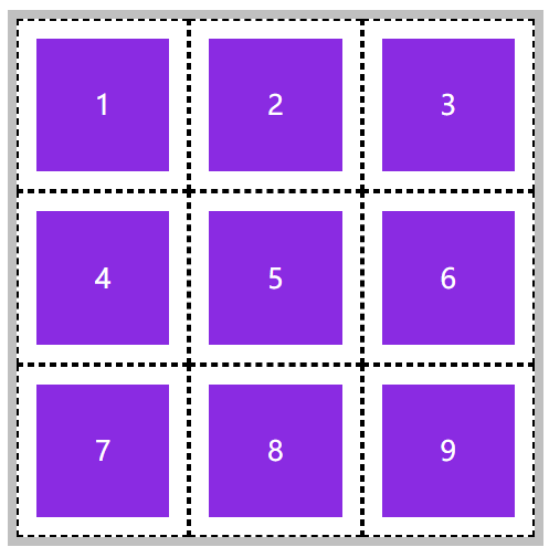
比如我们来构建一个3行3列单元格宽高均为100px的栅格容器。
/* 行数,列数 */
grid-template: repeat(3,100px)/repeat(3,100px);
<!DOCTYPE html>
<html lang="en">

<head>
        <meta charset="UTF-8">
        <meta name="viewport" content="width=device-width, initial-scale=1.0">
        <title>Document</title>
        <style>
                * {
                        padding: 0;
                        margin: 0;
                }

                body {
                        padding: 100px;
                }

                main {
                        width: 300px;
                        height: 300px;

                        border: solid 5px silver;
                        display: grid;

                        /* 行数,列数 */
                        grid-template: repeat(3,100px)/repeat(3,100px);
                }

                section {
                        background-color: blueviolet;
                        background-clip: content-box;
                        padding: 10px;
                        border: dashed 1px black;

                        text-align: center;
                        line-height: 78px;
                        color: #fff;
                }
        </style>
</head>

<body>

        <main>
                <section>1</section>
                <section>2</section>
                <section>3</section>
                <section>4</section>
                <section>5</section>
                <section>6</section>
                <section>7</section>
                <section>8</section>
                <section>9</section>
        </main>

</body>

</html>
minmax划分
使用minmax可以为行线或列线设定一个动态的取值数值,防止元素不会溢出。
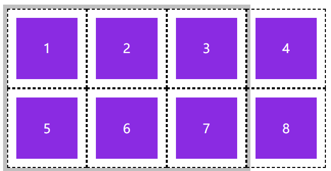
如上,每一行的栅格元素单元格总宽度是400px,栅格容器的宽度却只有300px,造成了列溢出,如果设置minmax则可以让每个单元格进行适当调整。
/* 行数,列数 */
grid-template: repeat(2,100px)/repeat(4,minmax(50px,100px));
<!DOCTYPE html>
<html lang="en">

<head>
        <meta charset="UTF-8">
        <meta name="viewport" content="width=device-width, initial-scale=1.0">
        <title>Document</title>
        <style>
                * {
                        padding: 0;
                        margin: 0;
                }

                body {
                        padding: 100px;
                }

                main {
                        width: 300px;
                        /* height: 300px; */

                        border: solid 5px silver;
                        display: grid;

                        /* 行数,列数 */
                        grid-template: repeat(2,100px)/repeat(4,minmax(50px,100px));
                }

                section {
                        background-color: blueviolet;
                        background-clip: content-box;
                        padding: 10px;
                        border: dashed 1px black;

                        text-align: center;
                        line-height: 78px;
                        color: #fff;
                }
        </style>
</head>

<body>

        <main>
                <section>1</section>
                <section>2</section>
                <section>3</section>
                <section>4</section>
                <section>5</section>
                <section>6</section>
                <section>7</section>
                <section>8</section>
        </main>

</body>

</html>
栅格容器之间距定义
行间距
栅格容器中每一个元素,现在看是紧密挨在一起的。我们可以对栅格元素本身进行margin或者padding来将彼此之前撑开留出间隙,也可以使用栅格容器提供的方法。
使用 row-gap 设置行间距。
<!DOCTYPE html>
<html lang="en">

<head>
        <meta charset="UTF-8">
        <meta name="viewport" content="width=device-width, initial-scale=1.0">
        <title>Document</title>
        <style>
                * {
                        padding: 0;
                        margin: 0;
                }

                body {
                        padding: 100px;
                }

                main {
                        width: 300px;
                        /* height: 300px; */

                        border: solid 5px silver;
                        display: grid;

                        /* 行数,列数 */
                        grid-template: repeat(3,100px)/repeat(3,minmax(50px,100px));
                        /* 行间距 */
                        row-gap:30px ;
                }

                section {
                        background-color: blueviolet;
                        background-clip: content-box;
                        padding: 10px;
                        border: dashed 1px black;

                        text-align: center;
                        line-height: 78px;
                        color: #fff;
                }
        </style>
</head>

<body>

        <main>
                <section>1</section>
                <section>2</section>
                <section>3</section>
                <section>4</section>
                <section>5</section>
                <section>6</section>
                <section>7</section>
                <section>8</section>
                <section>9</section>
        </main>

</body>

</html>
列间距
使用column-gap定义列间距。
<!DOCTYPE html>
<html lang="en">

<head>
        <meta charset="UTF-8">
        <meta name="viewport" content="width=device-width, initial-scale=1.0">
        <title>Document</title>
        <style>
                * {
                        padding: 0;
                        margin: 0;
                }

                body {
                        padding: 100px;
                }

                main {
                        width: 300px;
                        /* height: 300px; */

                        border: solid 5px silver;
                        display: grid;

                        /* 行数,列数 */
                        grid-template: repeat(3,100px)/repeat(3,minmax(50px,100px));
                        /* 列间距 */
                        column-gap:30px ;
                }

                section {
                        background-color: blueviolet;
                        background-clip: content-box;
                        padding: 10px;
                        border: dashed 1px black;

                        text-align: center;
                        line-height: 78px;
                        color: #fff;
                }
        </style>
</head>

<body>

        <main>
                <section>1</section>
                <section>2</section>
                <section>3</section>
                <section>4</section>
                <section>5</section>
                <section>6</section>
                <section>7</section>
                <section>8</section>
                <section>9</section>
        </main>

</body>

</html>
gap 简写
使用 gap 规则可以一次定义行、列间距,如果间距一样可以只设置一个值。
统一设置行列间距为20px
<!DOCTYPE html>
<html lang="en">

<head>
        <meta charset="UTF-8">
        <meta name="viewport" content="width=device-width, initial-scale=1.0">
        <title>Document</title>
        <style>
                * {
                        padding: 0;
                        margin: 0;
                }

                body {
                        padding: 100px;
                }

                main {
                        width: 300px;
                        /* height: 300px; */

                        border: solid 5px silver;
                        display: grid;

                        /* 行数,列数 */
                        grid-template: repeat(3,100px)/repeat(3,minmax(50px,100px));
                        /* 行列间距 */
                        gap:30px ;
                }

                section {
                        background-color: blueviolet;
                        background-clip: content-box;
                        padding: 10px;
                        border: dashed 1px black;

                        text-align: center;
                        line-height: 78px;
                        color: #fff;
                }
        </style>
</head>

<body>

        <main>
                <section>1</section>
                <section>2</section>
                <section>3</section>
                <section>4</section>
                <section>5</section>
                <section>6</section>
                <section>7</section>
                <section>8</section>
                <section>9</section>
        </main>

</body>

</html>
栅格容器之栅格线命名
可以发现,其实最少有2条线的数据就可以定位一个栅格元素所在的位置。
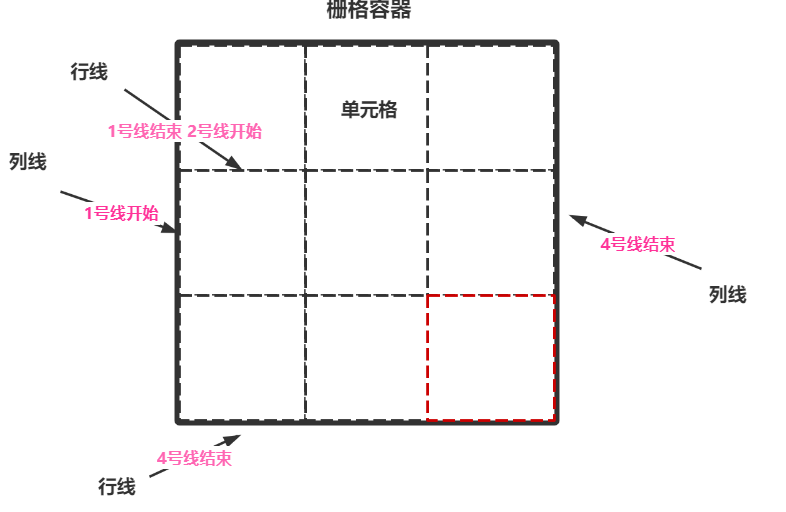
如果我们想将元素放入正中间,可以这样设置:
行线开始位:2号线开始或者1号线结束位置
列线开始位:2号线开始或者1号线结束位置
行线结束位:3号线开始或者2号线结束位置
列线结束位:3号线开始或者2号线结束位置
那么这样,我们就可以将元素定位在该容器正中,并且大小只占据1个单元格。
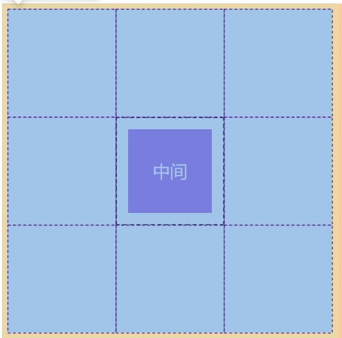
独立命名
我们可以为每一条栅格线都进行独立命名,现在就来将上面的伪代码实现一下。
grid-template-rows: [r1-start] 100px [r1-end r2-start] 100px [r2-end r3-start] 100px [r3-end];
grid-template-columns: [c1-start] 100px [c1-end c2-start] 100px [c2-start c3-start] 100px [c3-end];
每条线可以有多个名字,在使用的时候可以使用其任意的且具有的名字。
当我们需要定位的时候,使用如下格式对一个元素进行定位:
grid-row-start: r2-start;
grid-column-start:c1-end;
grid-row-end: r2-end;
grid-column-end: c3-start;

Ps:默认的栅格容器是不会展示栅格线的,此时需要打开浏览器的检查功能就会看到栅格线。
<!DOCTYPE html>
<html lang="en">

<head>
        <meta charset="UTF-8">
        <meta name="viewport" content="width=device-width, initial-scale=1.0">
        <title>Document</title>
        <style>
                * {
                        padding: 0;
                        margin: 0;
                }

                body {
                        padding: 100px;
                }

                main {
                        width: 300px;
                        /* height: 300px; */

                        border: solid 5px silver;
                        display: grid;

                        /* 行数,列数 */
                        grid-template-rows: [r1-start] 100px [r1-end r2-start] 100px [r2-end r3-start] 100px [r3-end];
                        grid-template-columns: [c1-start] 100px [c1-end c2-start] 100px [c2-start c3-start] 100px [c3-end];
                }

                section {
                        background-color: blueviolet;
                        background-clip: content-box;
                        padding: 10px;
                        border: dashed 1px black;

                        text-align: center;
                        line-height: 78px;
                        color: #fff;

                        grid-row-start: r2-start;
                        grid-column-start: c1-end;
                        grid-row-end: r2-end;
                        grid-column-end: c3-start;
                }
        </style>
</head>

<body>

        <main>
                <section>中间</section>
        </main>

</body>

</html>
自动命名
对于重复设置的栅格容器系统会为它自动命名,使用时使用 r1、c2 的方式定位栅格。
r代表行
c代表列
重复设置,命名前缀:
grid-template-rows: repeat(3, [r-start] 100px [r-end]);
grid-template-columns: repeat(3, [c-start] 100px [c-end]);
在使用自动命名的栅格线进行定位时,应该按照如下格式:
grid-row-start: r-start 2;
grid-column-start: c-start 2;
grid-row-end: r-start 2;
grid-column-end: c-end 2;
<!DOCTYPE html>
<html lang="en">

<head>
        <meta charset="UTF-8">
        <meta name="viewport" content="width=device-width, initial-scale=1.0">
        <title>Document</title>
        <style>
                * {
                        padding: 0;
                        margin: 0;
                }

                body {
                        padding: 100px;
                }

                main {
                        width: 300px;
                        /* height: 300px; */

                        border: solid 5px silver;
                        display: grid;

                        /* 行数,列数 */
                        grid-template-rows: repeat(3, [r-start] 100px [r-end]);
                        grid-template-columns: repeat(3, [c-start] 100px [c-end]);

                }

                section {
                        background-color: blueviolet;
                        background-clip: content-box;
                        padding: 10px;
                        border: dashed 1px black;

                        text-align: center;
                        line-height: 78px;
                        color: #fff;

                        grid-row-start: r-start 2;
                        grid-column-start: c-start 2;
                        grid-row-end: r-start 2;
                        grid-column-end: c-end 2;

                }
        </style>
</head>

<body>

        <main>
                <section>中间</section>
        </main>

</body>

</html>
栅格元素之元素定位
我们可以使用以下方法对栅格元素进行定位,但是关于如何定位又分为很多种。
| 选项 | 说明 |
|---|---|
| grid-row-start | 行开始栅格线 |
| grid-row-end | 行结束栅格线 |
| grid-column-start | 列开始栅格线 |
| grid-column-end | 列结束栅格线 |
栅格线位置定位
栅格线位置定位实际上就是数数,在水平的第几根线,在垂直的第几根线。
还是老办法,规定行开始线位置与行结束线位置以及列开始线位置和列结束线位置。
如下,可以看到,单纯的就是数数,非常的简单粗暴。
grid-row-start: 2;
grid-column-start: 2;
grid-row-end: 2;
grid-column-end: 2;
<!DOCTYPE html>
<html lang="en">

<head>
        <meta charset="UTF-8">
        <meta name="viewport" content="width=device-width, initial-scale=1.0">
        <title>Document</title>
        <style>
                * {
                        padding: 0;
                        margin: 0;
                }

                body {
                        padding: 100px;
                }

                main {
                        width: 300px;
                        /* height: 300px; */

                        border: solid 5px silver;
                        display: grid;

                        /* 行数,列数 */
                        grid-template-rows: repeat(3, 100px);
                        grid-template-columns: repeat(3, 100px);

                }

                section {
                        background-color: blueviolet;
                        background-clip: content-box;
                        padding: 10px;
                        border: dashed 1px black;

                        text-align: center;
                        line-height: 78px;
                        color: #fff;

                        grid-row-start: 2;
                        grid-column-start: 2;
                        grid-row-end: 2;
                        grid-column-end: 2;

                }
        </style>
</head>

<body>

        <main>
                <section>中间</section>
        </main>

</body>

</html>
栅格线自定义名称定位
这个其实上面在说栅格线命名的时候就已经说过了,这里不再重复。
<!DOCTYPE html>
<html lang="en">

<head>
        <meta charset="UTF-8">
        <meta name="viewport" content="width=device-width, initial-scale=1.0">
        <title>Document</title>
        <style>
                * {
                        padding: 0;
                        margin: 0;
                }

                body {
                        padding: 100px;
                }

                main {
                        width: 300px;
                        /* height: 300px; */

                        border: solid 5px silver;
                        display: grid;

                        /* 行数,列数 */
                        grid-template-rows: [r1-start] 100px [r1-end r2-start] 100px [r2-end r3-start] 100px [r3-end];
                        grid-template-columns: [c1-start] 100px [c1-end c2-start] 100px [c2-start c3-start] 100px [c3-end];
                }

                section {
                        background-color: blueviolet;
                        background-clip: content-box;
                        padding: 10px;
                        border: dashed 1px black;

                        text-align: center;
                        line-height: 78px;
                        color: #fff;

                        grid-row-start: r2-start;
                        grid-column-start: c1-end;
                        grid-row-end: r2-end;
                        grid-column-end: c3-start;
                }
        </style>
</head>

<body>

        <main>
                <section>中间</section>
        </main>

</body>

</html>
栅格线自动名称定位
也是在上面介绍过了,不再详细赘述。
<!DOCTYPE html>
<html lang="en">

<head>
        <meta charset="UTF-8">
        <meta name="viewport" content="width=device-width, initial-scale=1.0">
        <title>Document</title>
        <style>
                * {
                        padding: 0;
                        margin: 0;
                }

                body {
                        padding: 100px;
                }

                main {
                        width: 300px;
                        /* height: 300px; */

                        border: solid 5px silver;
                        display: grid;

                        /* 行数,列数 */
                        grid-template-rows: repeat(3, [r-start] 100px [r-end]);
                        grid-template-columns: repeat(3, [c-start] 100px [c-end]);

                }

                section {
                        background-color: blueviolet;
                        background-clip: content-box;
                        padding: 10px;
                        border: dashed 1px black;

                        text-align: center;
                        line-height: 78px;
                        color: #fff;

                        grid-row-start: r-start 2;
                        grid-column-start: c-start 2;
                        grid-row-end: r-start 2;
                        grid-column-end: c-end 2;

                }
        </style>
</head>

<body>

        <main>
                <section>中间</section>
        </main>

</body>

</html>
偏移量定位
这个其实也比较简单,我们只需要指定行线的开始位置以及列线的开始位置即可,关于结束为止也是数数,使用span来数,往后走一根线还是两根线。
grid-row-start: 1;
grid-column-start: 1;
/* 代表从行线开始位置向后数3根线 */
grid-row-end: span 3;
/* 代表从列线开始位置向后数3根线 */
grid-column-end: span 3;
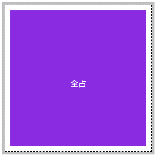
<!DOCTYPE html>
<html lang="en">

<head>
        <meta charset="UTF-8">
        <meta name="viewport" content="width=device-width, initial-scale=1.0">
        <title>Document</title>
        <style>
                * {
                        padding: 0;
                        margin: 0;
                }

                body {
                        padding: 100px;
                }

                main {
                        width: 300px;
                        /* height: 300px; */

                        border: solid 5px silver;
                        display: grid;

                        /* 行数,列数 */
                        grid-template-rows: repeat(3, 100px);
                        grid-template-columns: repeat(3, 100px);

                }

                section {
                        background-color: blueviolet;
                        background-clip: content-box;
                        padding: 10px;
                        border: dashed 1px black;

                        text-align: center;
                        line-height: 300px;
                        color: #fff;

                        grid-row-start: 1;
                        grid-column-start: 1;
                        /* 代表从行线开始位置向后数3根线 */
                        grid-row-end: span 3;
                        /* 代表从列线开始位置向后数3根线 */
                        grid-column-end: span 3;

                }
        </style>
</head>

<body>

        <main>
                <section>全占</section>
        </main>

</body>

</html>
简写模式
可以使用 grid-row 设置行开始栅格线,使用 grid-column 设置结束栅格线。
grid-row: 3/span 3;
grid-column: 2/span 3;
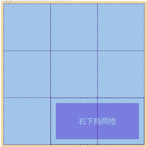
<!DOCTYPE html>
<html lang="en">

<head>
        <meta charset="UTF-8">
        <meta name="viewport" content="width=device-width, initial-scale=1.0">
        <title>Document</title>
        <style>
                * {
                        padding: 0;
                        margin: 0;
                }

                body {
                        padding: 100px;
                }

                main {
                        width: 300px;
                        /* height: 300px; */

                        border: solid 5px silver;
                        display: grid;

                        /* 行数,列数 */
                        grid-template-rows: repeat(3, 100px);
                        grid-template-columns: repeat(3, 100px);

                }

                section {
                        background-color: blueviolet;
                        background-clip: content-box;
                        padding: 10px;
                        border: dashed 1px black;

                        text-align: center;
                        line-height: 78px;
                        color: #fff;


                        grid-row: 3/span 3;
                        grid-column: 2/span 3;

                }
        </style>
</head>

<body>

        <main>
                <section>右下角两格</section>
        </main>

</body>

</html>
grid-area 极简模式
grid-area是对上面的简写模式grid-row以及grid-column的再次简写,它的语法结构如下:
行线开始/列线开始/行线结束/列线结束
grid-area: 2/1/span 1/span 3;
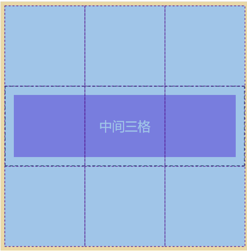
<!DOCTYPE html>
<html lang="en">

<head>
        <meta charset="UTF-8">
        <meta name="viewport" content="width=device-width, initial-scale=1.0">
        <title>Document</title>
        <style>
                * {
                        padding: 0;
                        margin: 0;
                }

                body {
                        padding: 100px;
                }

                main {
                        width: 300px;
                        /* height: 300px; */

                        border: solid 5px silver;
                        display: grid;

                        /* 行数,列数 */
                        grid-template-rows: repeat(3, 100px);
                        grid-template-columns: repeat(3, 100px);

                }

                section {
                        background-color: blueviolet;
                        background-clip: content-box;
                        padding: 10px;
                        border: dashed 1px black;

                        text-align: center;
                        line-height: 78px;
                        color: #fff;


                        grid-area: 2/1/span 1/span 3;

                }
        </style>
</head>

<body>

        <main>
                <section>中间三格</section>
        </main>

</body>

</html>
bootstrap栅格系统原理
bootstrap中的栅格系统将整个栅格容器分为了12个块,其实它的原理非常简单。
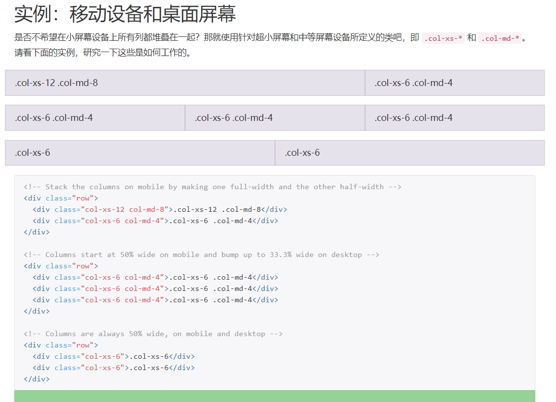
我们用目前所学的知识也能开发类似的组件,如下图

<!DOCTYPE html>
<html lang="en">

<head>
        <meta charset="UTF-8">
        <meta name="viewport" content="width=device-width, initial-scale=1.0">
        <title>Document</title>
        <style>
                * {
                        padding: 0;
                        margin: 0;
                }

                body {
                        padding: 100px;
                }

                .row {
                        padding: 10px;
                        width: 600px;
                        border: solid 5px silver;
                        display: grid;
                        grid-template-columns: repeat(12, 1fr);
                        gap: 10px 10px;
                }

                .col-1 {
                        grid-column-end: span 1;
                }

                .col-2 {
                        grid-column-end: span 2;
                }

                .col-3 {
                        grid-column-end: span 3;
                }

                .col-4 {
                        grid-column-end: span 4;
                }

                .col-5 {
                        grid-column-end: span 5;
                }

                .col-6 {
                        grid-column-end: span 6;
                }

                .col-7 {
                        grid-column-end: span 7;
                }

                .col-8 {
                        grid-column-end: span 8;
                }

                .col-9 {
                        grid-column-end: span 9;
                }

                .col-10 {
                        grid-column-end: span 10;
                }

                .col-11 {
                        grid-column-end: span 11;
                }

                .col-12 {
                        grid-column-end: span 12;
                }


                [class^="col-"] {
                        background-color: blueviolet;
                        background-clip: content-box;
                        height: 30px;
                        text-align: center;
                        color: #fff;


                }
        </style>
</head>

<body>

        <main>
                <div class="row">
                        <section class="col-8">col-8</section>
                        <section class="col-4">col-4</section>
                        <section class="col-4">col-4</section>
                        <section class="col-4">col-4</section>
                        <section class="col-4">col-4</section>
                        <section class="col-6">col-6</section>
                        <section class="col-6">col-6</section>
                </div>

        </main>

</body>

</html>
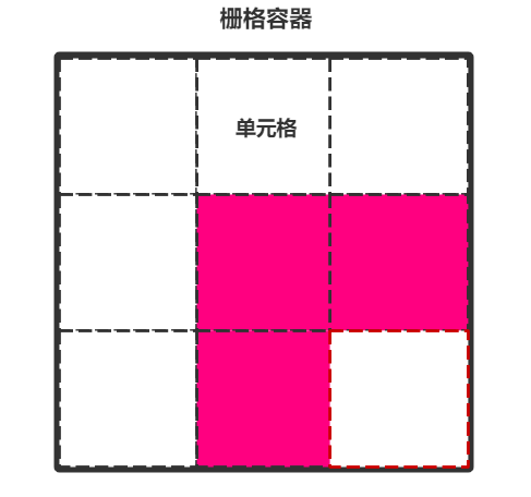
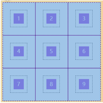
栅格容器之栅格区域
栅格区域说白了就是一堆栅格的单元格组成的区域,一个单元格也是一个区域。我们可以使用栅格区域更方便的放置元素而不用再慢慢的数线放置,栅格区域放置元素通常用在大布局上。
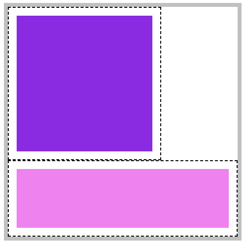
使用 grid-template-areas声明栅格区域时需要注意一点,栅格区域放置元素必须是矩形的。
你不能这样放置这样的一个元素:
栅格区域命名
来看一个简单的案例,如何使用 grid-template-areas对栅格区域进行命名并填充元素。
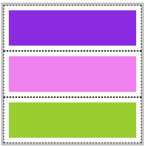
<!DOCTYPE html>
<html lang="en">

<head>
        <meta charset="UTF-8">
        <meta name="viewport" content="width=device-width, initial-scale=1.0">
        <title>Document</title>
        <style>
                * {
                        padding: 0;
                        margin: 0;
                }

                body {
                        padding: 100px;
                }

                main {
                        width: 300px;
                        /* height: 300px; */

                        border: solid 5px silver;
                        display: grid;

                        /* 行数,列数 */
                        grid-template-rows: repeat(3, 100px);
                        grid-template-columns: repeat(3, 100px);

                        grid-template-areas:
                        "top top top"
                        "mid mid mid"
                        "bottom bottom bottom";

                        /* 由于绘制了9*9的单元格,我们必须给每个单元格进行了命名 ,而且一定要是这种格式*/

                }

                main *{
                        background-clip: content-box;
                        padding: 10px;
                        border: dashed 1px black;
                }

                main header{
                        /* 完整的写法,推荐使用下面的简写方式*/
                        /* grid-area: top-start/top-start//top-start/top-end/top-end/top-end; */
                        grid-area: top;
                        background-color: blueviolet;
                }

                main article{
                        grid-area: mid;
                        background-color: violet;
                }

                main footer{
                        grid-area: bottom;
                        background-color: yellowgreen;
                }

        </style>
</head>

<body>

        <main>
               <header></header>
               <article></article>
               <footer></footer>
        </main>

</body>

</html>
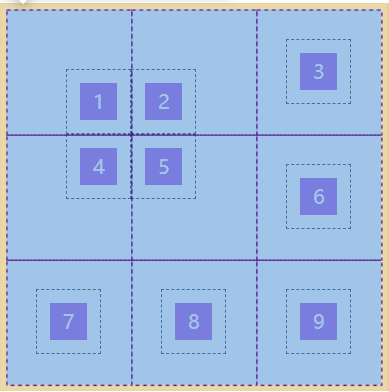
栅格区域边界线自动命名
栅格区域边界自动命名是什么意思呢?来看一下下面这张图:
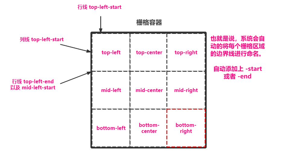
我们就按图中这种命名来实验一下。
<!DOCTYPE html>
<html lang="en">

<head>
        <meta charset="UTF-8">
        <meta name="viewport" content="width=device-width, initial-scale=1.0">
        <title>Document</title>
        <style>
                * {
                        padding: 0;
                        margin: 0;
                }

                body {
                        padding: 100px;
                }

                main {
                        width: 300px;
                        /* height: 300px; */

                        border: solid 5px silver;
                        display: grid;

                        /* 行数,列数 */
                        grid-template-rows: repeat(3, 100px);
                        grid-template-columns: repeat(3, 100px);

                        grid-template-areas:
                        "top-left top-center top-right"
                        "mid-left mid-center mid-right"
                        "bottom-left bottom-center bottom-right";

                        /* 由于绘制了9*9的单元格,我们必须给每个单元格进行了命名 ,而且一定要是这种格式*/

                }

                main *{
                         background-clip: content-box;
                        padding: 10px;
                        border: dashed 1px black;
                }

                main div:first-of-type{
                        grid-area: top-left-start/top-left-start/mid-center-end/mid-center-end;
                        background-color: blueviolet;
                }

                main div:last-of-type{
                        grid-area: bottom-left-start/bottom-left-start/bottom-right-end/bottom-right-end;
                        background-color: violet;
                }


        </style>
</head>

<body>

        <main>
                <div></div>
                <div></div>
        </main>

</body>

</html>
栅格区域命名占位
栅格区域命名占位就是说有的区域不想给他取名,那么就直接.就行。
为什么要这么做呢?看下图以及代码就能理解,我们在进行区域划分的时候就想好了这一块区域是来干什么的,应该有多大,那么多余的地方直接.占位即可。

<!DOCTYPE html>
<html lang="en">

<head>
        <meta charset="UTF-8">
        <meta name="viewport" content="width=device-width, initial-scale=1.0">
        <title>Document</title>
        <style>
                * {
                        padding: 0;
                        margin: 0;
                }

                body {
                        padding: 100px;
                }

                main {
                        width: 300px;
                        /* height: 300px; */

                        border: solid 5px silver;
                        display: grid;

                        /* 行数,列数 */
                        grid-template-rows: repeat(3, 100px);
                        grid-template-columns: repeat(3, 100px);

                        grid-template-areas:
                        "top top top"
                        "mid mid ."
                        "bottom . .";

                        /* 由于绘制了9*9的单元格,我们给每个单元格进行了命名 ,一定要是这种格式*/

                }

                main *{
                        background-clip: content-box;
                        padding: 10px;
                        border: dashed 1px black;
                }

                main header{
                        /* 完整的写法,推荐使用下面的简写方式*/
                        /* grid-area: top-start/top-start//top-start/top-end/top-end/top-end; */
                        grid-area: top;
                        background-color: blueviolet;
                }

                main article{
                        grid-area: mid;
                        background-color: violet;
                }

                main footer{
                        grid-area: bottom;
                        background-color: yellowgreen;
                }

        </style>
</head>

<body>

        <main>
               <header></header>
               <article></article>
               <footer></footer>
        </main>

</body>

</html>
栅格容器之元素排序
排序方式
默认情况下,整个栅格元素都是以行(水平)进行填充排序,我们可以在容器中设置grid-auto-flow 属性可以改变元素排序的方式。
| 选项 | 说明 |
|---|---|
| column | 按列排序 |
| row | 按行排列 |
<!DOCTYPE html>
<html lang="en">

<head>
        <meta charset="UTF-8">
        <meta name="viewport" content="width=device-width, initial-scale=1.0">
        <title>Document</title>
        <style>
                * {
                        padding: 0;
                        margin: 0;
                }

                body {
                        padding: 100px;
                }

                main {
                        width: 300px;
                        height: 300px;

                        border: solid 5px silver;
                        display: grid;

                        /* 行数,列数 */
                        grid-template: repeat(3,100px)/repeat(3,100px);
                        /* 排序方式:垂直 */
                        grid-auto-flow: column;
                }

                section {
                        background-color: blueviolet;
                        background-clip: content-box;
                        padding: 10px;
                        border: dashed 1px black;

                        text-align: center;
                        line-height: 78px;
                        color: #fff;
                }
        </style>
</head>

<body>

        <main>
                <section>1</section>
                <section>2</section>
                <section>3</section>
                <section>4</section>
                <section>5</section>
                <section>6</section>
                <section>7</section>
                <section>8</section>
                <section>9</section>
        </main>

</body>

</html>
空间填充
当元素在栅格中放不下时,将会发生换行产生留白,使用grid-auto-flow: row dense; 可以执行填充空白区域操作。
如下图,产生了两个空间。
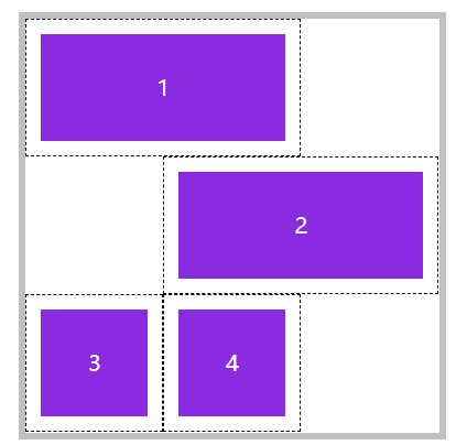
当设置之后可以发现,1和2的位置都没变,3和4填充了上来:
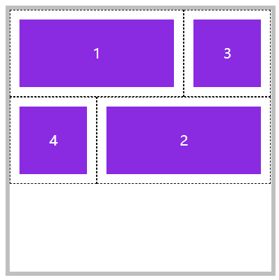
<!DOCTYPE html>
<html lang="en">

<head>
        <meta charset="UTF-8">
        <meta name="viewport" content="width=device-width, initial-scale=1.0">
        <title>Document</title>
        <style>
                * {
                        padding: 0;
                        margin: 0;
                }

                body {
                        padding: 100px;
                }

                main {
                        width: 300px;
                        height: 300px;

                        border: solid 5px silver;
                        display: grid;

                        /* 行数,列数 */
                        grid-template: repeat(3,100px)/repeat(3,100px);
                        /* 排序方式:水平  是否填充空间:填充 */
                        grid-auto-flow: row dense;

                }

                section {
                        background-color: blueviolet;
                        background-clip: content-box;
                        padding: 10px;
                        border: dashed 1px black;

                        text-align: center;
                        line-height: 78px;
                        color: #fff;
                }
                main section:nth-of-type(1){
                        /* 列线 第1根开始往后数2根的区域 */
                        grid-column:1/span 2;
                }

                main section:nth-of-type(2){
                        /* 列线 第2根开始往后数2根的区域 */
                        grid-column:2/span 2;
                }


        </style>
</head>

<body>

        <main>
                <section>1</section>
                <section>2</section>
                <section>3</section>
                <section>4</section>
        </main>

</body>

</html>
对齐方式
可以通过属性方便的定义栅格容器内栅格元素的对齐方式,可用值包括 start | end | center | stretch | space-between | space-evenly | space-around。
| 选项 | 说明 | 对象 |
|---|---|---|
| align-items | 栅格内所有元素的垂直排列方式 | 栅格容器 |
| justify-items | 栅格内所有元素的横向排列方式 | 栅格容器 |
| justify-content | 所有栅格在容器中的水平对齐方式,容器有额外空间时 | 栅格容器 |
| align-content | 所有栅格在容器中的垂直对齐方式,容器有额外空间时 | 栅格容器 |
| align-self | 元素在栅格中垂直对齐方式 | 栅格元素 |
| justify-self | 元素在栅格中水平对齐方式 | 栅格元素 |
| 选项 | 说明 |
|---|---|
| start | 元素按排序方式顺序排列 |
| end | 元素按排序方式倒序排列 |
| center | 元素在容器中 |
| space-between | 第一个元素靠起点,最后一个元素靠终点,余下元素平均分配空间 |
| space-around | 每个元素两侧的间隔相等。所以,项目之间的间隔比项目与边框的间隔大一倍 |
| space-evenly | 元素间距离平均分配 |
所有区域对齐方式
其实这些和弹性布局中的用法都差不多,可以看一下前一章写的弹性布局,那么这里就举例一个平均分配吧。
平均分布指的是,栅格容器中的栅格区域(即单元格),在栅格容器中的对齐方式。
注意:栅格容器一定要有多余空间。
指定所有区域对齐方式使用justify-content与align-content
<!DOCTYPE html>
<html lang="en">

<head>
        <meta charset="UTF-8">
        <meta name="viewport" content="width=device-width, initial-scale=1.0">
        <title>Document</title>
        <style>
                * {
                        padding: 0;
                        margin: 0;
                }

                body {
                        padding: 100px;
                }

                main {
                        width: 600px;
                        /* 宽度和高度要足够大 */
                        height: 600px;

                        border: solid 5px silver;
                        display: grid;

                        /* 行数,列数 */
                        grid-template: repeat(3,100px)/repeat(3,100px);
                        /* 水平平均 */
                        justify-content: space-evenly;
                        /* 垂直平均 */
                        justify-content: space-evenly;
                        align-content: space-evenly;

                }

                section {

                        background-color: blueviolet;
                        background-clip: content-box;
                        padding: 10px;
                        border: dashed 1px black;

                        text-align: center;
                        line-height: 78px;
                        color: #fff;
                }


        </style>
</head>

<body>

        <main>
                <section>1</section>
                <section>2</section>
                <section>3</section>
                <section>4</section>
                <section>5</section>
                <section>6</section>
                <section>7</section>
                <section>8</section>
                <section>9</section>
        </main>

</body>

</html>
所有元素对齐方式
指的是栅格区域中具体的栅格元素的对齐方式,比如说一个单元格太大了,那么里面内容又太小了该怎么做。
指定所有栅格区域中的具体元素使用:justify-items与align-items
注意:栅格区域一定要有多余空间。
<!DOCTYPE html>
<html lang="en">

<head>
        <meta charset="UTF-8">
        <meta name="viewport" content="width=device-width, initial-scale=1.0">
        <title>Document</title>
        <style>
                * {
                        padding: 0;
                        margin: 0;
                }

                body {
                        padding: 100px;
                }

                main {
                        width: 300px;
                        height: 300px;

                        border: solid 5px silver;
                        display: grid;

                        /* 行数,列数 */
                        grid-template: repeat(3,100px)/repeat(3,100px);

                        /* 控制具体元素在单元格中的位置 */
                        justify-items: center;
                        align-items: center;

                }

                section {
                        background-color: blueviolet;
                        background-clip: content-box;
                        padding: 10px;
                        border: dashed 1px black;

                        text-align: center;
                        color: #fff;

                        width: 30px;
                        height: 30px;
                        line-height: 30px;

                }
        </style>
</head>

<body>

        <main>
                <section>1</section>
                <section>2</section>
                <section>3</section>
                <section>4</section>
                <section>5</section>
                <section>6</section>
                <section>7</section>
                <section>8</section>
                <section>9</section>
        </main>

</body>

</html>
单个元素对齐方式
如果想控制单个元素对齐方式,使用justify-self与align-self即可。
注意:盛放该元素的栅格区域一定要有多余空间。
<!DOCTYPE html>
<html lang="en">

<head>
        <meta charset="UTF-8">
        <meta name="viewport" content="width=device-width, initial-scale=1.0">
        <title>Document</title>
        <style>
                * {
                        padding: 0;
                        margin: 0;
                }

                body {
                        padding: 100px;
                }

                main {
                        width: 300px;
                        height: 300px;

                        border: solid 5px silver;
                        display: grid;

                        /* 行数,列数 */
                        grid-template: repeat(3,100px)/repeat(3,100px);

                        /* 控制具体元素在单元格中的位置 */
                        justify-items: center;
                        align-items: center;

                }

                section {
                        background-color: blueviolet;
                        background-clip: content-box;
                        padding: 10px;
                        border: dashed 1px black;

                        text-align: center;
                        color: #fff;

                        width: 30px;
                        height: 30px;
                        line-height: 30px;

                }

                main section:nth-of-type(1){
                        justify-self: end;
                        align-self: end;
                }

                main section:nth-of-type(2){
                        justify-self: start;
                        align-self: end;
                }

                main section:nth-of-type(4){
                        justify-self: end;
                        align-self: start;
                }

                main section:nth-of-type(5){
                        justify-self: start;
                        align-self: start;
                }
        </style>
</head>

<body>

        <main>
                <section>1</section>
                <section>2</section>
                <section>3</section>
                <section>4</section>
                <section>5</section>
                <section>6</section>
                <section>7</section>
                <section>8</section>
                <section>9</section>
        </main>

</body>

</html>
简写模式
place-content
用于控制栅格中所有区域的对齐方式,语法如下:
place-content: <align-content> <justify-content>
place-items
控制所有区域中所有元素的对齐方式,语法结构如下:
place-items: <align-items> <justify-items>
place-self
控制区域中单个元素的对齐方式,语法结构如下:
place-self: <align-self> <justify-self>

 浙公网安备 33010602011771号