CSS文本控制
文本基础设置
字体设置
font-family可定义多个字体,系统会以从左至右的顺序进行查找,如左侧字体不存在,就往右侧找。
为什么要这么做呢?如果你只用了一种字体,而恰好人家电脑上没装,那么对不起了,他的显示肯定是有问题的。


<style>
    div {
        /* 多设置几种字体属性  font-family 文字家族,就是字体的意思 */
        font-family: 'Segoe UI', Tahoma, Geneva, Verdana, sans-serif;

    }
</style>
自定义字体
可以进行自定义字体,使用方式也非常简单。当自定义字体不存在时将通过src进行下载。注意导入字体后一定要使用format来说明字体的格式。
| 字体 | 格式 |
|---|---|
| .otf | opentype |
| .woff | woff |
| .ttf | truetype |
| .eot | Embedded-opentype |
不建议使用中文字体,因为文件太大且大部分是商业字体。
    <style>
        /* 导入该字体,可以多指定几个地址 */
        @font-face {
            font-family: "ALLEGRO";
            src: url("./ALLEGRO.TTF") format("truetype"),
                 url("./ALLEGRO.TTF") format("truetype");
        }
        div {
            /* 多设置几种字体属性  font-family 文字家族,就是字体的意思 */
            font-family: 'ALLEGRO', 'Gill Sans MT', 'Trebuchet MS', sans-serif;

        }
    </style>
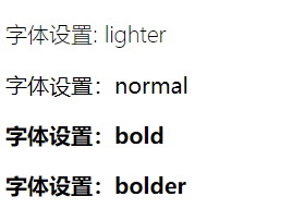
字体粗细
定义字体粗细为font-weight,它可以指定数字,也可以指定字母,数字可指定范围为100-900。
| font-weight值设定 | |
|---|---|
| lighter(细) | |
| normal(正常) | 400与normal相同 |
| bold(粗体) | 700与bold相同 |
| bolder(特粗) | |
<!DOCTYPE html>
<html lang="en"><head>
    <meta charset="UTF-8">
    <meta name="viewport" content="width=device-width, initial-scale=1.0">
    <style>
        body>:nth-child(1){
            font-weight: lighter;
        }
        body>:nth-child(2){
            font-weight: normal;
        }
        body>:nth-child(3){
            font-weight: bold;
        }
        body>:nth-child(4){
            font-weight: bolder;
        }
    </style>
    <title>Document</title>
</head><body>
    <p>字体设置: lighter</p>
    <p>字体设置:normal</p>
    <p>字体设置:bold</p>
    <p>字体设置:bolder</p>
</body></html>
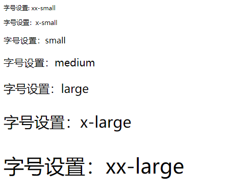
字号大小
设置字号大小用font-size,可以设置的方式较多。有英文单词,px,%,em,rem等等常用方式。
单词
我们可以使用单词来控制字号的大小,如下:
| font-size单词设置字号大小 | |
|---|---|
| xx-small | 最小 |
| x-small | 较小 |
| small | 小 |
| medium | 中等 |
| large | 大 |
| x-large | 较大 |
| xx-large | 最大 |
<!DOCTYPE html>
<html lang="en"><head>
    <meta charset="UTF-8">
    <meta name="viewport" content="width=device-width, initial-scale=1.0">
    <style>
        body>:nth-child(1){
            font-size: xx-small;
        }
        body>:nth-child(2){
            font-size: x-small;
        }
        body>:nth-child(3){
            font-size: small;
        }
        body>:nth-child(4){
            font-size: medium;
        }
        body>:nth-child(5){
            font-size: large;
        }
        body>:nth-child(6){
            font-size: x-large;
        }
        body>:nth-child(7){
            font-size: xx-large;
        }
    </style>
    <title>Document</title>
</head><body>
    <p>字号设置: xx-small</p>
    <p>字号设置:x-small</p>
    <p>字号设置:small</p>
    <p>字号设置:medium</p>
    <p>字号设置:large</p>
    <p>字号设置:x-large</p>
    <p>字号设置:xx-large</p>
</body></html>
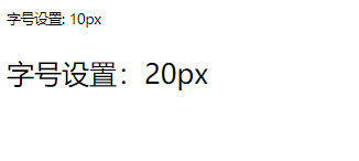
px
px是固定的像素单位,如果你的网页要在移动端使用,那么尽量的少使用它,它不会自动的进行变化。
<!DOCTYPE html>
<html lang="en"><head>
    <meta charset="UTF-8">
    <meta name="viewport" content="width=device-width, initial-scale=1.0">
    <style>
        body>:nth-child(1){
            font-size: 10px;
        }
        body>:nth-child(2){
            font-size: 20px;
        }</style>
    <title>Document</title>
</head><body>
    <p>字号设置: 10px</p>
    <p>字号设置:20px</p>
</body></html>
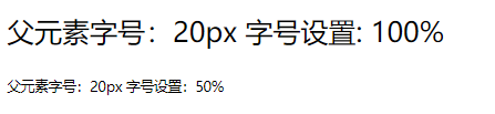
百分数
百分数是子元素相对于父元素设置的该属性大小,如父元素的font-size是20px,子元素设置为 200%即为父元素的两倍大小。
<!DOCTYPE html>
<html lang="en"><head>
    <meta charset="UTF-8">
    <meta name="viewport" content="width=device-width, initial-scale=1.0">
    <style>
        body{
            font-size: 20px;
        }
        body>:nth-child(1){
            font-size: 100%;
        }
        body>:nth-child(2){
            font-size: 50%;
        }</style>
    <title>Document</title>
</head><body>
    <p>父元素字号:20px 字号设置: 100%</p>
    <p>父元素字号:20px 字号设置:50%</p>
</body></html>
em
em与百分号类似,子元素的font-size:1em相当于父元素设置的font-size的100%,而0.5em则相当于父元素设置的font-size的50%。注意,对于0.多少来说,可以直接简写。
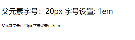
<!DOCTYPE html>
<html lang="en"><head>
    <meta charset="UTF-8">
    <meta name="viewport" content="width=device-width, initial-scale=1.0">
    <style>
        body{
            font-size: 20px;
        }
        body>:nth-child(1){
            font-size: 1em;
        }
        body>:nth-child(2){
            font-size: .5em;
        }</style>
    <title>Document</title>
</head><body>
    <p>父元素字号:20px 字号设置: 1em</p>
    <p>父元素字号:20px 字号设置:.5em</p>
</body></html>
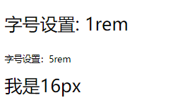
rem
rem作为em的升级版,是目前使用较多的一种方式。它不会根据父元素的该属性值进行变化,而是根据HTML的值,比如chorme是默认字体大小如果为16px,那么使用1rem就相当于16px。
注意:有的是16px,有的是12px。
<!DOCTYPE html>
<html lang="en"><head>
    <meta charset="UTF-8">
    <meta name="viewport" content="width=device-width, initial-scale=1.0">
    <style>
        body>:nth-child(1){
            font-size: 1rem;
        }
        body>:nth-child(2){
            font-size: .5rem;
        }

        span{
            font-size: 16px;
        }</style>
    <title>Document</title>
</head><body>
    <p>字号设置: 1rem</p>
    <p>字号设置:5rem</p>
    <span>我是16px</span>
</body></html>
文本颜色
文本颜色使用color属性来进行设定,可用单词,rbg,rgba,#16进制色。
单词
直接使用单词,可以设定文本颜色。如color:red;

<!DOCTYPE html>
<html lang="en">

<head>
    <meta charset="UTF-8">
    <meta name="viewport" content="width=device-width, initial-scale=1.0">
    <style>
        p{
            color: red;
        }
    </style>
    <title>Document</title>
</head>

<body>

    <p>文本颜色:red</p>

</body>

</html>
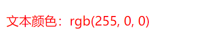
rgb
rgb是三原色,红绿蓝。格式为color:rbg(0-255,0-255,0-255),当然也可以使用单词在里面。
<!DOCTYPE html>
<html lang="en">

<head>
    <meta charset="UTF-8">
    <meta name="viewport" content="width=device-width, initial-scale=1.0">
    <style>
        p{
            color:rgb(255, 0, 0);
        }
    </style>
    <title>Document</title>
</head>

<body>

    <p>文本颜色:rgb(255, 0, 0)</p>

</body>

</html>
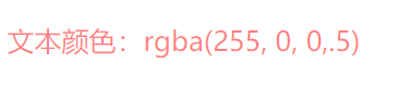
rgba
rgba相较于rgb来说,括号中多了第4位数值,数值范围为0-1,可用于指定透明度。
<!DOCTYPE html>
<html lang="en">

<head>
    <meta charset="UTF-8">
    <meta name="viewport" content="width=device-width, initial-scale=1.0">
    <style>
        p{
            color:rgba(255, 0, 0,.5);
        }
    </style>
    <title>Document</title>
</head>

<body>

    <p>文本颜色:rgba(255, 0, 0,.5)</p>

</body>

</html>
#16进制数
格式为#xxxxxx,其中x为16进制数。如果所有x都相同,可简写为#xxx。
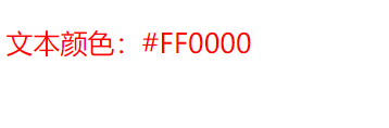
<!DOCTYPE html>
<html lang="en">

<head>
    <meta charset="UTF-8">
    <meta name="viewport" content="width=device-width, initial-scale=1.0">
    <style>
        p{
            color:#FF0000;
        }
    </style>
    <title>Document</title>
</head>

<body>

    <p>文本颜色:#FF0000</p>

</body>

</html>
文本行高
我们看一下图,当一段文本放在一个块级标签或内联块级标签中,那么默认它是以标签左上角为起始的。
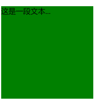
<!DOCTYPE html>
<html lang="en">

<head>
    <meta charset="UTF-8">
    <meta name="viewport" content="width=device-width, initial-scale=1.0">
    <style>
        p{
            width: 200px;
            height: 200px;
            background-color: green;
        }
    </style>
    <title>Document</title>
</head>

<body>

    <p>
        这是一段文本...
    </p>

</body>

</html>
如果我们想让他垂直居中,则使用line-height:标签高度即可。
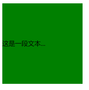
<!DOCTYPE html>
<html lang="en">

<head>
    <meta charset="UTF-8">
    <meta name="viewport" content="width=device-width, initial-scale=1.0">
    <style>
        p{
            width: 200px;
            height: 200px;
            background-color: green;
            line-height: 200px;
        }
    </style>
    <title>Document</title>
</head>

<body>

    <p>
        这是一段文本...
    </p>

</body>

</html>
文本倾斜
使用font-style即可,可以设定的值为italic倾斜,normal无倾斜。
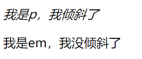
<!DOCTYPE html>
<html lang="en">

<head>
    <meta charset="UTF-8">
    <meta name="viewport" content="width=device-width, initial-scale=1.0">
    <style>
        body>:nth-child(1){
            font-style: italic;
        }
        body>p>:nth-child(1){
            font-style: normal;
        }
    </style>
    <title>Document</title>
</head>

<body>

    <p>我是p,我倾斜了</p>
    <p><em>我是em,我没倾斜了</em></p>

</body>

</html>
文本组合定义
一个一个写是不是太麻烦了?我们可以使用font进行组合定义。但是使用组合定义必须注意以下几点:
必须有字体规则
必须有字符大小规则
颜色不能进入组合定义

<!DOCTYPE html>
<html lang="en">

<head>
    <meta charset="UTF-8">
    <meta name="viewport" content="width=device-width, initial-scale=1.0">
    <style>
        p {
            font: italic bold 1em/1.5 'Courier New', Courier, monospace;
            color: rgba(255, 0, 0, .5);
        }
    </style>
    <title>Document</title>
</head>

<body>

    <p>倾斜:italic 粗细:bold  字号:1em/行高:1.5 字体:'Courier New', Courier, monospace 颜色:rgba(255,0,0,.5)</p>


</body>

</html>
文本样式
大小转换
如果想让一段文本的字体与大小写看起来不太一样,可使用font-variant进行操作。
| 值 | 描述 |
|---|---|
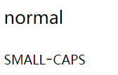
| normal | 默认值。浏览器会显示一个标准的字体。 |
| small-caps | 浏览器会显示小型大写字母的字体。 |
| inherit | 规定应该从父元素继承 font-variant 属性的值。 |
<!DOCTYPE html>
<html lang="en">

<head>
    <meta charset="UTF-8">
    <meta name="viewport" content="width=device-width, initial-scale=1.0">
    <style>
        body :nth-child(1){
            font-variant:normal ;
        }
        body :nth-child(2){
            font-variant: small-caps;
        }
    </style>
    <title>Document</title>
</head>

<body>

    <p>normal</p>
    <p>small-caps</p>

</body>

</html>
字母大小写
如果想对一段文本的字母做大小写转换,可使用text-transform。
| 值 | 描述 |
|---|---|
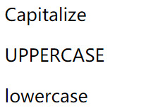
| capitalize | 首字母大写 |
| uppercase | 全部大写 |
| lowercase | 全部小写 |
<!DOCTYPE html>
<html lang="en">

<head>
    <meta charset="UTF-8">
    <meta name="viewport" content="width=device-width, initial-scale=1.0">
    <style>
        body :nth-child(1){
            text-transform: capitalize;
        }
        body :nth-child(2){
            text-transform: uppercase;
        }
        body :nth-child(3){
            text-transform: lowercase;
        }
    </style>
    <title>Document</title>
</head>

<body>

    <p>capitalize</p>
    <p>uppercase</p>
    <p>lowercase</p>

</body>

</html>
文本线条
我们可以用text-decoration来清除<a>标签自带的下划线,当然它还有其他的很多值。
| 值 | 描述 |
|---|---|
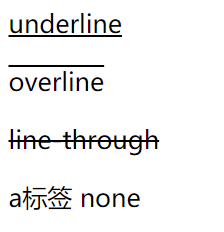
| none | 默认。定义标准的文本。 |
| underline | 定义文本下的一条线。 |
| overline | 定义文本上的一条线。 |
| line-through | 定义穿过文本下的一条线。 |
| blink | 定义闪烁的文本。 |
| inherit | 规定应该从父元素继承 text-decoration 属性的值。 |
<!DOCTYPE html>
<html lang="en">

<head>
    <meta charset="UTF-8">
    <meta name="viewport" content="width=device-width, initial-scale=1.0">
    <style>
        body :nth-child(1){
            text-decoration: underline;
        }
        body :nth-child(2){
            text-decoration: overline;
        }
        body :nth-child(3){
            text-decoration: line-through;
        }
        body :nth-child(4){
            text-decoration: none;
        }
    </style>
    <title>Document</title>
</head>

<body>

    <p>underline</p>
    <p>overline</p>
    <p>line-through</p>
    <a>a标签 none</a>


</body>

</html>
文本阴影
如果想让一段文本具有阴影的效果,可使用text-shadow来进行设置,它的参数顺序如下:
颜色,水平偏移,垂直偏移,模糊度

<!DOCTYPE html>
<html lang="en">

<head>
    <meta charset="UTF-8">
    <meta name="viewport" content="width=device-width, initial-scale=1.0">
    <style>
        body :nth-child(1){
            text-shadow:#ddd 5px 5px 0.4px;
        }

    </style>
    <title>Document</title>
</head>

<body>

    <h1>欢迎来到博客园</h1>


</body>

</html>
空白处理
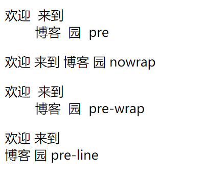
如果文本中有许多空白,那么是显示不出我们想要的效果的,除非你在<pre>标签中。我们可以使用white-space来控制文本中的空白显示。它的值如下:
| 值 | 描述 |
|---|---|
| pre | 保留文本中的所有空白,类似使用 pre 标签 |
| nowrap | 禁止文本换行 |
| pre-wrap | 保留空白,保留换行符 |
| pre-line | 空白合并,保留换行符 |
<!DOCTYPE html>
<html lang="en">

<head>
    <meta charset="UTF-8">
    <meta name="viewport" content="width=device-width, initial-scale=1.0">
    <style>
        body :nth-child(1){
            white-space: pre;
        }
        body :nth-child(2){
            white-space: nowrap;
        }
        body :nth-child(3){
            white-space: pre-wrap;
        }
        body :nth-child(4){
            white-space: pre-line;
        }
    </style>
    <title>Document</title>
</head>

<body>

    <p>欢迎  来到
        博客  园  pre</p>

    <p>欢迎  来到
        博客  园  nowrap</p>

    <p>欢迎  来到
        博客  园  pre-wrap</p>

    <p>欢迎  来到
        博客  园  pre-line</p>


</body>

</html>
文本溢出
如果一个容器里的文本太长,那么它不会自动换行而是溢出。我们可以使用overflow-wrap: break-word;让它自动换行。
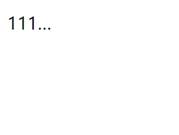
如果你不想让它换行,而是在结尾显示...,我们需要用到2个组合的属性,overflow: hidden;代表溢出部分隐藏,text-overflow: ellipsis;代表后面加上...。
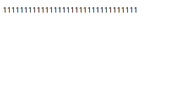
<!DOCTYPE html>
<html lang="en">

<head>
    <meta charset="UTF-8">
    <meta name="viewport" content="width=device-width, initial-scale=1.0">
    <style>

        body :nth-child(1){
            width: 50px;
        }

    </style>
    <title>Document</title>
</head>

<body>

    <p>11111111111111111111111111111111</p>


</body>

</html>
设置了overflow-wrap: break-word;

设置了overflow: hidden; text-overflow: ellipsis; 一定要注意顺序!这两个一个在上一个在下,不能换位置!
段落控制
文本缩进
文本缩进使用text-indent,跟上单位。可以是px,em,或者rem。
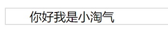
<!DOCTYPE html>
<html lang="en">

<head>
    <meta charset="UTF-8">
    <meta name="viewport" content="width=device-width, initial-scale=1.0">
    <style>

        body :nth-child(1){
            border: #ddd 1px solid;
            text-indent: 2rem;
        }

    </style>
    <title>Document</title>
</head>

<body>

    <p>你好我是小淘气</p>

</body>

</html>
水平对齐
我们可以使用text-align来进行文本的对齐方式。
| 值 | 描述 |
|---|---|
| left | 左对齐 |
| right | 右对齐 |
| center | 居中对齐 |
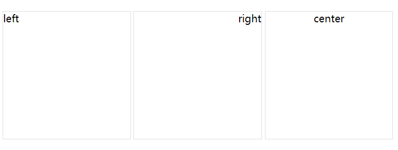
<!DOCTYPE html>
<html lang="en">

<head>
    <meta charset="UTF-8">
    <meta name="viewport" content="width=device-width, initial-scale=1.0">
    <style>

        p{
            width: 200px;
            height: 200px;
            border: #ddd 1px solid;
            display: inline-block;
        }

        body :nth-child(1){
            text-align: left;
        }
        body :nth-child(2){
            text-align: right;
        }
        body :nth-child(3){
            text-align: center;
        }

    </style>
    <title>Document</title>
</head>

<body>

    <p>left</p>
    <p>right</p>
    <p>center</p>

</body>

</html>
垂直对齐
垂直对齐一副图像请使用vertical-align。
| 值 | 描述 |
|---|---|
| baseline | 默认。元素放置在父元素的基线上。 |
| sub | 垂直对齐文本的下标。 |
| super | 垂直对齐文本的上标 |
| top | 把元素的顶端与行中最高元素的顶端对齐 |
| text-top | 把元素的顶端与父元素字体的顶端对齐 |
| middle | 把此元素放置在父元素的中部。 |
| bottom | 把元素的顶端与行中最低的元素的顶端对齐。 |
| text-bottom | 把元素的底端与父元素字体的底端对齐。 |
| % | 使用 "line-height" 属性的百分比值来排列此元素。允许使用负值。 |
| inherit | 规定应该从父元素继承 vertical-align 属性的值。 |
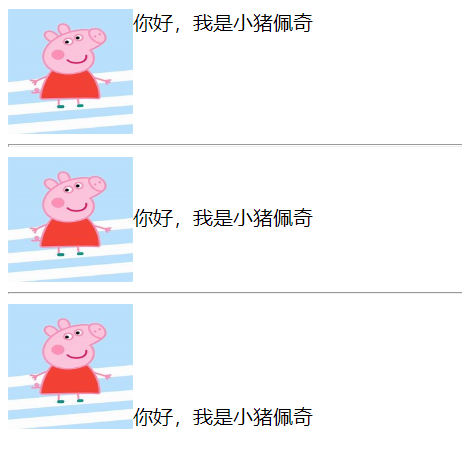
<!DOCTYPE html>
<html lang="en">

<head>
    <meta charset="UTF-8">
    <meta name="viewport" content="width=device-width, initial-scale=1.0">
    <style>

        img{
            width: 100px;
            height: 100px;

        }
        body :nth-child(1) img{
            vertical-align: top;
        }
        body :nth-child(3) img{
            vertical-align: middle;
        }
        body :nth-child(5) img{
            vertical-align: bottom;
        }
    </style>
    <title>Document</title>
</head>

<body>

    <div>
        <img src="../th.jpg" alt="">你好,我是小猪佩奇
    </div>
    <hr>
    <div>
        <img src="../th.jpg" alt="">你好,我是小猪佩奇
    </div>
    <hr>
    <div>
        <img src="../th.jpg" alt="">你好,我是小猪佩奇
    </div>

</body>

</html>
单词间距
请使用word-spacing来控制单词与单词之间的间距。
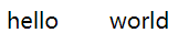
<!DOCTYPE html>
<html lang="en">

<head>
    <meta charset="UTF-8">
    <meta name="viewport" content="width=device-width, initial-scale=1.0">
    <style>

        div{
            word-spacing: 2rem;
        }

    </style>
    <title>Document</title>
</head>

<body>

    <div>hello world</div>

</body>

</html>
字符间距
请使用letter-spacing来控制字符与字符之间的间距。

<!DOCTYPE html>
<html lang="en">

<head>
    <meta charset="UTF-8">
    <meta name="viewport" content="width=device-width, initial-scale=1.0">
    <style>

        div{
            letter-spacing: 2rem;
        }

    </style>
    <title>Document</title>
</head>

<body>

    <div>老夫聊发少年狂,锦帽貂裘千骑卷平岗</div>

</body>

</html>
排版模式
如果想对文本进行排版,可使用writing-mode。
| 模式 | 说明 |
|---|---|
| horizontal-tb | 水平方向自上而下的书写方式 |
| vertical-rl | 垂直方向自右而左的书写方式 |
| vertical-lr | 垂直方向内内容从上到下,水平方向从左到右 |
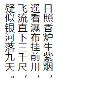
<!DOCTYPE html>
<html lang="en">

<head>
    <meta charset="UTF-8">
    <meta name="viewport" content="width=device-width, initial-scale=1.0">
    <style>

        div{
            writing-mode: vertical-rl;
            width: 8rem;
            height: 8rem;
            overflow-wrap: break-word;
        }

    </style>
    <title>Document</title>
</head>

<body>

    <div>日照香炉生紫烟,遥看瀑布挂前川,飞流直下三千尺,疑似银河落九天。</div>

</body>

</html>

 浙公网安备 33010602011771号