
第三十三讲——CSS
第三十三讲——CSS
Cascading style Sheet 层叠级联样式表
HTML(结构) + CSS(表现) + JAVAScript(交互)
Css选择器(重难点) 美化网页 盒子模型 网页浮动 网页定位 网页动画(特效)
1——初步认识CSS
Description
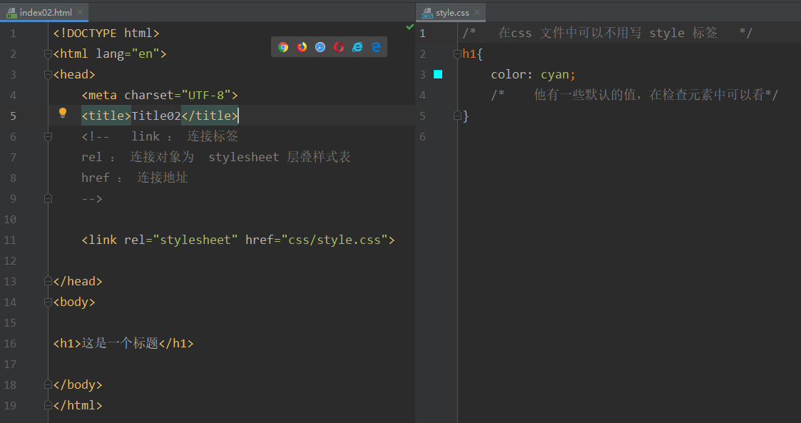
<!DOCTYPE html>
<html lang="en">
<head>
<meta charset="UTF-8">
<title>Title</title>
<!-- 规范: <style> 可以编写 css 代码 每一个声明最好以分号结尾
语法:
选择器{
声明1;
声明2;
声明3;
、、、、
}
-->
<!-- 不建议把 html 和css 写在一起 练习写写-->
<style>
h1{
color: cyan;
/* 他有一些默认的值,在检查元素中可以看*/
}
</style>
</head>
<body>
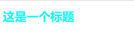
<h1>这是一个标题</h1>
</body>
</html>
Result
HTML 与 CSS 分离
Description
css的优势:
- 内容和表现分离
- 网页结构表现统一,可以实现复用
- 样式丰富
- 建议使用独立的 html 和 css 文件
- 利用 SEO 容易被搜索引擎收录
2——CSS 3种导入方式
三种导入方式:
- 内部样式
- 外部样式
- 链接式 (推荐使用)
- 导入式 (了解)
- 行内样式
Directiption
<!DOCTYPE html>
<html lang="en">
<head>
<meta charset="UTF-8">
<title>三种导入方式</title>
<!-- 内部样式 -->
<style>
h1{
color: blue;
}
</style>
<!-- 外部样式 -->
<!-- 外部样式1.0 链接式 -->
<link rel="stylesheet" href="css/style.css">
<!-- rel 属性规定当前文档与被链接文档之间的关系-->
<!-- 外部样式2.0 导入式 -->
<style>
@import url("css/style.css");
</style>
<!--
link 是 html 标签 推荐使用 link
@import 是 css语言
效果是一样的,但是在网页加载时,导入式会先加载骨架再渲染网页,link是渲染好再呈现网页 所以推荐使用
-->
</head>
<body>
<!-- 优先级 : 就近原则 -->
<!--行内样式 : 标签元素中,编写style 属性 编写参数即可 如果存在多个参数必须以分号 ; 结尾 -->
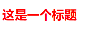
<h1 style="color: red">这是一个标题</h1>
</body>
</html>
CSS
/*   在css 文件中可以不用写 style 标签   */
h1{
    color: cyan;
    /*    他有一些默认的值,在检查元素中可以看*/
}
Result
3——选择器
作用: 选择页面上的某一个或者某一类元素
基本选择器:
- 标签 选择器
- 类 选择器 class
- id 选择器
基本选择器
Rescription
<!DOCTYPE html>
<html lang="en">
<head>
<meta charset="UTF-8">
<title>Title03</title>
<style>
/*
(在同一个属性上,例如同时设置字体颜色。如果设置的不同参数那么生效)不遵循就近原则 :
id 选择器 > class 选择器 > 标签选择器 */
/* id 选择器 : 选择到一个 id 上 (id 必须保证全局唯一)
格式 : # + id名称{}
*/
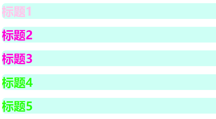
#a{
color: #00ff0e
}
/* 类选择器 : 选择到同一个 class 名称
格式 : .class的名称{} (名称好像不可以是数字,会报警 连注释也报警)
好处可以是多个标签归类, 用一个class, 可以复用,可以批量的定位 比标签要灵活
*/
.style01{
color: #ff00da;
}
/* 标签选择器 : 会选择到页面上所有的这个标签 h1 的标签
格式 : 标签名+{}
弊端: 定的标签是死的,如果在同一标签的内容中,区分开来是做不到的
例如: 再写一个 p 标签 那么是无法让两个标签 拥有不同颜色的
*/
h1{
color: #ff191a;
background: cyan;
border-radius: 10px;
/* 他们博客的标题就是这样写的 好看很多确实 */
}
</style>
</head>
<body>
<h1 id="a">标题1</h1>
<!--class 名字取得 见名知意-->
<h1 class="style01" id="b">标题2</h1>
<h1 class="style01" id="c">标题3</h1>
<h1 id="e">标题4</h1>
<h1 id="f">标题5</h1>
</body>
</html>
Result
广告消失术
层次选择器
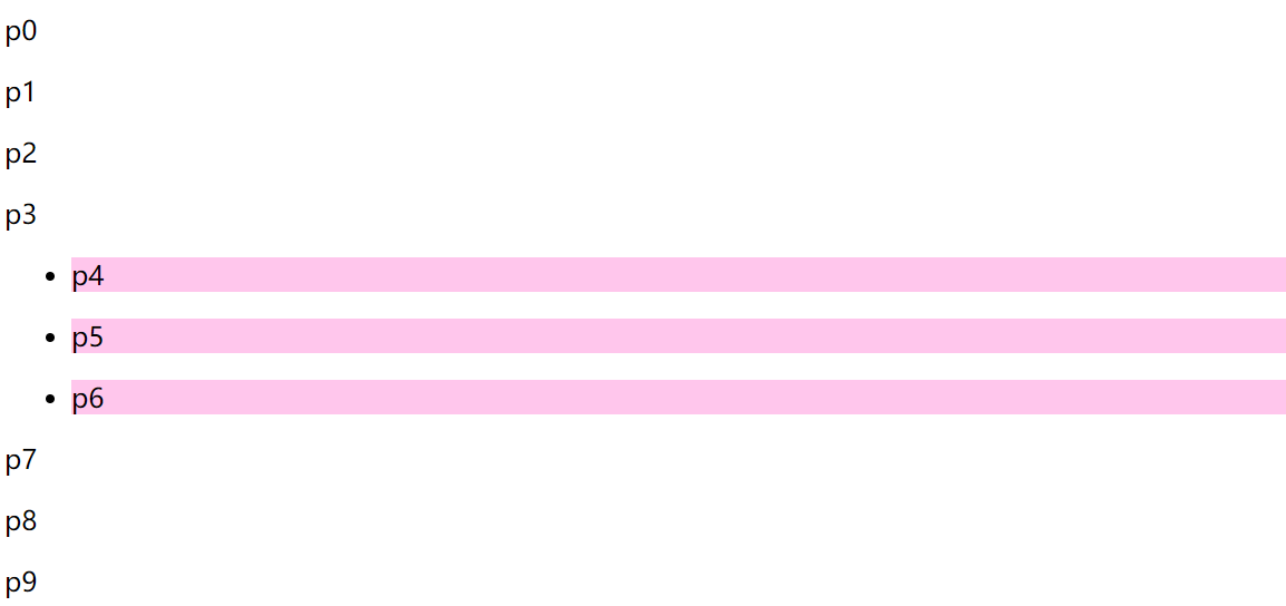
- 后代选择器 : (选后代)
/*后代选择器 : 某元素为切入点, 选中后续的所有指定衍生元素*/
<style>
li p{
      background: #ffc6ec;
}
</style>
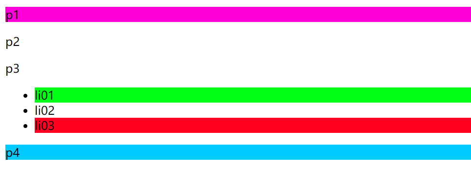
- 子选择器 : (选儿子)
/*子选择器 : 某元素为切入点, (选儿子)选中后续的第一代指定衍生元素 */
<style>
body>p{
    background: #ffc6ec;
}
</style>
- 相邻选择器(选胞弟,向下,唯一)
/*    相邻选择器 : 某元素为切入点, (选胞弟)选中后续的同一代首个指定元素*/
<style>
    .active + p {
        background: #2bff0d;
    }
</style>
- 通用选择器(选胞弟,向下,不唯一)
/*通用选择器: 当前选中元素的向下所有兄弟元素*/
<style>
.active~p{
    background: #ffb900;
}
</style>
结构伪类选择器
结构伪类选择器
    <style>
        /*定位第一个元素
        (如果第一个元素不是 li 元素 则不生效)
        */
        ul li:first-child{
            background: cyan;
        }
        /*定位最后一个元素
        (如果最后一个元素不是 p 元素 则不生效)
        */
        ul p:last-child{
            background: #2bff0d;
        }
    </style>
<style>
/* 定位元素,选中元素块的第一个元素 nth 父元素  child 元素  按绝对排序
选中所有拥有p元素的 元素块中的第一个 p 元素,前提是 p 元素 且排序正确(元素排序是绝对的,不是所选元素的排序)
nth 第几个元素
*/
p:nth-child(1){
    background: #ff00da;
}

/* 选中父元素、下 p 类型的 第四个元素  按类型排序  相对排序*/
p:nth-of-type(4){
    background: #ff0010;
}
</style>
悬停变色——伪类选择器
<style>
p:hover{
    background: #62ffb6;
}
/*悬停就会变色*/
</style>
属性选择器(常用)
Description
<!DOCTYPE html>
<html lang="en">
<head>
    <meta charset="UTF-8">
    <title>Title</title>

    <style>
        .demo a{
            float: left; /*浮动*/
            display: block; /* 此元素将显示为块级元素,此元素前后会带有换行符。 */
            height: 50px;
            width: 50px;
            border-radius: 10px;
            background: #62ffb6;
            text-align: center;
            color: gainsboro; /*字体灰色*/
            text-decoration: none; /*去下划线*/
            margin-right: 5px; /*右边距*/
            font: bold 20px/50px Arial;  /*设置字体: 粗体 宽20 高50  黑体 Arial:黑体 */
        }

        /* 属性选择器:
         格式:标签+[属性]
       */
        a[id]{
            background: #201fff;
        }    /*在a标签中有 id 属性的*/

        a[id=first]{
            background: #ff0078;
        }     /*在a标签中有 id 属性=first的*/
        /* 查找元素 多余的空格也不行,
        = 精确匹配
        *= 包含匹配
        ^= 以这个开头
        $= 以这个结尾
        */
        a[class=links]{
            background: #ffc6ec;
        }

        /*选择href 中以 http 开头的元素 正则表达式 */
        a[href^=http]{
            background: yellow;
        }
        /*选择href 中以 doc 结尾的元素 正则表达式 */
        a[href$=doc]{
            background: #4c43ff;
        }

    </style>

</head>
<body>

<p class="demo">
    <a href="http://www.baidu.com" class="links item first " id="first">1</a>
    <a href="http://www.baidu.com" class="links item active " target="_blank" title="test">2</a>
    <a href="images/123.html" class="links item  "  title="test">3</a>
    <a href="images/123.png" class="links item  "  title="test">4</a>
    <a href="images/123.jpg" class="links item  "  title="test">5</a>
    <a href="abc">6</a>
    <a href="abc.pdf">7</a>
    <a href="abc.doc">8</a>
    <a href="abc.doc" class="links item last ">9</a>
    <a href="abc.doc" class="links">10</a>

</p>
</body>
</html>
Result
4——美化网页元素
4——美化网页元素
需要重点突出的字用 span 标签括起来
<span style='color:pink;background:yellow;font-size:50px;font-style:italic(斜体);'>-----------黄色背景--------------</span>
字体样式
 <!--
 font-family : 字体样式
 font-size : 字体大小
 font-weight : 字体粗细
 color: 字体颜色

 -->
 <style>
     body{
         font-family: "Arial Black", 楷体 ;  /*字体样式 逗号隔开 */
     }
     h1{
         font-size: 50px;
         color: #ffc6ec;
     }
     .p1{
         font-weight: bold;  /*bold  */
     }
     .p2{
         color: #ff00da;
     }
/*
       写成一体
     p{
         font: oblique bold 20px/16px "楷体";
     }*/

 </style>
文本样式
Description
<!DOCTYPE html>
<html lang="en">
<head>
    <meta charset="UTF-8">
    <title>文本样式</title>


    <!--
    颜色:
         (RGB红绿蓝)  0~F
         RGBA  A: 0~1     color: rgba(0,255,0,0.1); 透明度
    text-align: center;   排版  居右  左右居中
    text-indent: 1em;     段落首行缩进  em 字符单位
    line-height: 300px;   行高  用来实现上下居中
    text-decoration: underline;      下划线
    text-decoration: overline;       上划线
    text-decoration: line-through;   删除线
    text-decoration: none;           去除超链接下划线 去除装饰 设置为none
    vertical-align: middle;          图片与文字的垂直居中 需要参照物
    text-shadow: #2bff0d 3px 0px 3px;  文本阴影 这里没用到
    -->
    <style>
        h1{
            color: rgba(0,255,0,0.8);
            text-align: right;
        }

        .p1{
            text-indent: 2em;
        }

        .p2{
            background: rgba(102,188,25,0.3);
            height: 60px;  /* 初步理解: 这里指的是背景的大小 */
            line-height: 30px;
            text-decoration: underline;
            text-decoration: line-through;
            text-decoration: overline;
        }

        /*初步理解 这里 , 的意思是他们是同等的地位 他们要在一个块元素里才行,并且是同等级的,要避免冲突 例如: h 是独占一行,就无法垂直对齐*/
        img,span{
            vertical-align: middle;
            /*这里实现了 图片和文字 的垂直居中*/
        }
        /*超链接 去下划线 只要 设置装饰为 none */
        a{
            text-decoration: none;
        }

    </style>


</head>
<body>
<h1>故事介绍</h1>

<a href="">点击跳转</a>

<p>
    <img src="images/1.png" title="2022"></img>
    <span>2022 love</span>
</p>

<p class="p1">一个犹太人走进纽约的一家银行,来到贷款部,大模大样地坐下来。</p>

<p>“请问先生有什么事情吗?”贷款部经理一边问,一边打量着来人的穿着:豪华的西服、高级皮鞋、昂贵的手表,还有镶宝石的领带夹子。</p>
“我想借些钱。” <br>
“好啊,你要借多少?” <br>

<p class="p2">Thoughts of you dance through my mind. Knowing, it is just a matter of time。Wondering will u ever be mine?You are in my dreams, night and sometimes day.The thoughts seem to never fade away.
</p>

</body>
</html>
Result
伪类
/*默认的颜色*/
a{
    text-decoration: none;
    color: black;
}

/* a 标签 鼠标悬浮的颜色*/
a:hover{
    color: #2bff0d;
}
/*激活后的状态 —— 鼠标按下未释放的情况*/
a:active{
    color: cyan;
    font-size: 30px;
}
/*阴影 :  阴影的颜色  水平偏移  垂直偏移  阴影半径*/
#price{
    text-shadow: #2bff0d 3px 0px 3px;
}
列表美化
Description——html
<!DOCTYPE html>
<html lang="en">
<head>
    <meta charset="UTF-8">
    <title>Title</title>
    <link rel="stylesheet" href="css/style.css">
</head>

<body>
<div id="nav">
    <h2 class="title">全部商品分类</h2>
    <ul>
        <li>
            <a href="#">图书</a>
            <a href="#">音像</a>
            <a href="#">数字商品</a>
        </li>
        <li>
            <a href="#">家用电器</a>
            <a href="#">手机</a>
            <a href="#">数码</a>
        </li>
        <li>
            <a href="#">电脑</a>
            <a href="#">办公</a>
        </li>
        <li>
            <a href="#">家居</a>
            <a href="#">家装</a>
            <a href="#">厨具</a>
        </li>
        <li>
            <a href="#">服饰鞋帽</a>
            <a href="#">个性化妆</a>
        </li>
        <li>
            <a href="#">礼品箱包</a>
            <a href="#">钟表</a>
            <a href="#">珠宝</a>
        </li>
        <li>
            <a href="#">食品饮料</a>
            <a href="#">保健食品</a>
        </li>
        <li>
            <a href="#">彩票</a>
            <a href="#">旅行</a>
            <a href="#">充值</a>
            <a href="#">票务</a>
        </li>
    </ul>
</div>

</body>
</html>
Description——CSS
/*整个 列表内容*/
#nav{
    width: 300px;
    background: #b3fff5;
}

/*标题*/
.title{
    font-size: 18px;
    font-weight: bold;
    text-indent: 2em;
    line-height: 35px;
    /*颜色 , 图片 ,图片位置,平铺方式*/
    background: red url("../images/1.png") 255px 3px no-repeat;
}
    /*
        list-style: none;       去除列表装饰        (例如:无序的点、有序的数字)
        list-style: circle;     空心圆  装饰
        list-style: decimal;    数字  装饰
        list-style: square;    正方形 装饰
    */
ul{
    background: #b3fff5;
}

ul li{
    line-height: 2em;
    text-indent: 2em;
    list-style: none;/* 去除列表装饰  (例如:无序的点、有序的数字)*/
    /*前面是一起写 这个是分开写*/
    background-image: url("../images/2.png");
    background-repeat: no-repeat;
    background-position: 213px  1px;
}

a{
    text-decoration: none; /*去除装饰*/
    text-shadow: #9521ff 2px 2px 4px;
    color: black;
}

a:hover{
    background: #e8f3ff;
    border-radius: 8px;
    text-decoration: underline;
}
body{
    background-image: linear-gradient(160deg, #0093E9 0%, #80D0C7 100%);
    background-repeat: no-repeat;
}
Result
5——背景以及渐变
Description——HTML
<head>
<style>
        div{
            width: 1000px;
            height: 800px;
            border: 2px solid red;
            background-image: url("images/1.png");
            /*默认全部平铺*/
        }

        .div02{
            background-repeat: repeat-x;
            /*向x 平铺*/
        }
        .div03{
            background-repeat: repeat-y;
            /*向y 平铺*/
        }
        .div04{
            background-repeat: no-repeat;
            /*就一张图片 不做操作*/
        }

    </style>

</head>
<body>

<!-- div 是系统定义的标签 是独占一行的  span是自己定义的标签不会独占一行的 -->
<div class="div01"></div>
<div class="div02"></div>
<div class="div03"></div>
<div class="div04"></div>

</body>
渐变 点击跳转
body{
    background-image: linear-gradient(160deg, #0093E9 0%, #80D0C7 100%);
    background-repeat: no-repeat;
}
6—— 盒子模型(内外边距)及边框的使用
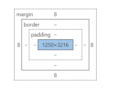
margin: 外边距 (边框向外)
border: 边框 (内边向外)
padding: 内边距 (元素向外)
Description
<!DOCTYPE html>
<html lang="en">
<head>
<meta charset="UTF-8">
<title>Title</title>
<!-- 外边距的妙用——居中元素 -->
<style>
/*
body 有多个个默认的外边距 margin: 0 需要设置为 0
许多标签都有对应默认值 需要设置为 0
margin 0
padding 0
text-decoration none
*/
body{
margin: 0px;
padding: 0px;
text-decoration: none;
}
#box{
width: 300px;
border: 2px solid red ;
/*
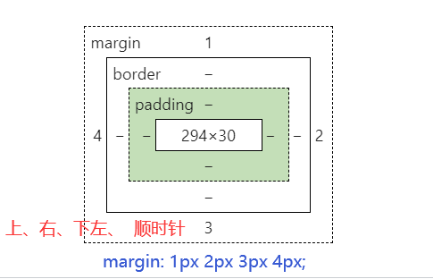
margin 格式 auto 表示自动对齐
margin: 0px 一个参数表示全是0
margin: 0px auto | 0px 2px 两个参数表示一个上下一个左右
margin: 1px 2px 3px 4px; 上 左 下 右 从上顺时针转 没必要记
*/
margin: 0px auto;
}
h2{
font-size: 16px;
background: #ffc6ec;
line-height: 30px;
color: #2bff0d;
/*原本标题与 内容是有一段空白的 但是去外边距后就 贴一起了 这要理解*/
margin: 0px;
}
form{
background: #ffc6ec;
}
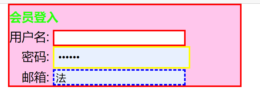
div:nth-of-type(1)>input{
border: 2px solid red;
}
div:nth-of-type(2)>input{
border: 2px solid yellow;
/*padding 同 margin*/
padding: 5px 5px;
}
div:nth-of-type(3)>input{
border: 2px dashed blue;
}
div:nth-of-type(2) {
text-indent: 1em;
}
div:nth-of-type(3){
text-indent: 1em;
}
/*-----------------*/
input{
border: 1px solid white;
}
</style>
</head>
<body>
<div id="box">
<h2>会员登入</h2>
<form action="#">
<div>
<span>
用户名:
</span>
<input type="text">
</div>
<div>
<span>
密码:
</span>
<input name="psw" type="password">
</div>
<div>
<span>
邮箱:
</span>
<input name="email" type="text">
</div>
</form>
</div>
</body>
</html>
Result (看看 就行 不用记)
盒子计算
margin + border + padding + 内元素大小 = 真实大小
7——圆角边框 以及盒子阴影(图片居中)
Demo
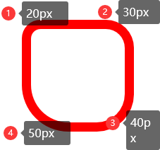
<style>
border-radius: 10px 20px 30px 40px; /*四个值时  从 左上 顺时针转*/
</style>
Decoration
<!DOCTYPE html>
<html lang="en">
<head>
    <meta charset="UTF-8">
    <title>Title</title>
    <style>
        div:nth-child(1){
            margin: 30px 0px 0px 30px ;
            padding: 0;
            width: 50px;
            height:  50px;
            background: red;
           /* border-radius: 50px 20px;*/ /*两个值时  指 两上 和两下*/
            border-radius: 10px 20px 30px 40px; /*四个值时  从 左上 顺时针转*/
            border-radius: 100px; /*这里的值应该是直径 当倒圆的直径与宽高相等就等于圆*/
            border-radius: 100px 0px 0px 0px; /* 门的形状  在这个基础上高度减去50 就是扇形  */

        }
        img{

            margin: 50px 50px;
            border-radius: 390px;
            background: #62ffb6;
        }

    </style>
</head>
<body>

<div>

</div>

    <img src="../../Resource/tx01.jpg" alt="">


</body>
</html>
Result
Demo
Decoration
<!DOCTYPE html>
<html lang="en">
<head>
    <meta charset="UTF-8">
    <title>Title</title>


    <!--margin: 0px auto;  img居中
    块中块   display: block; text-align  +  margin: "0px  auto"
    i

    -->
    <style>
        img{

            border: 4px dashed red;
            /*
            box-shadow: 盒子阴影
            text-shadow : 文字阴影
            */

            box-shadow: 10px 10px 100px #00daff;
            border-radius: 390px;

        }
    </style>

</head>
<body>

<div style="width: 5000px; display: block; text-align: center;">
    <div style="margin:  0px auto">
        <img src="../../Resource/tx01.jpg" alt="">
    </div>
</div>


</body>
</html>
这里讲:
- 一般自己写的,还不如网上的资源好看
- 不要重复造轮子
Result
8.——Display
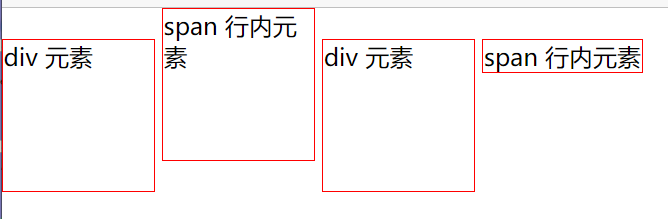
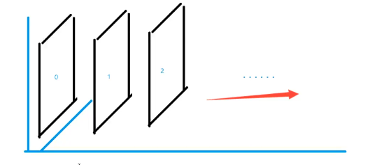
这也是一种实现行内元素排列的方式,但是我们情况都是用 float
- 标准文档流
块级元素独占一行
h1~h6 p div ol ul dl
行内元素 : 不独占一行
img a string em span
- 行内元素可以被块级元素包裹,反之不行
Description
<!DOCTYPE html>
<html lang="en">
<head>
    <meta charset="UTF-8">
    <title>Title</title>

    <!--
        display: block 显示声明设置
        block   块元素
        inline  行内元素
        inline-block 是块元素,但是可以内联,在一行
        none    不显示
        -->

    <style>
        div{
            width: 100px;
            height: 100px;
            border: 1px solid red;
            display: inline;/*设置成行内元素,就是一行的块*/

        }
        span{
            width: 100px;
            height: 100px;
            border: 1px solid red;
            display: block;
            display: inline-block;/*它是行内元素 也是块元素*/
        }
    </style>

</head>
<body>
<div>div 元素</div>
<span>span 行内元素</span>
</body>
</html>
Demo 与上代码 并无太大关联
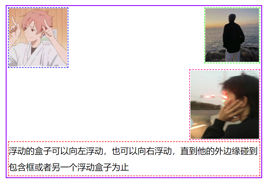
9.——浮动以及边框塌陷的解决
Description
<!DOCTYPE html>
<html lang="en">
<head>
    <meta charset="UTF-8">
    <title>Title</title>

    <link rel="stylesheet" href="Style.css">
</head>
<body>

<div id="father">

    <div class="layer01" >
        <img src="../../Resource/01.jpg" alt="">
    </div>
    <div class="layer02" >
        <img src="../../Resource/02.jpg" alt="">
    </div>

    <div class="layer03" >
        <img src="../../Resource/03.jpg" alt="">
    </div>
    <div class="layer04" >
        浮动的盒子可以向左浮动,也可以向右浮动,直到他的外边缘碰到包含框或者另一个浮动盒子为止
    </div>

    <div class="clear"></div>

</div>

</body>
</html>
CSS
/*float : 浮动
        : left  左浮动
        : right 右浮动
*/
/*
        所谓边框塌陷
        是因为 Float  所有东西浮动起来后,#father 边框就缩小了
        因为father 是用来装他们 的 当他们浮起来的时候就不需要了

*/
/*  clear: right;   右侧不允许有浮动元素
    clear: left;    左侧不允许有浮动
    clear:  both;    两侧不允许有浮动
    clear:  none;    可以浮动
    */


div{
    margin: 10px;
    padding: 5px;
}
img{
    margin: 0px;
    padding: 0px;
}
body{
    margin: 0px;
    padding: 0px;
}
#father{
    /*父级框的大小是被里面的元素 撑起来的 这点要理解*/
    border: 15px solid #9700ff;
    /*overflow: scroll;*/
}

#father:after{
    content: '';
    display: block;
    clear: both;
}

.layer01{
    border: 10px dashed #0000ff;
    display: inline-block;
    float: left;
    clear: both;
}
.layer02{
    border: 10px dashed #17ff00;
    display: inline-block;
   /*float: left ;   浮动 : 向左浮动! */
    float: right;
    clear: none;
}
.layer03{
    border: 10px dashed #ff0083;
    display: inline-block;
    float: right;
    clear: both;
}
.layer04{
    border: 8px  dashed red;
    font-size: 120px;
    line-height: 230px;
    float: right;
}

/*
    解决 元素漂浮后 父级框 塌陷 四大方案
    *  增加父级框 高度
    *  添加空 div
            - { 在#Father 里底部创建一个 div 去除内外边框 设置 clear 为both 就能让父级框整个包裹}
            ———初步理解; 父级框好比是一个网页的围栏,里面东西大小决定框的大小,在底部设置的div 好比在网页的最低放了一个东西,
            决定网页大小上限,那么如果只在设置margin padding时 相当于是一个 div标签的初始化,父级框是不会理会的,
            当设置属性 clear both 的时候,这个div就真正的存在了 父级框就会包裹它从而包裹所以内容
    *  在父级框设置 overflow:auto  scroll
    *  父级框里设置一个伪类 然后设置参数 相当于自动添加 div 是最好的办法

*/

/*
    添加 添加空 div 可以解决塌陷
    .clear{
        margin: 0px;
        padding: 0px;
        clear: both;
    }
*/


/*
    overflow 溢出
    overflow: auto      也有滚动条
    overflow: hidden;   会剪切内容
    overflow:scroll     滚动条

*/


/*
    伪类选择器
    #father:after{
        content: '';
        display: block;
        clear: both;
    }
    这里好像没起作用 但是单独提出来是可以的
*/
Result
10.——定位
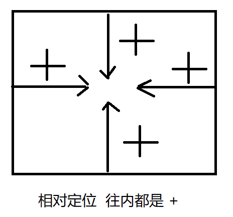
相对定位
绝对定位
固定定位
z-index
相对定位
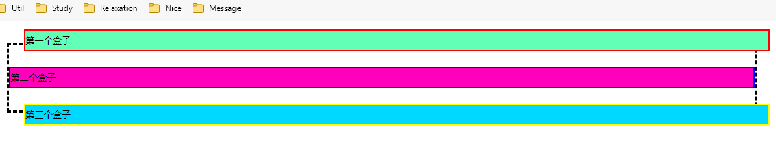
相对定位: position: relative
相对于原来的位置,进行指定的偏移,相对定位的话,它任然在标准文档流中,原来的位置会被保留
position: relative;
top: 20px;
left: 20px;
bottom: -10px
right: -20px
Description
<!DOCTYPE html>
<html lang="en">
<head>
<meta charset="UTF-8">
<title>Title</title>
<!-- 相对定位
相对于自己原来的位置进行偏移
-->
<style>
body{
padding: 20px;
}
div{
margin: 0px;
padding: 0px;
font-size: 12px;
line-height: 25px;
}
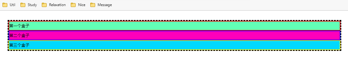
#father{
border: 3px dashed black;
padding: 0px;
}
#first{
background: #62ffb6;
border: 2px solid red;
position: relative; /*相对定位 : 上下左右*/
top: 20px; /*相对定位 向上就是 减 因为相对自己原来的位置是减得 同理可得*/
left: 20px;
}
#section{
background: #ff00bb;
border: 2px solid blue;
}
#third{
background: #00d9ff;
border: 2px solid yellow;
position: relative;
bottom: -20px;
right: -20px;
}
</style>
</head>
<body>
<div id="father">
<div id="first">第一个盒子</div>
<div id="section">第二个盒子</div>
<div id="third">第三个盒子</div>
</div>
</body>
</html>
Result
Finally
PositionTest
Decoration
<!DOCTYPE html>
<html lang="en">
<head>
    <meta charset="UTF-8">
    <title>Title</title>

    <style>

        body{
            margin: 25px;
            padding: 0px;
        }
        div{
            width: 300px;
            height: 300px;
            margin: 0px;
            padding: 0px;
            border: 2px dashed black;
        }
        a{
            margin: 0px;
            padding: 0px;
            width: 100px;
            height: 100px;
            background: cyan;
            display: block;
            text-decoration: none;
            text-align: center ;
            line-height: 100px;
        }
        a:hover{
            background: #9ad9ff;
        }
        a:nth-of-type(2),a:nth-of-type(4){
            position: relative;
            left: 200px;
            top: -100px;
        }
        a:nth-of-type(5){
            position: relative;
            left: 100px;
            top: -300px;
        }


    </style>


</head>
<body>
<div class="father">

            <a   href="#">链接1</a>
            <a   href="#">链接2</a>
            <a   href="#">链接5</a>
            <a   href="#">链接3</a>
            <a   href="#">链接4</a>

</div>

</body>
</html>
Result
        a:nth-of-type(2),a:nth-of-type(4){
            position: relative;
            left: 200px;
            top: -100px;
        }
/* 同样式可以用 , 逗号隔开*/
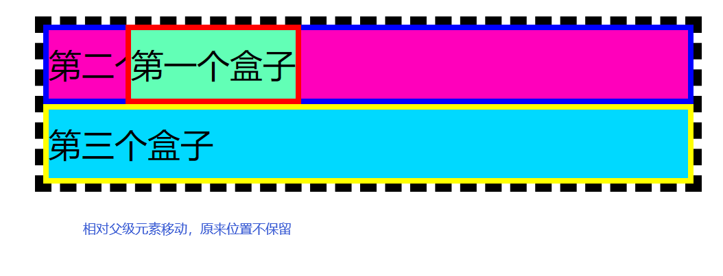
绝对定位(absolute)
绝对定位: 基于XXX定位,上下左右
- 没有父级元素定位前提下,相对于浏览器定位 和相对一样
- 假设父级元素存在定位,通常是相对于父级元素进行定位
- 在父级元素范围内移动
相对于父级或浏览器的位置,进行指定的偏移,绝对定位 不在标准文档流中,原来位置不会保留
/*父级元素  声明相对定位*/
#father{
    border: 3px dashed black;
    padding: 0px;
    position: relative;
}
/*子元素  声明为绝对定位时,就会相对父级元素偏移
*/
#first{
    background: #62ffb6;
    border: 2px solid red;
    position: absolute;
    left: 30px;
}
Result
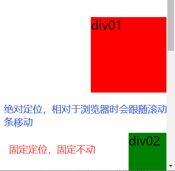
固定定位(fixed)
Decoration
<!DOCTYPE html>
<html lang="en">
<head>
    <meta charset="UTF-8">
    <title>Title</title>

    <style>
        body{
            height: 1000px;
        }

        div:nth-of-type(1){
            /* 绝对定位:  相对于浏览器,
        打开时始终在浏览器右下角,但是会跟随滚动条变动位置*/
            width: 100px;
            height: 100px;
            background: red;
            position: absolute;
            right: 0px;
            bottom: 0px;
        }

        div:nth-of-type(2){
            /* fixed : 固定定位 ,始终保持位置不动,
        他们回到顶部的按钮就是这个原理配合 js 做出来的*/
            width: 50px;
            height: 50px;
            background: green;
            position: fixed;
            right: 0px;
            bottom: 0px;
        }


    </style>
</head>
<body>


<div>div01</div>
<div>div02</div>

</body>
</html>
Result
z-index定位
网页图层,和ps中是一样的
Description
<!DOCTYPE html>
<html lang="en">
<head>
<meta charset="UTF-8">
<title>Title</title>
<link rel="stylesheet" href="css/style.css">
</head>
<body>
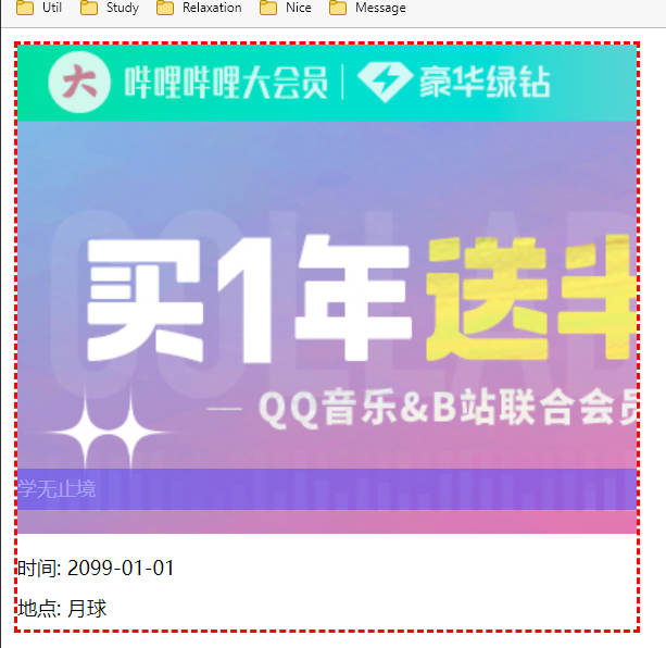
<div id="content">
<ul>
<li><img src="images/blbl.jpg" alt=""></li>
<li class="tipText">学无止境</li>
<li class="tipBg"></li>
<li>时间: 2099-01-01</li>
<li>地点: 月球</li>
</ul>
</div>
</body>
</html>
CSS
#content{
    width: 380px;
    margin: 0px;
    padding: 0px;
    overflow: hidden;
    /* 字体大小和行高是标准的 12*25*/
    font-size: 12px;
    line-height: 25px;
    border: 2px dashed red;


}
ul,li{
    margin: 0px;
    padding: 0px;
    list-style:none;
}
/*父级元素相对定位*/
#content ul{
    position: relative;
}

.tipText,.tipBg{
    position: absolute;
    width: 380px;
    height: 25px;
    top: 260px;
    color: white;
}
.tipText{

    /*
        设置 层次 999 较高层 所以一定会显示 默认是0  最高无限
        网页中用定位都是堆叠的,否则就是平铺,就是标准文档流 只有浮起来才有层级的概念
    */
    /*z-index: 999;*/
}


.tipBg{
    background: #4c43ff;
    opacity: 0.5; /*背景透明度*/

}
Result
新增单词
| 0 | CascadingStyleSheet | 层叠级联样式表 | ||
|---|---|---|---|---|
| 1 | radius | 半径 | 导圆角 | radio 单选框 | |
| 2 | display | 关闭显示 | ||
| 3 | stylesheet | 样式表 | ||
| 4 | active | 激活 | ||
| 5 | child | 元素|孩子 | ||
| 6 | firstchild | 第一个元素 | 蔡尔德 | |
| 7 | lastchild | 最后一个元素 | 蔡尔德 | |
| 8 | hover | 悬停 | 哈ver | |
| 9 | gainsboro | 灰色 | 给ins 波肉 | |
| 10 | decoration | 装饰 | 得可乱寻 | text-decoration: none; 去下划线 |
| 11 | align | 对齐方式 | 额莱嗯 | text-align: center; 对其方式 居中 |
| 12 | margin | 外边距 | 嘛gme | |
| 13 | Arial | 字体 | 哎润偶 | |
| 14 | weight | 字体粗细 | 喂特 | |
| 15 | oblique | 斜的 | 奥不利可 | |
| 16 | block | 块 | ||
| 17 | lighter | 薄体 | 莱特尔 | font-weight: lighter; 更细的 |
| 18 | align | 对齐(缩写) | 额莱恩 | |
| 19 | indent | 缩进 | 因等特 | |
| 20 | decoration | 装饰 | 第可瑞寻 | |
| 21 | underline | 下划线 | 恩德莱恩 | text-decoration: underline; 在什么下面--- |
| 22 | overline | 上划线 | text-decoration: overline; 在什么上面--- | |
| 23 | lineThrough | 删除线 | 丝柔 | |
| 24 | vertical | 垂直 | 沃ti扣 | vertical-align —— 垂直对齐 纵向 |
| 25 | middle | 上下居中 | 迷丢 | center 水平居中 左右居中 middle 垂直居中 上下居中 |
| 26 | price | 价格 | 噗乱丝 | |
| 27 | shadow | 阴影 | 夏都 | text-shadow: #2bff0d 3px 0px 3px; |
| 28 | circle | 空心圆 | 色狗 | list-style: circle; |
| 29 | square | 正方形 | 丝怪哎 | list-style: square; |
| 30 | repeat | 重复(平铺) | 瑞屁特 | |
| 31 | solid | 实体框 | so利德 | border: 2px solid red; |
| 32 | linear | 线状 | 莱嗯r | |
| 33 | gradient | 角度 | 坡度 | 各乱等 | |
| 34 | padding | 内边距 | 怕定 | |
| 35 | margin | 外边距 | 嘛居 | |
| 36 | login | 注册| 登入 | 落根 | |
| 37 | dashed | 虚线 | 打许特 | |
| 38 | block | 块 | 不落k | |
| 39 | layer | 层 | 类而 | |
| 40 | both | 两侧都 | 博夫 | |
| 41 | overflow | 溢出 | ||
| 42 | third | 第三 | 涩的 | |
| 43 | position | 位置(pos) | 陪贼寻 | |
| 44 | relative | 相对定位 | 瑞拉ti付 | |
| 45 | bottom | 底部 | 巴疼目 | |
| 46 | second | 第二 | ||
| 47 | fixed | 固定的 | 非渴死的 | |
| 48 | tipText | 提示信息 | ||
| 49 | opacity | 不透明度 | o噗cti |

 浙公网安备 33010602011771号