

前端学习(21)~css学习:如何让一个元素水平垂直居中?
如何让一个子元素在父容器里水平垂直居中?这个问题必考,在实战开发中,也应用得非常多。
如何让一个行内元素(文字、图片等)水平垂直居中
行内元素水平居中
给父容器设置:
text-align: center;
行内元素垂直居中
让文字的行高 等于 盒子的高度,可以让单行文本垂直居中。比如:
    .father {
        height: 20px;
        line-height: 20px;
    }
如何让一个块级元素水平垂直居中
margin: auto 的问题
在 CSS 中对元素进行水平居中是非常简单的:如果它是一个行内元素,就对它的父容器应用 text-align: center;如果它是一个块级元素,就对它自身应用 margin: auto或者 margin: 0 auto。
在这里,margin: auto相当于margin: auto auto auto auto。margin: 0 auto相当于margin: 0 auto 0 auto,四个值分别对应上右下左。其计算值取决于剩余空间。
但是,如果要对一个元素垂直居中,margin: auto就行不通了。
比如下面这段代码:
<!DOCTYPE html>
<html lang="en">
<head>
    <meta charset="UTF-8">
    <meta name="viewport" content="width=device-width, initial-scale=1.0">
    <title>Document</title>
    <style>
        .father{
            height: 500px;
            background: pink;
        }
        .son {
            width: 300px;
            height: 200px;
            background: red;

            margin: auto;
        }
    </style>
</head>
<body>
    <div class="father">
        <div class="son"></div>
    </div>
    <script></script>
</body>
</html>
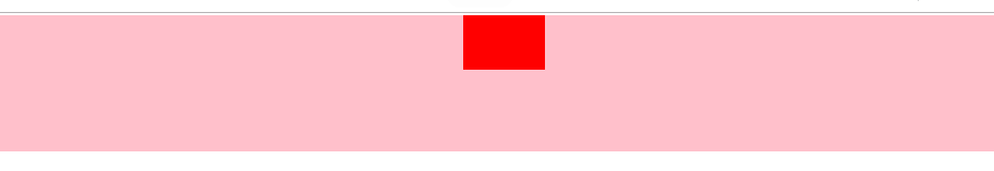
上面的代码中,父元素和子元素都是定宽高的,即便在这种情况下,我给子元素设置 margin: auto,子元素依然没有垂直居中。
那还有没有比较好的通用的做法呢?
方式一:绝对定位 + margin(需要指定子元素的宽高,不推荐)
<!DOCTYPE html>
<html lang="en">
<head>
    <meta charset="UTF-8">
    <meta name="viewport" content="width=device-width, initial-scale=1.0">
    <title>Document</title>
    <style>
        * {
            margin: 0;
            padding: 0;
        }
        .father{
            position: relative;
            min-height: 500px;
            background: pink;
        }
        .son {
            position: absolute;
            width: 200px;
            height: 100px;
            background: red;
            top: 50%;
            left: 50%;
            margin-top: -50px;
            margin-left: -100px;
        }
    </style>
</head>
<body>
    <div class="father">
        <div class="son">子元素的内容</div>
    </div>
    <script></script>
</body>
</html>
代码解释:我们先让子元素的左上角居中,然后向上移动宽度的一半(50px),就达到了垂直居中的效果;水平居中的原理类似。
不足之处:要求指定子元素的宽高,才能写出 margin-top 和 margin-left 的属性值。
但是,在通常情况下,对那些需要居中的元素来说,其宽高往往是由其内容来决定的,不建议固定宽高。
方式二:绝对定位 + translate(无需指定子元素的宽高,推荐)
<!DOCTYPE html>
<html lang="en">
<head>
    <meta charset="UTF-8">
    <meta name="viewport" content="width=device-width, initial-scale=1.0">
    <title>Document</title>
    <style>
        * {
            margin: 0;
            padding: 0;
        }
        .father{
            position: relative;
            min-height: 500px;
            background: pink;
        }
        .son {
            position: absolute;
            background: red;
            top: 50%;
            left: 50%;
            transform: translate(-50%, -50%);
        }
    </style>
</head>
<body>
    <div class="father">
        <div class="son">子元素的内容</div>
    </div>
    <script></script>
</body>
</html>
这种写法,在没有指定子元素宽高的情况下,也能让其在父容器中垂直居中。因为 translate() 函数中使用百分比值时,是以这个元素自身的宽度和高度为基准进行换算和移动的(动态计算宽高)。
方式3:flex 布局(待改进)
将父容器设置为 Flex 布局,再给父容器加个属性justify-content: center,这样的话,子元素就能水平居中了;再给父容器加个属性 align-items: center,这样的话,子元素就能垂直居中了。
代码举例:
<!DOCTYPE html>
<html lang="en">
<head>
    <meta charset="UTF-8">
    <meta name="viewport" content="width=device-width, initial-scale=1.0">
    <title>Document</title>
    <style>
        * {
            margin: 0;
            padding: 0;
        }
        .father{
            display: flex;
            justify-content: center;
            align-items: center;
            min-height: 100vh;
            background: pink;
        }
        .son {
            background: red;
        }
    </style>
</head>
<body>
    <div class="father">
        <div class="son">子元素的内容</div>
    </div>
    <script></script>
</body>
</html>
上面这种写法,不足之处在于:给父容器设置属性justify-content: center和align-items: center之后,导致父容器里的所有子元素们都垂直居中了(如果父容器里有多个子元素的话)。可我明明想让指定的某个子元素居中,要怎么改进呢?
方式4: flex 布局 + margin: auto(推荐)
我们只需写两行声明即可:先给父容器设置 display: flex,再给指定的子元素设置我们再熟悉不过的 margin: auto,即可让这个指定的子元素在剩余空间里,水平垂直居中。大功告成。
代码举例:
<!DOCTYPE html>
<html lang="en">
<head>
    <meta charset="UTF-8">
    <meta name="viewport" content="width=device-width, initial-scale=1.0">
    <title>Document</title>
    <style>
        * {
            margin: 0;
            padding: 0;
        }
        .father{
            display: flex;
            min-height: 100vh;
            background: pink;
        }
        .son {
            margin: auto;
            background: red;
        }
    </style>
</head>
<body>
    <div class="father">
        <div class="son">子元素的内容,想水平垂直居中</div>
        <div class="son2">这个元素不想水平垂直居中</div>
    </div>
    <script></script>
</body>
</html>
请注意,当我们给父容器使用 Flex 布局 时,子元素的margin: auto不仅能让其在水平方向上居中,垂直方向上也是居中的。

 浙公网安备 33010602011771号