

css3实现宽度渐变
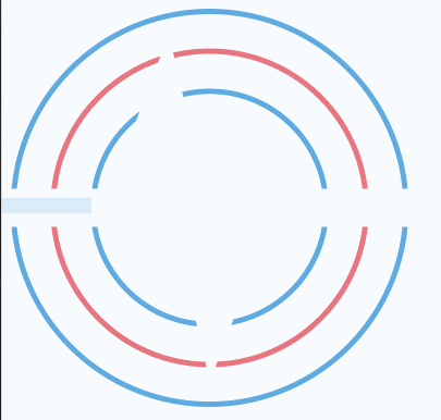
用css3实现宽度渐显效果,记录一下
效果:
<!DOCTYPE html>
<html>
    <head>
        <meta charset="UTF-8"/>
        <title>宽度渐变动画</title>
        <style>
            .bg {
                width: 365px;
                height: 366px;
                position: relative;
                background: url(img/bg.png);
            }
            .line {
                width: 407px;
                height: 252px;
                left: -20px;
                top: 55px;
                monitor-heartbeattion: absolute;
                background: url(img/line.png);
                z-index: 3;
                -webkit-animation: show2 3s ease-in-out;
                animation: show2 3s ease-in-out;
            }
            @-webkit-keyframes show2{
                0%{
                    opacity:0;
                    width:0;
                }
                100%{
                    opacity:1;
                    width:407px;
                }
            }
            @keyframes show2{
                0%{
                    opacity:0;
                    width:0;
                }
                100%{
                    opacity:1;
                    width:407px;
                }
            }
        </style>
    </head>
    <body>
        <div class="bg">
            <div class="line"></div>
        </div>
    </body>
</html>

 浙公网安备 33010602011771号