
CSS3新增属性
一、边框属性
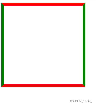
1. border-color
为边框设置多种颜色
 .morecolor{
            width: 300px;
            height: 300px;
            border: 10px solid;
            border-color: red green;
            /* 上下 左右 */
            /* border-color: red green blue; */
            /* 上 左右 下 */
            /* border-color: red blueviolet gold green; */
            /* 上 右 下 左 */
        }
2. border-image
使用图片来设置边框
3. border-radius
.mc{
            width: 300px;
            height: 300px;
           border: 1px solid;
           border-radius: 100px;
           /* 数值越大,圆角越大 */
        }
4. box-shadow
设置边框阴影
.mc{
            width: 300px;
            height: 300px;
           border: 1px solid;
           box-shadow: 10px 10px 5px #408
          /* 语法:水平阴影的位置(⭐) 垂直阴影的位置(⭐) 模糊的距离 阴影颜色 */

        }
二、新增背景属性
1. background-size
设置背景图尺寸
     .mc{
            width: 300px;
            height: 300px;
            background-image: url(./1.png);
            background-size: 80px 50px;
        }
2. background-origin
设置背景图从哪里开始显示
(背景图片可以放置于 content-box、padding-box 或 border-box 区域。)
 .mc{
            width: 300px;
            height: 300px;
            border: 30px solid #666;
            background-repeat: no-repeat;
            background-image: url(./1.png);
            background-origin:border-box;
            /* 从边框开始显示 */
        }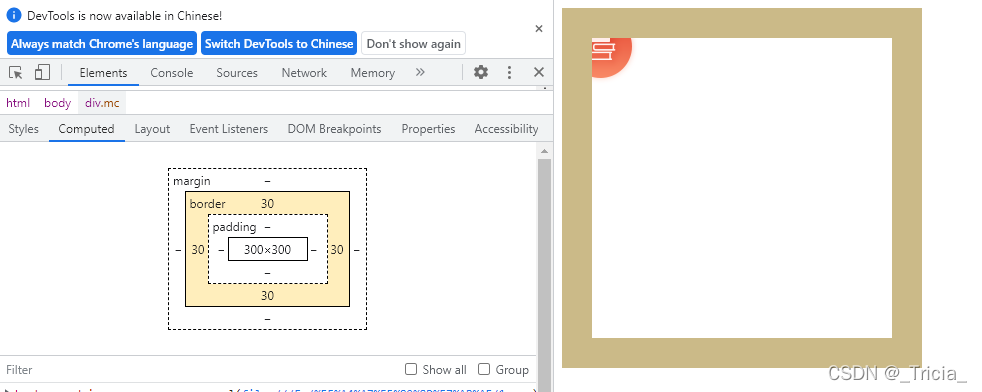
3. background-clip
设置背景图从哪里开始裁剪
       .mc{
           width: 300px;
           height: 300px;
           border: 1px solid ;
           padding: 50px;
       background-color: red;
        background-clip:content-box;
       }
三、新增文本属性
1. text-shadow
设置文字阴影
    .mc{
            width: 300px;
            height: 300px;
            border: 3px solid #666;
           text-shadow: 5px 5px 5px #999;
           /* 语法:水平阴影的位置(⭐) 垂直阴影的位置(⭐) 模糊的距离 阴影颜色 */
        }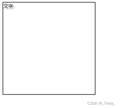
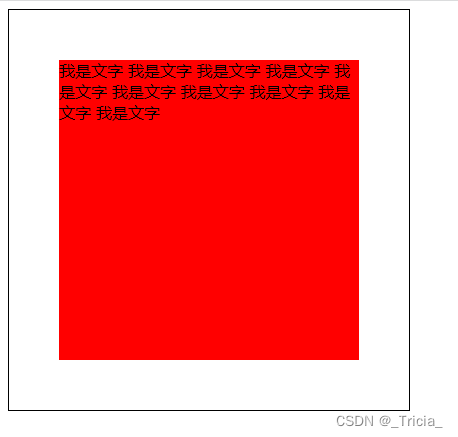
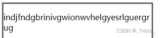
2. word-wrap
单词太长会自动换行
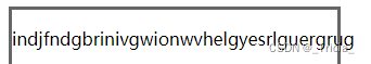
<p>indjfndgbrinivgwionwvhelgyesrlguergrug</p> 没设置换行:
设置换行
p{
             word-wrap: break-word;
        }
四、过渡效果
在给定的时间内平滑的改变属性值
transition
     .tra{
            width: 100px;
            height: 100px;
            border: 3px solid;
            border-color: red green yellow pink ;
            background-color: #666;
             /* 语法:要改变的属性 持续时间 */
            transition: width 3s;
            /* 只给宽度加 */
            transition: width 3s , height 5s;
            /* 给宽度和高度都加 */
            transition-timing-function: linear;
            /* 规定过渡效果的速度曲线 */
            transition-delay: 3s;
            /* 延迟过渡效果时间 */
            transition:transform 2s;
            /* 设置旋转过度 */
        }
        .tra:hover{
            width: 300px;
            height: 300px;
            transform: rotate(180deg);
            /* 旋转180度 */
        }
五、动画效果
css3支持不依赖js的html动画效果
animation
   @keyframes example {
            0% {
                background-color: red;
            }

            25% {
                background-color: yellow;
            }

            50% {
                background-color: blue;
            }

            100% {
                background-color: green;
            }
        }

    /* 分别在动画完成0% 25% 50% 100%时更改相应的背景颜色 */
        .tra {
            width: 100px;
            height: 100px;
            background-color: red;
            animation-name: example;
            /* 引入动画名称 */
            animation-duration: 4s;
            /* 动画持续时间 */
            animation-delay: 1s;
            /* 动画延迟时间 */
            animation-iteration-count:infinite;
            /* 动画重复次数:infinite表示永远持续,也可以用数字表示重复几次 */
            animation-direction:reverse;
            /* 表示动画如何播放 */
            /* normal - 动画正常播放(向前)。默认值
            reverse - 动画以反方向播放(向后)
            alternate - 动画先向前播放,然后向后
            alternate-reverse - 动画先向后播放,然后向前 */
            animation-timing-function:linear;
            /* 动画播放速度曲线 */
            /* ease - 指定从慢速开始,然后加快,然后缓慢结束的动画(默认)
            linear - 规定从开始到结束的速度相同的动画
            ease-in - 规定慢速开始的动画
            ease-out - 规定慢速结束的动画
            ease-in-out - 指定开始和结束较慢的动画 */
        }
简写:
animation: name duration timing-function delay iteration-count direction;

 浙公网安备 33010602011771号