

3.美化网页元素
为什么要美化网页
- 有效传递页面信息
- 美化网页,页面漂亮,才能吸引用户
- 凸显页面的主题
- 提高用户的体验
span标签:重点要突出的字,使用span套起来
<!DOCTYPE html>
<html lang="en">
<head>
<meta charset="UTF-8">
<title>Title</title>
<style>
#title1{
font-size: 50px;
}
</style>
</head>
<body>
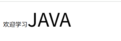
<div>
</div>
欢迎学习<span id="title1">JAVA</span>
</body>
</html>
字体样式
<!--
  font-family:字体
  font-size:字体大小
  font-weight:字体粗细
  -->
  <style>
    body{
      font-family: 楷体;
      color: coral;
    }
    h1{
      font-size: 50px;
    }
    .p1{
      font-weight: bold;
    }
  </style>
文本样式
- 颜色 color rgb rgba
- 文本对齐的方式 text-alin:center
- 首行缩进 text-indent:2em
- 行高 line-height:
- 装饰 text-decoration
- 文本图片水平对齐 :vertical-align: middle;
<!DOCTYPE html>
<html lang="en">
<head>
    <meta charset="UTF-8">
    <title>Title</title>
  <!--
  颜色:
    单词  RGB RGBA
    text-alin:排版  居中
    text-indent:2em;段落首行缩进
    行高,和块的高度一致,就可以上下居中
  -->
  <style>
    h1{
      color: orange;
      text-align: center;
    }
    .p1{
      text-indent: 2em;
    }
    .p2{
      background: red;
      height: 30px;
      line-height: 30px;
    }
    /*下划线*/
    .l1{
      text-decoration: underline;
    }
    /*中划线*/
    .l2{
      text-decoration: line-through;
    }
    /*上划线*/
    .l3{
      text-decoration: overline;
    }


     /*文字和图片水平对齐*/
     img,span{
         vertical-align: middle;
     }
  </style>


</head>
<body>

<h1>故事介绍</h1>
<p class="p1">
  法新社称,克拉克出生于英国,他与另外两名获奖者都是美国高校研究人员。对于获奖一事,克拉克表示,自己“感到震惊”,“我这一生从来没想过会发生这样的事情”。
</p>

<p class="p2">
  报道称,对于特朗普政府采取大幅削减科研预算等措施,克拉克表示,这是一个“极其严重”的问题。“这会使美国大量科学研究工作陷入瘫痪。”克拉克称,自己认识一些研究人员,他们在经费方面受到严重打击。
</p>

<p class="l1">123456</p>
<p class="l2">123456</p>
<p class="l3">123456</p>

<p>
    <img src="images/a.png" alt="">
    <span>6465131898465</span>
</p>
</body>
</html>
阴影
/*text-shadow:阴影颜色,水平偏移,垂直偏移,阴影半径*/
#price{
    text-shadow: #3cc7f5 10px 0px 2px;
}
超链接伪类
正常情况下,a,a:hover
a{
    text-decoration: none;
    color: black;
}
/*鼠标悬浮的颜色(只需要记住这个)*/
a:hover{
    color: orange;
    font-size: 50px;
}
列表
#nav{
    width: 300px;
    background: #a0a0a0;
}

.title{
    font-size: 18px;
    font-weight: bold;
    text-indent: 1em;
    line-height: 35px;
    background: #ec0909;
}
/*ul li*/
/*
list-style:
    none 去掉圆点
    circle 空心圆
    decimal 数字
    square 正方形
*/
ul{
    background: #a0a0a0;
}

ui li{
    height:30px;
    list-style: none;
    text-indent: 1em;
}

a{
    text-decoration: none;
    font-size: 14px;
    color:#000;
}
a:hover{
    color:orange;
}
背景
背景颜色
背景图片
<!DOCTYPE html>
<html lang="en">
<head>
    <meta charset="UTF-8">
    <title>Title</title>

  <style>
    div{
      width: 1000px;
      height: 700px;
      border: 1px solid red;
      /*默认是全部平铺*/
      background-image: url("images/b.png");
    }
    .div1{
        background-repeat: repeat-x;
    }
    .div2{
        background-repeat: repeat-y;
    }
    .div3{
        background-repeat: no-repeat;
    }
  </style>
</head>
<body>

<div class="div1"></div>
<div class="div2"></div>
<div class="div3"></div>

</body>
</html>
添加箭头
.title{
    font-size: 18px;
    font-weight: bold;
    text-indent: 1em;
    line-height: 35px;
    /* 颜色,图片,图片位置,平铺方式*/
    background: red url("../images/down.png") 270px 10px no-repeat;
}
ul li{
    height:30px;
    list-style: none;
    text-indent: 1em;
    background: url("../images/right.png") 230px 6px no-repeat;
}
渐变
4.盒子模型
什么是盒子模型
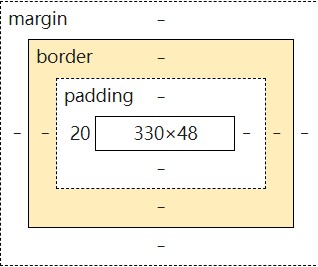
margin:外边距
padding:内边距
border:边框
边框
- 粗细
- 样式
- 颜色
#box{
      width: 300px;
      border: 1px solid red;
      background: #1288e7;
    }
内外边距
<!DOCTYPE html>
<html lang="en">
<head>
  <meta charset="UTF-8">
  <title>Title</title>
  <style>
    /*<!--body总有一个默认的外边距-->*/
    body{
      margin: 0;
    }
    /*<!--border:粗细,样式,颜色-->*/
    /*外边距的妙用:居中元素
    margin:0 auto;
    */
    #box{
      width: 300px;
      border: 1px solid red;
      margin: 0 auto;
    }
    /*margin:
    margin:0 上下左右外边距全为0
    margin:0 1px 上下外边距为0 左右外边距为1px
    margin:0 1px 2px 3px 分别对应上下左右外边距
    */
    h2{
      font-size: 16px;
      background: #1288e7;
      line-height: 30px;
      color: white;
      text-align: center;
      margin: 0;
    }
    form{
      background:#3cbda6;
    }
    input{
      border:1px solid black;
    }
    /*内边距和外边距类似*/
    div:nth-of-type(1){
      padding: 10px;
    }

  </style>
</head>
<body>

<div id="box">
  <h2>会员登陆</h2>
  <form action="#">
    <div>
      <span>用户名:</span>
      <input type="text" name="">
    </div>

    <div>
      <span>密码:</span>
      <input type="text" name="">
    </div>

    <div>
      <span>邮箱:</span>
      <input type="text" name="">
    </div>
  </form>
</div>

</body>
</html>
盒子的计算方式:你这个元素到底多大?
margin + border + padding + 内容宽度
圆角边框
4个角
<style>
    div{
      width:100px;
      height: 100px;
      border: 10px solid red;
      border-radius: 100px;
    }

  </style>
盒子阴影
<!DOCTYPE html>
<html lang="en">
<head>
    <meta charset="UTF-8">
    <title>Title</title>
  <style>
    img{
      display: block;/* 将图片转为块级元素 */
      margin:0 auto;
      border-radius: 70px;
      box-shadow: 10px 10px 100px yellow;
    }
  </style>
</head>
<body>
<img src="../3.圆角边框/images/b.png" alt="">
</body>
</html>
5.浮动
标准文档流
块级元素:独占一行
h1~h6 p div 列表...
行内元素:不独占一行
span a img strong
行内元素可以被包含在块级元素中,反之则不可以
display
<!DOCTYPE html>
<html lang="en">
<head>
    <meta charset="UTF-8">
    <title>Title</title>
  <style>
<!--
block 块元素
inline 行内元素
inline-block 是块元素,但是可以内联,在一行
none
-->
    div{
      width:100px;
      height: 100px;
      border: 1px solid red;
      display: none;
    }
    span{
      width:100px;
      height: 100px;
      border: 1px solid red;
      display: block;
    }

  </style>
</head>
<body>

<div>div块元素</div>
<span>span行内元素</span>

</body>
</html>
这个也是一种实现行内元素排列的方式,但是我们很多情况都是用float
float
左右浮动 float 相当于跳出块 可以自由排列
父级边框塌陷的问题
clear
/*
clear:right;右侧不允许有浮动元素
clear:left;左侧不允许有浮动元素
clear:both;两侧不允许有浮动元素
clear:none;
*/
解决方法:
-
增加父级元素的高度
#father{ border:1px #000 solid; height:800px } -
增加一个空的div标签,清除浮动
<div class="clear"></div>
.clear{
    clear:both;
    margin:0;
    padding:0;
}
-
overflow
在父级元素中增加一个 overflow:hidden; -
父类添加一个伪类:after
#father:after{
    content:'';
    display:block;
    clear:both;
}
小结:
- 浮动元素后面增加空div:简单,但是代码中尽量避免空div
- 设置父元素的高度:简单,但是元素假设有了固定的高度,就会被限制
- overflow:简单,但是下拉的一些场景避免使用,不够美观
- 父类添加一个伪类:推荐使用
display和float对比
- display:方向不可控制
- float:方向可控,但是浮动起来的话会脱离标准文档流,所以要解决父级边框塌陷的问题~
6.定位
相对定位
<!DOCTYPE html>
<html lang="en">
<head>
    <meta charset="UTF-8">
    <title>Title</title>
<!--  相对定位
相对于自己原来的位置进行偏移-->
  <style>
    div{
      margin: 10px;
      padding: 5px;
      font-size: 20px;
      line-height: 25px;
    }
    #father{
      border: 1px solid #ec0909;
    }
    #first{
      border: 1px dashed #1109ec;
      background: yellow;
      position: relative;
      right: 20px;
    }
    #second{
      border: 1px dashed #3cbda6;
      background: green;
      position: relative;
      left: 10px;
    }
    #third{
      border: 1px dashed #a0a0a0;
      background: coral;
      position: relative;
      top: 30px;
    }

  </style>

</head>
<body>

<div id="father">
  <div id="first">第一个盒子</div>
  <div id="second">第二个盒子</div>
  <div id="third">第三个盒子</div>
</div>


</body>
</html>
相对定位:position:relative;
相对于原来的位置,进行指定的偏移,相对定位的话,它仍然在标准文档流中,原来的位置被保留,父级边框不会塌陷。
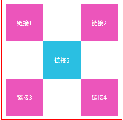
方块定位练习
<!DOCTYPE html>
<html lang="en">
<head>
    <meta charset="UTF-8">
    <title>Title</title>
<!--方块定位练习-->
  <style>
    #father{
      width: 300px;
      height: 300px;
      padding: 10px;
      border: 2px solid red;
    }
    a{
      width: 100px;
      height: 100px;
      text-decoration: none;
      background: #ec55bb;
      line-height: 100px;
      text-align: center;
      color: white;
      display: block;
    }
    a:hover{
      background: #2abfe2;
    }
    #son2{
      position: relative;
      left: 200px;
      bottom: 100px;
    }
    #son4{
      position: relative;
      left: 200px;
      bottom: 100px;
    }
    #son5{
      position: relative;
      left: 100px;
      bottom: 300px;
    }


  </style>


</head>
<body>
<div id="father">
  <div id="son1">
    <a href="#">链接1</a>
  </div>

  <div id="son2">
    <a href="#">链接2</a>
  </div>

  <div id="son3">
    <a href="#">链接3</a>
  </div>

  <div id="son4">
    <a href="#">链接4</a>
  </div>

  <div id="son5">
    <a href="#">链接5</a>
  </divid>
</div>
</body>
</html>
效果图:
绝对定位
定位:基于xxx定位,上下左右~
- 没有父级元素定位的前提下,相对于浏览器定位
- 假设父级元素存在定位,我们通常会相对于父级元素偏移
- 相对于父级或浏览器的位置,进行指定的偏移,绝对定位的话,它不在标准文档流中。
固定定位fixed
<!DOCTYPE html>
<html lang="en">
<head>
    <meta charset="UTF-8">
    <title>Title</title>
  <style>
    body{
      height: 1000px;
    }
    div:nth-of-type(1){ /*绝对定位:相对于浏览器*/
      width: 100px;
      height: 100px;
      background: red;
      position: absolute;
      right: 0;
      top: 0;
    }
    div:nth-of-type(2){ /*fixed:固定定位 定死不动*/
      width: 50px;
      height: 50px;
      background: yellow;
      position: fixed;
      right: 0;
      top: 0;
    }
  </style>
</head>
<body>

<div>div1</div>
<div>div2</div>

</body>
</html>
z-index
效果:
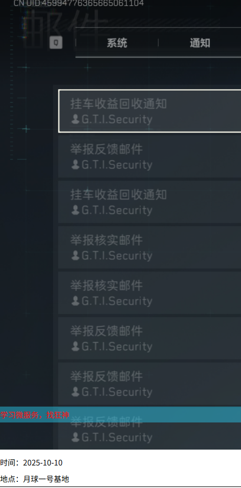
会让文字置于背景颜色之上从而显示出来

 浙公网安备 33010602011771号