CSS | z-index
z-index 有四大特性,每个特性你记住了,页面布局就不会出现找不到盒子的情况。
1) z-index 值表示谁压着谁,数值大的压盖住数值小的,
2) 只有定位了的元素,才能有z-index,也就是说,不管相对定位,绝对定位,固定定位,都可以使用z-index,而浮动元素不能使用z-index
3) z-index值没有单位,就是一个正整数,默认的z-index值为0如果大家都没有z-index值,或者z-index值一样,那么谁写在HTML后面,谁在上面压着别人,定位了元素,永远压住没有定位的元素。
4) 从父现象:父亲怂了,儿子再牛逼也没用
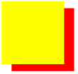
<!DOCTYPE html>
<html lang="zh-CN">
<head>
    <meta http-equiv="content-Type" charset="UTF-8">
    <meta http-equiv="x-ua-compatible" content="IE=edge">
    <meta name="viewport" content="width=device-width, initial-scale=1">
    <title>Title</title>
    <style>

        div.box1{
            width: 200px;
            height: 200px;
            background: red;
            position: absolute;
            top: 30px;
            left: 40px;
        }
        div.box2{
            width: 200px;
            height: 200px;
            background-color: yellow;
            position: absolute;

        }
    </style>
</head>
<body>
        <div class="box1"></div>
        <div class="box2"></div>
</body>
</html>
网页效果:黄色的盒子压盖住了红色的盒子。同是定位的盒子,后设置的掩盖住前面的
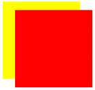
<!DOCTYPE html>
<html lang="zh-CN">
<head>
    <meta http-equiv="content-Type" charset="UTF-8">
    <meta http-equiv="x-ua-compatible" content="IE=edge">
    <meta name="viewport" content="width=device-width, initial-scale=1">
    <title>Title</title>
    <style>

        div.box1{
            width: 200px;
            height: 200px;
            background: red;
            position: absolute;
            top: 30px;
            left: 40px;
            z-index:1;
        }
        div.box2{
            width: 200px;
            height: 200px;
            background-color: yellow;
            position: absolute;

        }
    </style>
</head>
<body>
        <div class="box1"></div>
        <div class="box2"></div>
</body>
</html>
网页效果:红色的盒子压盖住了黄色的盒子。对于定位的盒子默认z-index:0;一旦z-index大于0,等级变高,数值越大,等级越高。
<!DOCTYPE html>
<html lang="zh-CN">
<head>
    <meta http-equiv="content-Type" charset="UTF-8">
    <meta http-equiv="x-ua-compatible" content="IE=edge">
    <meta name="viewport" content="width=device-width, initial-scale=1">
    <title>Title</title>
    <style>
        div.father1{
            width: 300px;
            height: 300px;
            background-color: darkmagenta;
            position: relative;
        }
         div.father2{
            width: 300px;
            height: 300px;
            background-color: darkorange;
             position: relative;
        }
        div.box1{
            width: 200px;
            height: 200px;
            background: red;
            position: absolute;
        }
        div.box2{
            width: 200px;
            height: 200px;
            background-color: yellow;
            position: absolute;
        }
    </style>
</head>
<body>
    <div class="father1">
        <div class="box1"></div>
    </div>
    <div class="father2">
        <div class="box2"></div>
    </div>


</body>
</html>
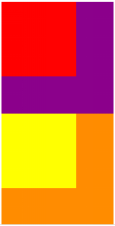
<!DOCTYPE html>
<html lang="zh-CN">
<head>
    <meta http-equiv="content-Type" charset="UTF-8">
    <meta http-equiv="x-ua-compatible" content="IE=edge">
    <meta name="viewport" content="width=device-width, initial-scale=1">
    <title>Title</title>
    <style>
        div.father1{
            width: 400px;
            height: 400px;
            background-color: darkmagenta;
            position: relative;
            z-index:10;
        }
         div.father2{
            width: 400px;
            height: 400px;
            background-color: darkorange;
             position: relative;
             z-index:20;
        }
        div.box1{
            width: 200px;
            height: 200px;
            background: red;
            position: absolute;
            top: 350px;
            left: 450px;
            z-index: 999;
        }
        div.box2{
            width: 200px;
            height: 200px;
            background-color: yellow;
            position: absolute;
            left: 480px;
            z-index: 20;
        }
    </style>
</head>
<body>
    <div class="father1">
        <div class="box1"></div>
    </div>
    <div class="father2">
        <div class="box2"></div>
    </div>


</body>
</html>
网页效果:从父现象 父亲怂了,儿子再厉害也没用
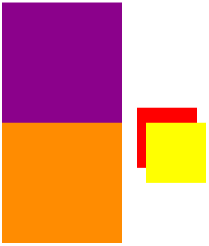
只要有定位的盒子,一定大于标准流的盒子
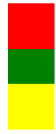
<!DOCTYPE html>
<html lang="en">
<head>
    <meta charset="UTF-8">
    <title>Document</title>
    <style>
        .box1{
            width: 200px;
            height: 200px;
            background-color: red;
            position: relative;
            top: 50px;
        }
        .box2{
            width: 200px;
            height: 200px;
            background-color: green;
        }
        .box3{
            width: 200px;
            height: 200px;
            background-color: yellow;
        }
</style>
</head>
<body>
    <div class="box1"></div>
    <div class="box2"></div>
<div class="box3"></div>
</body>
</html>
网页效果
z-link 应用--固定导航栏
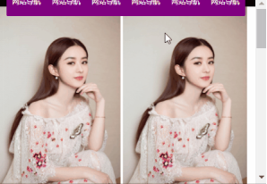
html:
<!DOCTYPE html>
<html lang="en">
<head>
    <meta charset="UTF-8">
    <title></title>
    <style>
        * {
            padding: 0;
            margin: 0;
        }

        ul {
            list-style: none;
        }

        body {
            padding-top: 40px;
        }

        .nav {
            width: 100%;
            height: 40px;
            background-color: black;
            position: fixed;
            top: 0;
            left: 0;
            z-index: 99999;
        }

        .wrap {
            width: 960px;
            overflow: hidden;
            margin: 0px auto;
            background-color: purple;
            border-radius: 5px;

        }

        .wrap ul li {
            float: left;
            width: 160px;
            height: 40px;
            line-height: 40px;
            text-align: center;

        }

        .wrap ul li a {
            width: 160px;
            height: 40px;
            display: block;
            color: white;
            font-size: 14px;
            text-decoration: none;

        }

        .wrap ul li a:hover {
            background: yellow;
            color: green;
            text-decoration: underline;
        }

        p {
            position: relative;
        }

</style>
</head>
<body style="height: 3000px">
<div class="nav">
    <div class="wrap">
        <ul>
            <li>
                <a href="#">网站导航</a>
            </li>
            <li>
                <a href="#">网站导航</a>
            </li>
            <li>
                <a href="#">网站导航</a>
            </li>
            <li>
                <a href="#">网站导航</a>
            </li>
            <li>
                <a href="#">网站导航</a>
            </li>
            <li>
                <a href="#">网站导航</a>
            <li>
        </ul>
</div>
</div>
<!-- <div class="wrap">内容</div> -->
<img src="images/zly.jpg" alt="">
<img src="images/zly.jpg" alt="">
<img src="images/zly.jpg" alt="">
<img src="images/zly.jpg" alt="">
<p>哈哈哈哈哈哈哈哈</p>
<img src="images/zly.jpg" alt="">
<img src="images/zly.jpg" alt="">
<img src="images/zly.jpg" alt="">

</body>
</html>
网页效果:

 浙公网安备 33010602011771号